

I’ll start today’s article with a quote by the designer Rob Curedale, I so much enjoy. He says that “design is creativity with strategy,” and I couldn’t agree more. If you know little about web design, it’s time to understand the basics. Handling visual appearance and style along with a clear and strong structure means that web design and web development cannot exist one without the other. So, it’s visual with a structure. How do you cope with design mix-ups that can ruin the consistency of your WordPress website?
The Roots: What’s behind a website?
When you want to create a website on WordPress, the system requires you to install a theme or to know how to code. A theme is made up by a team of developers and designers who “speak” programming languages. A web page, as you see it, consists of HTML, Javascript, and CSS code lines. HTML means Hypertext Markup Language and is the cornerstone structure of any website. Javascript is the one making HTML content an interactive one, while CSS (Cascading Style Sheets) creates its visuals. When adding colors, layout, and fonts, we are talking about CSS customizations.

With a powerful theme and pre-made designing tools, you already have all you’ve dreamed of. However, you can still ruin the overall consistency on your website’s design if you combine elements only because you love them independently. Everything stays in the way you make them, all looking amazing together!
Web design is a form of art. Web design means blood, sweat, and tears
The Web design road started as a way to show designs using complicated table structures. CSS was first introduced to a W3C presentation in December 1996. Browser wars happening between Microsoft and Netscape led to creative solutions that made web technology a powerful communication tool. Since then, the way people use the Internet is continuously changing the websites’ apparel, Designers and developers alike are challenged to innovate and bring new tools on the table, so people enjoy the final product and ease their work.
In web design, every feature tells a story, and a smooth way elements appear on your website will help you to:
- Give the audience the first impression of your website
- Build trust among your visitors
- Bring aesthetics and overall consistency to your site
- Improve the user experience on any device
A great user interface conducts to better user experience and if combined with the right SEO practices can facilitate the quality or quantity of your site’s traffic. Though, that’s a story for another time.

5 Web Design Mistakes You Need to Avoid Doing
They say everyone can learn from mistakes. So, the more mistakes, the merrier?
In web design, a single mistake can affect your entire WordPress website. Let’s go through the most frequently missed steps and learn how to avoid them.
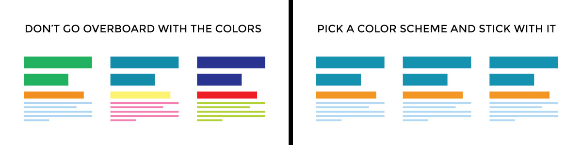
1. Show your site’s real colors
On web design, there is no limit of colors you can use on your website, and each one can be your favorite. It’s better to use few colors than too many. However, choosing the perfect color combination is an adventure as nobody wants a website that looks like a clown. So, for the very beginning, focus on a three-color scheme (triadic colors) to create your website harmony. This combination should consist of a primary color, greater than 50%, a contrast one, and an accent color to complement the others. Stay in the safe zone with this one!
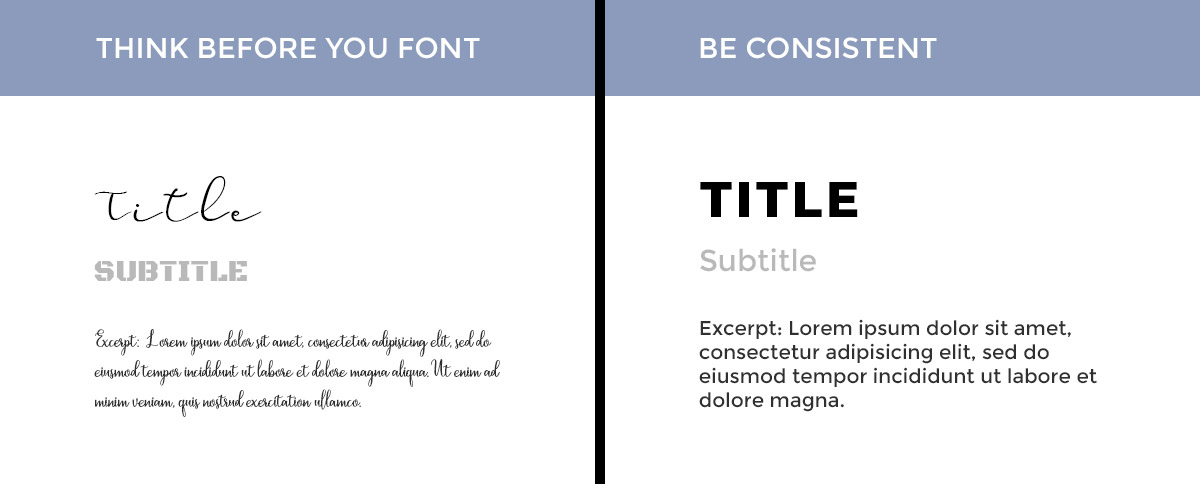
2. Fonts talk louder than your words
By combining different fonts with multiple weights or styles, it’s quite simple to create design chaos. There’s a wide range of fonts out there, so choose wisely. You’ll be tempted by so many types that catch your eye, though, there’s no need to make compromises with the website’s consistency.
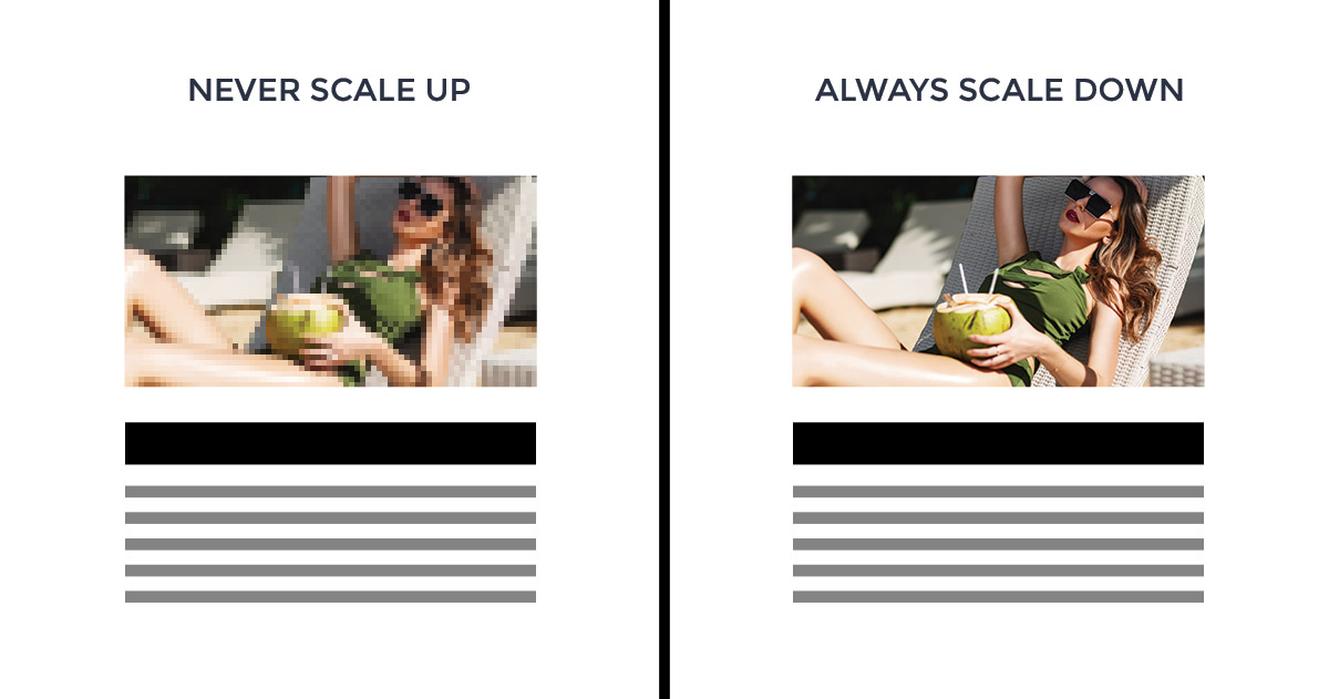
3. Sharp image for clear results
What happens when you add images in wrong sizes? They’ll display with poor quality and can increase the loading time on your website, instead of reducing it. Also, fuzzy images might look like your site is not a trustworthy source of information, chasing your visitors away. Consider optimizing them to the core, and you’ll get the best results!

4. Visitor’s visual flow
No matter what your industry is about, there are a few elements you need to show in designated places, such as the company logo, search bar, about, and contact details. People scan a web page using different patterns. Thus, it’s best to keep the reader’s visual flow he is used to: from top to bottom and left to right.
5. Balance within elements
The feeling of a well-balanced, either symmetrical or asymmetrical design, is given by heavy and lighter elements. Choose the right typography, optimize images, use triadic colors, shapes, while keeping the hierarchy and proportion. Elements combined with your content will make your website to stand out. Don’t forget to leave some negative space and maintain the rhythm by repeating elements in a regular, random, flowing, alternating or progressive way.
Knowledge is power. Experience is king
When you have all the tools to create outstanding website pages and posts in such a quick time, you only have to take care of how you mix and match elements. They are all fine-tuned and look spectacular. However, don’t get too excited. The more, the merrier doesn’t apply here. Just select those exquisite features, unique images and add your content while following your unicorn dreams. Let us see your amazing designs, below in comments. ⬇


