

Gradients in web design have been around for ages. However, it is only recently that they got popularised again through huge brands such as Instagram and Spotify who have used color combinations on their websites. The trend has come to stay. How do you incorporate this into your website? From buttons to logos, backgrounds, typography, you can easily make gradients part of your style.
Why you should use Gradients in Web Design
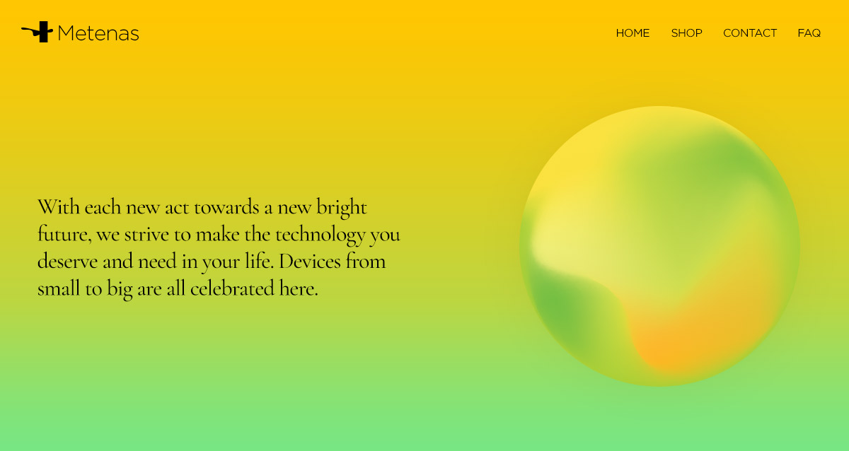
It’s a technique that catches the eye of the reader and makes any website more memorable. The stunning color transitions get any gradient to stand out and helps you elevate the layout further. When in nature, colors usually blend very beautifully, in a natural way. Just take a look at the sky at any time during the day. It might change shades of blue and then blend towards an orange, yellow, pink, during sunset or sunrise. Mimicking reality, gradients in web design add depth and dimension to any website, making flat elements appear as though in 3D.
![]()

General Tips to Style your Site with Gradients
When you create any form of gradient on any element on your website, you add two or more hues to obtain a fantastic color combination. However, how exactly do you pick the right colors for it? Which ones work best together, and how do you decide?
- Take a look into the color wheel. Pick analogous colors, which are close together in their hue so that the gradient becomes a seamless blend between them.
- If you deviate from analogous and decide for complementary colors, do a 3-part gradient which involves adding a third color in between the first two.
- The triadic scheme can usually result in dazzling hues.
- Use nature as inspiration if you’re stuck with picking colors. Take a look around you from the plant that is half in shade and half in sunlight, to the sky that is changing colors between sunrise and sunset.
- Work with the opacity of any gradient. Is it too bright? Lower the opacity and let it blend into the background.

Obtain a fantastic design with Newspaper Theme
While building your website, find elements that allow gradients easily through the tagDiv Composer, our frontend page builder. If you’re stuck, here are a few suggestions:
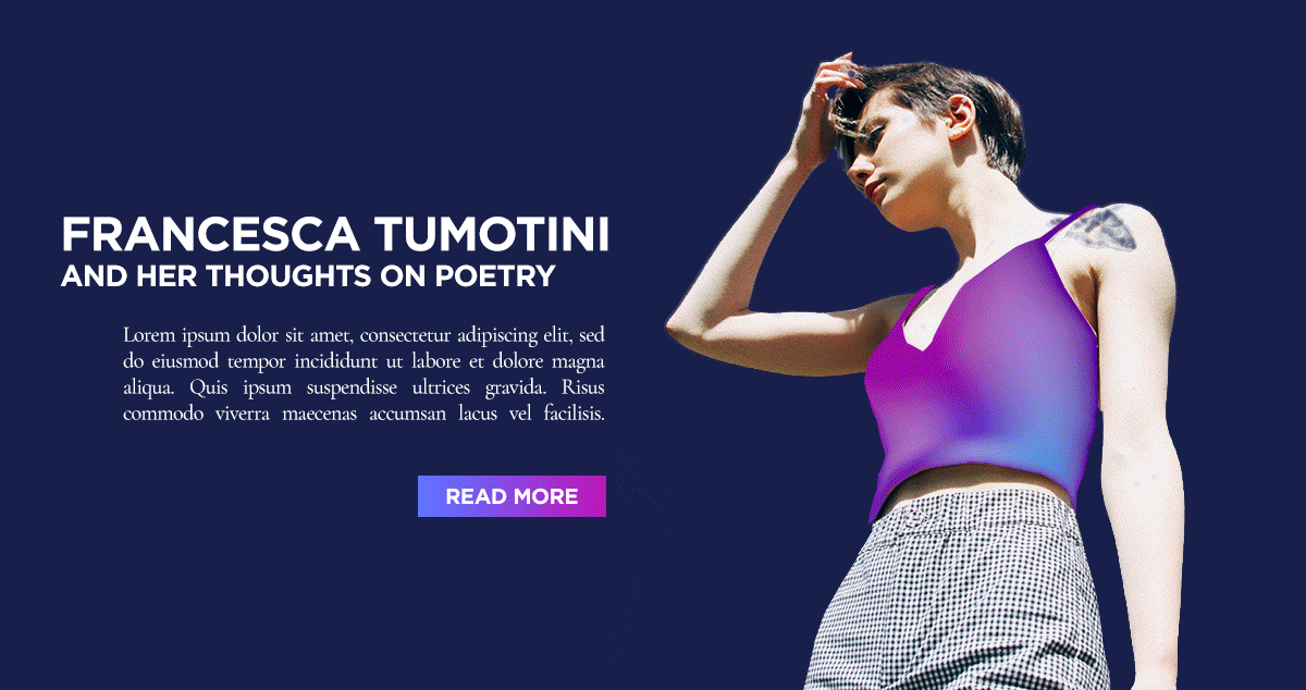
- Through the CSS tab of any row, you can choose two colors to create an alluring gradient on the background.
- All buttons can have a gradient applied to them in the Style tab of their settings. Whether you have a “Read More” button on your Flex Block or need to bold call-to-action, you can make it pop with a stunning color combination.
- Title elements can be turned into something fun and stylish by adding a gradient to the color of the text.
- Icons, from logo icons to the ones that are added to your page to highlight any area, can be a seamless transition between two or more colors.

Mix-and-match the different elements to obtain the perfect layout that works well with your brand and intention. Do you have a business website? Aim for colors that emphasize professionalism and trustworthiness such as blue, purple, and green. Each website can break the boundaries of 2D and become more realistic with a cutting-edge gradient. Don’t shy away from finding the one that is a roaring success.
So as a last note…
Have fun. With each new page and template, you create with Newspaper Theme designing becomes a breeze and gradients can be a friend in need. Make a stunning combination of realistic elements and flat design. Obtain a perfect balance, and your website can be the one struck a chord in your visitors’ minds.
Show us how you’ve used gradients in creating your website in the comment box below!


