

Want more customization options for your Big Grids? If so, then look no further than the 9.1 update to the Newspaper Theme. Our team has carefully created a new and improved list of Flexible Big Grids that brings you countless possibilities in designing your website.
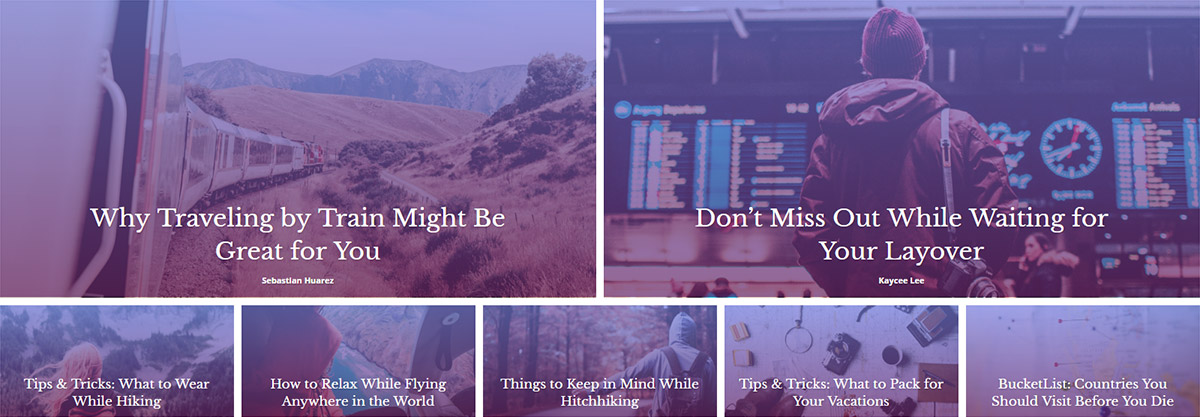

Flexible Big Grids for an endless variety of styles
Open the theme’s frontend page builder tagDiv Composer on a page or template. Now click on the Add Element button and find the 10 new items added to the list: the Flexible Big Grids. Each one has its own layout and comes with a default style, yet can be customized as your heart desires. Drag and drop one to see all the new settings you can use to feature the most important content of your website.
The General tab has a Pre-made Style Presets option ready to help you experiment with different looks for any Grid. Each choice is based on trends throughout popular websites, so mix and match to see which ones you enjoy the most:
- Image Height and Width percentage based
- Meta info padding, width, and margins
- Options to show and hide parts of the Meta Info
- Article padding and spacing
- And so on.
Each setting can be adjusted easily and if you liked how something looked before, just hit the Undo and Redo button to go back. Experiment and have fun while doing it!

Why you should switch to the Flexible Big Grids
Sprinkle a dash of adaptability and a cup of customization on your favorite web design elements, and you get the Flexible Big Grids. However, let’s be more concrete about them. In the Newspaper Theme:
- There are 10 available layouts for the new Flexible Big Grids which means endless possibilities in design.
- If you modify the row’s padding and width, the element adjusts itself according to the row that nests it.
- Access the Pre-Made Style Presets button to test various looks for any page with just a few clicks.
- Each tab contains settings that alter the form of the modules which gives you unlimited options for the overall appearance of the page.
How about a test drive?
Drag and drop Big Grid Flex 8 onto a page. Now, click on the block and hit the Pre-made Style Presets button. With the new section opened up, go ahead and experiment with different looks for your new element.
For Font Family, let’s choose Quicksand. Looks great! Now, pick the font size, align it on the center, and the best part: select the design of the Flexible Big Grid. The style settings give your block an overlay: gradients or colors for a more vibrant and colorful look!

Let’s dive into more details. Go to the Filter section. By default, the Grid is filtered to the Latest posts, but you can choose to display content from only a selected category. Navigate to the Layout section and alter all the settings to get a perfect layout.
Now, the cherry on top! In the Style tab, under the Colors section, mark the Lightsky checkbox and your block should have a small animation when anyone hovers over your Flexible Big Grid. That’s awesome!
Design and Build new Flexible Big Grids
From concept to creation, designing is smooth sailing with the Newspaper Theme. The new Flexible Big Grids give you more control over the layout and a lot more design options! Find the perfect form for each block in just a few clicks with the Pre-made Preset Styles button and get detailed adjustments with the new settings in the Layout and Style tabs.
Experiment and have fun! Show us your favorite Flexible Big Grid designs in the comment box below and keep on creating the content your heart and audience’s desire! ?


When I using the “Big Gird 8, style 3 – Flat colours” for my website front-page, there will have a gap between each pic……. how can I fix this problem?
Thanks for help.
Hi Howard,
Thank you for reaching out to us. It seems like a styling modification on the element. Can you please send us an email at contact@tagdiv.com so that our support team can investigate this situation? Unfortunately, the Blog area is not assigned to the Customer Support Department. We’re looking forward to helping you! Thank you for understanding. Have a lovely day 🙂
Hii,
How can i expand the width of Big Grid Flex 1? I want the grid to be full size just like the revolution slider. For reference, you can checkout Beebom.com’s first element on the homepage. I am looking for something like that but i am not able to remove the empty space from the sides of the Grid.
Thanks in Advance!
Regards
Parv
Hello,
If you want to enlarge the Big Grid Flex 1 you should stretch the ROW functionality from the TD Composer settings from here -> http://prntscr.com/uyh3bx If you need more technical assistance, please open a new topic at our support forum from here -> https://forum.tagdiv.com/forum/newspaper/ and we are ready to help you.
All the best,
Thanks
Hello,
Any chance of having a grid of pages instead of a grid of posts ? I want to create a grid with references to three static pages.
Regards,
Victor
Ok, I just figured it out: Post Type should be set to page in this case. It was a bit misleading.
Great theme, btw . Congrats !
Hi,
If you want to display pages instead of posts you need to make the following configuration from here -> https://www.screencast.com/t/8zEmxRVIjcXs
Hope this helps!
Thank you!
Is Newsmag also getting the Flex Big Grid? I don;t see it in the latest update that I have. Version: 4.7
Thanks Steve
Hi Steve,
Thank you for your interest :). The Newsmag theme has just been updated with two versions of the Flex Block https://www.screencast.com/t/DcaIKisf. Maybe in the future updates, we will implement Big Grid Flex elements too, if we have more requests.
Now I used this theme for so long. And I am so tempted to go back to it. It’s blazing fast too with its mobile plugin. Hmmmm. Thanks for the article Alexandra. I think I’ll be heading back to Newspaper soon.
Hi,
Thank you for your kind appreciation! We are glad to hear that you want to try out the new amazing features from our theme. Yes, Newspaper is designed mobile-first and is also AMP ready <3.