With Newspaper and it’s powerful header builder and tagDiv Cloud Header templates your websites can be outstanding right from the top. You can think of headers as the main entrance of your website. Once the door is opened, you’re entering a fascinating world. A universe of thoughts and stories. Bright, vibrant colors, with patterns or textures, solid colors or gradients – the header areas have to look amazing right out of the box.
In web design, the header must be intuitive and straightforward. How’s your website header? Are you looking for inspiration to make it stand out? Look no further than the Newspaper Header Builder and tagDiv Cloud Templates. With the tagDiv premium theme you have the power and freedom to build astonishing headers designs.
What’s a Header Builder?
It’s a tool that lets you customize the website’s header, including menus and top areas.
In Newspaper theme, this is a functionality that allows you to drag and drop elements to configure the above the fold area of your website. It’s an integrated part of our frontend tagDiv Composer page builder and can be found within the Website Manager tool.
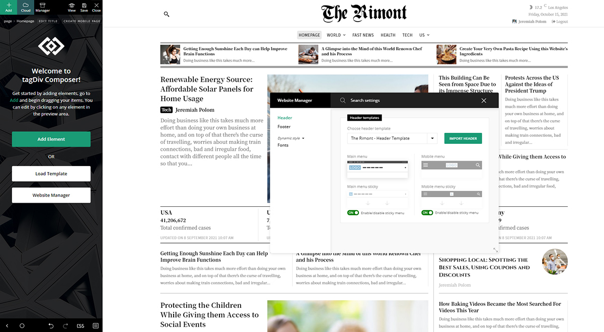
The header section can be customized using the live editing. Moreover, you can choose a pre-designed template from the tagDiv Cloud Library and modify it. Or, you can build one from scratch.
Explore the Header Designs from the tagDiv Cloud Library
Exclusively for the Newspaper theme, we’ve built a gallery that comes with already-created designs that can be used on any page or posts. There are over 100 header pre-designed templates within the tagDiv Cloud Library. Dark, light, colored or with neutral shades, you can mix and match elements to build your own personalized header.
You can preview all the headers from the Cloud Library and also, another recommendation is to browse the pre-built websites samples.
How to Build the Perfect Header with Newspaper and tagDiv Cloud Templates
If you’re already familiar with the tagDiv Composer page builder and the tagDiv Cloud Library, you’re one header away. The easy-customization made right on the frontend of your site makes the entire process a piece of cake. For more step-by-step guidance, you can follow our header documentation.
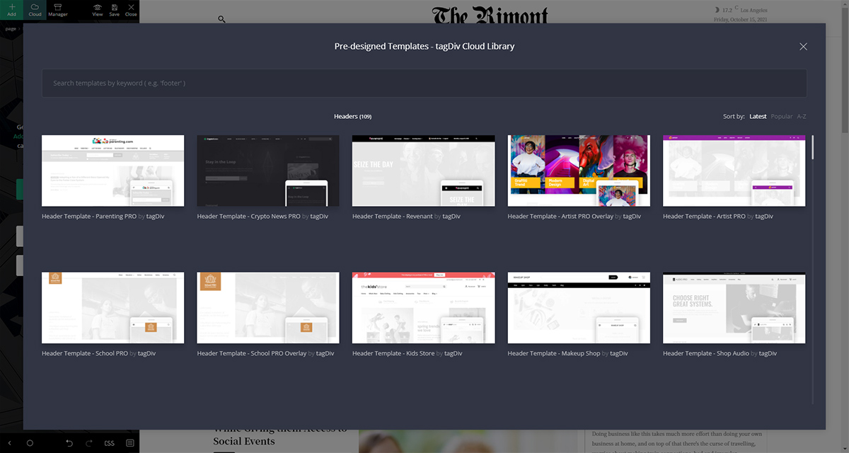
With Newspaper theme, possibilities are endless. But how about the performance of your site? Did you know that a large image or video placed in the header can slow down your overall site speed? Below you’ll find some quick tips in creating the perfect header and what you must include:
- Avoid using huge banners above or below the header section.
- Make sure your header looks smooth on mobile to keep bounce rate as low as possible.
- Limit your color palette. Rainbows are great, but not if you’re a business.
- Keep your logo visible. It’s your brand identity and can make a strong impression.
- You can drive emotions with the header section. Spark your reader’s curiosity and trust.
Elements to include on your header section:
- Include a call to action button.
- Contact Information or an About section.
- Shopping cart – if you own an eCommerce store.
- Share your social network profiles.
- Place a search icon, box, or field.
- Multi-language switcher (if needed)
Header Design Trends come and go
Yes, you can make your header a perfect one. If you like it and it’s easy-to-navigate for your visitors, you’ll see great traffic results. Indeed, headers are the main navigation source on your site, but sidebars and footers are also important guidance tools. These areas must be highlighted somehow. One of the long-lasting trends is the sticky header – that is present while you scroll down the page.
If you don’t have discovered your own style yet, with Newspaper and the already available, as well as newcomer header designs, you can get your inspiration in an instant. Now, let’s take a look at other design trends that can help you get the best out of your site.
Dark-themed headers
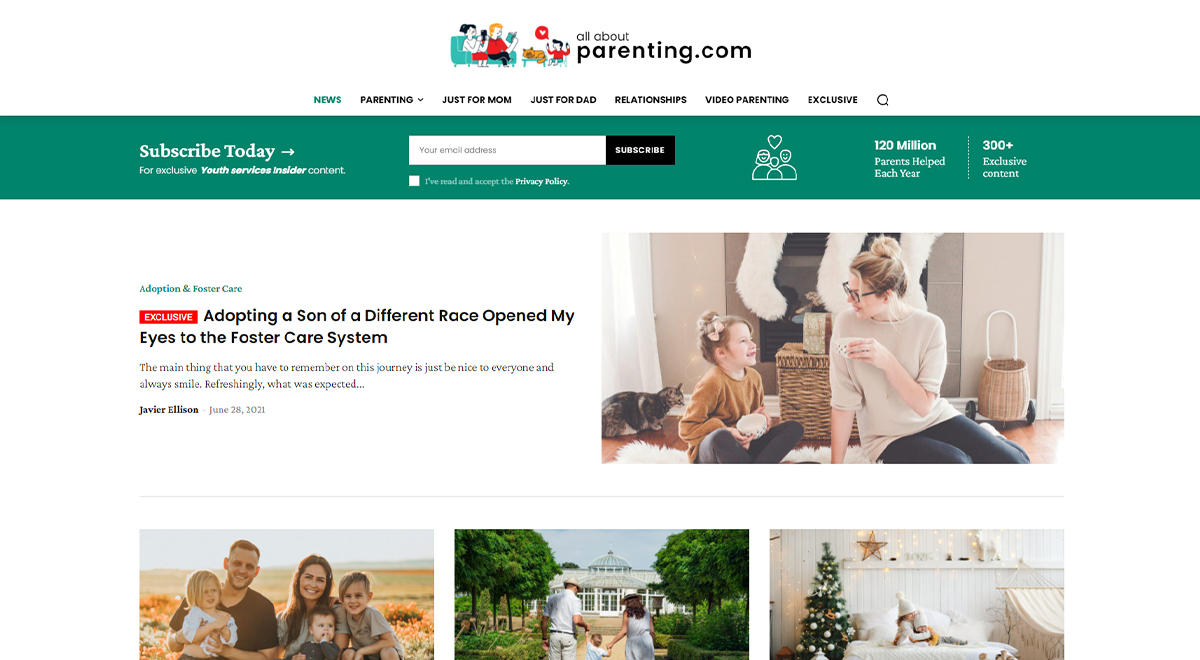
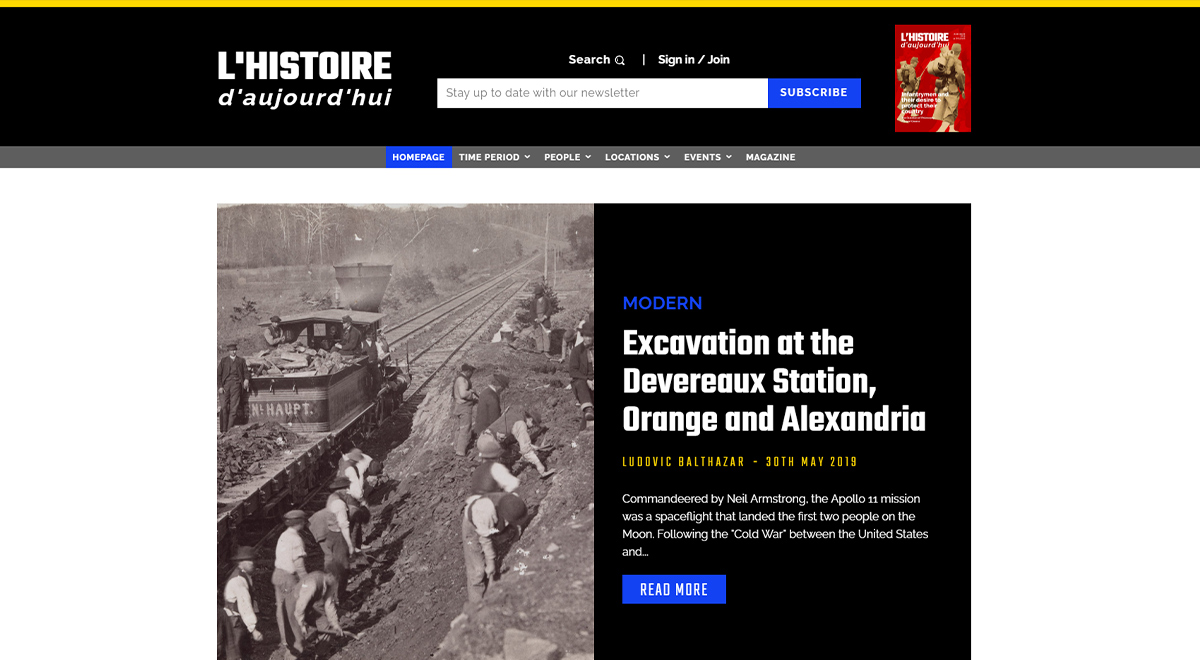
Some people prefer to display the menu on a dark background. Perhaps, due to the contrast between a dark space and white/grey typography. This way, all the elements present on the header section will be automatically highlighted.
Light-themed
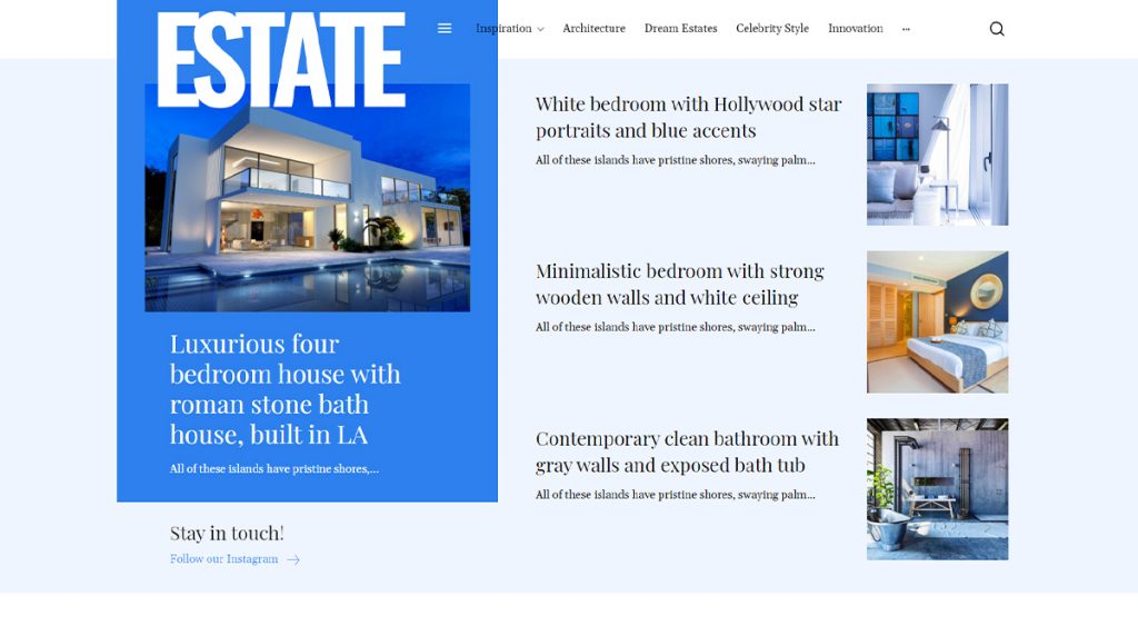
A light header is always appealing and appropriate for any kind of website. If you’re all into the airy headers, you can keep elements at a minimum and the background transparent.
Image Background
Since Google has renewed the pagespeed factors for ranking your site higher in SERP, keeping the header section without an image might be a bonus. However, some people prefer using a well-optimized image background and keep the menu simple.
Hamburger menu
For an enhanced user experience, the hamburger menu eases navigation on a website. It’s a minimal and elegant icon and is recognisable on any device.
Subscription
If you’re all into email marketing, you can place a subscription element into the header section. This is an excellent way to engage with your visitors after they leave your website.
Banners
A banner placed in the header of your website will always get noticed. Especially on a news website, where you have many useful things to highlight.
Creative
This creative header example is a black and white combo with red shades. In the left side there’s the logo in bold fonts and a minimal banner with a CTA button is placed in the middle. Everything you need is already there: weather stats, date, search area, latest article thumbnail, menu, and more.
Gradients
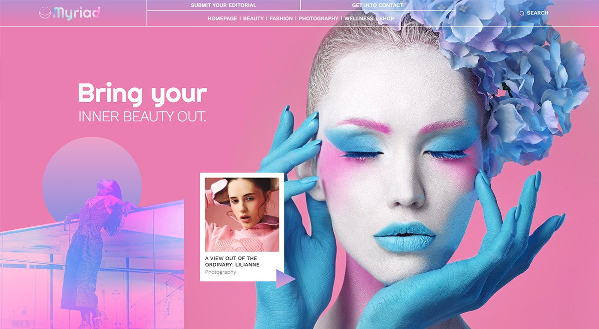
If you want to expand the color scheme on your site and go beyond the natural shades, gradients are all you need. It’s a unique approach and can streamline your website and implicit your brand’s identity.
Make Your Header Design Astonishing with Newspaper Theme
How many headers are enough? There’s no limit. You can customize an infinite number of header sections and divide your website categories as you want. The header area is that essential part of your website. Keep it simple, keep it clean but stylish. With Newspaper theme and tagDiv Cloud Header Templates, each page of your site can have a different header section to help you convert your readers into customers.













Wow, vero good!! Where is the Rimont template in cloud library?
Hi,
Thank you for your kind words! The Rimont prebuilt website will be available in the upcoming update. Stay tuned!
Thanks 🙂
Here something you can do on the backend.
Say you have post in Category X, but only on a few posts you want a different header.
You can add the header in to the post_meta manually using wp cli.
Here is the command I used
wp post meta set 12345 tdc_header_template_id 6789
The Post ID is 12345 the header ID is 6789
At some point it would be nice to add this into the post edit screen to selec only a specific header. This way you can make multiple headers without having to make full templates
Works for pages also.
I used this to attach a new header to 550 posts and it only took about 5 minutes.
Hi Dan,
Thank you for sharing these tips with us and our community. We appreciate your suggestion! Thank you. Have a lovely day ahead 🙂
Useful information for me Newspaper theme user. I tried one by one each of the directions outlined in the article. Thank you.
Thank you for your kind words. Have fun creating your website!
nice information, i am follow all steps. thanks