As with the previous years, 2020 comes with a whole new line of thinking for the visual arts. Where are we going now? How do we stand out? By answering these questions, we get to dive into a whole new era of graphic design and its popular tendencies. Find out how to take these design trends to the next level and incorporate them into your website or art.
3D Elements & Graphics
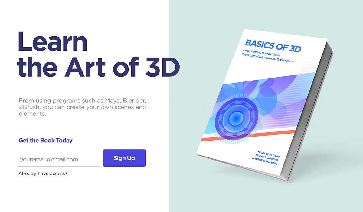
Countering the past decade’s minimalist aesthetic, companies have begun using 3D elements and animations to better showcase their brand. Graphic designers, that have knowledge and experience using Maya, Blender, Zbrush, or Cinema 4D, are sought after nowadays. If you need help creating a 3D model, we advise you to either seek out help from a professional or check out these amazing tutorials from GreyScaleGorilla. It’s never too late to learn something new!
Combining a 3D element with a 2-dimensional object or even typography, you get an innovative, fresh look to any design you create. Explore how to use colors to make everything pop by learning about Color Theory.
Line Art
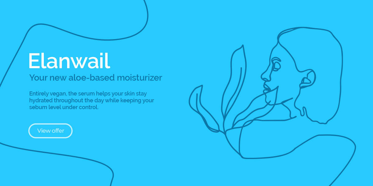
As a new contender in the design trends industry, line art is about making things simple, direct. With illustrations taking over companies’ branding and media, the desire to make it even clearer is dominating. As such, by removing base colors, you get this new type of illustration – only forms, lines guiding you to read and discover more.
You can achieve this effect by opening either Photoshop or Illustrator, and taking the pen tool to create a scene with no fill, only strokes. The entire concept behind this new trend is to make everything seamless while keeping it abstract.
Cyberpunk Color Schemes
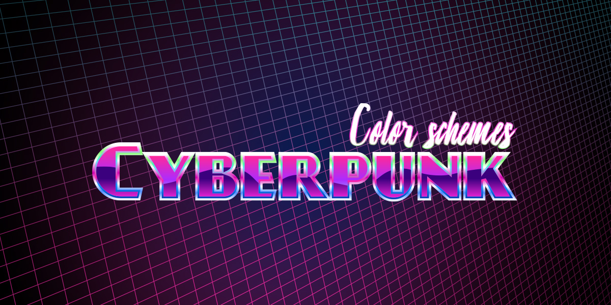
Previously, we’ve seen how gradients and bold colors have taken over the design industry so that companies and media stand out. In 2020, we can expect even more vibrancy coming from the visual arts, with bright neon colors mixed to give off a very retro yet futuristic look.
To achieve this, you would need to create a color palette that involves overly saturated colors while also keeping the contrast between them. This way, any text is visible and legible, ensuring a great reading experience. Mix and match to achieve the desired effect with Adobe Color. When you’ve decided on a scheme, just incorporate it into your website.
Typography Craze
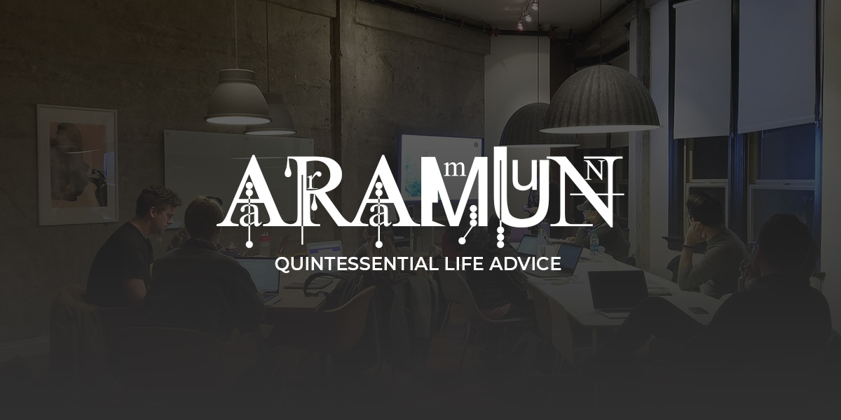
Experimenting with new fonts, dragging them, distorting them, and creating something brilliant is a graphic designer’s job. This year, we can already see this being taken to the extreme. The quirkier the font, the more use it will get.
To get started, head on over to your favorite font website. You can take a look at DaFont if you don’t have one yet. Browse through the multiple categories from distorted, eroded, western, calligraphy, handwritten, and so many more. In the search bar, you can select the licensing you want, whether the project you’re working on is for educational purposes or commercial use. When you find the perfect font, read through its licensing agreement and check whether it applies to the type of project you want to use it for. No worries, most artists link to their website from which you can buy the font from if you’re unsure!
Thin Lines in Geometric Shapes
We’ve seen how geometrical design has taken over the internet in the previous years. It still reigns supreme even now, just in a new form. Taking a grid and overlaying it on top of shapes to sculpt it and mesh it while removing the shape itself, you get a new trend. But how do you make this yourself? Open Illustrator and create the type of grid you want: thin strokes, small spacing in between each line. Now make a shape with the programs’ innate tools. Overlay the lines over the shape and choose merge.
Now you can add a background to the overall design, or even choose to drag the lines around using the Warp tool option. When it’s done, you can either export it as a .svg or to your library and choose to edit it even further in Photoshop.

Image or Text Masking
Double exposure in photography is the same as this effect. When you overlay one layer across another and link them so that it takes the shape of the one beneath, you get a basic example of masking. This creates a mysterious vibe to the overall image as it leaves much of it unrevealed.
With your editor of choice opened, you can juxtapose two images on top of each other, an image over a text, or one over a brushstroke. Now, there are multiple ways to get this and the most accessible being to link the two together. However, you can also do this using the multiple blending modes your program offers, such as Lighten, Overlay, Multiply, and others. The last option would be to take the time to mask the image out. You would need to click on the mask option. While having it selected, begin chipping away at its edges using your brush, pencil, or lasso tool with a dark color.

Retro or Vintage design
You know the saying about how history repeats itself? Well, the ‘50s are back in style in graphic design with artists trying to evoke the earthy colors and the illustration aspects of those years with a modern outlook. Get inspired by taking a look at the warm earthy tones the posters from back then used to look like.
Create a color scheme that evokes the feeling of these fantastic designs and wow the crowd. If you’re working on an illustration, add a grain texture on top of your finished work to give it a sandy retro feel.
Conclusions
Whether you choose to adopt any of these new styles into your art, project, or website is up to you. As media is always ever-evolving, trends can come and go, which is why the vintage and retro design is now widespread. To amaze people with a fantastic design takes more than just following the trends: your brand needs to be something your audience can relate to and enjoy. Useful UI is just as impressive as stylish images. If done right, it can be even more impressive. So before you do a complete redesign, try to prioritize your user’s experience. And when you’re up for it, use this list as a source of inspiration.
Tell us all about your favorite 2020 design trend in the comment box below and show us how you incorporated it into your project! 😀







Great article ! Thanks
Thank you!
nice article ! Thanks
Thank you for your kind appreciation!
Can we have these designs in tagdiv visual composer please? 😀
Hi,
Yes, it’s possible if you will use our page builder tool. First of all, check the documentation from here -> https://forum.tagdiv.com/tagdiv-composer-tutorial/ If you need more technical assistance, please open a new topic at our support forum from here -> https://forum.tagdiv.com/forum/newspaper/ and we are ready to help you.
Best regards!
Congratulations to your nice team.
Great article ! Thanks
thank you for information.
Interesting information. Thank you
Hi,
Thanks for the feedback.
Best regards!
is this free to learn or have to pay?
Hi,
Thank you for your interest but please note that’s article is just for information purposes only.
Best regards!
I found this post useful. It really help me
Hi,
Please accept my thanks for your kind thoughts. We really appreciate them!
Best regards!
Dear Alexandra. You and your colleagues place many interesting posts about the design, it looks, it is done in TagDiv Composer. If yes, add these (done elements) into cloud library. Basically, add as many as possible prepared elements into cloud library 🙂
Thank you in advance. Best regards, David
Hello David,
We appreciate your kind words. Thank you for the suggestion 🙂 We’ll take it into consideration.
Have a lovely day & Stay Safe.