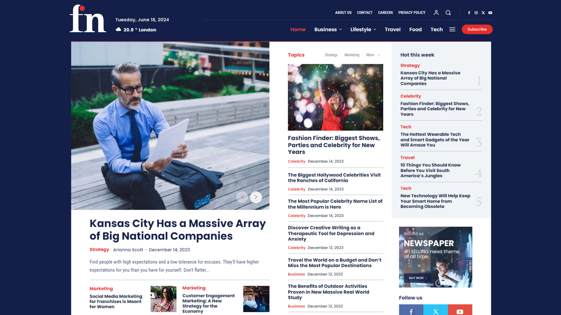
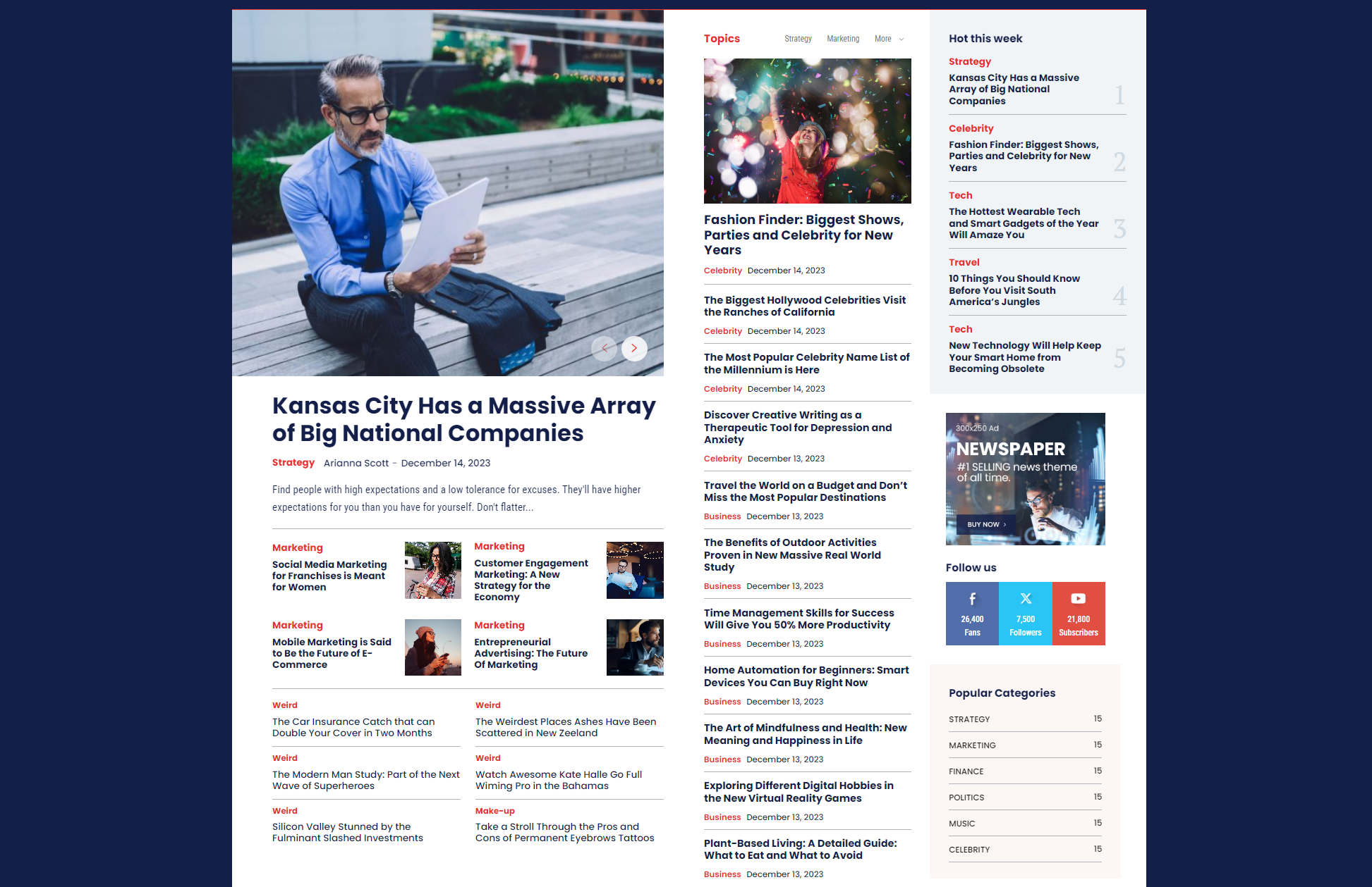
In the following paragraphs, we introduce you to one of our latest releases, the Newspaper Free News Pro. We created this prebuilt website for anyone looking to create a corporate professional blog or news website that is easy to use and presents a beautiful design.
Note: To use the prebuilt websites, you must first install the Newspaper theme and then activate the tagDiv Cloud Library plugin. This premium plugin will give you access to a wide selection of fully editable templates and elements.
Prebuilt Website Features: Newspaper Free News Pro
Design
Color scheme
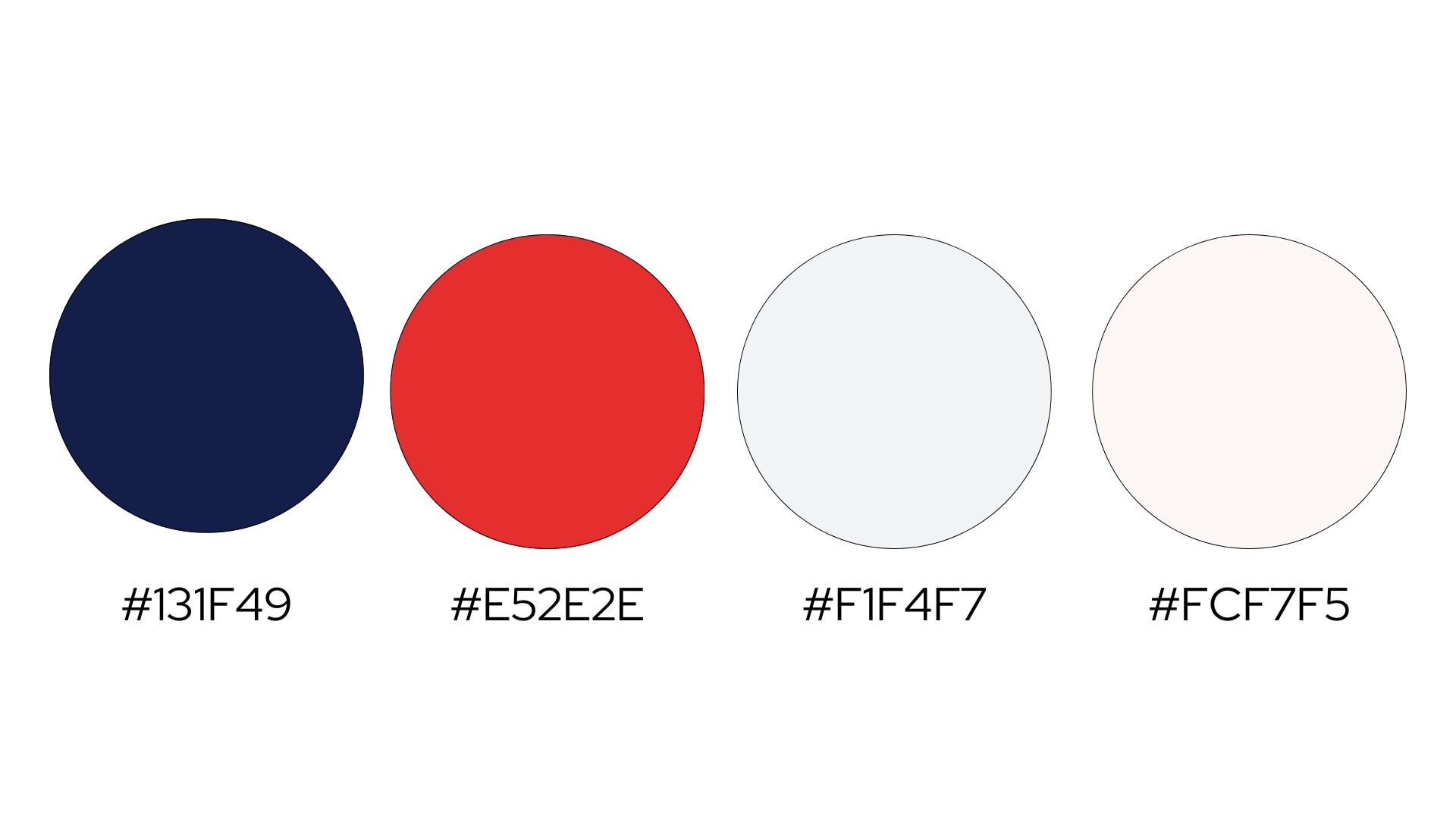
The Newspaper Free News Pro template is designed to be clean, modern, and highly readable. Its color scheme plays a crucial role in achieving this aesthetic. Let’s explore the primary colors used in this prebuilt website.
The primary color of the “Newspaper Free News Pro” prebuilt website template is a rich, deep blue. Used for headings, tags, links, social icons, and other vital accents, the color conveys reliability and professionalism, making it perfect for a news website. Moreover, it evokes a sense of trustworthiness and responsibility.
Read our Color Meanings 101 article to learn more about the meaning behind the color blue.
As secondary colors, we used a light and darker shade of gray to complement the deep shade of blue. The lighter shade is used for backgrounds and borders, offering a neutral backdrop that enhances readability and keeps the focus on the content. The darker shade of the same tone of gray is also used for the body text to ensure a clear and comfortable reading experience.
The accent color is a vibrant shade of red. When used strategically in category labels, call-to-action buttons, text hovers, and other interactive elements, the color can illustrate a sense of urgency and importance for the selected element.
The ‘Newspaper Free News Pro’ template’s background color is primarily white, ensuring a clean and uncluttered look. This choice of background color enhances the overall readability and creates a pleasant viewing experience.
It’s up to you what website colors you choose. While the default color scheme is an excellent palette, the ‘Newspaper Free News Pro’ prebuilt website offers extensive customization options. Using the tagDiv Composer tool, users can easily adjust the colors to match their brand identity.
Typography
Website typography plays a crucial role in determining the quality of a good website. Above all, it’s one of the core principles of good website design, and it decides whether a website interface offers a good user experience or causes people to abandon the website.
As primary typefaces for the Newspaper Free News prebuilt website, we used Poppins (a Sans-serif typeface) and Roboto Condensed (a variant of the Roboto typeface family).
If you are considering using the Newspaper Free News Pro template to build your website, we recommend using these two pre-defined typefaces. This will ensure compatibility with the website’s interface and the other pre-defined elements.
Alternatively, the tagDiv website builder offers many font selections and customization options for your typography.
Website structure (Homepage Layout)
Header
The Newspaper Free News Pro header template, created with tagDiv Composer, appears globally across all website pages. Additionally, can create unique header layouts for different pages or posts and customize each one accordingly.
You can import the header layout with all the other prebuilt elements by installing the Newspaper Free News Pro or separately as a cloud header template. The cloud template can be installed on any other prebuilt website.

Modal Pop-up Menu
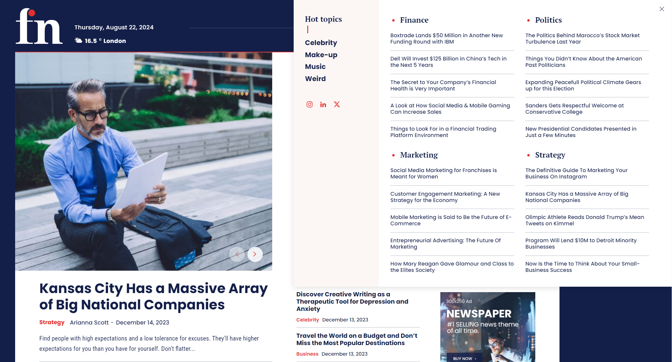
A modal pop-up element, a submenu, is integrated into the page menu. The submenu has three columns. The first is for the list menu and social icons, the other two for article categories.
Main content area
As a prebuilt page for news websites, the main content area displays articles filtered by topic, headline, author, popularity & more.
Footer
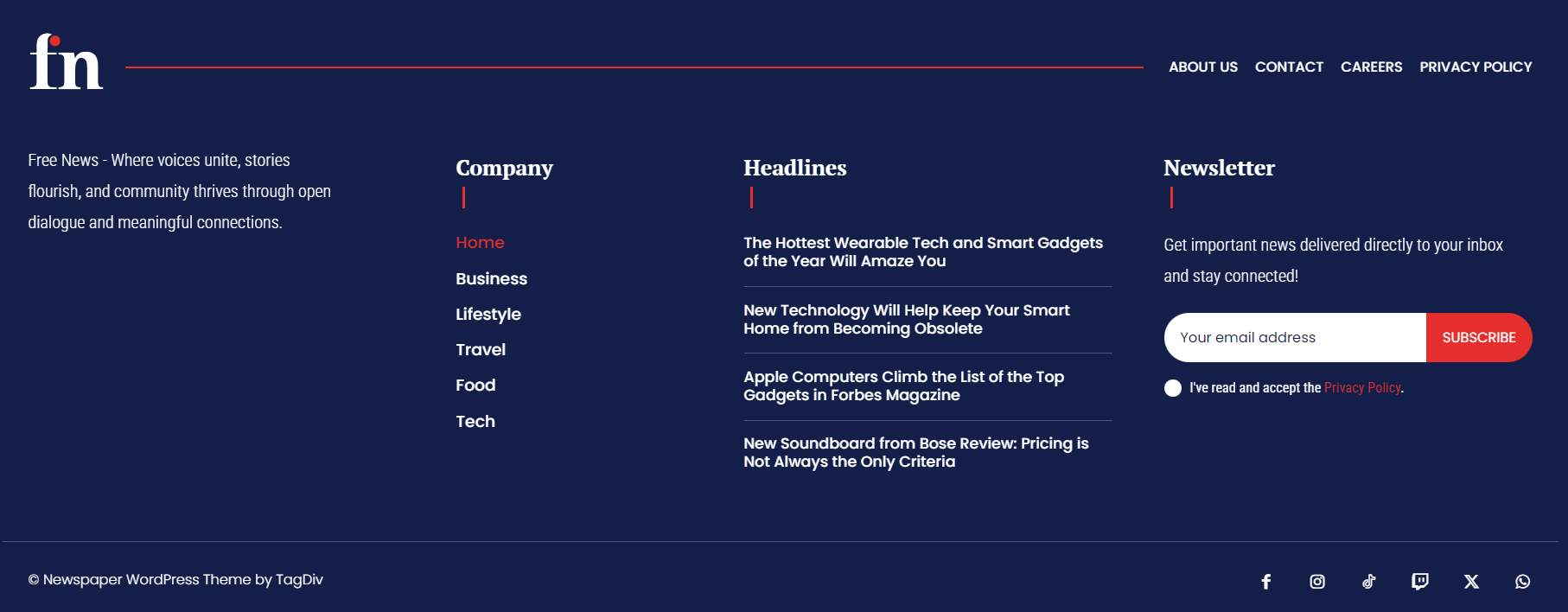
The Footer section was created using the tagDiv Composer and set to display on each website page and post. Of course, you can also change or customize this pre-defined footer or set a different footer layout for different pages or posts.
Category
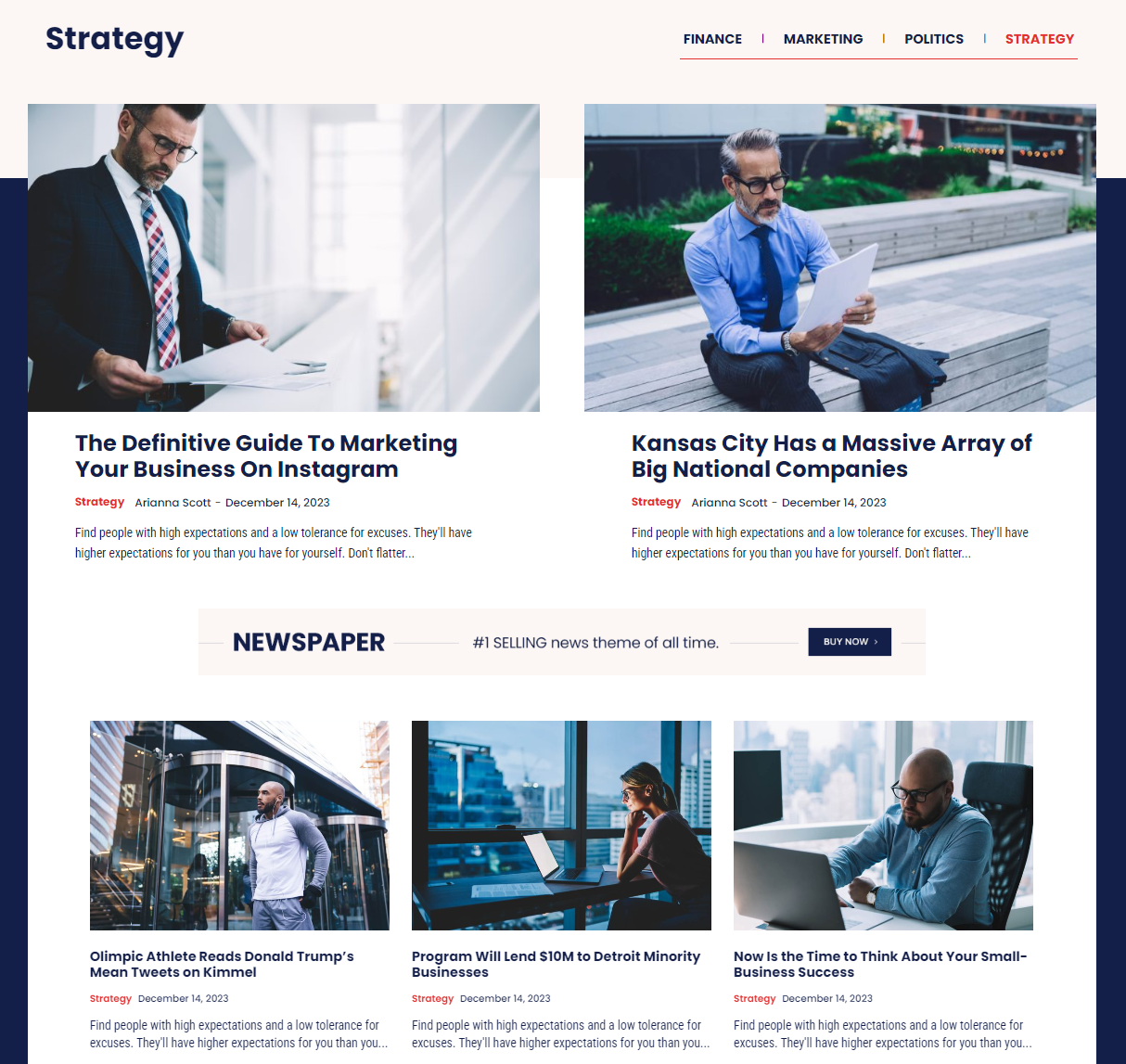
The category page uses a visual hierarchy to prioritize content. The most important articles are positioned at the top. Each article displays the author’s name and the category it belongs to. Additionally, there is a dedicated section for each author where people can find a list of all the articles written by them.
Below the most important articles, there’s a designated space for advertisements that could come in handy if you are looking to monetize your website.
When it comes to optimization, the category page is designed with the best SEO practices in mind. It has clear headings and subheadings and a content structure that search engines can easily navigate, which helps articles appear more prominently in search engine results.
An important thing to note is that the page is set to dynamically update to always show the most recent and relevant content within a category, keeping the page fresh and engaging for returning visitors.
Articles
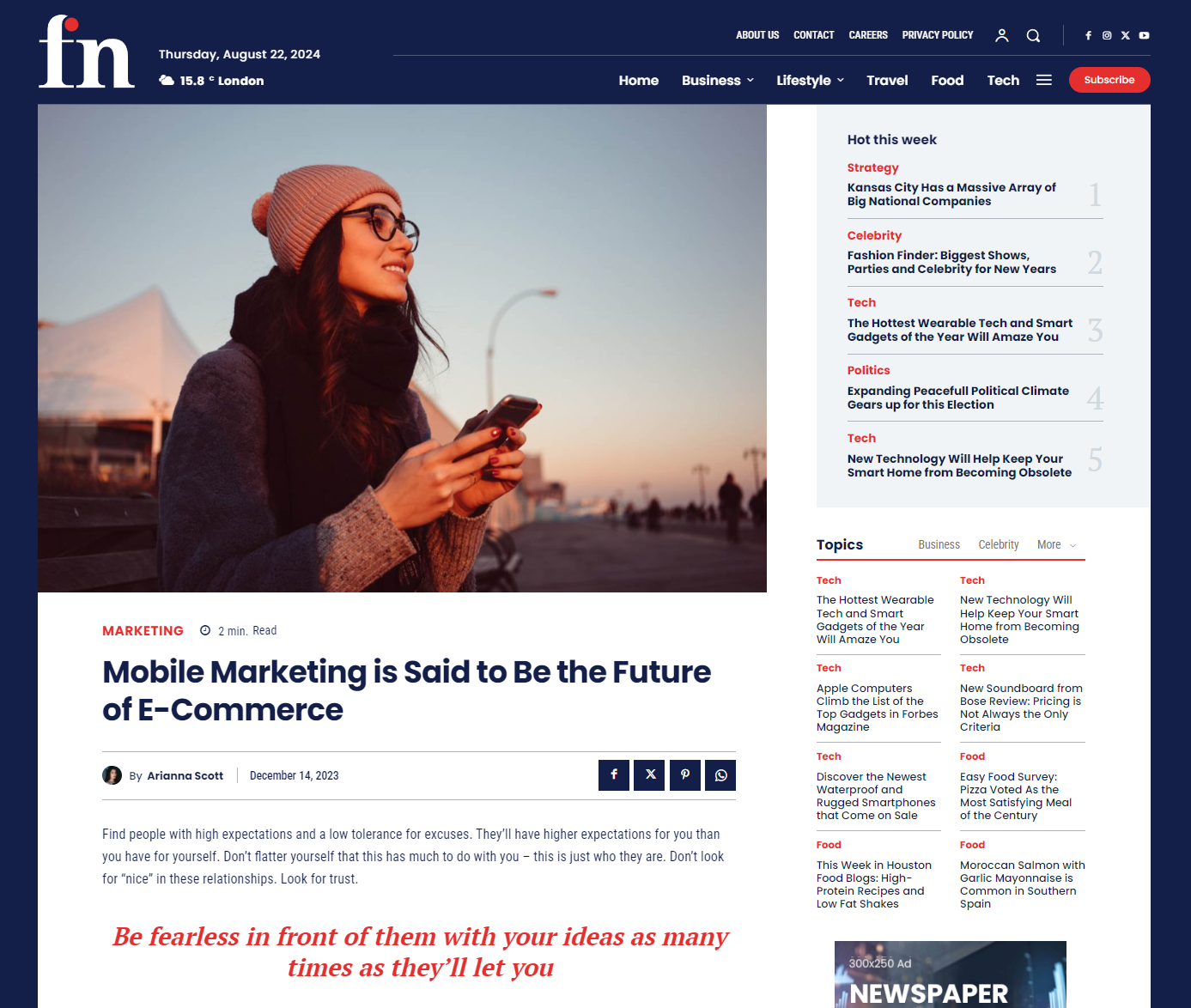
The article page opens with a striking hero image that sets the visual tone and engages the reader from the outset. The headline is bold and clear, while the concise subheadline and read time indicator (e.g., “2 min. Read”) cater to time-conscious readers, making it easy to gauge the article’s relevance.
Social sharing buttons are prominently placed, encouraging readers to disseminate content across various platforms, which is crucial for expanding reach. The page also features a highlighted quote, visually breaking up the text and drawing attention to key insights.
The sidebar enhances the user experience by offering quick access to trending articles and categorized topics, helping readers explore more of what interests them. Ad placement is discreet yet effective, ensuring monetization without detracting from the content.
Search
When users search for a specific term, such as “Marketing,” the page displays relevant articles in a clean and visually appealing layout. The search term is prominently displayed at the top of the page, reinforcing the relevance of the results and confirming the user’s query. A well-defined line subtly separates the search input area from the results, contributing to the page’s clean design.
Each article in the search results is presented with a large, eye-catching image, the title of the article, the publication date, and a brief excerpt. This allows users to quickly scan through the content and decide which article is most relevant to their needs. The uniform design across all results ensures consistency and ease of navigation.

Customization Options
With the tagDiv Composer, a powerful and user-friendly tool, you can adjust and personalize each “Free News Pro” prebuilt website template element to suit your unique needs. The possibilities are endless with tagDiv Composer and pre-built cloud templates for your website. Change the layout, add new sections, or modify the color scheme for complete control.
Learn more about the Newspaper Prebuilt websites by reading this article.
Conclusion
Newspaper Free News Pro is not just a prebuilt news website template. It’s also an easy-to-install and easy-to-use solution to design your website. Designed with simplicity in mind, it offers an ideal layout for creating a blog or news website, making the process a breeze for even the most novice users. Each template section is fully customizable with the tagDiv Composer’s array of options.
Looking for a prebuilt website template to easily import and adjust on your WordPress site? Here at tagDiv, we offer over +155 prebuilt websites and +1800 ready-made elements from which to choose.
If you have any questions or need assistance creating your website, submit a request, and we’ll contact you as soon as possible.


