
Can you effortlessly incorporate blue into any design? Discover the perfect color palette for your brand. Whether you’re promoting a product or coming up with a design sketch, use it to invoke the core message through the color’s meanings.
The Meanings behind Blue
Intuitive and loyal, blue represents your intuition, open spaces, freedom, and sensitivity. It is often associated with cold and has a calming effect on the human body. Too much blue can dampen the mood.
Its significant use in military garments, or even in the corporate media, makes blue an intelligent, trustworthy color. Depending on the shade of blue you use, it can have different meanings:
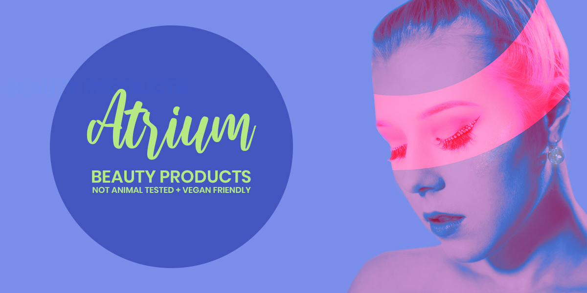
- Violet Blues are feminine and pretty. They can easily be used in creating feminine products or even in association with something fragile and pure.
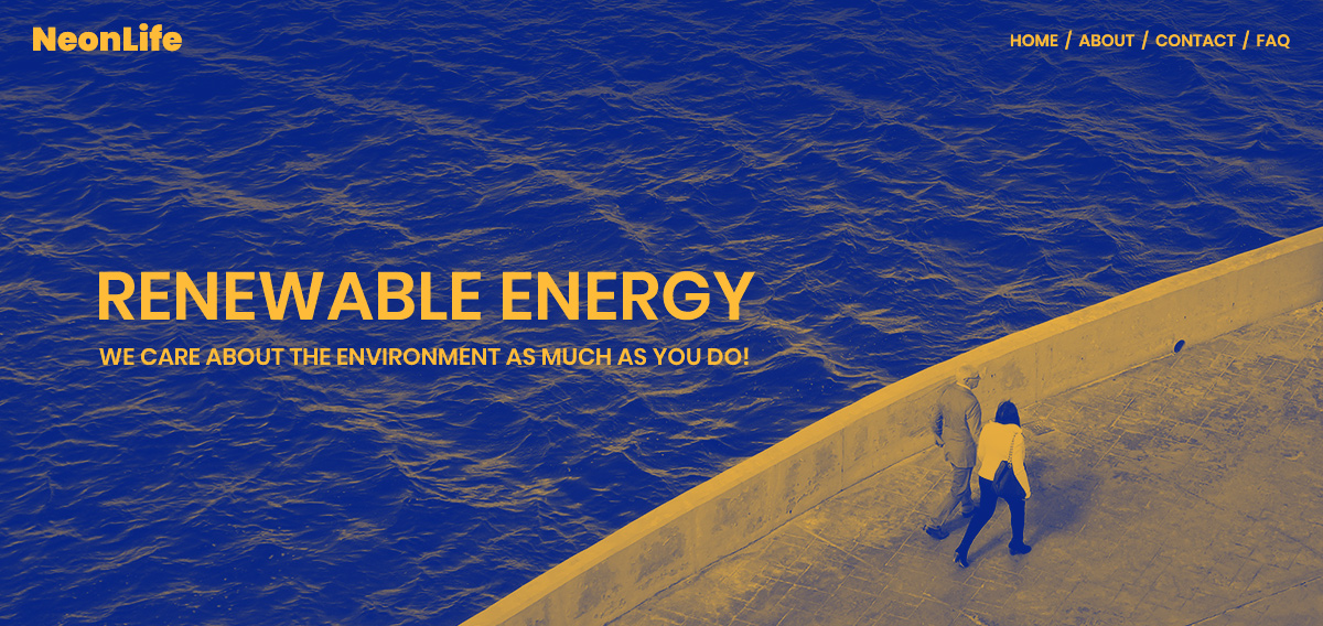
- Green Blues, such as turquoise or aqua, invoke the essence of water. They’re a lot more energetic, so they can easily be used for environmental projects or even sci-fi media.
- Gray Blues, like the color of denim, are versatile and peaceful. Since they’re flexible, they can be used in almost any product design or for any other purposes.
- Pure Blues are sincere and soothing. They can be bright and eye-catching or even serious and somber.
Color Palettes for Blue
After exploring all the different meanings behind different hues of blue, you can now choose it as the primary color for your project. Knowing how each color reflects on the wheel and which ones make great pairs, is essential. So, if you need information, head on over to Color Theory to freshen up on various color schemes.
So, what colors go well with blue? Go to Adobe CC and choose your primary hue. Now choose one of the well-known color schemes to find out:
- Monochromatic palettes rely on their beautiful blend of shades from the same color to catch the eye. From light to dark blue, create something stunning.
- Find the closest neighbors to your primary color by choosing Analogous from the left side panel. Not only would you usually get different shades of blue, but also, violet and green. Pair these colors up for a refreshingly cool look to your website.
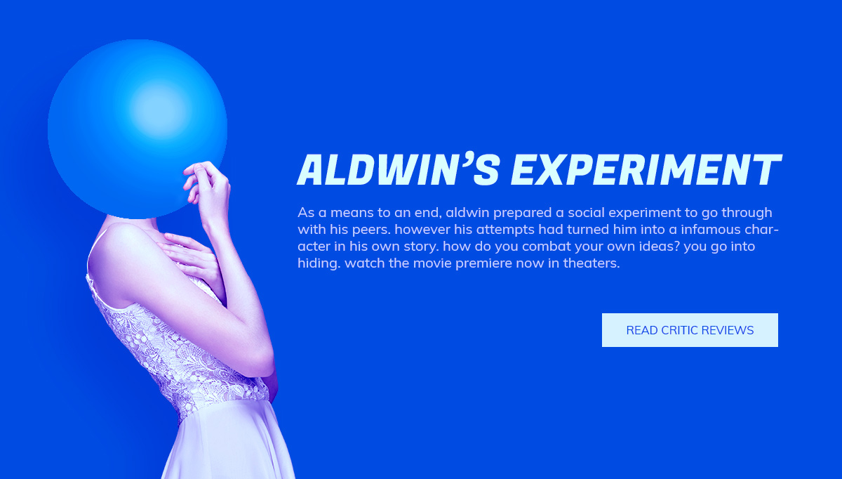
- The complementary color to blue is orange. However, for deeper or more violet blues, you might even get a shade of yellow. The color combination goes perfectly together and is one of the most popular color pairs for cinematic use.
- For split complementary palettes, you would have a blue primary and yellow and orange secondaries. They quickly convey summer vibes and are often associated with hotel resort websites or even summer products such as sunscreen.
- Depending on your chosen primary blue, a triadic scheme would pair it with either green and orange, or yellow and red. The closer blue is to green, the more likely it is for your triadic palette to include yellow and red instead of orange and green.
Have you got the blues?
With a beautiful color scheme in mind, express your brand’s identity through the new product, design, or website. Integrate each color seamlessly into the result. Remember that each shade of blue is associated with a different emotion. Choose wisely!
If you’re designing a website and plan on using WordPress, you may need a professional theme that offers every tool you need in one package. Newspaper Theme has a built-in front end page builder, the tagDiv Composer, that lets you drag and drop elements straight onto any page. Import premade templates to get started quickly and change the fonts or colors to match the color palette you’ve chosen.
Moreover, you have the option to craft everything from the ground up. From posts’ templates to footers, headers, pages, and much more! Just open the tagDiv Composer and click on any element to open its Settings panel. Add paddings, margins, pair fonts that work well together, and then choose the colors – unlimited options right at your fingertips.
From adding a background color to a row to choosing the hover color for links, Newspaper Theme offers you countless customization options!
Conclusions
Keep the intent of your product or design clear with a well-chosen primary color and a palette that best fits your brand’s identity. Integrate it with your website or illustration. If designing a website, change and match colors with Newspaper Theme straight on the frontend. While some visitors may have stumbled upon your website out of the blue, don’t let them stray and capture their attention with a beautifully designed website.
Show us your results in the comment box below!


