
Typography is the art of arranging type (from fonts to typefaces) to make written language readable and appealing. Anyone can learn some basic rules for design purposes with a clear Typography Guide 101. It can be the difference you need to motivate visitors to continue reading. Also, it is much easier to make good typography choices than calligraphy ever was.
Easily choose the appropriate typefaces and fonts, line-spacing, sizes, weight, and letter-spacing to convey the mood of the intended message.
Typography terms and definitions
Before jumping into how to design your page using good typography, let’s clarify some specific words that might appear multiple times while learning more about the art of arranging type.
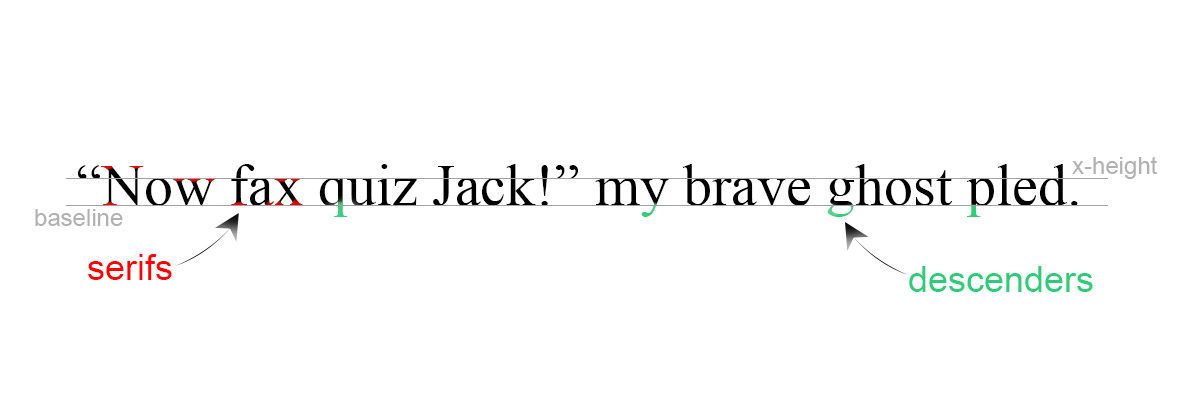
- Serif is a small line attached to the end of a letter or symbol. As such, you can distinguish all serif typefaces according to that.
- Sans Serif is the opposite of a serif. It doesn’t have the small lines attached to the end of letters. Also, the name sans-serif comes from French, where sans means “without.”
- Display fonts often have more eccentric and variable designs. They may take inspiration from other genres such as hand-painted signs, calligraphy, and so on.
- Monospaced fonts are those whose letters and characters occupy the same horizontal space. They are customarily on typewriters and for typesetting computer code.
- A Typeface, or font family, is a set of one or more fonts that share common design features. Each one has a specific weight, style, condensation, width, slant, italicization, ornamentation. For example, a typeface is Open Sans which is the font family of Open Sans Light, Open Sans Bold, and others.
- Fonts have a particular style and are generally part of a typeface, though not always. Some do not have a font family.
- Tracking refers to the consistent degree of space between letters to visually affect a block of text. Letter-spacing is another term for tracking.
- X-height is the distance between the baseline and the mean line of lowercase letters in a typeface.
- The Baseline is a line upon which letters sit and below which descenders (the letter “y” has a descender line) extend.
Typography basics
When designing, make sure your type is connecting with the audience. Typefaces are linked to Human Psychology, and the selection is hardly a random process. The font has to fit your readers and the content.
Fonts have distinctive moods or personalities ranging from serious, casual, comic or even elegant. As such, your intended message has to match the mood of the fonts. For instance, a bubbly typeface may not be appropriate for a business newsletter.
Hierarchy is another asset to typography. Use it to emphasize aspects of any page from the header to the subheading and the body of text. A good way of establishing a proper hierarchy on a page is to create contrast between the information you present.
Contrast, similarities, and pairings
Create contrast by changing the size, weight, spacing, and color of different elements on the page. By doing this, you construct roles for each piece of text and guide your audience throughout the page fluently. However, if fonts are too different or too similar to each other, they can create conflicts.
Try to choose typefaces that have a few similarities without being too many. For example, select two fonts that have the same x-height and maybe similar proportions. Maybe a heavy, bold font for the heading and a neutral one that helps balance the heading font’s big personality.
An easy way to test whether the fonts might be too similar is to place them side by side on your screen and squint. If they look the same, that’s a good indication that your design could benefit from turning up the contrast. Try pairing a sans-serif with a serif for that. It’s a sure way to create contrast as long as the two types have a few similarities between them.
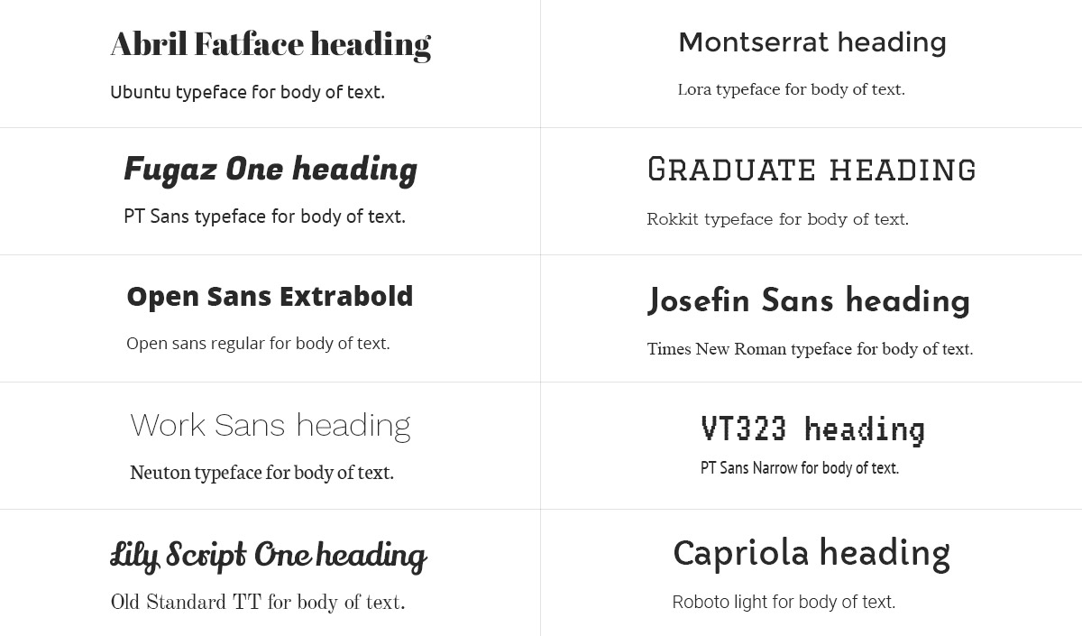
One more tip is to keep the number of typefaces used on a single page limited to two or three at most. It helps to avoid conflicts between them. Using a single typeface that has distinct fonts attached to its family, can be an excellent way to go. Montserrat and Oswald both have a good range of fonts in their family.
Lastly, get inspired. Browse through your favorite websites, note the way they combine fonts and how they achieve their hierarchy.
Typefaces through Newspaper Theme
With Newspaper Theme, you have access to a various list of fonts and even have a faster way of moving font settings from an element to another with the Typography Presets. Choose between distinctive typefaces ranging from serifs to sans-serifs, display, monospace. Contrast the heading to the body by changing the size, weight and even the tracking of the font. A myriad of options from which to pick!
Furthermore, to give you some suggestions, we have come up with a few pairing tips based on the biggest websites out there:
- For fashion and beauty websites, such as Versace, Gucci, and Vogue, there’s a tendency to use modern sans-serifs, usually rounded typefaces.
- News websites, for example, Google News, Yahoo! News, and The Guardian, tend to use sans-serifs, too. They move away from the rounded typefaces and into more simple, even old-style typefaces.
- Blogging has a lot more freedom of expression through typography. We’ve seen prominent bloggers use a pair of typefaces from serifs to sans-serifs.
- As for Music Artists’ websites, it is a jungle gym of artistic range. They use display fonts, decorative fonts, all to express their identity and brand.
Here are some typeface combinations we recommend.
Stay true to your website’s core message
While you may be tempted to try some rounded typeface out, it might not convey the proper mood for your message. What is your website’s core? Answer that question to find what type of font you need.
There are numerous possibilities for design through the Newspaper Theme. Slanted, heavy fonts, or even thin, rounded ones that you can apply in just a few clicks. Choose the best pairs based on their mood and contrast. Moreover, remember that typography is just as easy as let it be. Don’t let yourself get caught up in the rules and measurements. Have fun and experiment to find out which fonts fit your website best.
If you have more typefaces pairings that go well together, tell us about them in the comment box below! Show us your unique designs! 🙂


Wao! Thanks for sharing this amazing and informative blog post. Yes, typography is so important in every designs.
Really cool guide and i love it.
Thank you for commenting!
I love news paper themes
Nice. Valuable update and interesting.
Thank you! We appreciate your kind words <3
YOUR ALL THEMES ARE VALUEABLE
Thank you. We appreciate your kind feedback!
hi Alexandra, hope all is well, i have a coupe of questions. first is if are all new fonts are compatible with all browser and if you can mix them with typekit from adobe. and the other one well, im pretty new at this web thingy so my question might be very dumb, but im confused. if i want to create a news site what is better for the news and articles, posts ot blogs. since im beginning fresh, not only in knowledge(there isnt an erase site completely forever and ever is there? im afraid ill find it by mistake) but with the site i would like to know what do you recommend, or how is it done properly, thank you for your time, Eduardo.
Hi,
There are so called safe fonts that can be used to ensure a better compatibility across browsers https://www.w3schools.com/cssref/css_websafe_fonts.asp The themes have many fonts available, and the possibility to upload and use your own fonts if needed (in the theme panel). Please check the demos that are available for install for each theme, they are there to provide a quick start when beginning to create a website. For safety it is recommended to make periodic backups for the website, issues can happen so this way a backup can be restored https://wordpress.org/support/article/wordpress-backups/
Thank you!