It has become common knowledge in the world of eCommerce that a conversion-centric design can make all the difference. If your product sells well in regular stores, but you have trouble selling it online, then there is a strong chance that something is wrong with your website or, more precisely, its design. Web design plays a crucial role in online sales, as it is directly responsible for quality user experience, the visibility of your website, accessibility and, of course, conversion.
One of the core aspects of a successful conversion is a positive first impression, and that is achieved with an aesthetically pleasing website. It’s pretty simple – the audience that browses your content for 15 minutes would rather look at something with a high aesthetic value than reading a plain text. To put this claim into perspective, 38% of people will most likely leave your website, simply because they do not like the layout, in other words, you lose a large number of leads right from the get-go.
Here we will discuss some of the most popular design tactics that can help you increase the conversion rate on your website.
1. Hick’s Law
The more choices you leave to a user, the bigger the chance they will forgo making any kind of decision. Hick’s Law helps us establish a balance and ensure that we don’t scare off our traffic by spamming them with too many choices.
The law is named after psychologist William Edmund Hick, and it explains how that time for making a decision increases proportionally to the number of possible choices. So, according to this theory, if you present users with more choices, the time for a successful conversion will also increase.
Psychologists Sheena Iyengar and Mark Lepper tested this theory in an experiment. They presented two different tables with varieties of jam, one simple with only 6 varieties of jam, and other with 24 different products. Only one-tenth of buyers went for the table with more choices, and the other 90 percent of buyers all purchased from the simple table.
2. Skeleton Screens
Skeleton screens are a great way to improve the overall load time of your pages and therefore reduce the bounce rate, which is one of the key elements of a good conversion. Loading screens can be annoying, and since things do not run smoothly 24/7, there is a strong chance that a portion of online shoppers will experience a delay in loading speed. In order to mitigate the bounce rate caused by the lingering loading display, you can do this simple design trick that can persuade users everything is still running fine.
Even though you do not speed up the loading speed itself, your page will start displaying the skeleton of the content, which gives the impression of a more functional site, and that everything will be available in just a second.
3. Animated Call-to-Action Buttons
CTA buttons that are well-designed and well-placed can increase conversion. The latest trend is specially designed, animated CTA buttons which do not take away too much from the overall page but attract just enough attention to provoke a reaction. So, in addition to deciding on the size and placement of the button, take some time to think of a tasteful animation that corresponds to the style of your website. We have already stated how visual appeal plays an important role in the conversion process, and animated call-to-action buttons are just an extension of that statement.
4. Use Negative Space
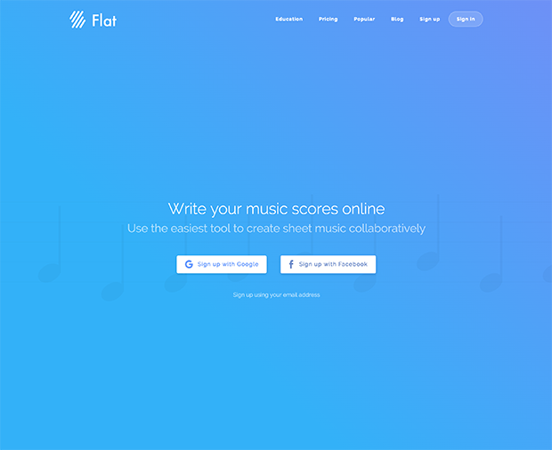
Everything that isn’t an element of the page design, in other words, all the blank page space, is considered negative space. Despite the simplicity of the definition, negative space is one of the most important design elements at our disposal, since it ensures visibility and clarity of information, which is the key to a good conversion.
The right use of negative space can focus the attention on call-to-action buttons and increase on-page engagement. Here is an example of a website that uses negative space splendidly – Flat.io.
As you can see, their main objective is to make the visitors sign up with Facebook or Google, and the entire homepage is designed around this incentive.
5. K.I.S.S. (Keep it Simple Stupid)
It is important to keep in mind the original purpose of the website that you are designing, and not overcomplicate the design with unnecessary clutter that serves no purpose. If there is one thing that was made pretty evident throughout the article, it’s that simplicity is an efficient tool for conversion.
First of all, it takes longer for people to process what they are seeing if there is more information crammed into one page, which is what Hick’s law has verified. Second, the whole point of skeleton screens is to mitigate the impression of an unresponsive website, which can occur due to a lot of unnecessary on-page elements in the first place. In other words, do not make your site too flashy, as it only backfires in the majority of cases.
6. Gestalt Similarity Principle
Good individual elements do not make a good unified design. The human eye tends to group similar elements together and, through that, identify their function. The Gestalt similarity principle allows us to leverage this to increase conversion. Gestalt design principles can be easily implemented during web design in numerous ways.
All you need to do is group the items you want to be associated with one another, for example, call-to-action buttons, images, and positive customer reviews. To provide you with an example, if you have a really good positive review and want to use it to increase conversion, you can place it directly below the signup form.
7. High-Quality Images
Photos do it all, and it is crucial that those that are used on your website match your theme and niche and that they are engaging. High-quality unblur images raise conversion and increase the chance of returning visitors. You can either use public domain HD images, or you can purchase the license from sites that sell quality images, and strategically place them throughout your website.
If you want to ensure the website can establish a strong brand identity, you should hire a photographer to create HD photos of you, your team, and your office, and use these personalized elements on your website. The main idea is to utilize the images to give your site a unique identity and make it more memorable so that potential users can know where to return and eventually become loyal customers.
These were some of the simple design tricks you can implement to increase the conversion rate on your website. Of course, if they are to be fully effective, you must first cover all the basic principles of web design and make sure the online platform itself is fully operational.


