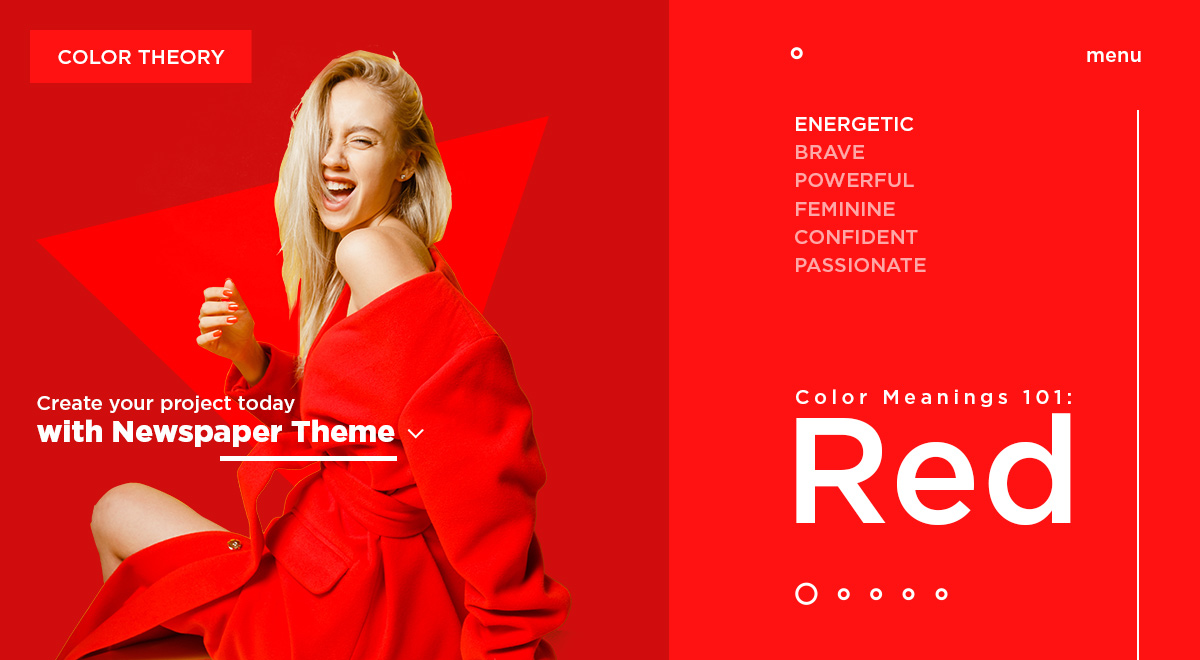
A high-energy passionate color, red has had its fair share of symbolism throughout history. From being incorporated as a sign of power to being gifted in flower bouquets, red can include different meanings. But, how do you use it to design a website or product? Let’s explore how to best approach using this bright color in your future endeavors.
The Origin and Meanings of Red
It was first used as a paint dye in caves. Red as a color has always been present in nature. The flames of a fire, the petals of a flower, each are a part of this beautiful hue. However, it was during the Renaissance that red began to grow. With aristocrats dyeing their clothes scarlet, it was seen as a symbol of power.
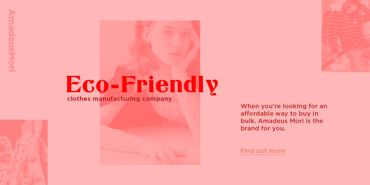
During the 19th century, it took on a more significant role: a sign of revolution and anarchy. Whereas nowadays, red is seen as a feminine color. In fashion design, it is incorporated to portray sensuality and confidence. Let’s take a closer look at red’s primary meanings:
- Most traffic signs which indicate danger make use of red as a color. Whether it is high voltage markers, stop signs, or even traffic lights, the color immediately attracts attention.
- The background or logo of an energy drink usually contains red as its primary color. Why is that? It’s because it’s a lively hue that promotes a sense of vitality.
- Martyrs are usually portrayed wearing red as a color of their sacrifice and bravery. This can also be noticed on flags during wars as it inspires the troops to march into battle.
- As a shade of seduction, women often wore red lipstick throughout the ages to encompass their youth.
Red Color Schemes
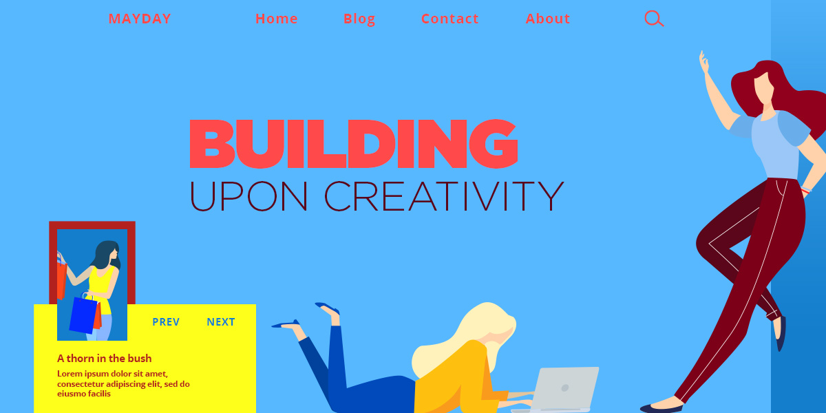
There are many variants of red: purple reds, orange-reds, true reds, and dark reds. Each one has its own personality and appeal. With orange-reds, you get a brighter and livelier shade. Purple reds tend to be more feminine, while dark reds embody a rich and luxurious vibe.
When designing a product or a website, there are a few rules you must keep in mind. Color Theory is essential to know which colors to use together and what they create. So, these are the most popular color combinations for red:
- A Monochromatic color scheme means different shades of the same color. When adopting this type of color palette, you make use of contrast between darker and brighter tones of red.
- Using an analogous combination of colors means using the neighboring shades of red. Pink and orange are some of the friendly neighbors to our color.
- The color complementary to red is green. When paired up, they tend to symbolize Christmas and all its delights.
- Triadic uses neighboring colors to the complementary one for red, which are teal and yellow. This color palette has a retro-futuristic vibe.
- The split-complementary for red includes a lime-green and a blue shade of green. Combined, they make a refreshing pair.
For more inspiration regarding color palettes for red, check out Adobe CC, which lets you pick out the type of color combination needed.
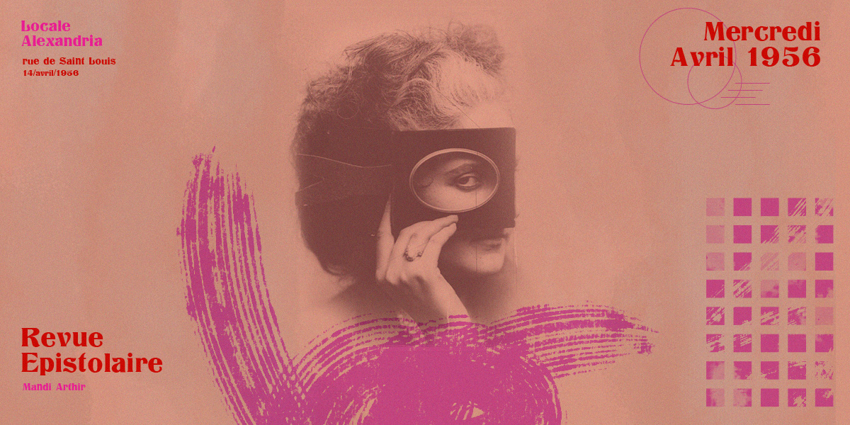
Designing with Red
When you embark on a new project or website design, you need a plan. What is the primary purpose? This can be any number of things, such as trying to build trustworthiness or even constructing a brand image. The audience needs to receive the intended message upon first sight. Do it using color combinations that place your product’s meaning at the forefront.
While reading about the various color schemes involving red, you might have already chosen something to convey your intent adequately. Now, it’s time to decide whether to make red the primary or accent color in your design. As an accent color, it thrives on highlighting objects, whereas as a primary color, it bathes every object in it.
If you’re designing a website using WordPress, you need a template to build everything on the front-end. With Newspaper Theme, you get access to the tagDiv Composer, the frontend page builder that lets you drag and drop elements while constructing it. Let’s see how to use it to adjust your site’s colors.
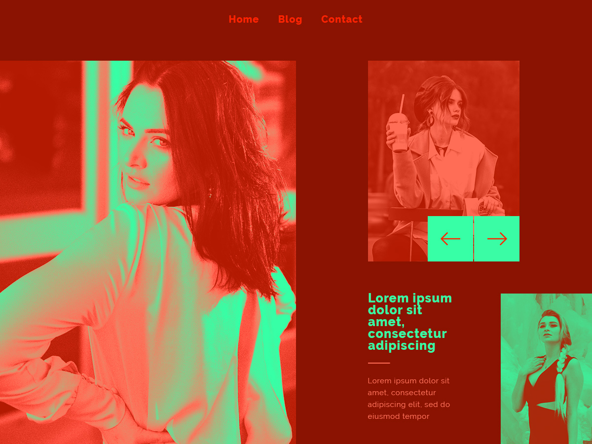
Newspaper Theme in Red
Take a look at our basic tutorial for the front-end page builder if you’re new. Then open any page or template using tagDiv Composer. Whether you’ve installed a demo or created the entire website from the ground up, any element can be modified to fit into your chosen color palette.
Click on an object to begin editing. Go to its Style or CSS tab to adjust colors of different headings, titles, descriptions, and even image overlays for posts. As a bonus, you can add a gradient or color blending mode to any article or image. Take a look at our helpful tutorial for more information.
When you’ve finished creating and incorporating a red color scheme, save your settings and continue for the rest of the website to create uniformity.
Conclusions
As a highly-energetic color, red can be seen as both a symbol of power and enticement. Each meaning that is associated with red, can be easily adjusted with a color combination to fit your product. While developing and creating the visual appearance of your website, you need a strong plan in mind. Furthermore, it also has to incorporate the intent behind your project. If you follow your intuition, creativity, and the plan you come up with, you’re bound for success!
Show us your amazing red designs in the comment box below!


