Wondering what in the world is UX or UI design? When we talk about a WordPress website, we automatically take both UX and UI designs into consideration. There’s no product without its basics: user experience or user interface. When we craft something for someone, we are stepping into his shoes and analyze every detail to deliver ease of use and delight. Below, I’ve gathered some of the most important aspects of UX and UI design processes you must take under consideration when creating or customizing your website.
UX & UI aka User Experience and User Interface
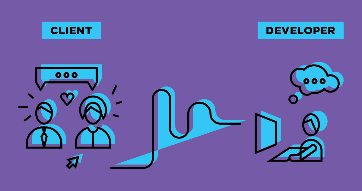
Interface and experience have two different connotations. Though, they do make a strong bond together. In short, what user interface and user experience are trying to achieve together is that when something is visually appealing to the visitor’s eye, the experience is naturally pleasant. Also, if the interface is difficult to understand, the user’s experience might be dreadful. Well, none of us wants to deliver that. All the marketing efforts are team efforts, meaning that developers, designers, and marketers work side by side to build a product anyone loves. When a reader interacts with your website, he lives an experience. It depends on how you build your stories. Both visually and satisfactory.
All the marketing efforts are team efforts, meaning that developers, designers, and marketers work side by side to create a fulfilling experience, both visually and as interaction processes.

User experience is that part of a website which is technical and analytical, while user interface design is more likely a visual one. Let’s put it this way: UX is for performance and optimization, while UI is design and presentation’s beauty.
UX and individual perception
Based on Wikipedia’s definition, UX “refers to a person’s emotions and attitudes about using a particular product, system, or service. It includes the practical, experiential, affective, meaningful, and valuable aspects of human-computer interaction and product ownership.”
UX is all about individual perception. When a website is easy to use, valuable to its visitors/customers and awakes positive feelings and emotions, we can talk about design improvement brought out by UX. User experience first appeared in the machine age, to increase production efficiency, then it led to major technological achievements. As fundamentals, the engineers Frederick Winslow Taylor and Henry Ford were trying to help humans interact with one another at the workspace.
As a term, “user experience” was mentioned in the 1990s by Donald Norman and was meant to highlight only the “affective aspects of usage.” With time, the term conquered a widespread of industries. For example, in web design, the product assembles usability, visual design, marketing, and branding.
Interaction with visitors through design
UX represents the interaction of a visitor with your site. It drives empathy and brings enjoyment among readers. User experience as a concept should help to remove barriers between visitors and your business. People can get bored in a heartbeat. If you want to sell them something, you need to take action to keep them on your site, and not lose them after the first click. Keep in mind that people react to emotions. What kind of emotional bond do you use on your site?
Based on theories developed by Aristotle, Darwin, or Robert Plutchik, there are different lists of emotions humans feel. We’ve analyzed how people react when seeing different websites and searching for certain things. So, here’s the list of contradictory emotions a UX design can generate:
- Trust, Love, Admiration
- Friendship, Kindness
- Joy, Surprise
- Sadness, Fear
- Envy, Anger
A website is made entirely of posts and pages, options, and elements. Depending on these, and also on the type of content you publish, visitors feel different emotions. When navigating a website about animals or babies, you can be surprised, happy, and even cherish everything you see. Meanwhile, if you don’t have a dog as a life companion, but you desire one, feelings change. A travel blog can be heart fulfilling, but also, it can make you envious and sad at the same time.
It’s all about the composition, and how every little detail merges together to create an experience your visitors will never forget.
UI design is for Utility & Learnability
For examples, web developers invest a lot of time and effort in developing a WordPress theme. It has to be a reliable product, with intuitive features, which can be easily managed by both experienced and beginner users. That’s the same in other industries too. If you create something based on usability and sustainability, your results won’t stop showing.
In web development, besides UI and UX, we can mention the Interface’s customization. Well-explained a few years ago by the NNGroup in one of their articles, it means “functionality that lets users customize their online experience by adapting the user interface to suit their preferences.” That’s the same case when using a WordPress theme which offers you the necessary tools to customize layouts, arrange blocks or elements on the frontend of the website. It means you get a final product with a ready-to-experience interface you can get creative with. Your first interaction with the theme and its tools define what kind of experience you meet.

Each website can easily obtain a flawless UI design by having high:
- Utility
- Performance
- Learnability
- Memorability
- Achievement
When talking about UI, we think about utility and also refer to whether the item has the features you really need. If the product is easy and fun to work with, it means the UI is useful, as it combines utility and usability.
If a website is looking great, but it’s difficult to find the search bar or the contact info, it means the UI is well done, but it’s a poor UX. Actually, UX is an attribute of quality for the UI.
A great Interface ensures a great Experience
In the end, UX and UI designs are all about understanding and researching human behaviors. UX design is based on previous and individual experiences, environment, context, or website’s properties. At the same time, UI design is simple, straightforward, and understandable for any user; it wins anyone’s attention and delivers positive vibes. If you want visitors to take action on your website, don’t force them. Let them know they’ve come to the right place to live an extraordinary experience. With a balance between UI and UX designs, you’ll keep your visitors happy and coming back to your website.


Hi Alina ,
I really enjoyed reading your article ,…I publish the Sydney Times and we are considering changing from Newsmagazine to Newspaper Theme ,…I would really appreciate if you took a look at our site and do a critique about vital improvements , I would value you casting your professional eye over the site to isolate the mistakes and design flaws
Thanks in advance
Axel Ritenis
Hi Alex,
Thank you for commenting. I truly appreciate your kind words and the given trust.
1. One recommendation would be to change the social IDs with your own, in the Social Counter, as now you have the default ones – https://www.screencast.com/t/YFmM0Duml.
2. Also, I suggest you do some SEO efforts and make descriptions for your pages and posts – https://www.screencast.com/t/msINb3qePQ.
3. When people go to your website’s footer area, they see our theme’s description and a random email address. How can they reach you? For a great UX on your site, you should add your own – https://www.screencast.com/t/PPZwnCyOLj.
4. You are the one who knows better your audience. Keep tracking of your traffic and see the most popular posts and pages, and try to optimize them.
Depending on what do you plan with your website, the Newspaper theme comes with sets of pre-built designs for pages and posts, a header manager, flexible blocks, and many more. If you have any pre-sale questions about Newspaper, please send us an email at contact@tagdiv.com. We’ll be happy to respond to all your queries. Have a lovely day :).