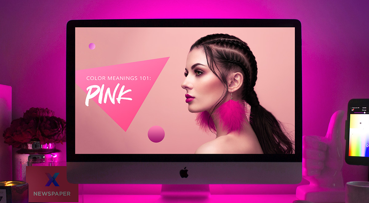
As a bright, innocent color, pink may be what you need for any product or design. But how do you use it to create something stunning, and what colors go well with it? Explore all that pink has to offer and its hidden meanings throughout history.
Pink Color Meanings
A tint of red that appears when you mix red with white, pink is the color of youth, love, friendship, and charm. You can create lighter shades of pink by adding more white, while darker shades of the color can be achieved by adding more black.

This hue represents sweetness, playfulness, and romance. Often associated with feminine products or ideas, pink has multiple meanings behind it. Moreover, this ties closely with its shade:
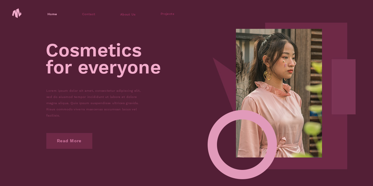
- The more violet the pink is, the more likely it is to be associated with interior design and even wedding motifs. A color such as pink lavender is perfect for cosmetics, too.
- When the shade of pink has orange tints to it, you get colors like coral pink, peach pink, and even apricot blush. These colors are vibrant and positive.
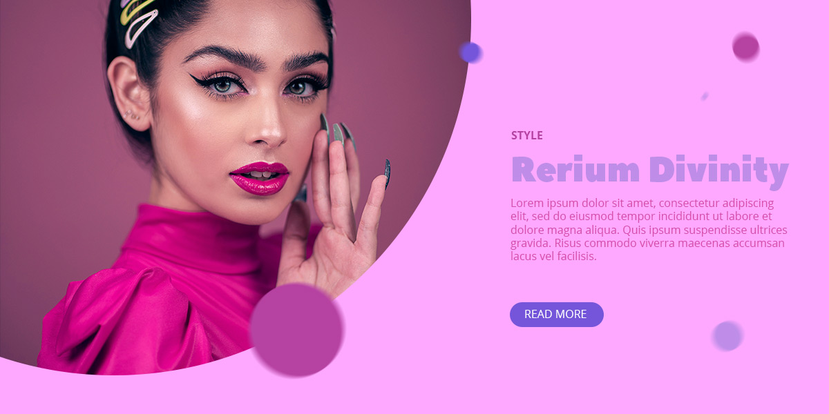
- Magenta, Fuchsia, and Hot Pink are colors often associated with Barbie dolls, lipsticks, and even children’s toys. Highly feminine, try pairing these colors with muted tones such as grays, or pale shades of blue and green.
Pink Color Schemes
Whether your product is designed for children or adults, you may need to rethink the colors used for it. Head on over to Adobe CC for the first look at pink’s color schemes. Choose the primary color by dragging the circles in the color wheel to pick. From the left side panel, click on any color scheme to see the options. If you’re new to what color schemes are, head on over to Color Theory to find out.
- A pink monochromatic scheme uses darker and lighter shades of the color. If part of your design’s color already includes pink, it’s easy to add different shades of it to create a stunning result.
- Pink’s analogous palette makes use of its close by color neighbors: violet, purple, and orange. Depending on the shade of your primary color, this can either be a pastel, preppy beginning, or with a dark shade of pink, a luxurious one.
- The complementary color to pink is lime green, a green that’s close to yellow. These two hues are closely tied together in nature, so it gives a natural feeling.
- Pink’s split complementary is lime green and yellow. With these two shades, your design should then be associated with liveliness and high-energy.
- A triadic scheme for pink would be yellow-orange and turquoise or teal. This is a trendy color palette for modern designs. It’s highly versatile and can be used for almost any media.

Go pink!
No matter what you’re designing, you can easily incorporate pink into it if it aligns with your core message. In fact, according to The Telegraph, your product doesn’t even need to be intended for a female audience, as pink used to be associated with masculinity. It was only in the 1950s that it became the centerpiece color for femininity.
So, if you’re designing a clothesline for men, use nude pinks as the primary color for it. Choose one of the color schemes above for a great start. However, don’t go overboard with the number of colors.
For website design, apply pink as either the backdrop, an accent color, or douse your entire site in this youthful, charming hue! How would you do that? The answer to that depends on how the website was built. If you use Newspaper Theme, open any page with the tagDiv Composer, the frontend page builder. Drag-and-drop elements, arrange them, create the perfect layout, and then from the “Style” tab of each element, choose colors.
Pink as a backdrop
On any row of the page, open the “CSS” tab. Choose pink as the background color and then drag elements into the row. For buttons or hover effects, go with one of your other chosen shades from the color palette. This makes the pink fade in comparison to the content and act more like a curtain guiding the audience through the page.
Pink as an accent
If you want to use pink sparingly, add it on items that you want to highlight. Such as a background for a button, or even a link’s color. This makes those elements stand out from the rest and helps guide your audience along.

Pink, pink, pink, everywhere pink
If you’re a pink lover and you want the world to know it, you can always turn the entire website pink with Newspaper Theme. From background colors to fonts, image blending modes, use either an analogous or monochromatic scheme and go wild!
Conclusions
Whether your intended product is designed for a male or female audience, don’t let it deter you from using this highly vibrant and sweet color. Pink is the perfect choice no matter the project as long as you choose an appropriate shade of it and color scheme. Don’t let social standards dictate how you should use colors, and have fun!
If you’ve designed your website with pink, show us how you did in the comment box below. We’re always happy to see more creative and brilliant ideas.


