This whole period has been a tough one for everyone, including online businesses, and personal websites. Yet spring means energy. It is a great opportunity to recharge your batteries. Sun is up, nature is becoming greener, so your creativity should blossom and sparkle too. If your website needs a fresh reshape this year, follow these 10 web design trends and enjoy the spring vibes.
What are the Current Trends in Web Design?
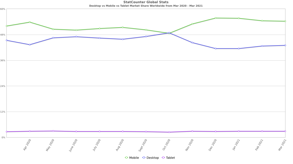
Web design trends are strongly determined by people’s demands, news, fashion, cultural events, new product releases, social media experiences. Designing or reshaping your site might be challenging. However, it could really worth it. The worldwide web is full of precious design tips that you should test and see if they’re a fit for your needs. As small details make the difference, tiny web design changes are always insightful. All websites must be mobile-friendly, as these mobile devices are mostly used nowadays. According to StatCounter data, mobile usage is almost reaching 55% out of 100%, while desktop devices are being used by 42.9% of people worldwide.
1. Less is More
In spring 2021, minimalism is still one of the most popular design trends. It can fit any online store, services page, architecture studios, medical site, portfolio, personal blog, and so on. Minimalism is a concept. For some people, it is a way of living. For others, it represents an organized way to present simple things online. When you navigate through a minimalist website, you automatically feel positive emotions, as there’s nothing like too many visuals or Call to Action buttons to overwhelm you. When saying that ‘less is more,’ you should know that a minimalist web design is unifying negative space, basic shapes, essential colors, and clear typography. A minimalist website is simple yet powerful, as it gives the user exactly what he needs, in an instant. For example, if an app uses a minimalist design, the UX will be straightforward and pleasant, as the UI makes it that way.
2. Neon Designs
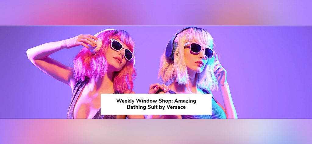
By using neon colors to highlight your typography, backgrounds, or images, you’re creating a contrast that stands out from the rest, similar websites. People will notice your site and they’ll keep in mind it’s different from others. Neon colors are used to grab the audience’s attention and lead their eyes to read more and stay longer on the page. For example, if your buyer persona is a millennial, you should definitely consider incorporating neon on your site. A neon color backed by black or white hues, including geometric shapes and parallax effects, will look sleek and keep your audience engaged.
3. Abstract art
Abstract art is pure creativity. It is strongly influenced by impressionism, post-impressionism, and cubism movements. “Abstract art now lives in the art world in many forms. It is two- and three-dimensional. It can be vast or small. Abstract art can also be made with many materials and on many surfaces. It can be used in concert with representational art or completely abstract. Artists creating it often focus on other visual qualities like color, form, texture, scale and more in their nonobjective work,” outlines the Artists Network.
Whether we refer to a textured background, interesting shape, different color compositions that describe objects, moods, or just serve as visual objects – they all mean abstract art. Squares, circles, and more geometric forms are minimal, and if web designers include these elements in their designs, they create immersive online experiences for any user.
4. Scrolling
Can we say that from March 2020 to April 2021, we used scrolling a lot? It’s the most used form of interaction on social media, online magazines/newspapers, blogs, and any other platform. More and more web designers include interaction in their visual design while users scroll through the site. It could be a change of colors, fonts, images, pages, and what else? The scrolling effect could be horizontal or vertical, depending on how the elements were coded. According to UxPin, there are four types of website scrolling patterns: long, fixed, infinite, and parallax scrolling. Each one of them involves interaction and transition. Sometimes, they are optical illusions, making the objects look like faster-moving performance elements.
5. Micro-Interactions
What is a micro-interaction? When a user interacts with a certain element from a website, and that element is animated and changes its appearance, it means interaction. Some examples of micro-interactions include color or fonts changing, text highlight, or even shapes’ modifications. Web designers often make buttons or links animated to make the user experience as smooth and engaging as possible. For example, we’ve added .gifs that explain how a certain element works within the tagDiv Composer builder and the Newspaper theme. They are triggered when you hover the mouse over them. Another example of a page entirely built with micro-interactions that initiate while scrolling, is the new iPhone 12 presentation.
6. Video Header and Background
In this times, with small to zero social interaction, people tend to create explanatory videos or filmed podcasts. They either talk in front of a camera about a chosen subject or with someone they interview. Moreover, if owning a website, you probably want to include your personal videos and center the information around them. They’re engaging and keep your visitors up to date with your stories. An awesome approach is to add high quality videos in your site’s header area or background. Videos are attention grabbing. Also, they’re the best way and quickest to introduce your website or business.
7. Negative Space
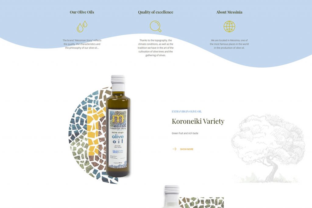
This one has always been one of the favorites web design trends and it is used to emphasize the most important areas of a website. Negative space is white space. One example that uses negative space beautifully is Apple. The upper area of the homepage represents the latest launched product of the company. Few information, but you still can deduct details such as the eight colors, and the fact that the new iMac is sleek and really thin.
8. Illustrations
In the past year, more and more start-ups were launched into the market. Most of them are centered around the tech industry. To describe software platforms or products, web designers have crafted innovative illustrations that best define their items. Illustrated people, icons – everything is laid out as interactive visuals.
9. Dark Mode
Dark Mode makes any interface look sleek and improves the UX. For example, we have the option to enable dark mode on our smartphones, to reduce the usage of the battery and diminish eye strain. Even browsers have the option to switch between light or dark modes. Choosing between a light or dark mode gives you more control over your website. By opting for switching to a dark mode, you’re reducing the blue light exposure rate. UX Planet has outlined some great tips, such as avoiding pure black, saturated colors, and more.
10. Gradients and Textures
Gradients are created by combined shades of colors. They can be either linear or radial. With gradients, your website becomes a fresh, realism-inspired design. For example, if you do not like empty backgrounds, you can add a gradient background or patterns to make your site a unique one. If you’re a composition enthusiast, you can use wood, ice, bricks, water, and other nature-inspired textures; these will make visitors feel familiar with your site, and they’ll come back for the smooth and cozy experience.
Examples of businesses that went totally digital
The pandemic situation has pushed business owners to find innovative ways to keep in touch with their customers. From art, sports to medicine and school, everything moved online, with us spending a considerable amount of time in video meetings, connecting with people in ways we haven’t thought of. All these businesses created or redesigned their online platforms, so they can schedule events or host live streaming conferences. Let’s take a look at some examples:
- Fashion shows – Prada Spring Summer 2021 Womenswear Showspace
- Digital marketing conferences – Digital Summit at Home
- Theatre and movies awards – Oscars, launched live on April 25th
- Livestream concerts – Billboard publishes a monthly calendar with all concerts
- Sport competitions – Miami Open
These are just a few of the businesses that have embraced the new tech environment and moved their events online. Moreover, nowadays it is easier to learn a language, to meet with your doctor, or to virtually visit museums around the world. The web designers included micro-interactions, scrolling, dark themes, illustrations, or videos – to outline their businesses and events.
UI Trends to Follow in 2021
This year, new User Interface web design trends also come along. Glassmorphism, neumorphism, 3D imagery, real-life pictures, blurred lines, brutalism, and others, are highly gaining web designers’ sympathy.
What is Neumorphism?
Some UX oriented websites advise that it is the new skeuomorphism. According to Wikipedia, a skeuomorph is “a physical ornament or design on an object made to resemble another material or technique,” and they can have a familiar look, resulting from a designer’s cultural influences and knowledge. An example of a skeuomorph element is the “recycle bin”. On the other hand, neumorphism is the neo-skeuomorphism, and represents the combo of a low chroma colours, close shade gradients, accessible shades, and new forms represented. “Neumorphism combines developments of flat design and skeuomorphism. Neumorphism, or soft UI, is a visual style that combines background colors, shapes, gradients, highlights, and shadows to ensure graphic intense buttons and switches. All that allows achieving a soft, extruded plastic look, and almost 3D styling,” notes the author Dmytro Dvurechenskyi in his extensive article on this modern movement. However, there are experts that do not embrace neumorphism, but they’ve found more interesting glassmorphism as web design approaches.
Glassmorphism
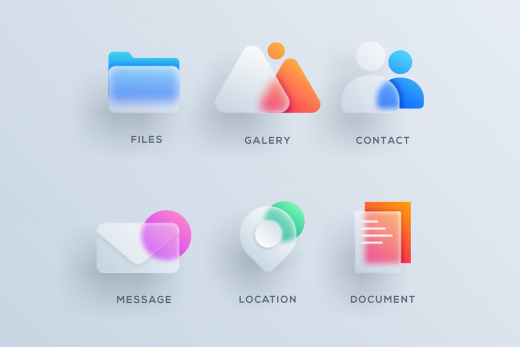
Well-known design platforms, including Behance and Dribble, have already embraced this new UI example among the other web design trends. Glassmorphism as a concept is using pastel color palettes, transparency, as well as light borders. If you’re a front-end designer, you could easily incorporate glassmorphism onto your designs by using the backdrop-filter CSS property and quickly create blurry effects.
Aesthetics, Usability, and Accessibility
Hope. The pandemic situation has led us to create or redesign websites that inspire you to hope. Calming colors, vivid layouts, animations, bold typography, modern designs combining with retro art – they all make us think outside the box and find new ways to live and see the beauty in everything. According to Fiasco Design, website designs tend to be environment friendly, that incorporate visual elements and colors that connect you with nature, and have an organic inspiration. Combining greens, blues, yellows – the web designers keep it simple in terms of colors. Moreover, the Internet has become home for any business that kept connecting with its customers. Simplicity wins. Negative space. Illustrations and micro-animations. Websites adapted to new technologies.







Very interesting, Please share more stuff.
Perfect, this is exactly what we’ve been looking for. And especially, the glassmorphism seems to be a trendy thing. Have seen it on a couple of websites lately.
Keep up the good work, Team-TagDiv 😀
Thank you for your kind appreciation, Marcus. I’m glad to hear that the information suits your website’s design vision. Have a lovely day 🙂