2020 is the year of new beginnings. It’s the year we launched another software into the international market. We are proud to tell you about our project, the HRiFlow App. It is an online timekeeping and HR software that helps you track the working hours and reports in your company. The app uses technology such as Vue.js, Bootstrap framework & PHP, while the website is built upon the Newspaper WordPress Theme. The app and the website are interconnected; as new users must create an account right from the site to start using the app. And, since our news template is a great choice for any website, we have tailored it to design an amazing platform that combines both UI and UX best practices.
The Beginning of the HRiFlow.ro
As a team of web developers and web designers, we are excited to share our Newspaper theme experience in creating a brand new website to feature different software. Well, we all know that Newspaper is an excellent way to build a site, including a product presentation. We focused all our efforts on the app development and created a simple, yet functional website. Let’s take a closer look at how the website was made and how we used your favorite theme to create a product presentation.
Homepage from Top to Bottom
Every new start is challenging. We are an experienced team, highly WordPress skilled, and yet, we’ve stumbled while redesigning to increase time on page and visitors engagement. All of it started with our desire to create a more welcoming environment for our audience and clients. Just as you do, we wanted a stunningly beautiful, easy to navigate site and, of course, more time to focus our attention on the product, not on the website.
We had to come up with some brilliant ideas to design and optimize everything. And when all was set in place, we began the journey into making the HRiFlow website into what it is today. For us, HRiFlow is a celebration of graphics and vivid colors that speaks out in the creative language.
To communicate directly to the audience, we’ve redesigned the homepage using illustrations (SVG images). In chromatic terms, we chose white and soft blue shades as primary colors. Furthermore, to highlight the most important aspects of the website, we’ve used shadows around some elements.
In terms of speed, the HRiFlow website is fast and loads pages quickly. We’ve tested it with several online tools, specifically for this article, and, for example, HRiFlow has a 94 performance score based on Google Pagespeed Insights.
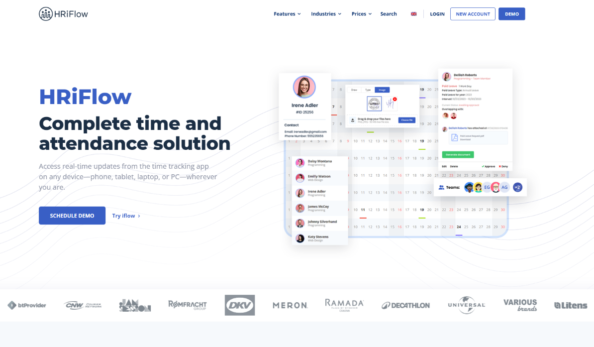
Header
So, let’s begin with the first thing you see when landing on a new website: the header section. Before all else, it’s necessary to mention that the website was released in 2018 in Romania, a European country. The website’s primary language is Romanian, but recently we launched it for the international market as well. HRiFlow uses a simple and clean menu that facilitates navigation without cluttering the page. Currently, there are four items linked on the menu, the country flag and search icons. On the upper right side, you’ll see two buttons that help you enter the app’s account or create a brand new one. This is the bridge between the site and the app.
The HRiFlow site is translated in English for 8 more countries that use it as a primary language, such as Australia, Canada, Great Britain, Ireland, Jamaica, New Zealand, and South Africa. To make the translation functionality, the developers have used the WPML plugin. There’s a country flag icon placed on the menu that displays the other available website’s versions in an elegant dropdown.
Website’s Welcome Area
Below the logo, there’s a custom video that loops and shows you the three main features of the HRiFlow app as a presentation.
Content
The next part of the website includes a combination of SVG images, rounded buttons with gradients, titles, and descriptions that show the main benefits of the app. There’s also a typography mix consisting of Montserrat, Open Sans, and Verdana Geneva fonts. Every feature is customized with the frontend, tagDiv Composer page builder, and some of the used elements are the column title, inline text, buttons, and single images.
Every app benefit is placed within its own row and framed by white space to gain more exposure. It’s important to have a proportion of negative space in your designs if you want to give your site a minimal and modern touch. With plenty of white space, your visitors can scan the page easily to understand your message and find what they are looking for.
Blogging
Before the footer area, there’s a nice section where you can preview the latest blog articles, and you can easily navigate to the one that catches your attention. You can also replicate this by simply selecting the Flex Block 1 from the tagDiv Composer and drag it into the designated area. You go to Style > Blend Modes, and you choose a color/gradient and the effect from the dropdown menu.
The Footer Section
The footer consists of a row divided into four columns. The first column shows the website’s description and the other three essential links you can quickly navigate through.
Curious about HRiFlow as an HR software?
So, what is the HRiFlow project? If you haven’t seen the website yet, HRiFlow is a timekeeping and HR app that helps companies digitalize the Human Resources efforts. After helping companies and bloggers around the world to create a great presence online, the HRiFlow comes to help them save time and focus on their projects instead of spending amounts of time on creating endless sheets tracking the employees worked time.
Besides having an accessible price, HRiFlow has more advantages you should know about. Let’s highlight below the most important benefits this app could bring in your company:
- Helps business owners and their staff to stay productive
- It’s an employee self-service app
- Anyone can Check-in/Check-out of work from any device
- It’s a real-time software
- Automatically calculates overtime and leave hours
- Live chat assistance in the app
- Integrated with the Payroll software
Conclusions
We’ve built dozens of demo websites for our customers over the last five years. Creating the HRiFlow App site was different because we needed it to work seamlessly in real, competitive conditions, rank on search engines, keep the visitors engaged, convert users; exactly what you expect, and desire from your website. Creating a website from scratch with Newspaper to brand the new HRiFlow software was a truly one-on-one experience with the best theme on the market. We had to share the news with you in this case study.
The reasons behind choosing the Newspaper theme to build the HRiFlow website are beyond the fact it’s our item, and we’re proud of it. The WordPress template has everything we needed to design a product presentation site: frontend customization, drag and drop functionality, responsive tools, and so on. If you also have a product and designed a Newspaper website for it, show us below in the comments.








How were the scroll effects created in iFlow?
Hi Dev! Thank you for your interest. The iFlow website is created with the Newspaper theme, but for some of the elements there have been implemented some custom solutions. If you want to achieve a website similar to iFlow, you can reach out to our customization department and submit a request, including all the details. Thank you!