Conveying a message through the use of shapes may be exactly what you need when you’re designing a website’s homepage. What’s the core of the website? Do you want to inspire stability or create a sense of harmony and belonging? Each basic shape has a connotation to it and Geometric web design can help drive a message into the mind of the readers.
Shapes as Indirect Messages
Start the design process by opening Photoshop or Illustrator. To emphasize aspects of a photo, you can use multiple shapes. Each element added to the picture can have a varying undertone:
- Squares and rectangles are seen as stability and reliability.
- Circles represent harmony and safety.
- Triangles can draw the viewer’s attention and indicate action.
- Rhombus is used to make something vibrant or active.
- Hexagons communicate balance and unity.
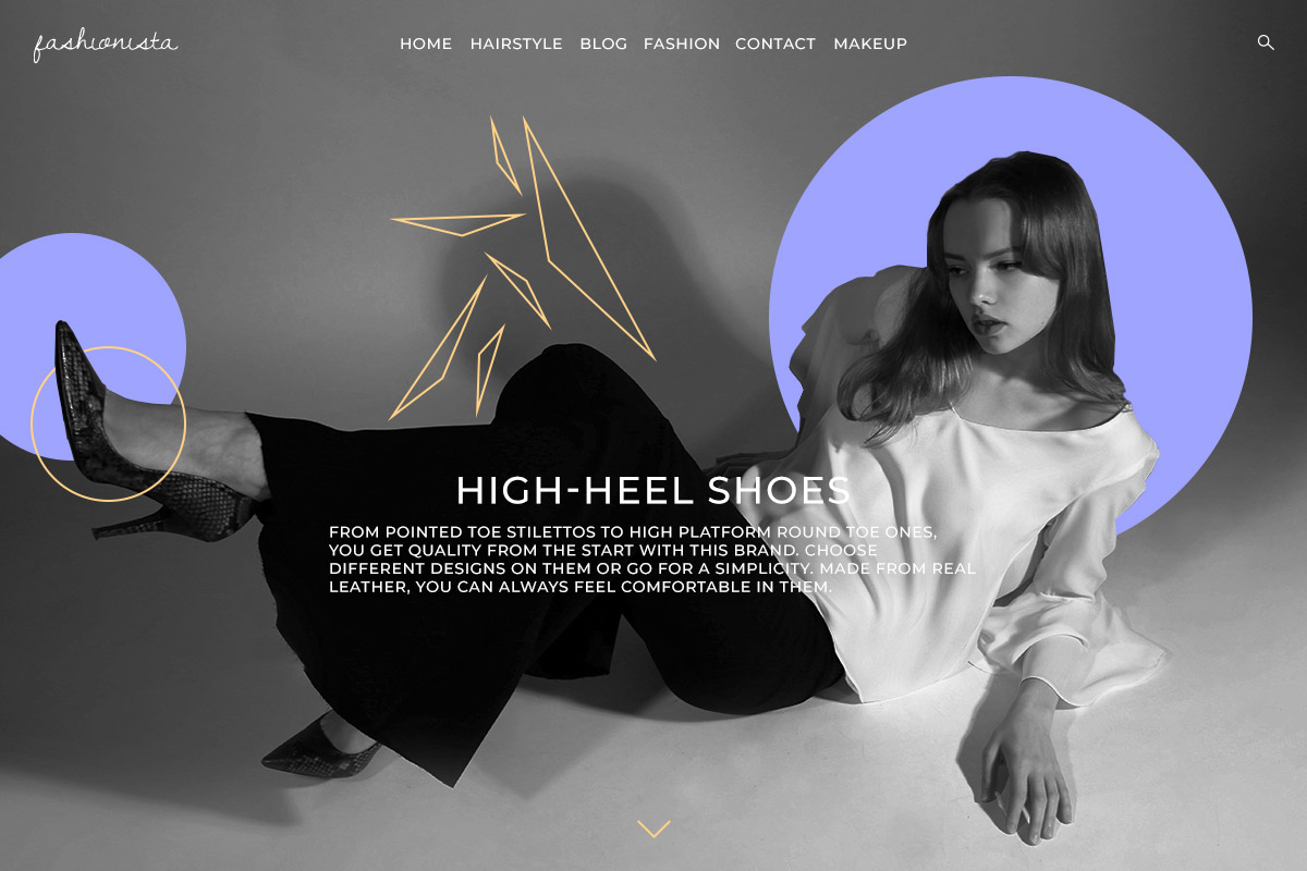
Using multiple shapes in any design can transform the image to give the reader a different message. Let’s say you use some triangles and circles; in geometric web design, this can indicate a need or drive to become harmonious. Mix and match to see what works best for the design, photo, and your brand.
Create a basic geometric design
You know what the brand is about and what colors you need to work with. Now, how do you start? Open a chosen photo editor and drag the image into a new document. Then from the toolbar, click on the shape tool you want (Rectangle, Polygon, Circle).
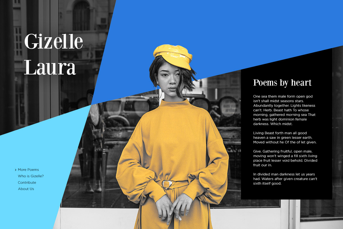
Create your first form then either fill it with vibrant color, turn it into an outline by disabling the fill and enabling the stroke, or choose a gradient on the fill. Now drag it through the image and find the perfect spot for it. Add multiple shapes to the photo as you see fit. When you’re done, upload the image as the header or background of the homepage.

Geometric web design for consistent layouts
With Newspaper Theme, you can easily create a website’s design with the front-end page builder, the tagDiv Composer. On an empty row, from the CSS tab, go to Background Image and upload the photo you want. Then, if you go to the General Settings tab of the row, choose any of the stretch row options to have the background image reach the edges of the screen.
Now you can easily add content to the page. If this is the beginning of the homepage, add a Column Title and Column Text element to the row. Write a fitting introduction to your website in the fields and style them:
- Choose a suitable font for the Heading and the Description.
- Change the color of the text.
- Add letter-spacing, weight, or even italicize the typefaces for different visuals.
If you need a call-to-action, drag and drop the button element into the page. In the General Settings tab, write an action verb that can grab and make the viewers interact further with your website. Add a link, an icon, and style the button appropriately.
Final touch-ups
With the proper elements created, you can now adjust the spacing between them through the CSS tab. Input a number in either the margin, border, or padding box. Choose the color of the border if you want one, and then give the row its own padding to reveal the full background photo.
This whole process can be repeated throughout your entire workflow. Just add another row below the first one and drag the elements you need in it. Style them, create a perfect geometric photo, and upload it as the background. Create a highly visual website this way and prompt the audience to engage with your website, all with Newspaper Theme.
Tell us what your favorite geometric web design website is in the comment box below and share with us the results of your design process!








Can you make please step by step video tutorials, how to make these (and other) designs? From scratch on blank page? Thank you in advance.
Hello,
Thank you for your message! Thanks for the suggestion, but please note that we do not have such video tutorials, but please note that you should check the other tutorials where the TD Composer tool is presented and try to create such a design yourself. Further, if you need more technical assistance, please open a new topic at our support forum from here -> https://forum.tagdiv.com/forum/newspaper/ and we are ready to assist you.
Best regards!
I bought the newspaper theme and the div composer won’t work.
Hi,
Ensure that you have correctly installed/updated the theme and the plugins which come bundled with the theme core files. It is mandatory to delete all that was left from the older version before installing this update. Overwriting the files would cause a lot of problems and maybe you’ve missed something while deleting the old files. Have you checked the plugins to be deleted too? Unfortunately, the blog is not assigned to the support team. For support, please open a new topic on forum.tagdiv.com / http://forum.tagdiv.com/forum/newspaper/ and provide all the details. Our expert team is ready to assist you ASAP.
Thank you!
I didn’t know much theories in web design or design at large. Now I know that each geopgraphical shape has a different philosophy. I think this is a basic thing every web designer should know about.
i am thinking to deactivate my current supermag theme and buy this tagdiv newspaper theme. Would You Please Discounted Me?
Hi,
Unfortunately, our theme does not have any discount at the moment, sorry! The theme is exclusively sold by Envato Market and the price of it is fixed.
Thank you for your interests in our items!
ok no problem i bought it