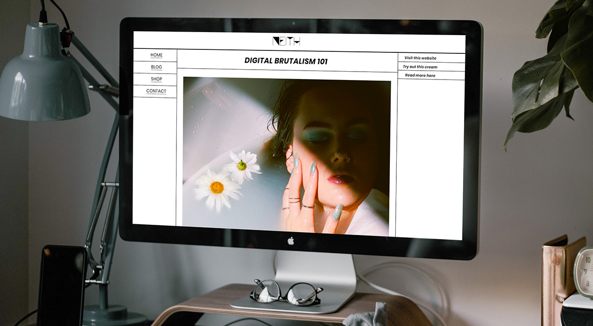
When all rules get broken, you get Digital Brutalism. With an asymmetrical layout, no visual hierarchy, and a fight for attention between the elements on the page, it certainly stands out. As a design trend that has its origins on the architectural movement from the 1950s, the “no holds barred” attitude of Digital Brutalism makes each site unique. In a realm where anarchy reigns, how does User Experience hold up? Before we explore that question, let’s start at the beginning.
![]()
What is Digital Brutalism?
Back in the 1950s, right after World War II, a new architectural movement broke out as a counter to the overly ornate style of the previous years. Buildings were crafted out of solid concrete and were left bare, with no drops of color. A stark contrast, they stood out for looking comfortable or relaxed.
How does this come into play nowadays? The lack of structure and rules has always been present in the media and culture. So now we witness it in a new Design trend called Digital Brutalism. A movement which, according to Pascal Deville, “can be seen as a reaction by a younger generation to the lightness, optimism, and frivolity of today’s web design.”
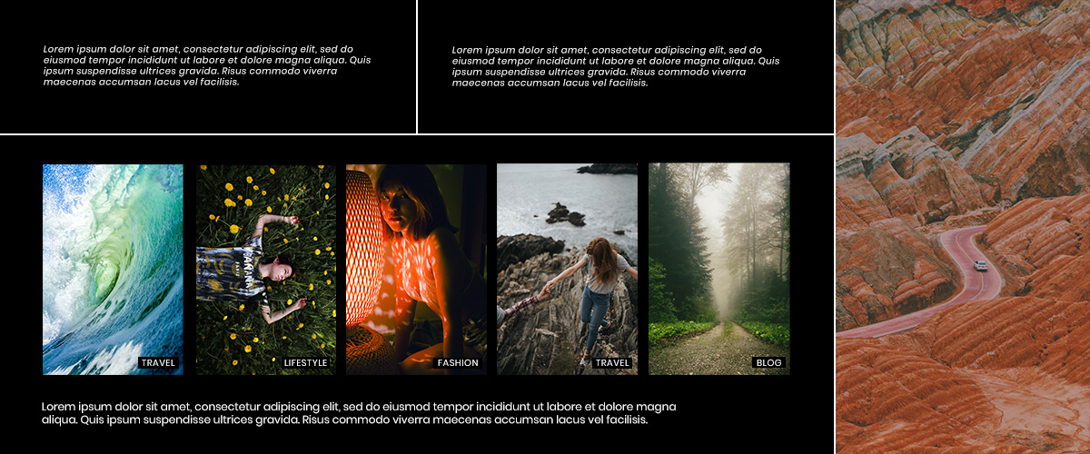
While exploring any brutalist website, you may start to notice patterns. Surely the one distinctive thing about it is the nostalgia. Let’s go back to the early days of the internet when anyone could make a website. Not everyone who had a website back then knew what they wanted to achieve with it or how to get their core message across. You’d come across things such as:
- Cluttered design, with elements overlapping one another.
- Items that would appear clickable weren’t.
- Clashing colors between various blocks or text.
- No visual hierarchy.
- Use of pixelated images, multitude of fonts, animated gifs.
These examples may be seen as a faux pas now, but they’ve started popping up again as a throwback to the early days of the internet in this new trend.
Why would you build a website like that?
If each website is keeping the same design: a link is a link, buttons are easily distinguishable, there is no clash of colors. Then everything becomes a copy of a copy of a copy. Now how do you break free of that? By abolishing all rules. That’s where Digital Brutalism comes in.
User Experience is important. Anybody wants a site that can be easily navigable. However, when it costs your brand identity to build one, you may need to rethink some design choices. If you search through the vast web, notice that not all sites are user-friendly. This doesn’t have to be the case for you.
Let’s take a look at some popular Brutalist websites:
- Craigslist has kept the same look since it was built. It is still used to this day even with the simple layout and its quirks. Its plain in your face design, however, has probably been the reason why it’s still popular to this day.
- Bloomberg has experimented with Digital Brutalism while still retaining its easily navigable features. Take a look at their Yahoo! Article, while it does not align with their other articles, it stands out and grabs your attention.
- The Outline shines through with its appearance. There’s an abundance of color, fonts intermingled together, elements that give the website a unique look.
- Have you seen Dropbox’s new design? While the elements are still accessible to users, the colors and photos are different and make it novel.
- Balenciaga has always been a rule breaker. When announcing new products or preparing for an event, their website’s design changes and gets funkier. Even if it may seem overwhelming, it’s been highly successful.
What can you take out of this? There’s no need to sacrifice UX for fantastic design, and if you want to make a striking site: you need to go against the flow.
Build a Brutalist website with Newspaper Theme
The first step would be to get inspired. Take a look through any brutalist website that appeals to you. What exactly do you like about it? The color scheme, fonts, layout? Then try to implement it straight on your site with the tagDiv Composer page builder. Whichever answer, keep in mind that you still need to have a user-friendly website. Don’t go overboard with the rule-breaking.
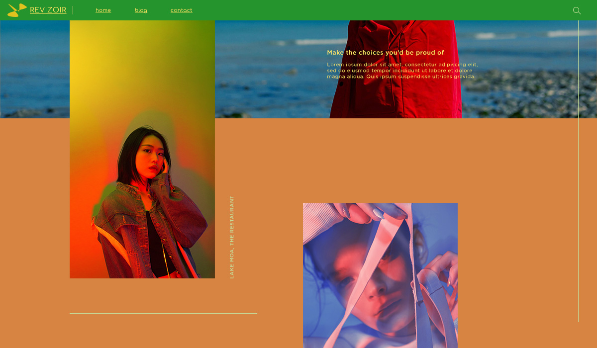
Color me surprised
If you want to catch the audience’s eye with the abundance of colors used, then go to the CSS tab on a row and add color to the background. Why don’t you change the color of the Logo and text to a contrasting or complementary one? On the next row, the background color should be different than any of the previously used ones. So, for example, if you used blue and yellow before, use red or green for the background now.
Keep the same scheme up throughout the page while still adhering to the rules of Color Theory. So you can obtain a unique design for your website.
Let’s Open the Type
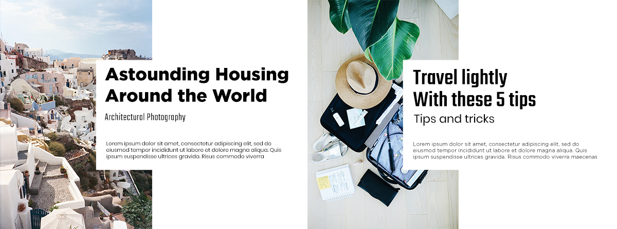
Do you want to be remembered for your choice in fonts? Change the title’s typeface to something bold, big, or even a Display font. Choose a different font for the subtitle and another one for the content. The contrast between each different font is undoubtedly going to make the page distinctive. However, to keep the layout as straightforward and appealing as possible, go for a white or black background and text color so the focus can stay on the content.
No matter what elements you need: Newsletter box, Buttons, Single Images, Flex Blocks, Flexible Big Grids, try to vary the fonts used. So they’re never where anybody expects them. For example, if you used Fugaz One for the title, use it on the subtitle for the next element. You’ll quickly wow your crowd while keeping the users happy by sticking to a visual hierarchy.
May we lay these out?
If you want to respect Typography rules and Color Theory, break the boundaries with your design. How do you do that? Go for an asymmetry. Keep each element on the page very far apart from the other by creating white space. Take inspiration from TechStyleFashionGroup. Their grid-breaking layout shines. There’s no abundance of fonts or colors. Everything kept to a minimum to draw attention to the positioning of each element on the page.
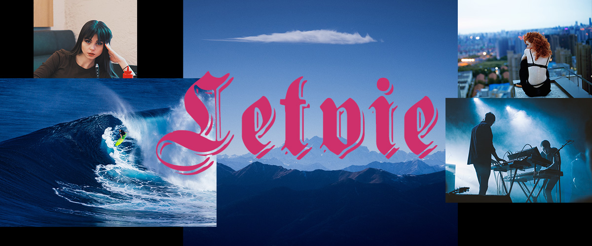
With tagDiv Composer open, add the necessary elements on your page and then create white space between them by increasing the padding or margins between them. You can either do this in the CSS tab or through the General Settings. For example, on the CSS tab of the row, add a lot of space top and bottom. Now add a Flex Block into the row. From the layout tab, modify the Module Padding to create space. Float the featured image to the left, change its width to 50% and then add padding to the Meta Info.
Each time you make changes, look to your favorite website, and get inspired by it. This way, you can achieve something that not only appeals to you but to the audience, too.
Conclusions
While Digital Brutalism may seem flawed from a distance, with all its rule-bending styles, there’s something to take out of it. To stand out in an online environment where design rules are so easily accessible, you need to break loose from some boundaries. Keep your website unique, but also user-friendly with Newspaper Theme.
Show us your favorite brutalist website in the comment box below!


