
How much do you enjoy your smartphone, and how long are you connected to the Internet? Does a website look the same on every device? Well, in today’s article, we’ll highlight the importance of responsive web design, where this term comes, and what exactly are its characteristics. Sometimes you’ll see it displayed as RWD, which is the acronym for Responsive Web Design.
Evolution of Technology
Everything you like is now online. The clothes, shoes, or bags you used to admire in the shop-windows, even cars, and homes, all of them are now on the world wide web. Companies design mobile apps to facilitate online shopping and improve them continuously. If a few years ago, you had a limited time of Internet per day and a huge desktop, nowadays, you have smartphones, tablets, or laptops with full-day Internet access. The mobile industry is more performant with each day that passes, and all devices become thinner and smarter.
For example, a smartphone is the base accessory that no one wants to lose. You surf the web from school, home, bus station, work using this device. Bank My Cell is a website that published statistics regarding the usage of mobile devices worldwide. According to their article on “How many phones are in the world,” there’s a number of over 5,15 billion people using mobile devices in 2019; it means almost 66% of the world’s population. That’s huge! Also, the 4G speed of the wireless connection is now history. 5G is the hero of the year and will conquer the world in a very short time. With these in mind, IoT (Internet of Things) is more powerful, and websites use faster tools to ensure great optimization. The fact that everyone has access to the latest mobile technologies forces web developers and web designers to align with the trends.
Who said RWD for the first time?
Some of you might think that responsive web design is how a website behaves on several mobile devices. Well, that’s right, but not entirely. There’s a story behind each responsive website and a lot of work. Team of web developers and designers create web products (themes or plugins) with features that can easily adapt to serve the user’s needs and improve its experience.
Every device, no matter the screen size, whether it’s a mobile or a desktop one, has to be able to show a website’s pieces of content in a suitable and visually appealing way. A website must be intuitive and flexible for anyone browsing from a desktop as well as from a smartphone device.
The graphic designer Ethan Marcotte first talked about “responsive web design” as an approach to web design. RWD helps web pages to load well on different devices, windows, or screen sizes. Ethan Marcotte is the author of the Responsive Web Design and Responsive Design: Patterns & Principles” books. These show how RWD evolves and changes the web, making it a better and friendly place for every online consumer.
Did you know that the first website that used adaptive layout was Audi.com back in 2001? It was created to “adapt to browser viewport width,” and with time, experts used terms like “flexible,” “liquid,” “fluid,” or even “elastic” to describe responsive web design. However, on A List Apart website, on May 25, 2010, appeared an article, written by Ethan Marcotte where he used for the first time the term “responsive web design.”
So, what’s the RWD?
Wikipedia states that “a site designed with RWD adapts the layout to the viewing environment by using fluid, proportion-based grids, flexible images, and CSS3 media queries.” A flexible design looks amazing on desktops since it was initially designed for such a device. However, it is not optimized to perform beyond that. So, how does it become a responsive design?
“Fluid grids, flexible images, and media queries are the three technical ingredients for responsive web design.”
Ethan Marcotte
The purpose of making the designs more flexible was to make them adapt to the media queries that execute the actions. Media queries are a popular technique for delivering a tailored style sheet to different devices.
You can introduce a media query to alter images’ layouts and recalculate the widths of the fluid grid, making it a two-column one (if it’s a three-column layout). The viewport’s width adapts to show everything nicely on any device resolution. That’s how it all started! From simple CSS media queries to advanced ones, you can reshape every detail of a page to look exactly the same or distinct in various contexts.
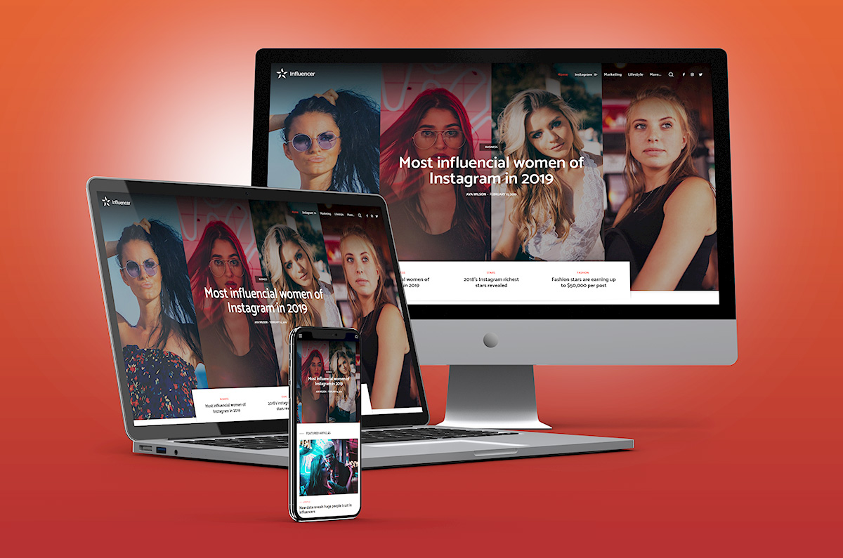
Who are mobile device users? It’s incredible, but they represent the same audience as the ones using the desktop version. It’s a known fact that people scan the information they read, and they lose their patience quickly. If a site is responsively created, with UX best practices in mind, a reader is more likely to stay longer, regardless of the size screen device. Furthermore, a responsive website has a single URL and one set of code elements. That way the content is presented the same on tablets, desktops, or smartphones.
What are the advantages of Responsive Web Design?
- It’s created with HTML elements and CSS properties
- Fluid Grids, flexible Images, typography and navigation
- Optimized content delivery on desktop monitors, laptops, tablets or smartphones
- Cost-effectiveness – a single URL’s usage ensures visibility on all devices without the need for multiple site versions for each screen
- Improves your SEO efforts, since Google reads your site’s URL & crawls information one time
- Precise typography on any screen device
- Readable text size without zooming it
- Easy tapping on well-spaced CTA buttons
- Brand consistency and flexibility
Your site should adapt to your visitors, not the other way around
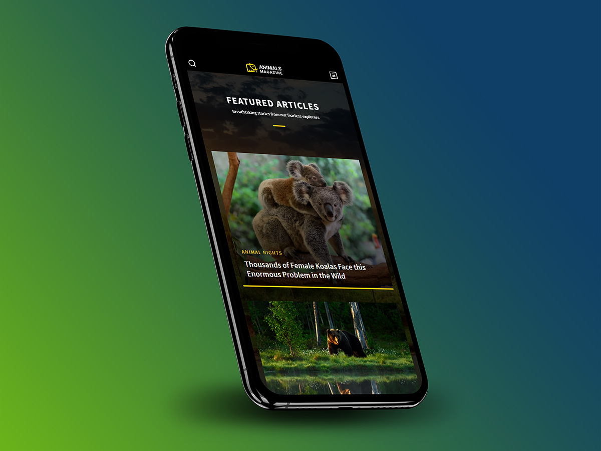
How to differentiate a responsive website from others? If you access a site from a tablet or smartphone and see a set of three lines in the upper corner, you’ve reached the hamburger menu. Let’s be honest: taping an element from a large menu stuffed on a small screen is a horrible experience. Instead, a tiny hamburger icon is elegant and yet minimal. All you have to do is click on it and choose where you want to navigate. This is the best UX practice example! Readers love visuals, icons, and elements that speak to them right away.
A newspaper’s structure is the core of a RWD
“The idea for responsive content derived from newspapers,” and started from how they were structured, says the Responsive Design website. Elements such as the headline, lead, body, and conclusion can now be organized on a website like header, content, and footer. With tagDiv Composer and Newspaper theme, it’s faster than ever to create and preview your site on any screen device. A responsive WordPress theme and a frontend page builder, you can easily adapt your content, logos, fonts, images. You have to ensure the same UX across all mediums. Remember that the audience loves to receive information automatically, based on their exact needs.


Good blog, Alina. The blog nicely explains the concept of responsive web design. It is important that the user need not zoom to read the text on the website. The website should load on any mobile devices and offer good viewing experience. This is achieved through responsive web design approach.
Dear Alina and Team,
thanks for this article with valuable background info.
Overall I find your Blog Articles a great source of inspiration and also a good opportunity to get deeper into the technical aspects raised here.
Keep the good work!
Michael
Hi Michael,
I’m happy to read your kind feedback. Thank you so much!
Hi Catalin, i know that you have official support forum but my support period expired and for me it’s pointless to renew support just to let you know that i found something that may be not working corretly. I don’t need help, i have fixed it easily with css code but it should be working out of the box as it supposed to be. I’m writing here because my support period expired and there is no other special communication channel to give your team a feedback about potential problems with the theme. Hope you will pass it forward to the develloping theme.
Thank you for response, have a nice day 🙂
Hi,
Thank you for your interest in our theme! You can send us an email at contact@tagdiv.com where you can tell us about your encountered problems.
Best regards!
I know that it may not be the best place to share with this but i have no longer posibillity to post on support forum but i think i have found something that may be worth to check. So it seems like i have found a little bug in viewport opptions for flex block 1 (maybe for other blocks aswell but i don’t know, haven’t check this). You can’t set different “Meta info horiz align” for desktop and mobile viewport. I would like to have center for desktop and left for mobile but when i change it in mobile viewport it also changes in dekstop viewport and conversely. I don’t think it’s how it supposed to be? Please check this.
Hi,
Unfortunately, our official support is made only on that platform from here -> https://forum.tagdiv.com/forum/newspaper/ If your support period is expired, please renew the support forum from here -> https://help.market.envato.com/hc/en-us/articles/207886473-Extending-and-Renewing-Item-Support and our team is ready to assist you.
Thank you!