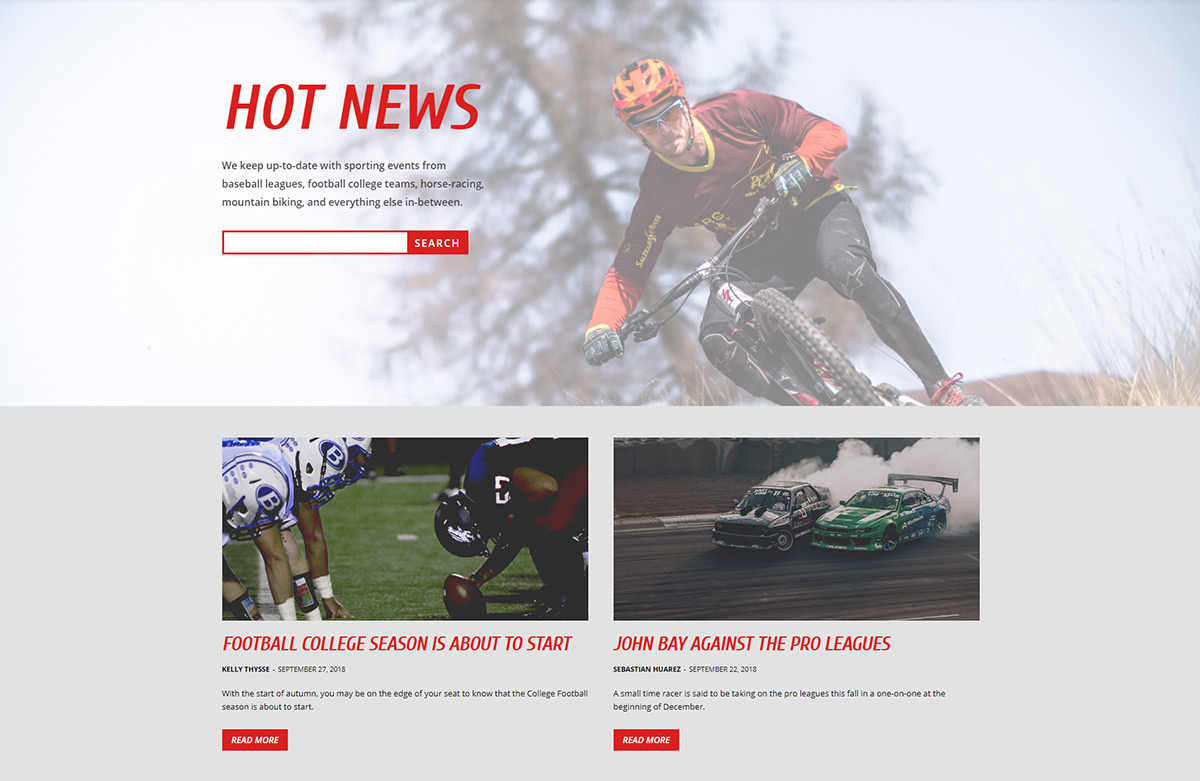
Address the viewers and show them highlights of your articles and posts easily. With essential elements such as a search field, blocks containing article excerpts, a specific image that shows your website’s personality, the Latest News Page is the best way to drive traffic toward your valuable content.
Start your Latest News Page easily with Newspaper Theme
For websites or blogs with a large amount of content posted on a regular basis, the Latest News Page is the best way to organize and bring readers to your new articles. Start by creating a new Page through the WordPress Admin Dashboard. In the Title field, write Latest News then press the Publish button.
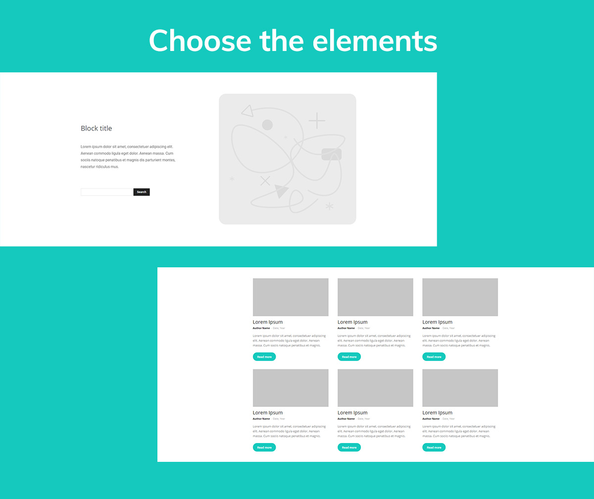
Now select the tagDiv Composer button to be taken directly on the front-end editing section. For a successful Latest News Page, you need good navigation elements such as a Search Form, Flex Block, Title element, Column Text, and a Button. Why? There’s a reason behind each one:
- The Search Form allows the user to quickly find what exactly they’re looking for on the website, and adding it to the page is a plus to the User Experience.
- A Flex Block is the highlight reel of your content. Include it to boost the click-through-rate on the page and bring users to the most important posts.
- The Title is necessary to show readers what the page is all about. It’s an attractive element that triggers a thought in the audience’s mind.
- A column Text would be a great way to add a suitable Description of the page itself, an introduction to your Articles and Posts and to give the users an idea of what to expect.
- Buttons are excellent means to drive engagement. Through them, the audience performs the desired action: open a new tab, a video or drive them to a specific place on the page with a Scroll-To-Class.
Customization is the key to the Latest News Page
Start by dragging each of the elements into the page. There are multiple versions of the Flex Block to choose from, but for this tutorial, let’s use Flex Block 1. It comes with an integrated button you can fully customize to increase your articles’ click-through rate.
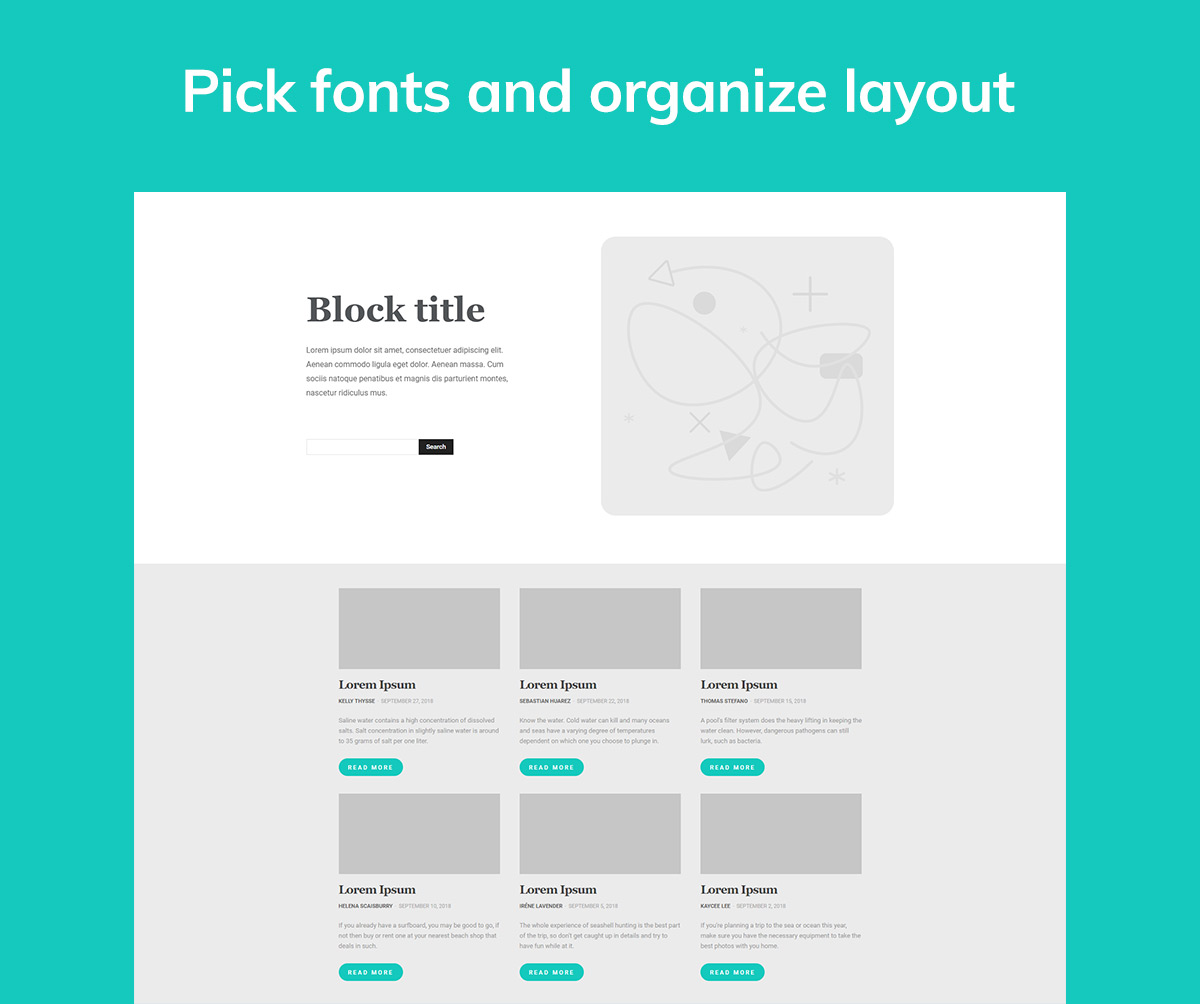
Let us show you a way to obtain a stunning result. Create a row and divide it into two columns. Then drag and drop a Title, Column Text, Search Form item on the first column. For the second column, add an image either as the background or as a separate element entirely by using the Single Image item.
In the second row add a Flex Block. You can display as many posts as desired. From the Filter tab, choose the sort order by Latest. The element shall now showcase the newest articles and give the audience a good starting point to navigate your site.
Typography is also essential to your website. Choose font families for the Latest News Page to be consistent with your other pages. Keep the design uniform as well because it makes the viewer think of every page as part of a well-built structure.
Get creative with the settings for each element and pick colors, gradients, paddings, margins. You have all it takes to create a stunning presentation.
Adapt the design to your vision
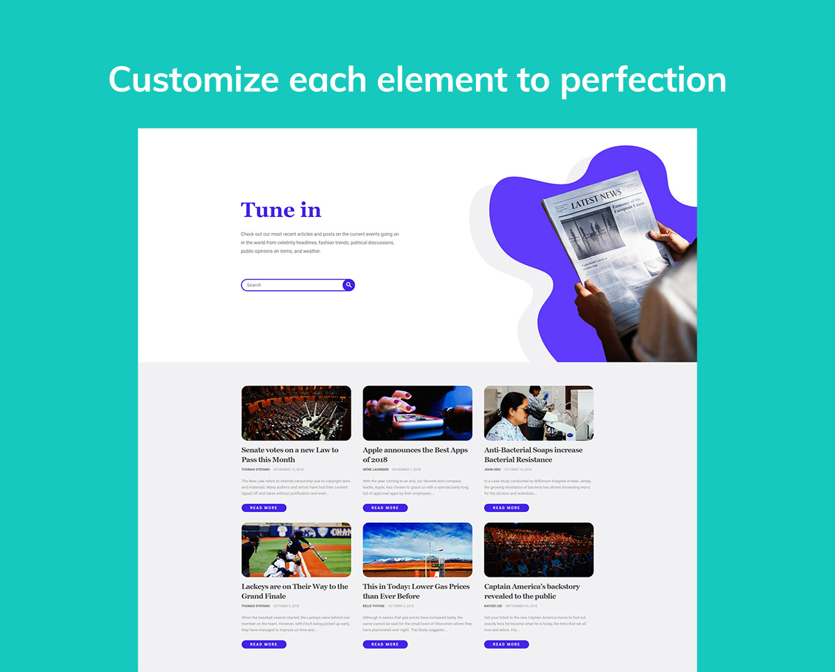
It’s so easy to take the design of the page even further. Endless possibilities are right in the palm of your hand with Newspaper Theme. If you don’t know where to start, use the above layout as a reference and change each element to match your vision.
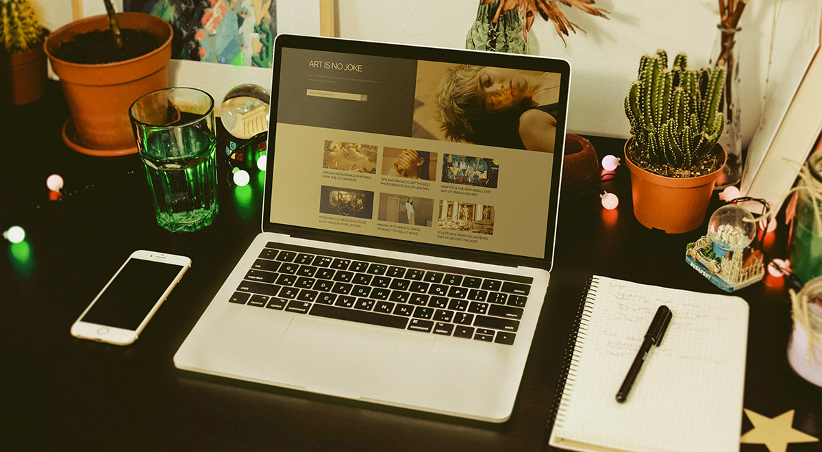
For art and photography blogs, magazines or portfolios, this page can have a lot more involved. Keep a color palette for each element. Why don’t you begin with the Single Image element? Choose the appropriate photo to showcase your site’s personality, and then run with the same color scheme through the page.
If you have a sports blog, create this page to highlight all your significant updates. Choose bold fonts and colors for the titles to show off your content. Write a higher number in the Limit Post Settings of the Flex Block to display more articles.
The sky is the limit. Try it yourself
Capture the readers’ attention through the Latest News Page. With links to your most recent articles and posts, get your audience engaged with your content. Here’s a tip: give each element room to breathe with white space. It’ll come naturally for your visitors to navigate your page. Segment information into sections to get a visual hierarchy and make it more readable.
Gain traffic and push your most valuable content forward with Newspaper Theme. As always, use the comment box below to share your Latest News Page designs! ?








Alexandra,
I am an IT specialist who had retired for about 10 years and decided to come to come out of it.
Now I am starting over and will have to relearn things that thought that I knew.
I study everyday for about (4-5) hours.
One of the best things that I did, back on my journey, was research and buy the NEWSPAPRE THEME!
It is an execentlent produce,
It has reinspired me and made my journey much easier,
Thanks!
Vincent
Hello,
Thank you for your kind thoughts and words! We are delighted to discover that our work it’s appreciated the way you do. We truly value your feedback!
Best regards!