
Are you taking a step towards a brighter future and a better 2020? So are we! Let’s tackle the rest of the year with a positive design project. A color as enlightening and joyful as yellow is the perfect way to start your journey. Let’s dive right in by exploring some of its meanings and associations.
Yellow’s Color Meanings
One of the first cave drawings used yellow paste. Since then, yellow has been incorporated into art in various ways and to describe multiple things. Paintings from Medieval and Renaissance times used yellow to portray outsiders. However, that’s not the only association it has had. Artists like Vincent Van Gogh used yellow to convey light and vibrancy.
During the Age of Enlightenment, bright yellow was seen as light shining down on the people’s minds and bringing about a new age of prosperity, of science. So what does this color mean exactly? Yellow is often associated with joy, caution, energy, optimism, intellect, and loyalty. But let’s explore this further:
- Orange yellows are sophisticate and powerful.
- For a somber and traditional look, brown yellows are perfect.
- Refresh anything with green yellows bursting with stylishness.
- Pale yellows are spring-like and pure.
Color Schemes for Yellow
Knowing the basics of color theory, you might be able to guess some colors that pair well with yellow. According to the Color Wheel, here are some of yellow’s color combinations:
- Monochromatic yellow palettes use the different shades of yellow to bring consistency across the entire design. Use dark, bright, and pale hues to create contrast.
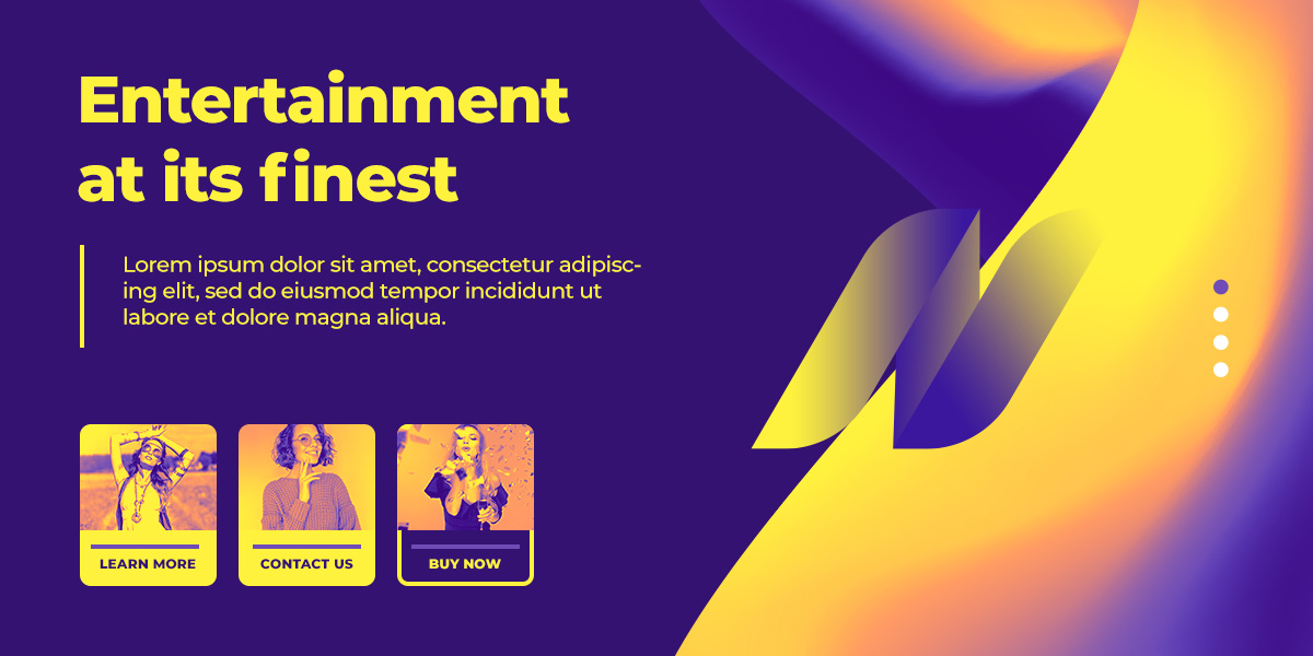
- Analogous color schemes involving yellow rely on its neighbors: orange and green. It’s a fresh and bold way to make a statement.
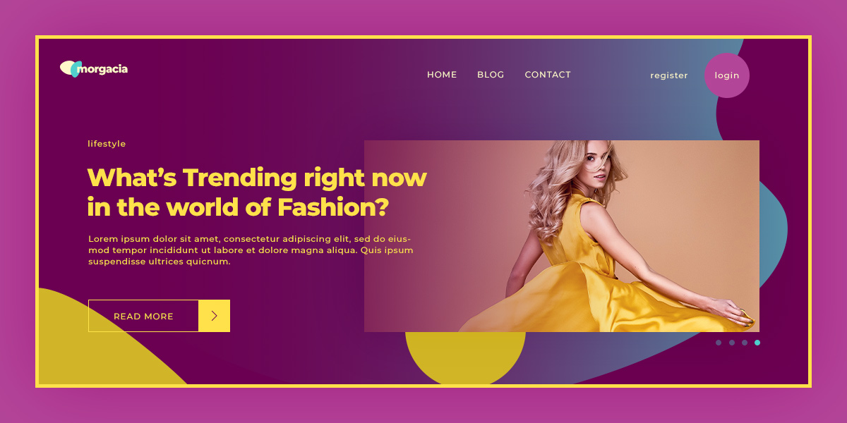
- Purple is the color complementary to yellow. With this combination, anything can be striking and exceptionally beautiful.
- Split complementary relies on a triangle being drawn across the color wheel, its edges indicating this surprising, yet very alluring color combination: yellow, cyan, and red.
- Last but not least, a triadic color palette involving yellow should contain blue and pink.
Knowing what colors go well together can be detrimental to any design project, so choose your color palette wisely.
Design with Yellow
Whether you’re working in a vector-program, painting digitally or traditionally, designing a website – integrating a vibrant and energetic color as yellow should be straightforward. Create the perfect color palette that suits any motif or design idea using Adobe CC. It helps you make triadic, complementary, analogous, and even monochromatic schemes. For more inspiration, there’s also a section to explore other schemes.
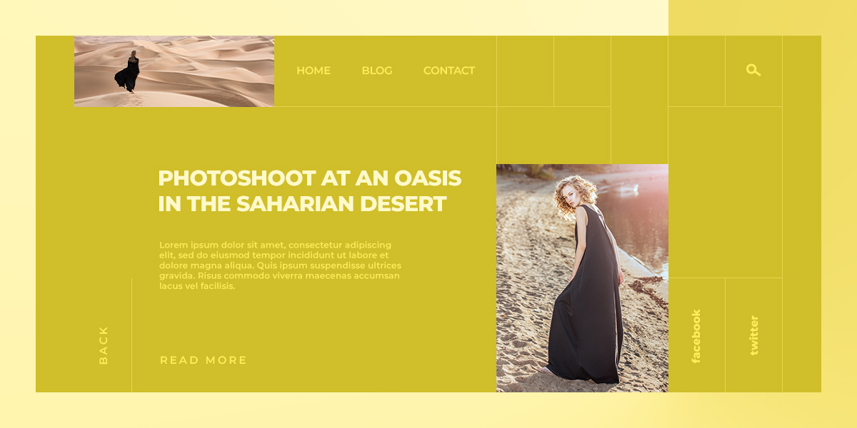
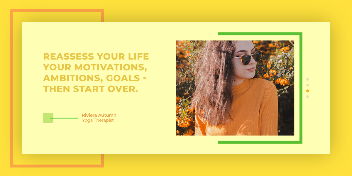
Yellow can be the accent color of the piece you’re creating or the one which frames your composition and brings it to life, working from behind the scenes to ensure your project shines. How do you do that if you’re designing a website? With a theme that lets you edit everything on the front-end, such as Newspaper Theme, you can easily change colors for columns, backgrounds, buttons, and text.
Just click on any element on the page, go to its Style settings, and choose your preferred hues. Create contrast between the text and its background to make sure it is highly visible and legible for your readers. If you’re stuck in a rut, look to your favorite websites for inspiration: how did they incorporate colors in their design? Where did they use it, and how can you do it yourself? Once you have an idea, get creative, find what works best for your vision.
Conclusions
Adapting is the basis of any creative endeavor. Any project undertaken shall be successful if you allow experimentation. When designing with the color yellow, keep in mind its meanings and how they can affect your general audience. What is the core message of the project, and how to convey it? Moreover, what is the driving force behind it? Use those answers to conclude what type of yellow you want to use and what color combination makes the best decision.
If your website uses yellow throughout its design, show us its design in the comment box below. 😀


Seems nice customization.
wow your article so good i am happy and take knowledge article.
I have never used yellow in my website and after reading this post I feel that if I use yellow color in my theme, then I can make my blog even better.
thank you