Ready to start a blog? Become the frontrunner of a locally-brought news source or just share your insights on new technology. Show stories from all around the world with a beautiful website design. Newspaper Theme 10.3.3 released 6 new demos that are meant to stun and wow the audience. One of which is the dark yet cozy-looking PRO demo AmberLight. Let’s explore all that it has to offer and why you should consider installing it on your website.
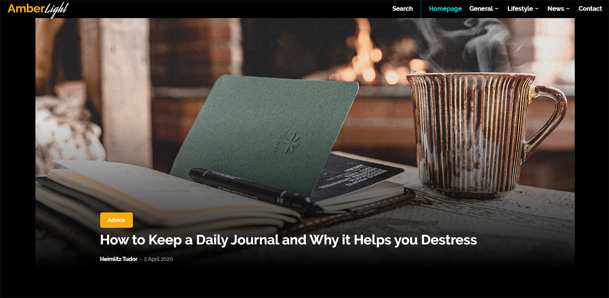
AmberLight: intro
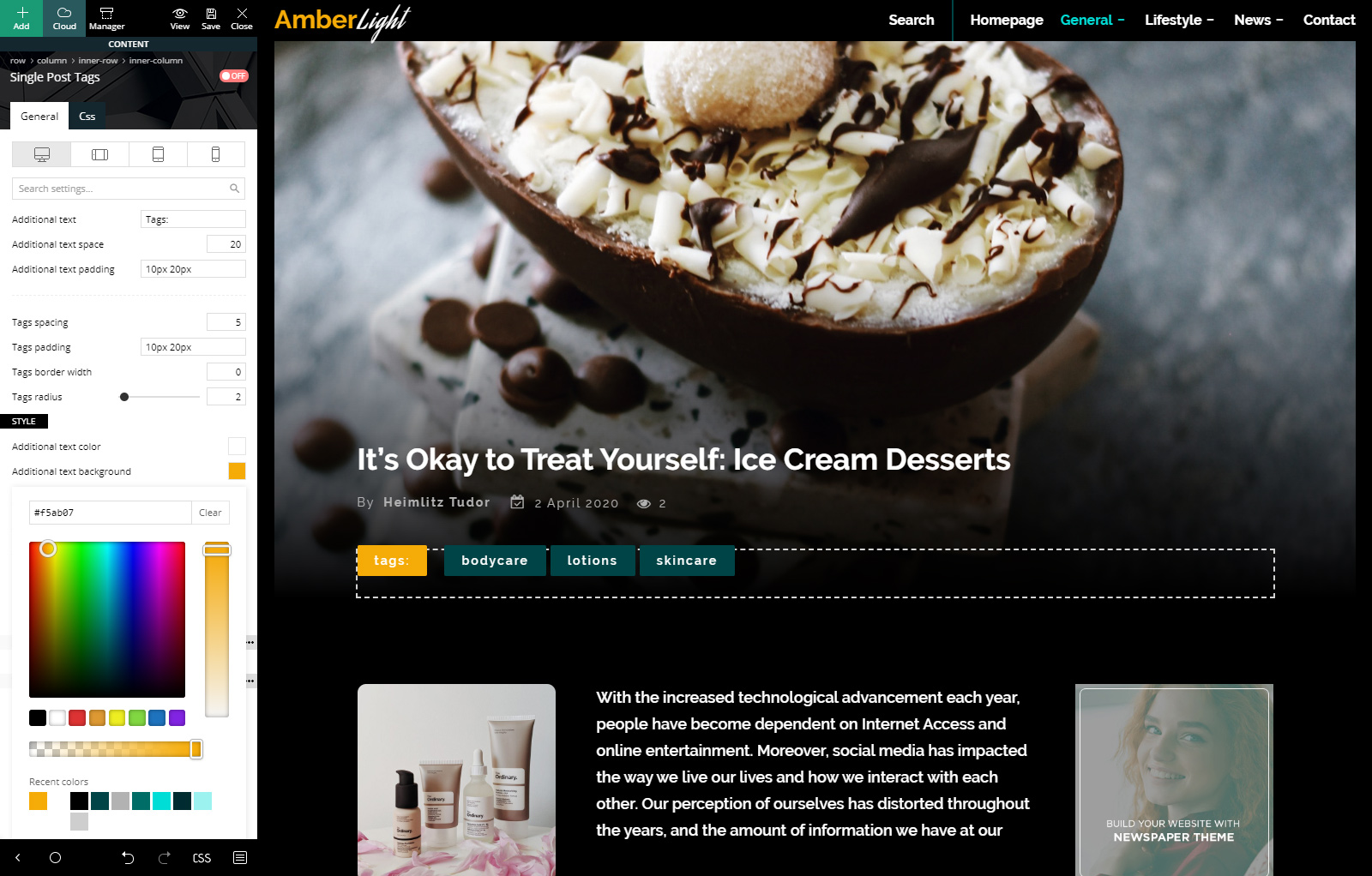
Emboldened by a dark background, the text and images will stand out among each page and template with AmberLight PRO. As such, your blog can deliver the content the viewers want to read in an enjoyable fashion. Combining the warm tones of yellow with turquoise and a dark green-blue, the site gets modernized while maintaining a level of comfort in aspect.
The bright neon turquoise tends to slip on the cyberpunk color scheme and gives the page’s elements a retro-futuristic vibe. Take advantage of this accent color as it seamlessly blends with a website focused on technological advancements. Moreover, the amber hue plays an essential role in warming up the entire layout. Contrasting widely against the cool-shades of turquoise, the golden tones are perfect for any type of blog.
Taking a Dive into the Deep-End
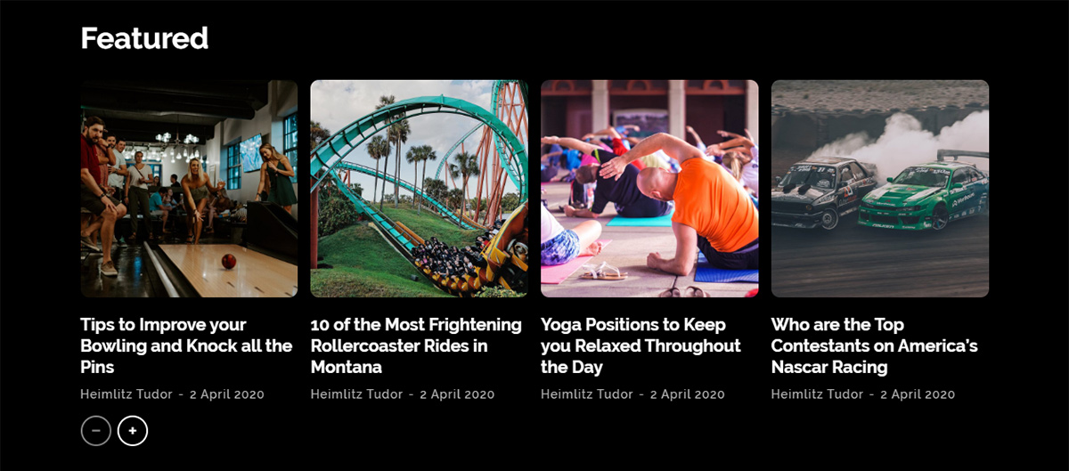
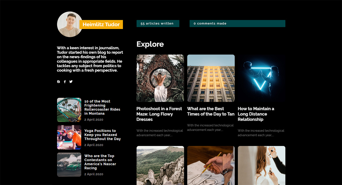
As we’ve previously seen, each geometric shape has its own meaning. Any element that is rounded and has no sharp edges represents harmony and safety. Consequently, AmberLight PRO demo follows that theory as each item has a curved smooth surface. Moreover, according to UX Movement, while sharp corners take away focus from inside a rectangle, rounded corners place the viewer’s attention inside it.
Another different pair, just like the color scheme, are the shapes which appear in the design. Taking away from mathematical equations, we have polar opposites: the plus and minus sign, which are predominant throughout the demo. Of course, the last polarity of the layout is the hover effect of any feature post image, which turns black and white. By taking away the color of the photo, the feature crosses into another contrasting threshold. It marks the dissimilitude between monochromatic and colorful.
Installing AmberLight PRO
When you update the Newspaper Theme to the latest version, you get access to all the recent features and PRO demos. Version 10.3.3 comes packed with 6 new demos, one of which is AmberLight PRO. If you’re new to WordPress, we have a helpful article on how to update Newspaper Theme.
From the Admin Dashboard, go to Newspaper Theme > Install Demos. You can look for AmberLight on the side column, which shows a list of all the possible demos you can install, or scroll down the page to the featured demo image. When hovering over the demo’s photo, the Install button pops up. Moreover, right next to it, there’s a switch that allows you to import the entire demo’s articles, categories, menu items, images, and links.
If your website has no content, and you want to test out how AmberLight would look, install it by letting the demo “Include Content.” However, if you’ve already started publishing articles and posts, flip the switch over to “Design only.” This option installs the demo without actually adding the articles and posts. Because when you uninstall a demo, it will delete all the categories and posts it came with.

Header & Footer
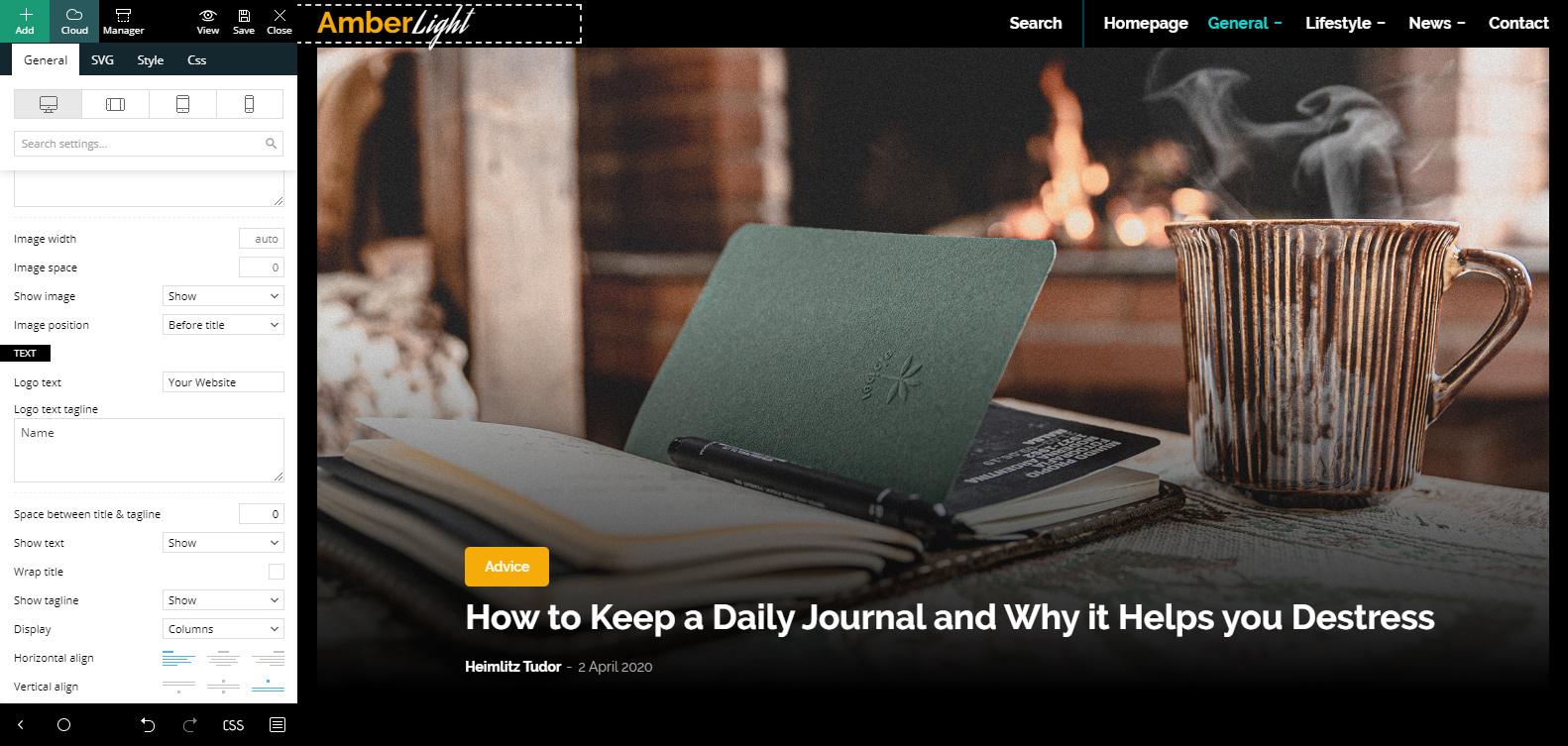
When first installing a demo, you need to make some changes to truly showcase your website. For starters, if you’re new to using the tagDiv Composer we advise you to check out the basic tips and tricks for our frontend page builder. Now open the homepage using the tagDiv Composer and click on the Header Logo. In the General Settings tab, scroll down to the “Text” section and write your website’s name inside the text and tagline boxes. Whichever word you input in the text box will be white, while the tagline will be golden. Upon hover, the colors will switch.
Save the settings. Go to the Admin Dashboard then to > Appearance > Menus. If you have already created a menu with pages, items, categories, and various other links, you can skip this step. If that’s not the case, then start dragging the homepage, and any categories you want to showcase. Make items mega menu elements or even create sub-menus. If you need more information about that, check out our main menu article. Save the created menu, then open the tagDiv Composer on your homepage again. Click on the Main Menu item and choose your predefined menu in the drop-down list.
Repeat these steps for the mobile menu by going to the Website Manager button in the top left corner of your tagDiv Composer and clicking on the mobile view. When you finish, scroll down to the bottom of the page and choose 3 different list menus for the footer. Change your Header Logo here, too, and finally: Save!
Homepage Adjustments
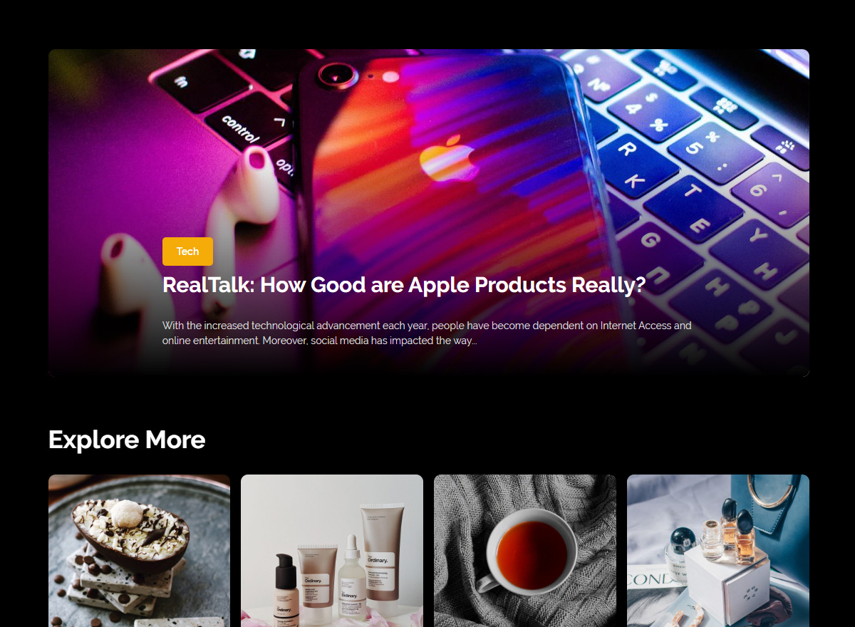
If the frontend page builder is still open on the homepage, let’s take this moment to make some further adjustments. Click on the first Flex Block on the page. When importing the demo, it will display your latest posts but you can go to its Filter settings tab and choose to display a preferred category. The next Flex Block on the page can show a different category, or if you want, just add an offset so that it skips over the first few posts. Go to the General tab and add a number in the Offset Posts box. Great! Now continue filtering the rest of the Flex Blocks for the page.
Let’s take a look at the ad that appears on this page. Click on it and go to the Image Ad tab. This is where you upload an affiliate’s photo. Moreover, copy-paste the affiliate’s link in the Ad URL box. If you want to use Google Ads, go to the Custom Ad tab and input the code there. You’re done! Save the settings.
Templates & Contact Page
The steps you’ve taken above can be applied for the rest of the templates of the website, as well. Edit them by going to the Admin Dashboard > Cloud Templates and choosing which one to start > Edit Template. This should open the template with tagDiv Composer using sample content. If you want a live preview of it, however, just navigate to where it’s used. For example, for single Post Templates, open an article and hit the “Edit Template” button on your admin bar.
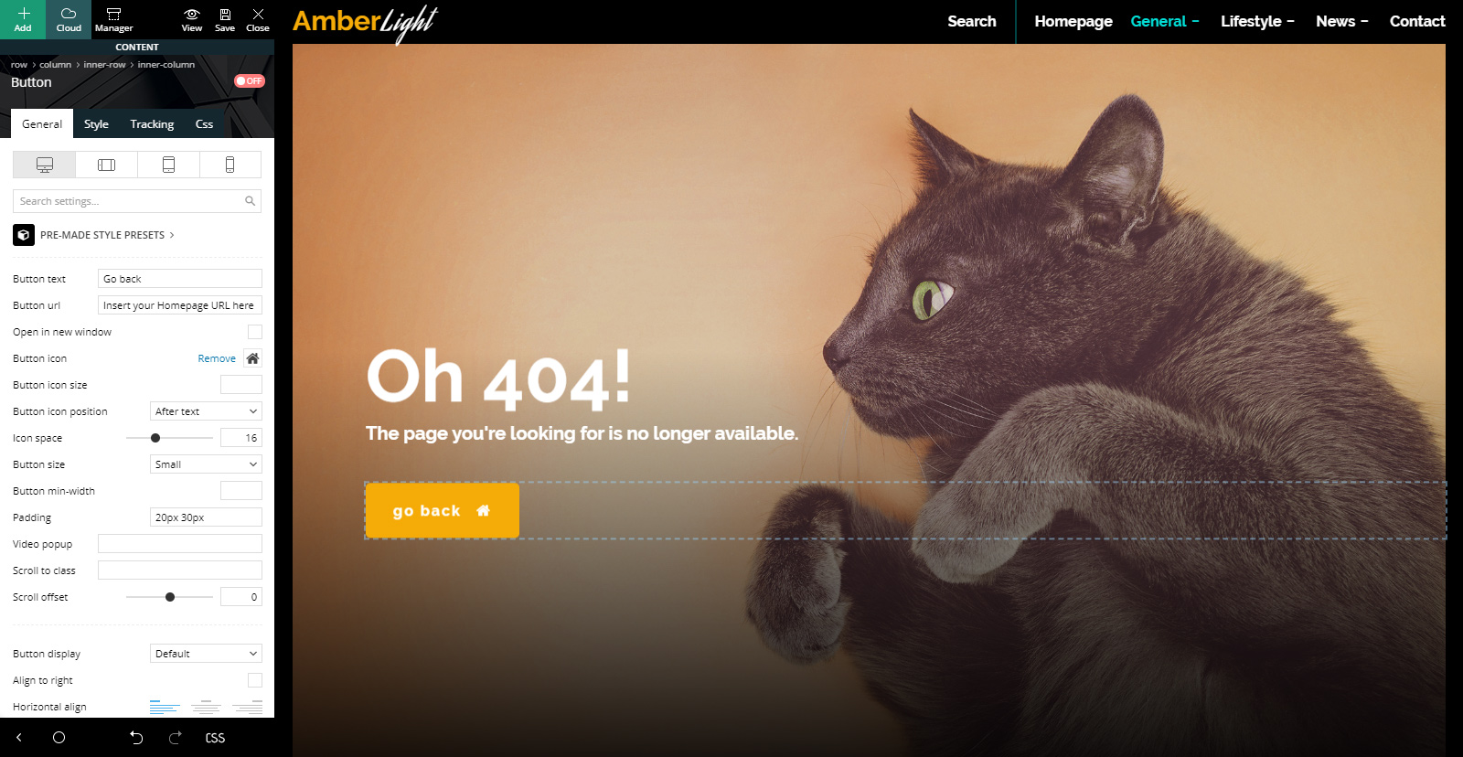
AmberLight PRO has a straightforward and direct layout design. So, all you need to do for most templates is filter Flex Blocks to display different posts and adjust codes for your Ad Boxes. The only template that needs something else done to it is the 404 Template. It contains a button that needs a link back to the homepage. Click on the button through the tagDiv Composer, and go to the General Settings tab. In the “Button URL” box type in your website’s address. Save!
Contact Page
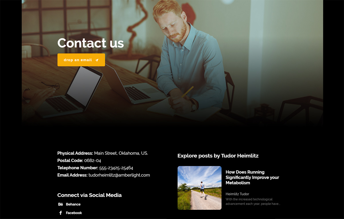
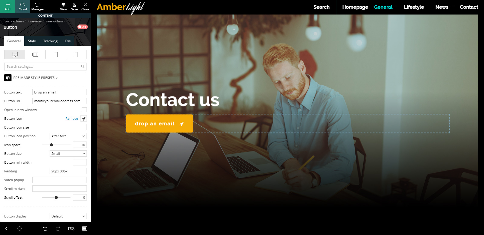
The demo also comes with its very own contact page that you can edit to your liking. Let’s go to the frontend page builder and see what needs to be edited. The first item that needs adjustment is the button: it needs a link just like the 404 Template one. Add a link to your email address using the “mailto:emailaddress” form.
Let’s check out the next element, which is a text element. All you need to do for this one is to insert your personal contact information replacing the sample one. Push the “Edit Content” button from the element’s General Settings tab. Now write your correct addresses and numbers. Great! Right below this item is a social links one. Click on it and add your precise social media usernames.
And last but not least, this element is a Flex Block. Filter it by a favorite category or add an offset to adjust what posts you want to show, and you’re done! Save.
Make AmberLight personal
Just as you’ve made the last few edits to each template and page the demo has, you can make a lot more! Whether you want to adjust fonts or colors to match your website’s core vision or add new images to the contact and 404 pages, the frontend tagDiv Composer builder makes everything effortless and intuitive.
If you already have a color palette you want to stick to, change both the row’s background color and text colors. Links, hovers, buttons, anything can be modified. Just click on any item you want to change and go to its style or CSS tab. In fact, the newest version of the Newspaper Theme has a search bar function. Just type in “color” to see exactly what you need marked by a red dot.
Go through each page and template and gradually turn the demo into something stunning that wows your audience. Don’t forget to save consistently!
Conclusions
Whether you want to create a striking contrast by using AmberLight PRO or just build something new from the ground up, each adjustment made should match your vision. With rounded corners, yellow highlights in opposition to the cooler tones of turquoise, grayscale hover featured images all of these upon a dark background make up precisely what makes AmberLight stand out. Explore each feature, each factor that contributes to it by installing it and showcasing your website down below!









Picture on my header are not responsive on mobile phone…
Hi,
Sorry for the delay. We can take a look at the issue with the image, I suggest to contact us by email at contact@tagdiv.com and provide a link to the website and admin login. I suspect that a specific width and height are set for the image https://prnt.sc/loKsf7gpSk5z and that is what is stretching the image. But we will take a closer look to see what the problem is exactly. Let us know.
Thank you!
hello, how can i change background color in amberlight theme?
Hi,
Unfortunately, there is no such easy method to change the whole body background for that demo. Unfortunately, this account is not assigned to our support forum and that’s why, if you need more technical assistance, you have to open a new support ticket at our support forum from here -> https://forum.tagdiv.com/forum/newspaper/ where you need to provide more details about your problem and we are ready to help you.
All the best!