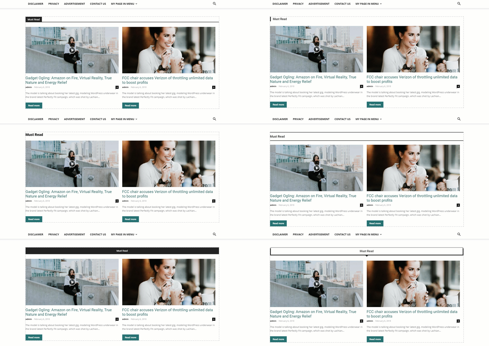
Wouldn’t it be nice if we would never feel restrained by anything, and we could simply recreate layouts or create designs just like we imagined? There are moments when the predefined blocks are just not enough to match everything you have been thinking of. We know. It happens more often than desired. That’s the reason we are now excited to introduce in Newspaper Theme the new Flex block! A block that displays articles without constraints, a block you can customize in detail to live up to your wildest ideas. How do you use it? What does it bring extra to your website? Will it ease your page building process? Here are the answers to all those questions!
The Flex Block is a new type of news block that is available only in the tagDiv Composer page builder on the Newspaper WordPress Theme. It brings extra flexibility and powers up your creativity. With this new feature, you’ll be able to replicate any block you like or create new, unique ones from scratch. No coding skills needed, so all you have to do is play with the settings until you reach the desired form. Let’s take a closer look!
Design without limits
Until now, blocks had settings for style, post category filtering, sort order, backgrounds, colors, and alignment. You used to have a predefined layout of the block in which you could make some small adjustments, and the page template was a combination of blocks and modules. In the version 8.7 of the Newspaper WordPress theme, we are changing all these to give you the absolute freedom to create what you can think of. The new Flex block doesn’t only allow you to adjust fonts on titles, the size of the images, the position of the element, but you can also change the number of columns occupied by the blocks, the number, and style of the elements.
This item allows adjustments that were not possible before and will help you create amazing modules exactly how you imagined them. This is possible because the Flex block overrides the grid structure rules to give you superpowers.
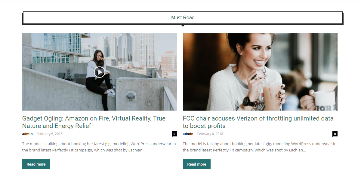
When you drag it into the page, it comes with a predefined layout. We opted for this outline to help you visualize it, but the settings allow you to customize everything. As Flex Block is a tagDiv Composer page builder element, you can customize it on the frontend of your website and see every change happening instantly, right before your eyes. This means you don’t have to be a web designer to create a unique layout and you don’t have to know how to code. Simply, click on the settings, make adjustments and keep the ones you like. You can build a whole page using customized versions of the same element like we did on the Crypto News Demo.Yes, it’s that easy!
The Flex Block settings explained
The Flex block settings are divided into 5 categories such as General, Filter, Layout, Style, and CSS.
The General tab enables you to change the title and URL of your block, and choose from 17 header templates. Also, you can set the title and excerpt length for the posts inside the block, as well as the post number and offset posts.
Good structure leads to success
The Layout tab is where you will find a lot of options that you can use in order to customize every little detail of the module according to your preferences.
Starting with the layout, you’re free to choose how many modules will be displayed in a row. Give your visitors entertaining articles to read, presented beautifully. Furthermore, you have the option to set the modules gap, padding, and bottom space, for a nice display of posts.
The modules divider is basically a line that separates the posts rows, and it can be solid, dashed or dotted. Also, the choice of color is up to you.
Within the Article Image section you can define the image’s size from three standard values (696px, 1068px, 1920px), or select a custom height and width. For an extra touch of style, its position is also changeable (normal, float left, right, or hidden).
Under the Article Meta Info tab you’ll find all the settings related to the alignment, margins, padding of the meta info, and spacing for titles, excerpt, button, as well as borders styles. There are also options to show or hide the post’s category, author, date, comment, excerpt, and the Read More button.
Create your own innovative style
The Style section is dedicated to fonts for every part of the block such as header, titles, excerpt, meta info, buttons, and Ajax categories. For more in-depth information, check out this article.
In the Colors area, you can put your creative muscles to work and change the colors for every part of your module. From title texts, category text, comment text, and button background, everything is customizable!
More responsive than responsive
Wikipedia defines Responsive web design as “an approach to web design which makes web pages render well on a variety of devices and window or screen sizes”. How about making your content and design different on each device without using different subdomains? It sounds great, right? In Newspaper Theme version 8.7 we bring you exactly that.
When you customize the Flex Block, you can change the design of the element by choosing different styles for the desktop, tablet landscape & portrait and mobile. You can access these settings by switching from one device icon to another.
With the amazing Flex Block, we are aiming to give you more freedom and flexibility to build the website that you want. Unfold your creativity onto your pages and amaze your visitors with beautifully designed blocks! For more information, updates, and tips & tricks stay tuned to our blog!


