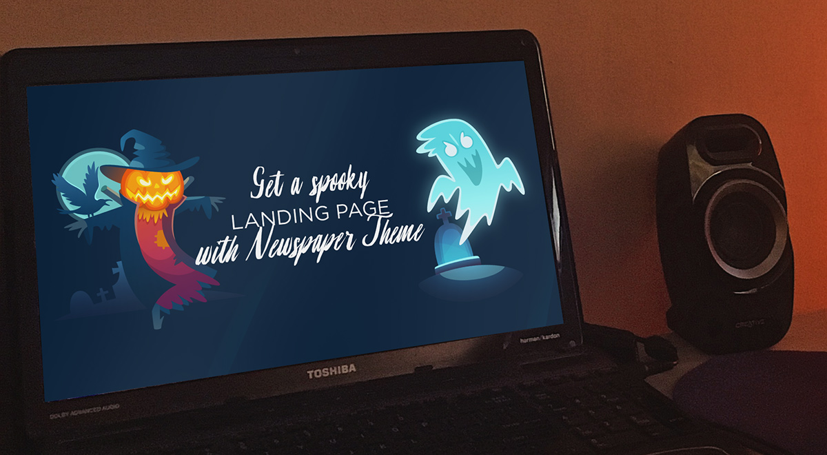
With a single focused purpose, a landing page is what your visitors land on when they click an ad, offer, or call to action button. Each season comes with its trends and marketing opportunities. October is the spookiest month of the year. With Halloween coming up, most brands stir from their standard business path and approach the audience differently. Introduce the users to your offers, site, or blog with a Newspaper Theme seasonal landing page that captures their attention and turns them into a client.
Why a landing page?
An ad click is a split-second decision from the audience. Make it personal and relatable enough that from visitors, they become consumers. With a customized landing page, you do just that. No matter the purpose or intention with the landing page, help your readers discover precisely what they need.
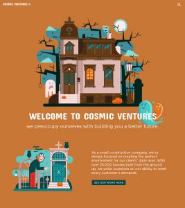
The visitor, upon hearing or reading a promotional offer, trusts your website to deliver on the promises it makes. The landing page is where you make a special offer, a trade, deal, or exchange of information in return for their contact details. Done just right, the potential is vast:
- A boost in traffic for your website
- Increased sales
- Growth in conversion
Newspaper Theme makes it easy to create an eye-catching landing page that will hook each user in.
Let the spooks rise!
Halloween’s just around the corner, with its increasing and ever-growing popularity globally, it is just the right time to spruce things up. Popular brands such as Ford, Oreo, LG have released Halloween campaigns that stuck with the audience for years to come. After all, sometimes, the best way to lure new users in is to give them an original seasonal campaign.
Shine above the competition with a spooky or cute Halloween landing page. Easily show visitors that you can adapt to suit their needs. Before you start, however, do your keyword research. What is the topmost searched for words or queries? Use Google Trends as a helpful tool.
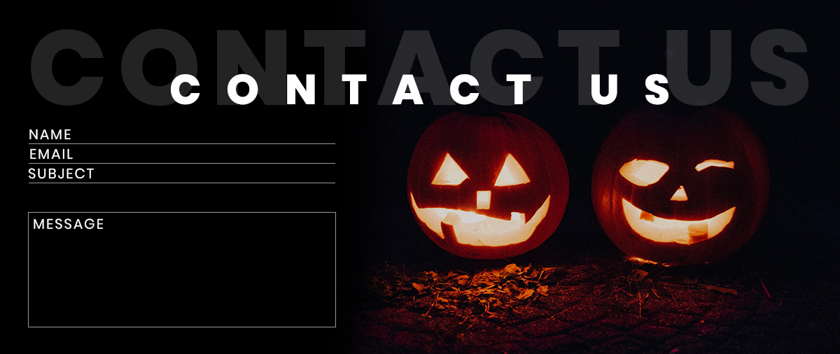
Be relevant and personal
Whether you choose to be different from your usual website’s style or maintain some form of uniformity with this landing page, know the target audience. After all, people care about getting a solution to their problem, so market it accordingly. If you have a news website, create a Halloween landing page to promote your newsletter and bring more readers in.
The tricky part of designing a seasonal campaign is to create something relevant to your product while keeping the holiday spirit. Take inspiration from popular brands such as:
- LG chose to show the realistic display of its technology through an elevator prank
- The Canadian Heart and Stroke Foundation jumped on the seasonal campaign with a scary but informative video regarding first aid in case of stroke
- M&M’s went viral with an Instagram interactive story that urged their audience to decide the faith of its protagonist
- The Best Dog Day Ever event chose a cute one-page layout to show their event’s details
Look for something that fits your brand.
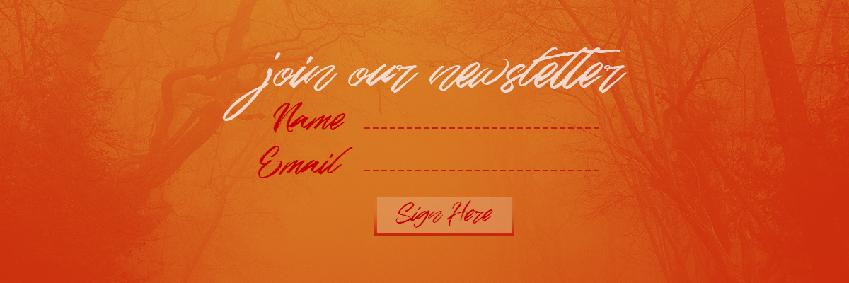
Halloween landing page with Newspaper Theme
With inspiration in mind and a goal set, you’re ready to create the perfect seasonal campaign! Browse through your favorite stock website and choose images that are going to fit perfectly with your idea. Whether it be jack-o-lanterns, spooky scary skeletons, ghosts, witches, zombies, bats, vampires, choose something that fits with the theme.
Open the tagDiv Composer, our front-end page builder, on a new page. Create a simple Header that allows the user to see the logo and your most essential site links:
- The Homepage
- Blog
- About
- Social Media
If you’re going for a full-screen background, make an Overlay Header to lay on top of the background image. Make a full-screen background by going into the CSS tab of the row’s settings and uploading your photo. Then choose from the General tab the “Stretch row and content” from the drop-down menu.
Content ghosts
Add a Column Title and an Inline Text element to describe the landing page’s purpose. Invite them to further explore the page by creating a second-row beneath dividing it into two columns. On one of the columns, add an image, and on the other, write a message to convince people why your website is right for them.
For example, if you have a news website, tell them that it always delivers the most accurate reports and it’s always up to date. Convince them through a real and genuine argument. Showcase this through a Flex Block, displaying your latest articles and news posts.
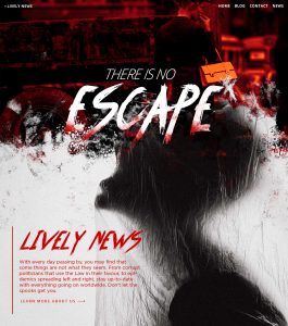
Add more spooky elements to the page through the Image element. Adjust the padding and margin to the item so that it appears next to an element as a ghost. Try to include references in your text to the Halloween customs and its associations. However, make it blend in seamlessly with the rest of your message. Drag and drop buttons into the layout to create beautiful call-to-actions and urge the visitors to convert. The last step is to change the fonts and colors of each element to fit in with the theme. Browse through the available fonts from Newspaper Theme, create a beautiful color palette, or get inspired by the Halloween ones offered by Adobe CC. It’s easy! Just type out the term Halloween and browse through user and author made color schemes that have a HEX code you can copy straight onto your website.
Boo your inner critic away
With a great idea in mind, you can achieve anything. Don’t let your inner critic get the better of you. Newspaper Theme’s easy drag-and-drop front-end page builder helps to create any layout desired for any page. Blend everything seamlessly with the Style tab settings. It’s the month where everything ghostly and dreary rises and haunts the earth, so why not celebrate it along with your followers? Remember that a well-made seasonal campaign’s purpose is to convert readers into consumers and also to make your brand appear relatable. So, start editing, start creating, start designing!
Show us the results of your efforts in the comment box below and tell us about your own experiences with Halloween in your country!


