We all know that high conversion rates are a website owner’s dream. But how do you convince people to take action?
Some say it’s the psychology of colors, others that it’s about the structure of the page, the clever words you put on it, or maybe all of them together. We believe that the essential thing is to manage to combine them all in a compelling way.
Yes! For this reason among others, we all love the Call-to-Action buttons. These are the elements you can easily implement on your website and landing pages to guide the users towards your goal conversion. Beautiful and distinct, the “call-to-action” are those buttons that users feel the need to click in order to take or complete an action. And you are right there to give them exactly that. It seems easier to say than do? You’re mistaken. The CTAs are flexible and vary in style and size, easily adapting to your goal conversion and website style.
You can start building a strong CTA message with Newspaper’s tagDiv Composer page builder. You will find the element in the Multipurpose section. Drag and drop it on the page, and you can start customizing it from the 3 tabs –General, Style, CSS– with neatly organized options.
For this element, in particular, the General tab contains settings for the title text, its size, and the description text. It also comes with a useful feature that helps you with your SEO efforts. You can emphasize the importance of your title by associating it with one of the H1 to H4 tags.
Next, there is a section dedicated to the button’s settings, such as text, URL, icon, size, and others. The last field is about the layout, and it refers to the alignment of the text & the button and how they look together. You can also flip the content, by changing the button’s position from the right side of the text, to the left.
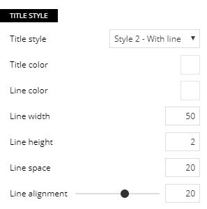
The Style tab is where you can give a touch of magic to your call-to-action as it empowers you to add colors, shadows, spaces, and more. To reach the website goals, you must explore this section. It’s designed to be intuitive, and with every change you make, the particular settings will diversify, unveiling more options.
The Newspaper Theme call-to-action element has 2 styles that you will surely like and use with pleasure:
Finally, the CSS tab gives you access to make advanced style customizations, like modifying the padding, margin and border space, border radius, width, and everything about the background that you might want to change. For a touch of individuality, feel free to play with the color overlays, gradient direction, or background images.
When you finished this creative process, the customization tab allows you to save the design as a shortcode. This way you can later find it within the tagDiv Composer and use it again without spending additional time on design.
Your CTA needs to make visitors want to click, so give them a compelling reason to do that!
P.S. Don’t forget to check our blog for more articles!


Hi,
Call to action template is not displaying on smartphones. How can I solve this ?
Hi,
From what I see it looks like you placed the call to action element in the desktop header. The desktop header isn’t displayed on mobile, not just the call the action. If you want it in the mobile header as well, please place the element in it https://prnt.sc/1nFarUzCFATZ Let us know if you have more questions, you can always create a new topic in the theme support forum https://forum.tagdiv.com/forum/newspaper/
Thank you!
I can not change the CTA button link for each single post, it’s template application for all my posts!
Hi,
Thank you for reaching out. As the Blog is not assigned to the Customer Support Center and you need assistance, please let us know at contact@tagdiv.com or open a new topic in the forum.tagdiv.com. We’re looking forward to helping you! Have a lovely day 🙂