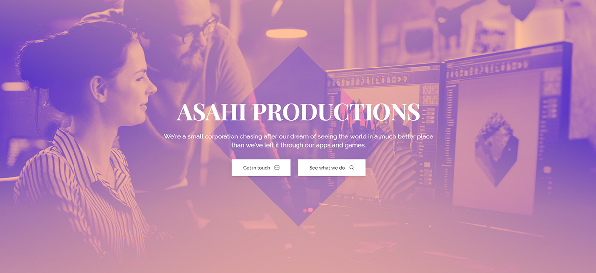
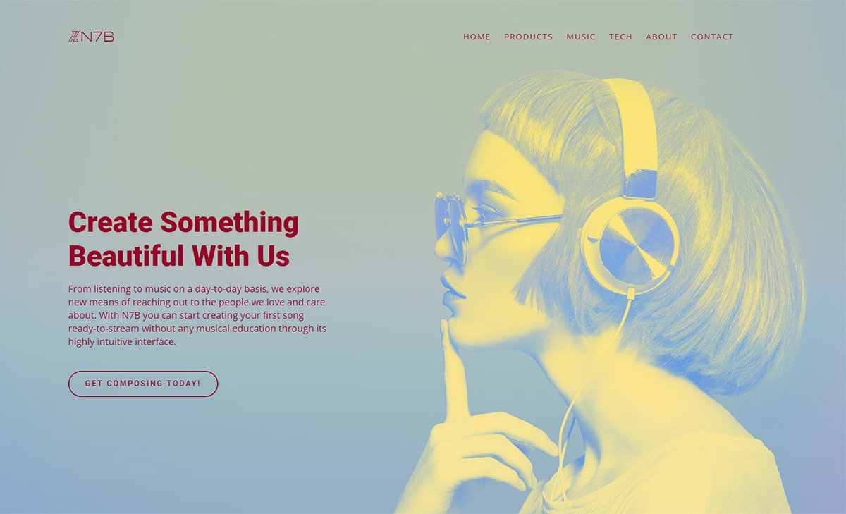
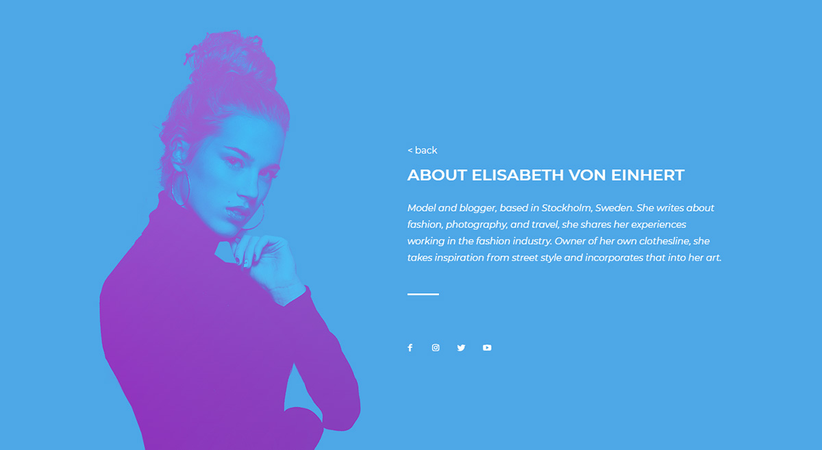
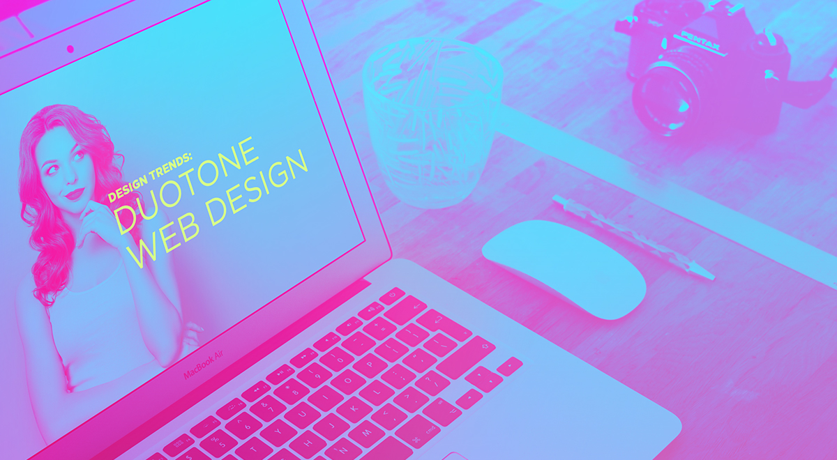
Are you looking to redesign, bring color, and spice up an already-existing page? One design trend you could use is to give the images on the page a duotone aspect. Combine two colors to create a contrasting effect and give the page the attitude it needs. Make it radiant, delicate, subtle, or bold – using the versatility of duotone web design to create a lasting effect in the readers’ mind.
What is the Duotone Web Design?
Photography used to lay one color halftone over another to bring out the middle tones and highlights of any photo. Traditionally one halftone was black while the other was a different color such as blue, or yellow; however, there are many varieties of color combinations. A photo created with this method was known as a duotone image.

Since then, it has evolved into a web design technique. One of the most popular sites to ever use Duotone Web Design is Spotify. From its homepage, login, and even artists’ pages, you can see images in two-tone colors. Pantone also used a pair of colors for its “Color of the Year” which made the blending of the colors reflect the minimalism of its time.
With a duotone image as the background for a page or section, you can make the content pop out. Just use a different color for the text, and it becomes readable no matter its location on the page. With this method, the website can be equally engaging visually for both your designers and audience.
How to create a Duotone Web Design with Newspaper Theme
First, decide on the picture you want to turn duotone. Select a high-quality photo as blurry images tend not to work well. Then, choose two colors for the pair. Think about complementary colors: red – green, blue – orange, purple – yellow, and so forth. However, don’t let that prevent you from picking colors you enjoy or that depicts your branding.

Using an image editing program such as Photoshop, you can add a gradient map with the selected colors on top to achieve the effect. If you don’t have such a program installed, use an online website that does the job for you. Now, imagine the place you want to set the photo in: do you want it as a background or as an element in a box? Crop and resize the image accordingly.
Get Creative
Open the tagDiv Composer on a page or Template. If you want the image to be set as the background, select a row and go to the “CSS” tab. Then upload your photo in the Background section. Adjust the padding to the row and add the elements:
- Column Title or Title
- Column Text or Inline Text
- And a bold call-to-action.
Choose the typefaces to fit with the overall mood of your message and image. Then pick a color to contrast well with the background. Whenever you design a duotone page, template, or even website, work with a palette of colors and maintain it on each element.

You could also insert the photo through the “Single Image” element and change the background color of the row so that it blends perfectly. Divide the row into 2 columns, and write your author’s name, description, and social links on the second column.
Another easy way to get a perfect design is to add a “hero” element at the beginning of your page. Select the image from the “General Settings,” create the text and page name, a stylish button, and you’re done!
Duotone Web Design & You
Don’t be afraid to go out of your comfort zone when it comes to working with Duotone Web Design! Your content pops against a high contrast image and makes text easily readable. The end goal is to create an exciting and appealing visual that demands attention from your readers.
Have you created a Duotone Page or Template with Newspaper Theme, yet? Show us your results in the comment box below!


Awesome, post. It inspired some ideas for my next project. Thank you! 🙂
Hi,
Thank you for your feedback.