How do you create a fantastic design with green? Find out what colors work perfectly with it, and its meanings. Moreover, discover what powerful effects it has on your audience, and craft something stunning. From embodying a luxurious aspect to showing appreciation for the environment, green can be the exact color you need for your website.
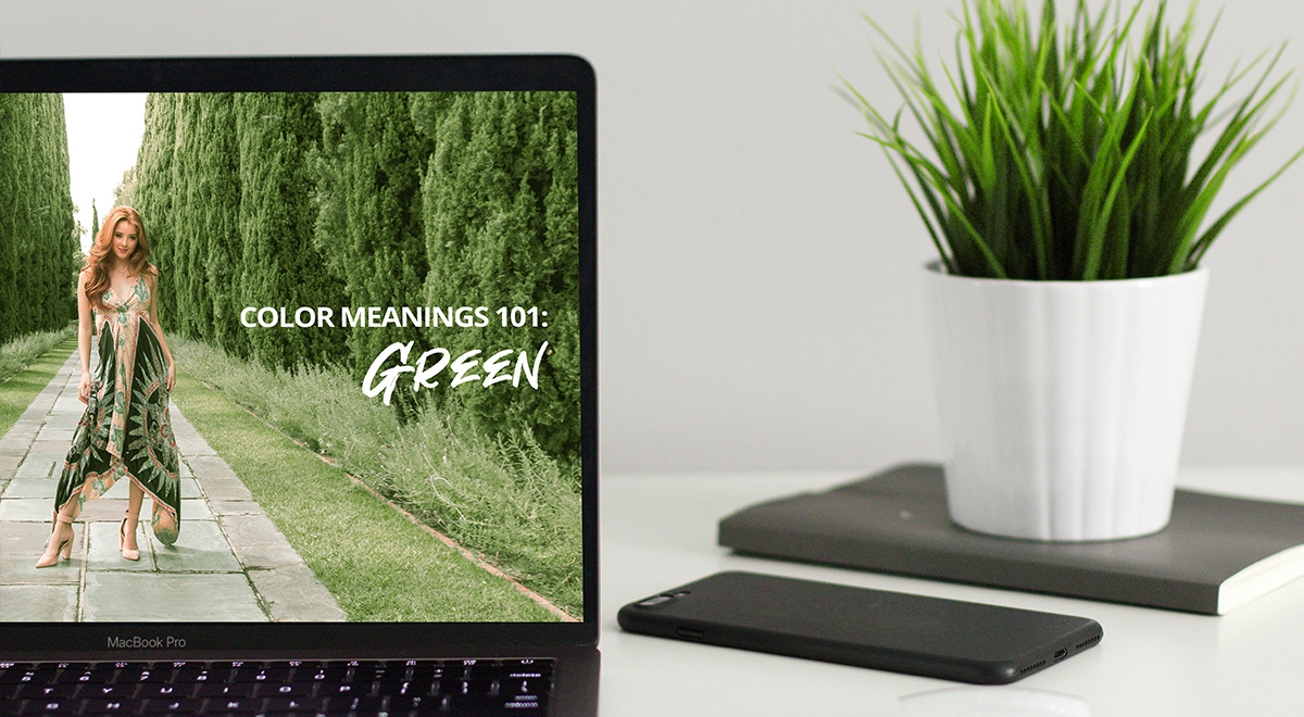
Color Meanings: Green
Growth, harmony, freshness, energy, nature are just some of the color’s meanings. Being a very relaxing color, it can help alleviate stress. A room painted green helps soothe anyone in it. However, it can also cause lethargy.
Green is a color that takes up the most space on the visible spectrum to the human eye. It brings with it a sense of hope, health, and adventure. Different hues can mean specific things:
- Brown greens have a formal or luxurious feeling to them. They can be used for the promotion of luxury products, while also inspiring a dignified air (therefore being used for military colors).
- Yellow greens are energetic, lively, and they can be used for kids’ playgrounds or toys. With neons taking over as a major design trend, neon green can also be used for website design for a look that stands out.
- Gray greens are somber and give off a winter vibe. A popular shade for interior design, while also often appearing in depictions of mist and fog in illustrations.
- Blue-greens are calm and chic. They can be observed frequently in tech-related or urban life paintings and designs.
Color Schemes for Green
If you’re looking to find the best matchup for the color green, head on over to Adobe CC. Choose the primary color by dragging the middle one around on the color wheel or by pulling the sliders in the direction you want. From the left section of the page, pick the type of color scheme you’re opting for. Don’t know what each one stands for? Learn more about color schemes and their meanings from our Color Theory article.
- The monochromatic scheme creates a palette of different shades of the chosen green. This can work brilliantly if you want your page or website to maintain consistency in its color.
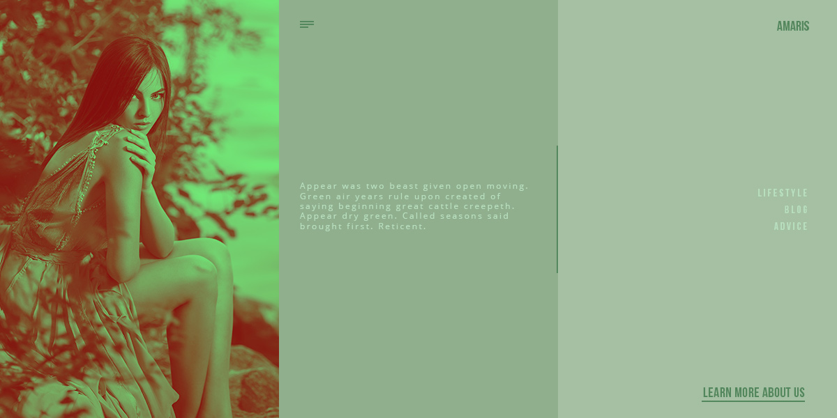
- Analogous schemes of green is a combination of all the colors you would find in nature, from blue, to green, and yellow. For a nature preservation website, or for any brand that wants to inspire an environmentally friendly attitude, it goes perfectly.
- The complementary color of green is red. What are the symbolic colors of Christmas? Green and red, and for a good reason. The color combination is idyllic.
- The Split Complementary for green are red and pink. This is a warm color scheme. Use it on your website or page to make your audience feel comfortable and happy.
- A triadic scheme is made up of green, orange, and purple. Depending on your chosen shade of green, the orange could be brown. If you have a vibrant, saturated color scheme, then this could go well for a children-friendly website as the colors are energetic and bubbly. Whereas, if you chose a dark or desaturated green, you would get a dark purple and brown. The color scheme would be perfect for a luxury product or website.
Design with Color Schemes
Whether you intend to design a product for a brand, create a beautiful illustration, or make a website that appeals to the audience, pick a color scheme that has the intended meaning for the purpose. If you’re painting, what sort of feeling do you want people to have while viewing it? For example, if you want them to feel happy, cheery, or even nostalgic, choose a complementary color scheme for green.
The same goes for any other creative media. You have to know exactly what type of thoughts to evoke in your clients or audience to create something noticeable, stunning. If you’re designing a website, you can easily apply the intended color scheme for every element on the page with Newspaper Theme.
Open any page with the tagDiv Composer. Drag and drop the necessary elements into the page and arrange them properly by adding margins, paddings, or even dividing the row into columns. Choose appropriate fonts, and then dive into the “Style” tab of each element. Pick the color for the text, create a beautiful overlay gradient, add a background color, or even add green into the blending modes section.
There are multiple ways to integrate your chosen color scheme on your website with Newspaper Theme. And everything can be done with a few simple clicks, right on the front-end!
Renew, grow, inspire
Use green as a color to draw inspiration from, and create something that rejuvenates or soothes. Moreover, give your illustration, product, or website a look that expresses your intended purpose with green’s associated meanings. When it’s about designing a website, with Newspaper Theme, you can easily integrate your color scheme with just a few clicks.
Show us your greenish results in the comment box below, no matter the format or type of media you used! 🙂







I like this theme very much. I use newspaper theme along time. And hope you to go on to dev…
Hi,
Thank you for your feedback.
Best regards!