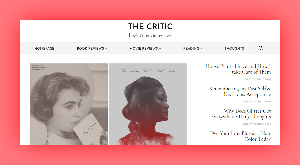
One of the demos to come with the 10.3 update of Newspaper Theme is The Critic. A review blog destined for book or movie lovers all over the world. Moreover, it leaves a lasting impression with its portrait-type flex blocks, its wide layout, and the covers and posters for each of the reviews. With a review system implemented in the articles and posts, the demo is ready to be imported on your website with a single click.
The Critic: intro
The idea behind the creation of this demo was a review blog. That was how it started. It first needed some realistic book covers and movie posters. Each one designed in Photoshop with immense scrutiny to make everything blend in with the theme. After the images were crafted, a rough layout plan was sketched out.
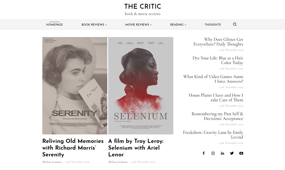
One of the main aspects of the demo had to be the portrait-type elements with plentiful white space between each. Simplicity was the key. All the fonts were chosen with this in mind: a sans-serif and a serif, Josefin Sans, and Cormorant Garamond, respectively. Cormorant Garamond had been the perfect choice to reflect the appearance of printed books, which often have a serif font for their text. Josefin Sans, however, had been picked in part due to its modern character. A blend of old & new.
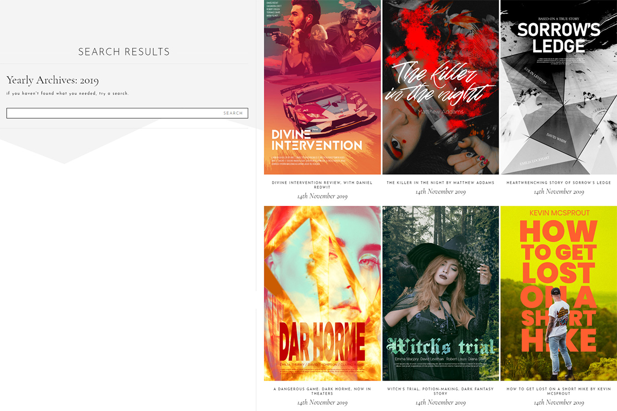
Each article was based on its already predestined book cover or movie poster. For Book covers, the genres being Horror, Comedy, and Romance, whereas, for film, it was Action, Drama, Fantasy, and Sci-Fi. To faithfully portray each genre, a number of 5 covers, respectively posters, had been designed.
Simple & Sweet
Between the various grays used on each page and template, the accent color is a peach pink. It is the drop of warmth necessary to brighten and attract the attention of your viewers. Moreover, to guide the audience along the page, 1px borders have been added to columns and rows – divide, guide, and emphasize.
Each template, in turn, receives these characteristics, wide layout, sticky columns, guiding lines, and a pleasant bit of warmth between the shades of gray. In fact, to go along with the theme behind this demo, as a review blog, the book and movie review posts have a rating from 1 – 5 stars. This way, when you import the demo and finish writing a review, you can also display the grade given to it.

The Critic: installation
To fully enjoy the benefits of this demo, you first need to make sure the Newspaper Theme is up-to-date. This PRO demo comes alongside the 10.3 update to the theme. If you want to learn how to update, look at our helpful guide here. When you’re done, just go to the Admin Dashboard > Newspaper > Install Demos. Scroll down to find The Critic demo in our list, and pick the installation choice:
- With Content – if you choose this option, you get the entire demo’s design and the photos, covers, posters, that are included. Moreover, all the posts come with it. This option works well if you’re starting a website from scratch and would like to experiment with the design before adding any posts. Remember that the posts and images are removed if you uninstall the demo.
- Design Only – you get the templates, headers, footers, without the posts and images. In fact, all the flex blocks then display your own crafted posts. This is perfect for someone who has already filled their website with content, and just needs a redesign.
Click on the switch to alter your preferred option and then hit the Install button. That’s it. You’ve imported The Critic demo design!

Adjustments & menus
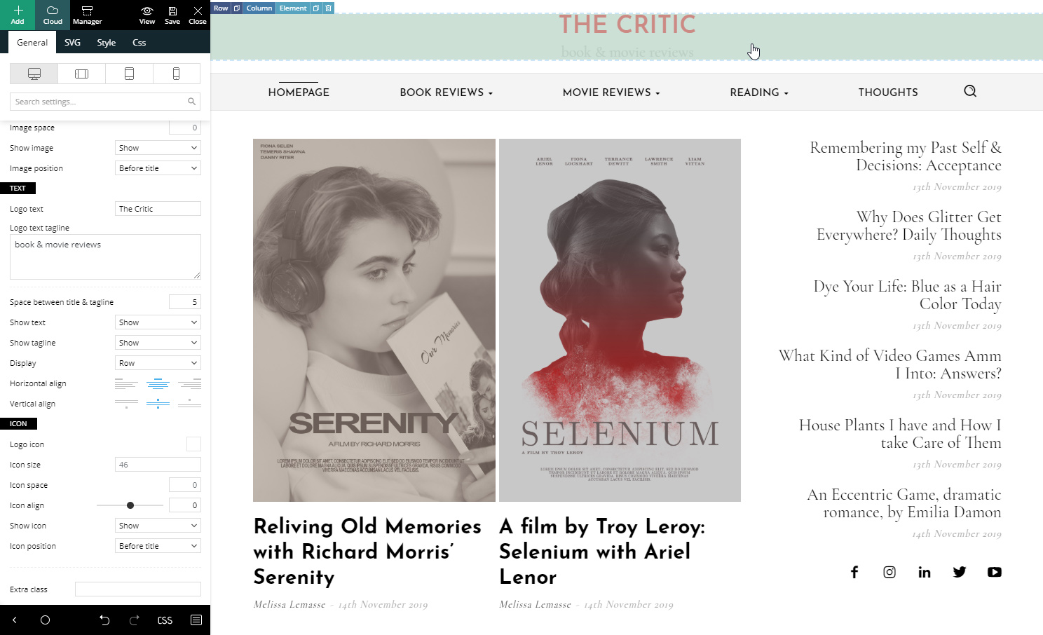
Don’t leave; there are a few more things you need to do. Open the tagDiv Composer on the new Homepage. Now click on the Header zone and the logo. Replace the text with your website’s name and a short tagline. Great! Now click on the small “Manager” icon next to the save Icon of your frontend page builder. Change the logo’s text for each section of the Header. Now hit save!
There’s only one Header Template for The Critic, so once you change it here, it’s applied site-wide. Now click on the menu element. If you have a custom-made menu, you can change it from the dropdown menu of the General Settings. Or, if you want to create a custom menu, then save the settings and go to the Admin Dashboard > Appearance > Menus. Build the new menu by adding page links, categories, and then arranging them in the preferred order. When you’re done, go back to the Homepage. Pick your newly-created menu for the element. Save the settings!
Homepage changes
The first row of the Homepage should have 2 Flex Blocks and a Social Icons element. Click on the Social Icons, and add links to your Facebook, Youtube, Twitter, and anything else you may need. Let’s move onto the Flex Blocks. To have them display different posts each, you need to either filter them by category, tag, author or to add an offset. Open the General Settings of the element, and under the Extra section, add a number in the “Offset posts” box.
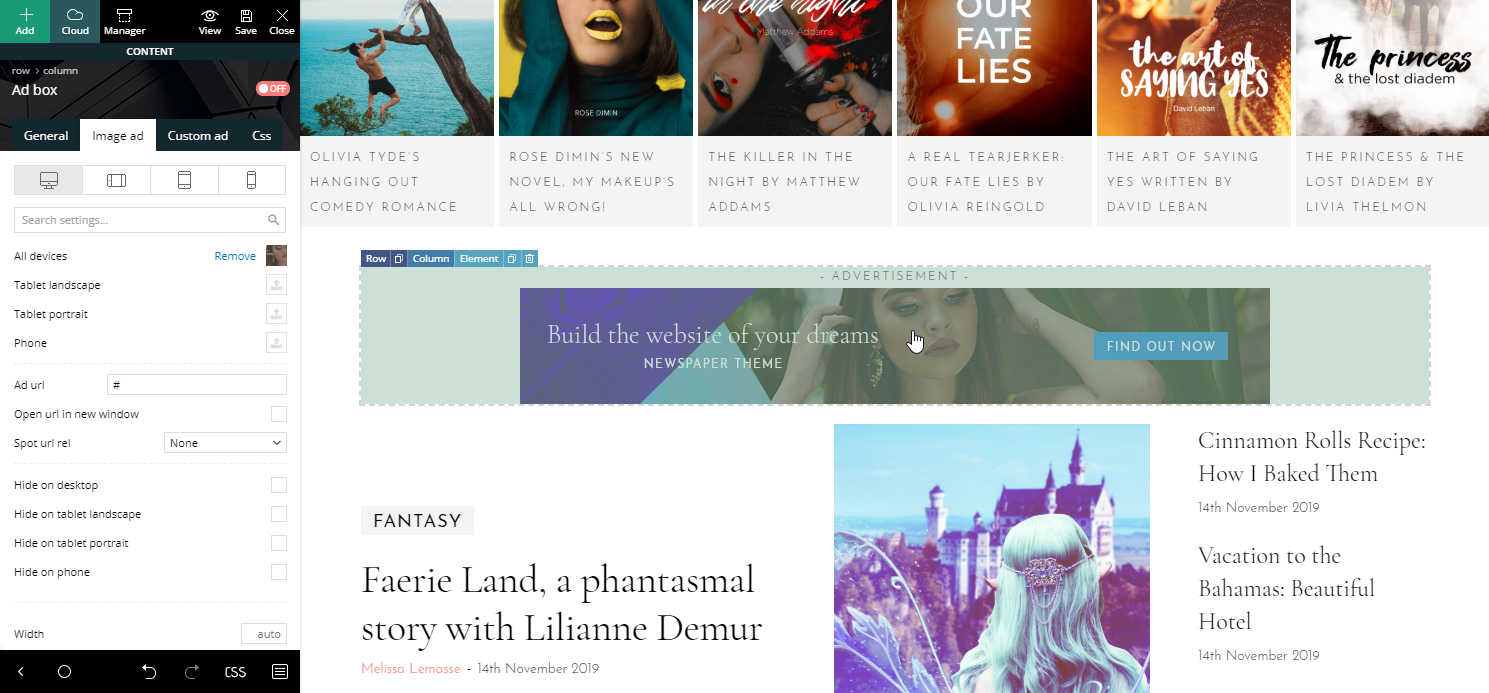
The next row contains a text element which can be changed to reflect something else. Add your text to it. Likewise, a wide row follows this with a Flex Block in it. Alter the articles that are being shown by adding a filter or an offset. Next up is an Ad Box element. Write your Google AdSense code in it, or link to your affiliates and upload a dedicated photo.
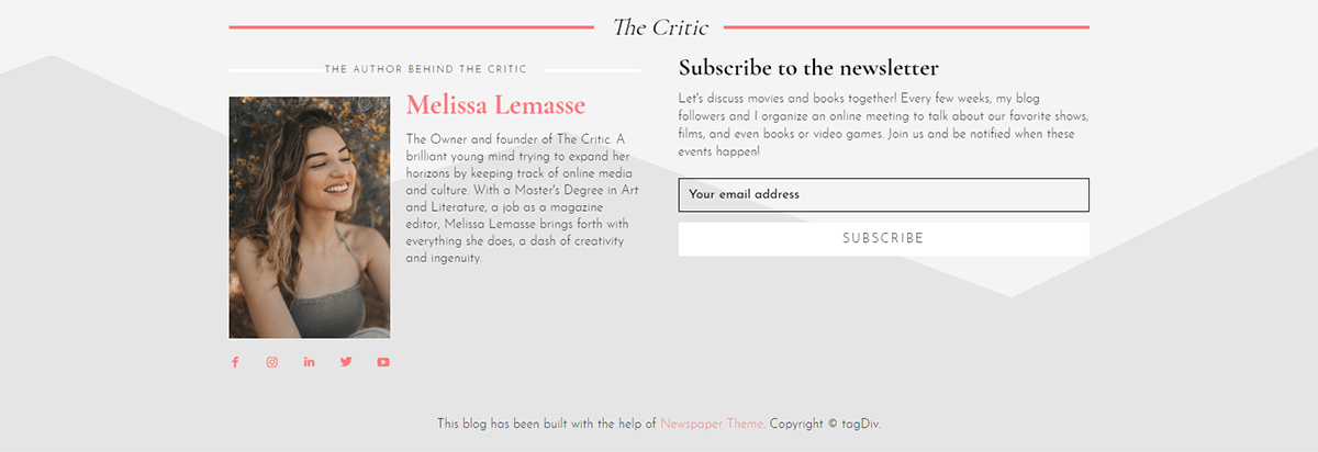
Apply these steps for the rest of the page. The same goes for the Newsletter box. Add a Mailchimp, Mailer Lite, or Feedburner code. Great! You’ve arrived at the footer zone. You have two footers with your demo import. One that should be for your Author page, however, let’s get to editing. Add social links, Newsletter code, adjust the Copyright code to match your website’s name, and you’re done! Save.
Moreover…
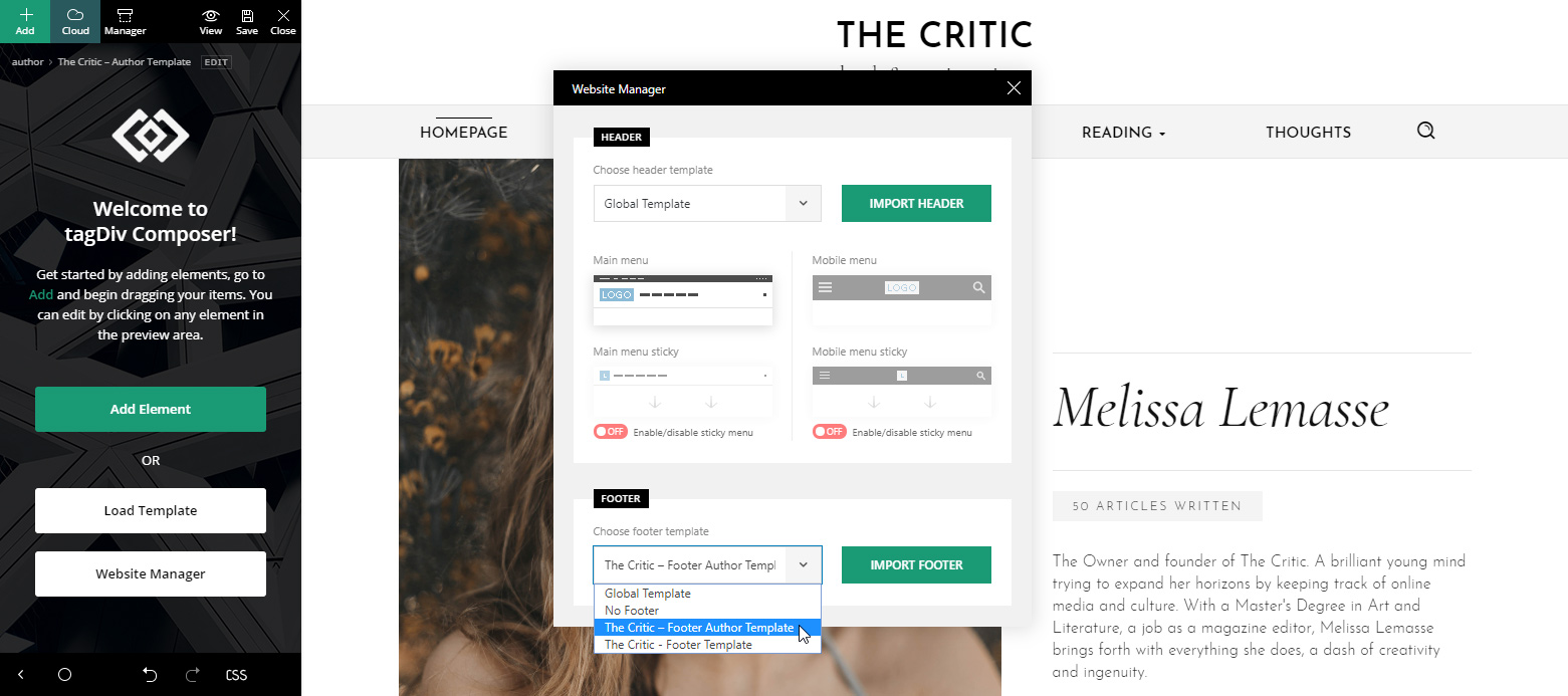
Let’s travel to the Author page. Open the Website Manager window, now under the footer section, choose the alternate The Critic footer. Great, you’ve managed to assign it to this template! Now modify the text, the links, and the subscription code. This is an extra step that adds continuity to your website as the footer changes and shows a different side when you’re on the Author page.
The Category Template has a few text elements that can be changed to display a different message. Travel to one of your Categories, and then open the tagDiv Composer on it. Create a new text to greet the viewers with. Do the same for the Ad Box element. There’s another Ad Box element on your Posts Template. Don’t forget to change that, too!
Save the settings. Let’s travel to the 404 Template now. Some texts can be adjusted here also. The same goes for your tag, date, and search Templates. Just open the tagDiv Composer on each one and alter the text to reflect your website’s core ideas.
Make the Critic demo yours
Just as you’ve edited texts, links, and subscription box codes, you can now fine-tune the demo’s design. Drag-and-drop new items into the page or template with Newspaper Theme’s frontend page builder. Moreover, there’s no limit to how much you can change. From font typefaces to colors displayed, paddings, borders, margins.
If you want any element from any page or template moved, all you have to do is drag it to the position you want. Now scroll to the various devices to see how it looks on different screens. Adjust its padding, margins, size. Create something beautiful that amazes your audience.
Final notes
As with each demo that comes out, every element can be altered to display or show something entirely different. If you’re feeling uninspired, then there’s no need to worry about changing the website’s design as The Critic demo comes entirely responsive from get-go. However, if you’re feeling creative, then drag, drop, modify, and design anything that fits in with your website’s style and vision. Make it useful, easy to navigate, and the audience will enjoy every minute spent reading through your content.
If you’ve imported the new demo, have you taken the extra steps to make it yours? Or have you just adjusted the items and embraced it as it is? Show us your website design in the comment box below.








Thanks for creating such a nice theme. Newspaper has always being a top choice for me.
But am wondering if I can use two demos at the same time on my blog courseadviser.com.ng ?
Hi,
Thank you for your interest in our theme and our demos. Yes, please note that you can use our demos at the same time on your blog but please note that we strongly recommend importing your desired sections from our Cloud Template Library. Check the guide from here -> https://tagdiv.com/category/documentation/cloud_library/
All the best!
Can we get an option to edit the hamburger menu layout in next updates in mobiles responsive site? We should get some options to choose from.
Hi,
Please note that you can edit that button and section is you will use the Header Template functionality, according to our guide from here -> https://tagdiv.com/newspaper-theme-customize-the-header-manager/ If you need more technical assistance, please open a new topic at our support forum from here -> https://forum.tagdiv.com/forum/newspaper/ and we are ready to help you.
Best regards!
Nice theme. We needed some portrait thumbnail options.
Hi,
Thank you for your message! All the available thumbnails in the theme can be found here -> https://forum.tagdiv.com/theme-thumbs/ If you need more technical assistance, please open a new topic at our support forum from here -> https://forum.tagdiv.com/forum/newspaper/ and we are ready to help you.
Best regards!
Hello there,
Thanks for creating such a wonderful theme with so many wonderful demos along with. I’m suggesting if you can add e-commerce functionality in your theme then it’ll be great.
Thanks & Best Regards
Dharmendra Rajput
Hello,
Thank you for your feedback. Please note that our theme is fully compatible with WooCommerce which allows you to use the e-commerce functionality of this plugin. If you need more technical assistance, please open a new topic at our support forum from here -> https://forum.tagdiv.com/forum/newspaper/ and we are ready to help you.
Best regards!
I look forward to this update, thanks