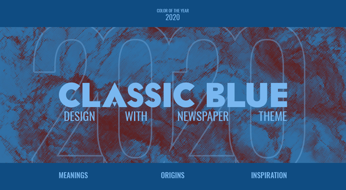
As with every year that comes around, a new attitude begins to bloom. Influenced by a wave of social perspective, marketing, and advertising shifts to complement it. With a turmoil brewing underneath the seams internationally, Pantone chose classic blue as 2020’s color of the year. How does one color make a massive impact on design and media trends? Let’s explore its meanings and the vast possibilities of creation together.
Classic Blue: Meanings
When the social and cultural environment shifts and begins to change, everyone tries to cling to something that has always been constant. Just like a sunset which welcomes the cold of the night, classic blue is present in various aspects of anyone’s daily life. It can appear on the surface of any deep pool of water, the sky at night, and even in design or art.
To have a stable future, you need a solid foundation, and that’s where this color comes into play. With its evocative nature of peace, clarity, and even protection, the color takes precedence over any doubts or qualms anyone might have. This is precisely what is needed in such an unstable environment, such as the year of 2020. It helps with concentration and brings a sense of resilience.
To Blue or not to Blue?
If you’re running a company that needs a boost in its traffic, one of the best ways to achieve that is to redesign one of your projects. Trusting the front-runner of all things color-related, Pantone, is a great choice. Their decision for 2020’s color of the year comes with its own merits. Companies, marketers, and even designers have incorporated classic blue into their art, projects, and social media posts.
Paying close attention to other design trends that are popular right now can also help you create something entirely stunning and different. And when your audience is happy with your product, they can spread the word and boost your sales and traffic.
Color Schemes
Any project or product needs a plan before you start it. One of the main aspects is choosing a color palette that defines it and your own design perspective. To better understand why colors play such an essential role in creation, head on over to our Color Theory tutorial.
One of the first things that needs to be decided is the type of color scheme you need:
- A monochromatic scheme would involve different shades of blue being used and weaved in between elements to create contrast and attract the viewer’s eye. It’s simple and direct, effective, and meaningful.
- Analogous is both harmonious and eloquent in getting a design started as it involves colors on the right and left side of the color you’ve chosen: purple and green shades. These hues, paired with classic blue, evoke a mysterious aura and feeling.
- The color-complementary would be brown or cream. A royal or navy palette presents dark colors which are majestic in nature.
- The triadic color scheme requires both lime green and red hues as the counterparts to classic blue. A rather fun color palette that can also be used to evoke a neon, futuristic style, or even a serious, somber outlook.
If you need more inspiration, go to Adobe Color and explore some of the user-made color palettes that involve classic blue.
Designing with Classic Blue
When you’ve chosen a color scheme to go with, you can begin your design process. Go into your preferred software of expertise and implement classic blue as the main color of it, and adding other shades as accent hues. This can be applied to anything you create:
- If you want to incorporate these colors in your painting, you can try forming a neon-futuristic landscape inspired by cyberpunk themes. Or even take a standard-setting and switch up colors – the grass isn’t green anymore, it’s blue, and so forth.
- As an animator or 3D artist, you may need to plan out the way your project should go before you start work on it. With your plan set and knowing what you want to show, you can implement the color scheme to match it.
- Illustrations and posters can be retouched by adding gradients or splashes of color that make it excitingly stunning. If you need inspiration, take a look at Behance’s projects.
- When you redesign or create a new website, you have to think of the layout and the user experience before you start. The moment you have all the elements together, you can always change the color scheme to match the one you’ve chosen as your color palette.
Keep in mind that even if you don’t find yourself targeted in this list, you can still create something unique with the chosen color scheme. Experiment, have fun, and don’t let anything constrain your creativity!
Newspaper Theme & Classic blue
Our front-end page-builder, the tagDiv Composer, makes any design task effortless! With a few simple clicks, you can access the element’s settings and change its appearance. If you’re new to the editor, take a look at our first steps tutorial. Let’s start with the idea behind the project: what is its purpose? Whether you’re designing a Single Post Template or creating a Landing Page, the goal is to engage your audience in a meaningful way. That can be either done by adding a subscription box, disclosing methods of contacting the company, or even by linking social media accounts that boost your follower interaction.
Layout
When you have the idea, and set up a goal and start creating the layout. If you are looking for inspiration, take a look at some of the websites you enjoy browsing through. Where is their search button? How does their header look? Are the posts crowded together or given ample space between? Now that you have your inspiration, drag and drop the necessary elements into the page. Arrange them according to your vision by adding padding, margins, borders. Check out our handy tutorial about creating a homepage if you need further instruction.
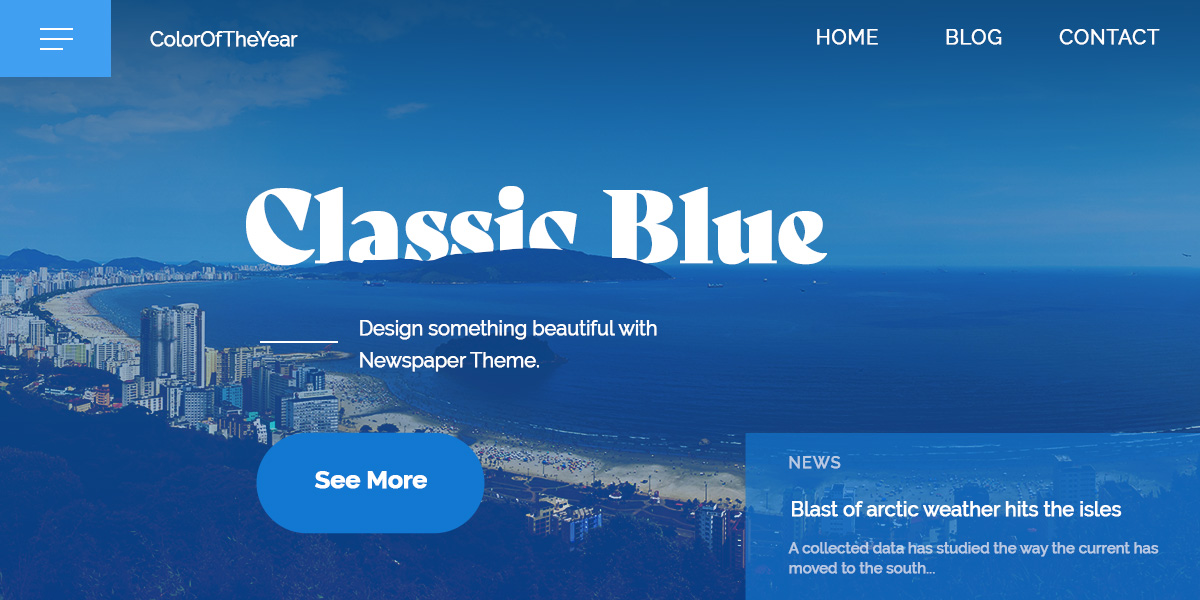
Style
The next part is choosing fonts and changing colors. To do this, click on an element to begin with and go to the “Style” tab. All the settings you need are here: text colors, backgrounds, shadows, and different borders. Change each one in a way that creates contrast. For example, if the palette chosen is a monochromatic one, you can have classic blue as the primary color of text and elements. In contrast, their background can be a pale sky blue. This can be switched up if you need for the next row to create balance and sections. The idea is to experiment with what looks good and appeals to you. Don’t forget to ask for feedback from coworkers, clients, or even the audience. A second opinion never hurts!
Wrapping it up
Pantone is a trendsetter in color decisions, and can positively impact your audience if you let it. Try incorporating classic blue while designing to add a touch of stability to an otherwise unstable environment. As a color of clarity and peace, let it inspire you in all of the projects you undertake.
If you experiment classic blue in art, design, or any other form of media, show us your creations down in the comment box below!






Nice color…
Really good idea, and blue is a lovely colour which fits to our crete website.
I think I creeate some subpagesin blue style.
Thank you for the inspiration
Wow Amazing theme
Great color, i like it very much.
Excellent Post. Thanks for your hard work.
Hi,
Thank you for such great words! You have made our day 🙂 One of our main goals is to please every customer!
All the best!
Sorry for the late
Thanks for your replay
Really good post and your blog is so loving keep is up
Thank you, Shakeel!
Hi,
I’m looking for custom WordPress theme for my Mobile app development website. I seems good
Thank you for reaching out, Anamika. If you need custom web development and web design solutions for your mobile app development website, please let us know by submitting your customization request. We’re looking forward to helping you! Have a lovely day 🙂
Nice idea
Wowww… nice.
I implemented classic blue color since early 2020 and really compatible with Newspaper theme. Thank you for teams hard works.
Irfan, thank you for your kind feedback.
this is the best theme
Thank you! We’re happy to hear this 🙂
Thanks For Sharing Your Ideas
Thanks Again
Hi, Sandy! Thank you for your kind words 🙂