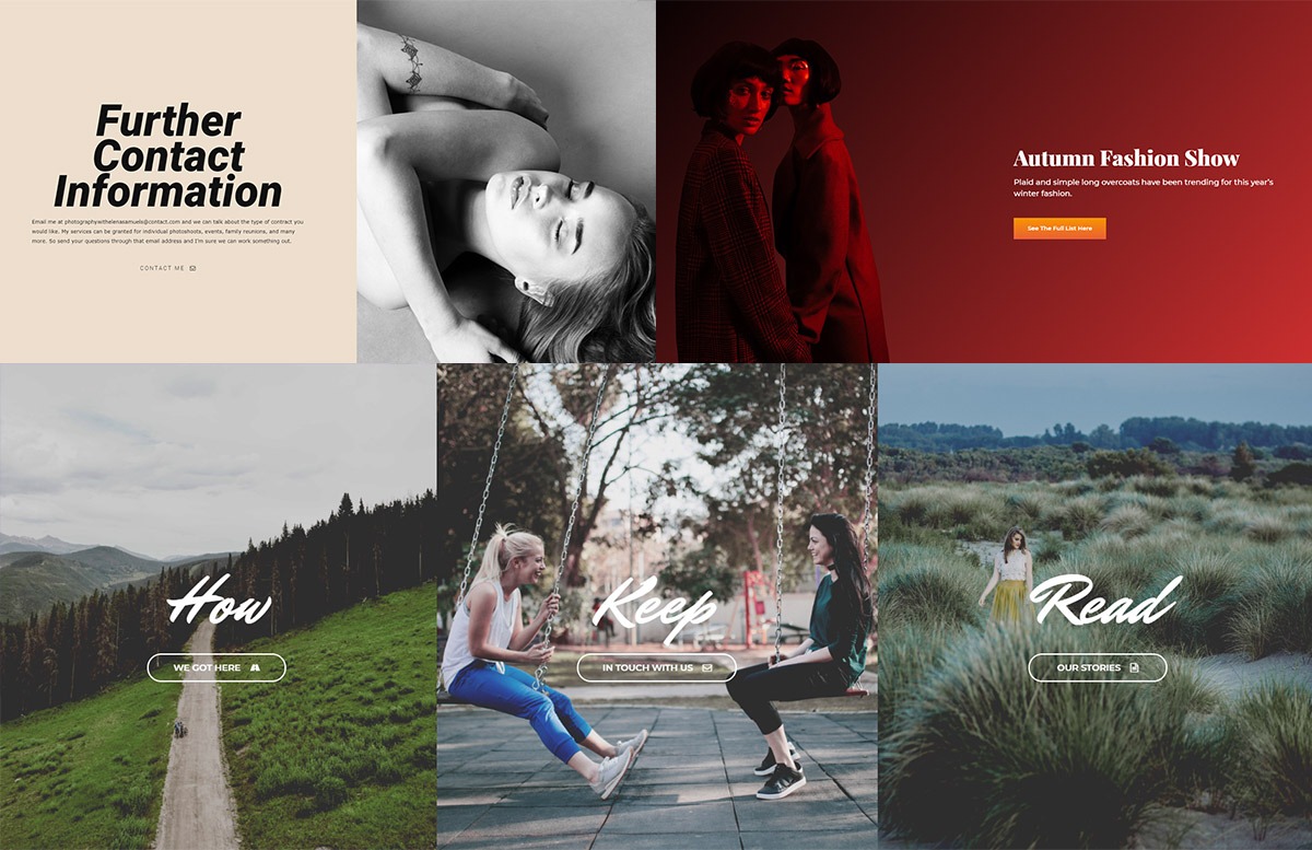
Buttons are present in our everyday lives from our phones to our website browsing. They are used to trigger an action whether it’s to let someone submit a form or open a new website in a different tab. Newspaper Theme helps you design and create a button that fits perfectly into any layout. You can use it to guide readers to different pages for more information, but also trigger a popup video or even scroll down to a particular element on the page. Have you tested it out yet?

Buttons, buttons, buttons
In a standard HTML page on the Internet, you encounter call-to-actions like “Shop now,” “Read more,” “Get started,” and many more. Tech industry producers such as Apple, Adobe or Samsung prefer to have minimalistic designs to their websites, and this also applies to their buttons which tend to be rounded, bordered, transparent background with clear and concise text.
Musicians and artists have diverse styles for their websites, so the buttons that appear on the page tend to change colors on hover (Arianna Grande’s website, Taylor Swift’s website). Gradients are also a popular choice to give a button a lot more color and vibrancy. Moreover, for each website, the call-to-actions frequently use icons such as arrows, checkmarks, and so forth to drive more engagement.
With Newspaper Theme, anyone can easily design the perfect buttons for their site. You can add them to any page and template. Whether you opt for a minimalistic design or a colorful, vibrant one, it’s all in your hands as Newspaper theme is ready to make it happen for you.
Intention and consistency of a site’s buttons
How do you design a button to fit into a website’s design? Be consistent. Keep the colors the same as those appearing on your pages and posts. Moreover, if a page’s photos have rounded corners, the button’s edges should appropriately be round, too. The choices are unlimited.
Let’s start by opening the tagDiv Composer on a page. In the Add Element List find the Button item. Drag and drop it on the layout, in the desired position. Now, design it! In the General Tab create a message for the element. What do you want it to do? Should it link to an existing page? Then, in the URL field type or paste the web address.
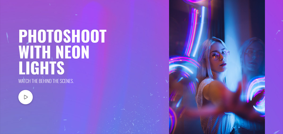
If you want to guide your audience to discover your YouTube, Dailymotion or Vimeo content, create a button that plays a video. To do this, drag and drop the element in the page or article, and, in the Video Popup section, simply add an existing URL. When a viewer clicks on the icon, the video pops up and plays. Now, all the readers can watch it without ever leaving your website.
Need multiple control elements to look the same? Check out the copy and paste style features to improve your workflow.
Scroll to class
For a long page or article, create a button at the beginning that drives users to a specific place on the page. All you have to do is add a class to the targeted area. It’s easy! Just open the General tab of the row, column or element and in the Extra Class box, type a name.
Now, in the Scroll to Class section of the Button options panel, write the same name. Save the settings and test out this feature. Did it scroll you down to it? Awesome The button appearing in this post, above, has the same attribute. Test it out by clicking it!

Design your button
Here are a few suggestions for any button’s style:
- For a minimalistic design, choose Style 2 – Bordered in the Button Style section. Now pick a color for the text and border that fits into your site. Also, select a font that blends in, too. In the General tab, pick an Icon to represent the intended message.
- Colorful designs bring a drop of vibrancy to any website. Click on the Style 1 – Solid for Button style. Now, choose two or three colors for the background color. If you’re not sure which colors to pick, try complementary colors such as blue – yellow or stick to shades of the same color, like a dark and bright red. In the Deg. box, input a number. 180 reverses the rotation of the colors, 90 and -90 turn it clockwise and counterclockwise.
- If you want a small animation for a button, you can do that. Either choose Style 4 – 3D Cube or Style 6 – Bordered with Shadow. They both add a small animation upon hover. Select the hover colors and text for the 3D Cube to shift the element’s appearance. Whereas, if you alter the Shadow Offset for the Bordered with Shadow to give it more movement upon hover. Don’t forget to choose the colors and fonts!
Adopt your very own button today
With all the variations in designs and styles, Newspaper Theme also makes it easier to experiment and create numerous original buttons. Gradients, hover animations, icons, dabble in each and find what works best for your site. Remember, each one is meant as an action. What would you like yours to do?
Links, scrolls, video popups ? ? Tell us how you use buttons on your site in the comment box below!


hi, unfortunately, at home I couldn’t find the Button element in my tagDiv elements
Hi Tirexo,
Thank you for reaching out. Please open your page with the tagDiv Composer page builder and search the “Button” element – it is under the “Multipurpose shortcodes” label. Now, just drag and drop the “Button” element and customize it. As the Blog area is not associated with the Customer Support Department, please open a new topic in the forum or send us an email if you need technical help. We’re ready to assist you! Thank you for understanding.
I use Newspaper theme my problem is call to action button proper looking in computer on blog but mobile version button is not perfect design.
It is show wordpress default button on blog mobile version.
Only perfect design not show on mobile version
Hi,
Unfortunately, the blog account is not assigned to our support forum. IF you need more technical assistance, please open a new topic at our support forum from here -> https://forum.tagdiv.com/forum/newspaper/ and our team are ready to assist you.
Thank you!
Will this be available on Newsmag as well?
Hi Stefano,
Thank you for your message. For the moment we don’t plan to implement these type of buttons for the Newsmag WordPress Theme. If we’ll have more requests in this behalf, we will reconsider adding them. Thank you for understanding!
Can we see live demo examples of these?
Hi,
Thank you for your interest! The buttons in this article were specially crafted to highlight the variety of design options you can use to each one of them. There is an infinite number of choices to style a button.
Another great example of Call to Action buttons is this beautiful live demo
https://demo.tagdiv.com/newspaper_law_firm/. If you need technical assistance from our support team, please send us an email at contact@tagdiv.com. Thank you for understanding!
Great Post! Button! Button! Button!
Thank you. Great post!
Why such a near impossible to read font in this blog? Light grey??
Hi Roland,
We appreciate your feedback, and I’ve already passed this information on to our design team. Thank you! Have a great day :).
agree, very white/light…