As with every new year, Pantone has released their choice for Color of the Year, 2022, Very Peri. It is blue with a red-violet hue, a purplish-blue as it is. Everyone knows that colors affect our mood and vision, so using them for marketing your website better might give you the boost you need! Discover how to create beautiful layouts and color combinations with this beautiful shade and your Newspaper WordPress theme.
Very Peri
As a beautiful violet-blue, Very Peri is a color full of innovation, creativity, and deep-rooted freedom. After the past few years full of tremulous global events, 2022 was supposed to be the start of a period full of possibilities and great opportunities. However, not everything can go the positive route, especially with everything going on in the world at this very instant.
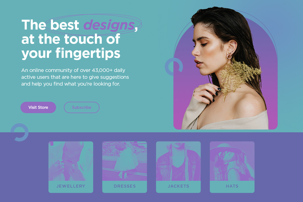
Yet, the color is supposed to give us hope for a better version of the future, and as long as we all continue to do better, we can strive for a better tomorrow.
As stated in our previous article, where we explored the roots of blue and its meanings throughout history, we know that, in general, it stands for open spaces, trustworthiness, and intuition. In contrast, violet blues express a more sensitive side, a more feminine, joyful color. Very Peri can be precisely the color you need for your brand, campaign, project, or website. So let’s explore some of its color combinations.
Color Palettes for Very Peri
Whether you’re building a website from the ground up, creating a striking illustration for a client, or just starting a personal project, one of the first steps into the workflow process is to decide which colors to use. Knowing a little bit of Color Theory can go a long way. So, let’s see how we can incorporate Very Peri into any project.
First of all, start by going to the Adobe Color page and looking at the various color combinations: analogous, monochromatic, triad, complementary, and split-complementary. Now, click on the middle color to select it and change its HEX value to #6768ab, the shade of Very Peri you are aiming for. At this point, you can see a few color combinations for it and decide which one seems to be most up your alley.
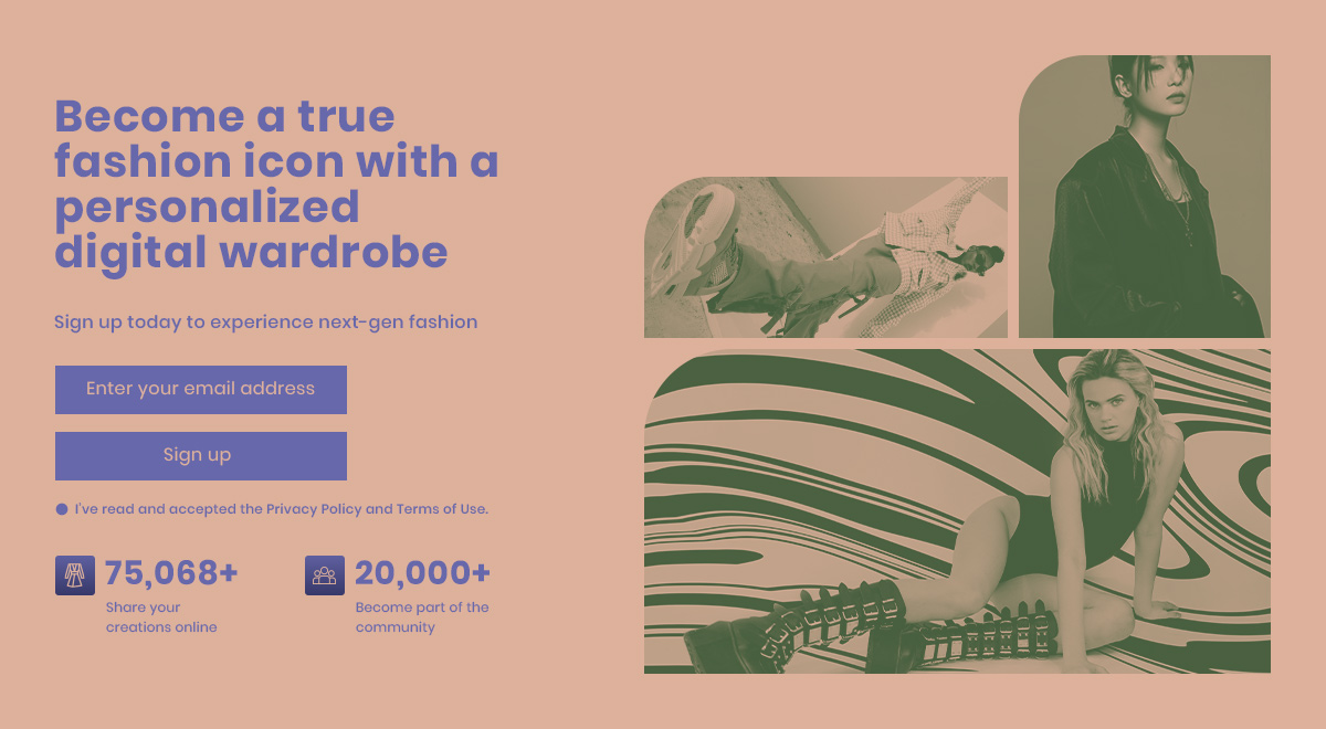
- Analogous takes some of the hue’s close neighbors to create a beautiful harmony and keep the sentiment close to the very heart of the original color.
- Monochromatic takes Very Peri and bumps up its brightness or even lowers it to achieve a unique and clean look.
- Triad pairs three different colors with this beautiful violet-blue shade: an orange and a green to get a bright and carefree palette to work with.
- The complementary color to Very Peri is: a shade of yellow – most likely a copper or even a soft sort of cream hue. You can pair these two colors up to create a very smooth and elegant combination.
- The split-complementary goes very differently as it pairs Very Peri with the cream, copper hue, and a very bright lime yellow. This palette is very joyous and energetic.
Designing with 2022 Color of the Year
If you want to use WordPress, you’ll need a beautiful theme with a live visual editor that can help you begin your design process from the get-go with no fuss. Have you tried Newspaper Theme yet? If you already own the theme, here are a few ideas to incorporate Very Peri into a beautiful website design:
- The newest Prebuilt Websites, Newspaper Theme has delivered, come with global colors. This means you can change the entire color scheme of the website’s design from a single place at the same time. Open the Website Manager through tagDiv Composer, click on Global Colors and then choose one of the color schemes from above, using Very Peri as the base.
- Creating a website design from scratch can be straightforward. Just follow the steps of our YouTube tutorial or start by gathering some inspiration. Start by opening the tagDiv Composer on your Homepage and drag a flex block into the first row. Style it using Very Peri as the primary color. You can also go to the Website Manager > Global Colors and create your color palette by naming them. Then input the Hex codes to pick and choose as you go along.
Layout Design
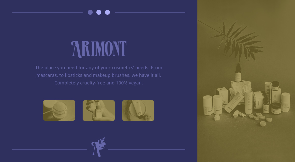
Once you get started designing, you can keep going by dragging similar elements into the page. Start arranging by splitting rows into columns and adding paddings to create distance between items. If you like any websites, you can take the inspiration they’ve used for highlighting Very Peri and use it as a guideline for learning. Just go to their homepage and take note of how they’re showcasing their content.
Don’t forget to add column titles to guide your viewers across the page and call-to-action messages. Finally, remember: you can always change your colors from one place simultaneously when you have all the elements you want. That is if you had already started using the Global Colors from the beginning of the design process.
Of course, to continue, we would also need to go through the process of adjusting fonts to appropriate dimensions for each of the three device screen sizes that are at the top of your tagDiv Composer. When finished, hit save!
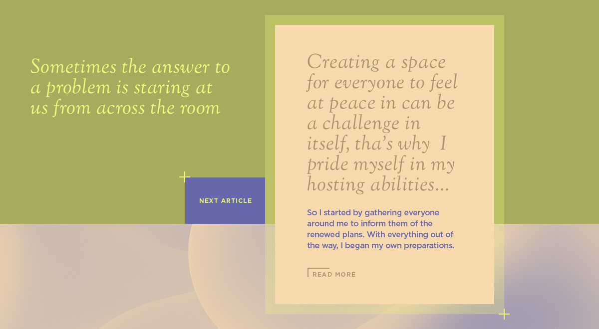
Moving on, you can then go and create your single post layout for your articles. Add Single Post content, Page Title, Author Name, Social Shares, a comment box if you want to interact with your audience, and anything else you might need. Use the same colors as your Homepage, and don’t forget to make it responsive.
This process has to continue for: 404, Date, Tag, Author, Category, Search, Header, and Footer Templates. Then you have a fully-designed website that you can call your own. You can get help from our experts or one of the top web designers in 2022.
Conclusion
While designing a website from the ground up seems daunting at first, it is possible even without any CSS or HTML knowledge with Newspaper Theme. Incorporating different colors schemes surrounding the 2022 Color of the Year Very Peri is effortless using the new feature of Global Colors. Moreover, Newspaper Theme’s Prebuilt Websites let you import a full-website design with a single click. So, why not take them for a spin?











Once you have begun the design process, you can continue indefinitely by dragging pieces that are similar into the page. To begin the arrangement process, divide rows into columns and add paddings in order to create space between the elements.