
With the increase in mobile browsing and shopping, optimization for portable devices is essential for a successful website. Therefore, having a slick and elegant design for your mobile header is the first step toward impressing your audience. Take the plunge and find out how to make a fantastic Mobile Header with Newspaper Theme below.
The Introduction of Mobile Header Elements
Open a page or post through the tagDiv Composer, Newspaper Theme’s front-end page builder. Have you imported a Header template from the Cloud Library, yet? If you haven’t, then do so by clicking on the Website Manager and then on the Import Template button under the “Header” section. Scroll through the various designs and choose the one that fits your website best.
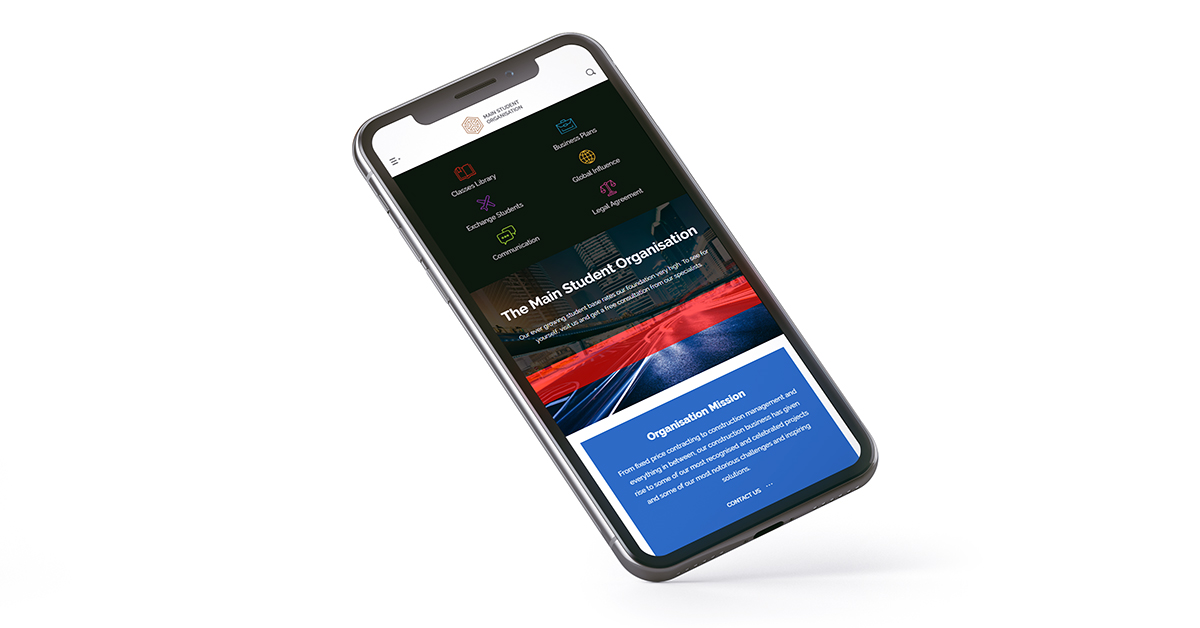
Now, click on any element of your Header or content and then click on the Mobile Device Viewport icon. The entire page now gets displayed as it would look like on the phone. Did you notice how the Header shrank in size alongside the content? That’s the power of the new Mobile Header elements.
Before we move on how to get the same result for your website from scratch, make sure to check out the other related articles for the Header Manager: the Header Logo, Main Menu, Live Search and last but not least the Header Manager. Do this to get a good grasp on how to use the new features!
Build your Mobile Header Easily
When looking at your page across various devices, the design automatically gets adjusted to fit on various screens and sizes. However, you can always adjust the text size and spacing of each element precisely as you wish by clicking on the desired screen viewport and consequently, beginning the alterations.
On the Mobile, however, your job gets easier. With the Newspaper Theme 9.5, alongside the various elements of the Header, new mobile-centered items are available to you:
- The Mobile Menu will display a small icon. When clicked on, it opens a list of the menu items so that you can have an elegant layout for the header.
- Just like the desktop version, there is a Mobile Live Search element that you can add to your Header. It is specifically modified to bring the same performance on smaller screens as its desktop version.
- Do you want to keep the same look across each device through the menu? With the Mobile Horizontal Menu, you can now do so. Each item is shrunk to appear better on the phone screen and lets you display all of the essential navigational links at once.
So, start by dragging and dropping the Header Logo and then adding the Mobile Menu and Mobile Live Search. With the three items added, you can now begin going through the settings for each.
Slick Designs for Better Functionality
By default, the Mobile Menu and Mobile Live Search open with the theme’s default fonts and colors. However, you can easily modify this in the Newspaper Theme Panel. In the Admin Dashboard, navigate to the Newspaper Theme Panel. From there, go to Theme Colors > Mobile Menu/Live Search for colors.
If you need to modify the fonts, go to Theme Fonts > Mobile Menu. Also, if you wish to display a specific image as background, open the Background section, then select Mobile Menu/ Search Background tab. Simply upload a photo in the box and save your settings. These will be instantly applied to the new mobile elements.
Now, back to the tagDiv Composer, don’t forget to select a Menu to be displayed for your Mobile Menu from the General Settings of the element. For a sticky mobile Header, drag the items into the row once more, or through the right-click menu, right-click on the Header row and choose Copy. In the empty Header row for your Sticky Menu, right-click and select Paste Before or Paste After, then delete the remaining empty row.
Your design has now been transferred to the sticky mobile variant. Adjust the spacing and sizes of the icons and logo to get a beautiful thin header. Add a transition to the Mobile Menu Sticky zone and a background to the row to be able to see it displayed over your content. Save, and you’re done!
Wrapping Up
Get in touch with your creative side and design a minimalistic mobile header to impress the audience. Adjusting the logo’s size and choosing between two different ways to display your menu it’s easy. You should create a beautiful user experience for the visitors that are scrolling through your website by making the header smooth to navigate. With the Newspaper Theme, all of these are possible without effort or coding skills.
Post and share with us your beautiful Mobile Header designs in the comment box below!


I really loved your support, From the bottom of my heart Thank you so much. But I have another issue the header template is not showing on the home page on a mobile device. I had edited it and that looks perfect at template but when I tried to put it on the home page that was disappeared Now that’s not even showing at template editor. please help me
Hi,
Thank you for your kind words about our tagDiv team. Can you please send us more details about your inconvenience? As the Blog area is not assigned to the Customer Support Department, I strongly recommend you to open a new topic in the forum or send us an email. We’re always ready to help you! Thank you for understanding.
Hello,
I wish to edit the social icons above the list of the menu items. (The area circled in blue here: https://i.ibb.co/0tWBj7X/screencap.jpg). May I know how could that be done, please?
Hello,
Check the Social Networks from the Theme panel, like this -> https://www.screencast.com/t/hRray3NhJac If you need more technical assistance, you should write to us on our official support forum from, here -> https://forum.tagdiv.com/forum/newspaper/ and we are ready to assist you.
Thank you!
Can these mobile header features be applied to mobile theme + AMP?
Hi,
No, they cannot. The mobile theme will use its own header when active. The cloud headers built/imported with the tagDiv Composer and Cloud Library plugin will be displayed on mobile only if the mobile theme is not active. Most of the mobile theme elements are predefined, this would be why it is noticeably faster on mobile than the responsive version. Please let us know if you have more questions, you can always create new topics in the theme forum or send us an email at contact@tagdiv.com.
Thank you!
So how do I edit the mobile versions header and footer when I cant use tagdiv composer?
Hi,
Thank you for your interests in our theme! If you want to affect the mobile layout, please note that you can do that from the TD Composer according to our documentation from here -> https://tagdiv.com/newspaper-theme-customize-the-header-manager/ Regarding on footer, you can make it, in the same way, using the TD Composer and select the viewport from the left tabs. If you want more assistance in this case, please open a new topic at our support forum from here -> https://forum.tagdiv.com/forum/newspaper/ and our team are ready to assist you.
Thank you for your understanding!
I bought and am using the Newsmag theme, which is similar to Newspaper. I feel like Newsmag development and updates are way behind the Newspaper theme 🙁
Hi,
While the two themes are similar, there are differences as well. The Newsmag theme has a structure that would not allow the implementation of most features that have been added in the Newspaper theme and the composer provided with it. It is true that the Newsmag theme hasn’t received many major new features, like the Newspaper theme has. Currently I can’t exactly say when there will be a major update for the Newsmag theme, but we will try to add more useful elements for it in the future.
Thank you!