
Have you ever wondered what shaped the last 3 years in web design? With the rise and fall of trends, it might be hard to keep track of what exactly grew in popularity. In this article, we take a look back to the top most marketable trends of 2017-2019. Web designers are creative and find their inspiration in simple things. They find and recycle elements, then mix them for stunning style results. Moreover, they want to ensure a great user experience while creating an intuitive interface. In this article, we’ll take a closer look at the web design trends that influenced the online presence between 2017 and 2019. Moreover, we’ll show you some great tips about the site’s consistency.
Geometry in Web Design
What’s the basic element in Geometry? Ta-da, it’s the point. Then, you got the line, and the shapes. The readers’ mind has to be trained, and that’s why web designers choose geometry to add a plus of symmetry, balance, repetition, and design consistency.
Moreover, geometric figures help you build any element on a website. For instance, text boxes, call-to-action buttons, or the underlying structure of the site, they all are designed using rectangular shapes. Furthermore, square & rectangular shapes ensure a sense of stability and are common visual cues. But, why do web designers use circles? Icons or logos represent the main visual elements that are circular. Representing safety and harmony, combined with squares and rectangles, circles give a trustworthy aspect to any website. Each shape has its meaning, discover how to use Geometric Web Design to emphasize your content, by using the Newspaper Theme and tagDiv Composer page builder. If you need inspiration, take a look at the Awwards article on this subject.
Duotone or Monochrome Colors?
Some web designers love monochrome colors, while others find the duotone compositions more interesting and appealing. Black and white are not going anywhere. Just like how some people enjoy dressing in a color or another because it represents their personalities, the overall color of a website must reflect the theme and feel of it.
But, what’s duotone, and how can you achieve it? Duotone is an appealing aspect you can give to the images you show on your website. “Duo” has its etymology in Latin, and means “two”. If you want to bring out the middle and highlight tones of a picture, then, duotone helps you. You can recreate the halftone of the wanted “image using the superimposition of one contrasting color halftone over another color halftone,” as noted in Wikipedia. If you love sepia pictures, you know exactly what I mean, as it’s a duotone effect of mixing brown hues to get a vintage look.
Oversized Fonts for Daring Titles
Many websites have imposing homepages and oversized fonts. You can notice big fonts on titles, menu items, buttons, and also on footer areas. The gist of capturing someone’s attention is always through big gestures, and what bigger gesture is there besides a giant font trying to make you swoon? Head over to our article about bold fonts and find out how you can mix and match to create the visual appeal you want for your website.
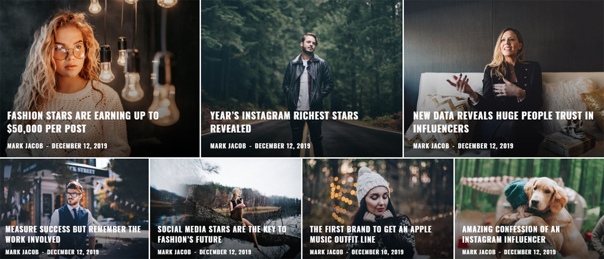
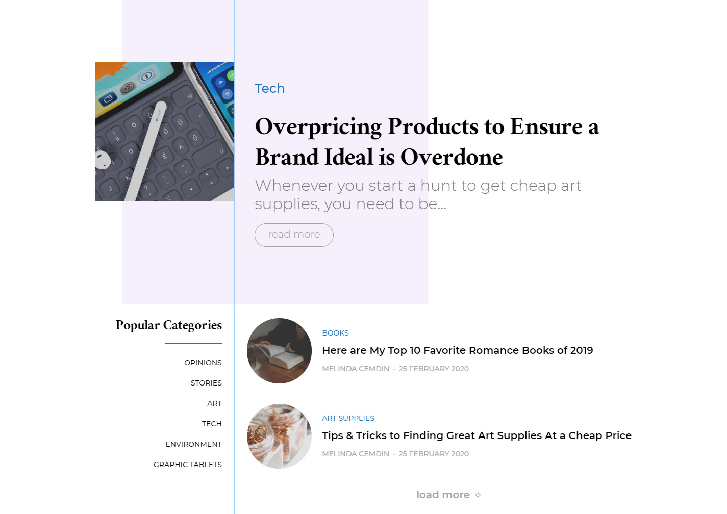
Dominance of Grids to Show Content
Content means title, excerpt, and media files. Showing off the content in a nicely designed grid is a form to make it memorable in the reader’s mind. The grid is “a two-dimensional structure which serves as a framework in which a designer can put various content and elements,” says the Undsgn team. By showing off your content within beautiful grids, you’re ensuring better readability, which conducts to better user experience on your website. We’ve also crafted some great Flex Big Grids in our themes, to help you to easily structure your content on pages.
Asymmetry
More and more websites tend to adopt grid layouts. Here comes the asymmetry, for those who don’t want a regular grid-based website. Furthermore, they can use shapes and elements that usually blend together symmetrically, to get astounding asymmetric designs.
Appealing About Pages
What about the authors? When creativity means the right tools, everything becomes magic. The authors of a website are the ones who do the research, gather relevant information, take amazing images or videos and post them online. So, why not show their work in a stunning, eye-catching Author Page?
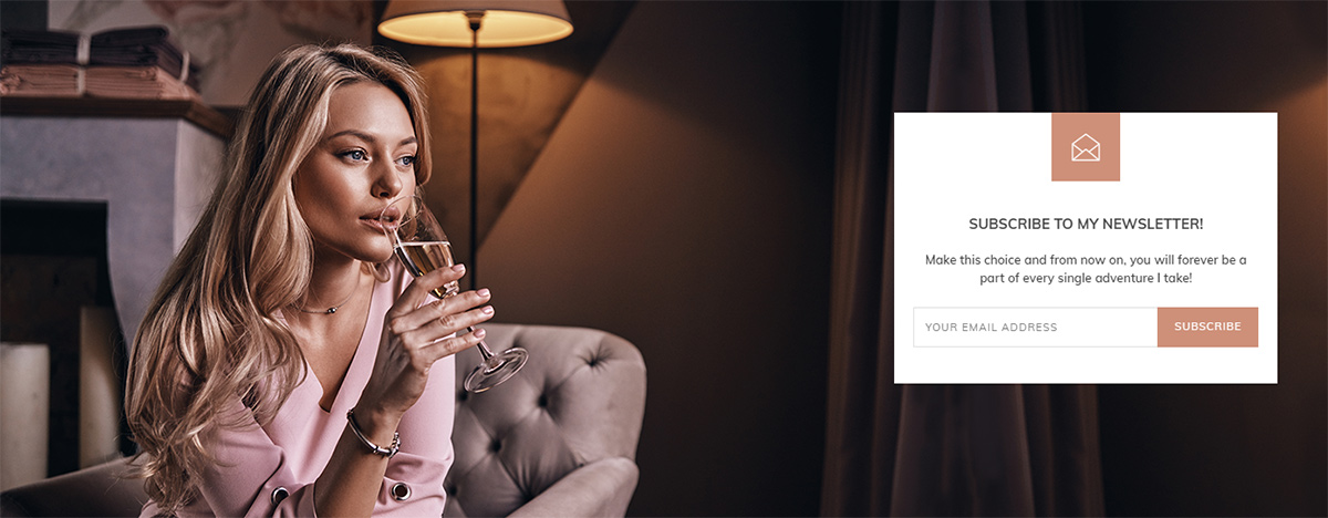
Styled Newsletter Boxes
Creating content also means to share it with the world-wide. For this, in case you don’t have one, you should consider adding a newsletter box on your WordPress website and make it look engaging. An example is the Newspaper theme, which adopted the tagDiv Newsletter plugin, that is compatible with popular email marketing providers. People still use email as a handy method to communicate with their business partners, to understand their competitors, and to keep up with the latest news in various industries.
Animations & Illustrations
Enough with the basic animations that were quickly added into websites for impressive visual impacts. They’re old news already. Nowadays, buttons get animated, hover effects, or shadows – they all imply movement. As web design trends, animations and illustrations continue to be suitable for any blog or website.
When Old becomes New in Web Design
Trends come and go, but there are some things, like the layout of a website, that never change. It’s vital to keep the site’s consistency, as it will give a sense of structure and personality to the overall website’s design. So, what’s the recipe for greatness? You need to have responsive websites with plenty of negative spaces, high-quality images, or media content. Navigation, visual appearance, and branding represent the three main aspects you definitely have to enhance.
Navigation
Who loves easy navigation on a website? Sure: everybody! Keep it simple, and your visitors will stay longer on pages, and return to discover more information. There are three words that characterize the website’s navigation: consistency, simplicity, and also clarity. You can combine them regardless of the navigation style. Furthermore, for the website’s usability, you need accessible navigation, as well as a clearly organized sitemap.
Sitemap
Technically, the site map needs to deliver information about a site’s structure for Google to understand the layout and index it. According to Wikipedia, “many sites have user-visible sitemaps which present a systematic view, typically hierarchical, of the site. These are intended to help visitors find specific pages, and can also be used by crawlers.” Below is an example of a basic sitemap:
- Home
- About page
- Categories
- Tech
- Lifestyle
- Medical
- Blog
- Product Listings
- Product Reviews
- FAQ
- Contact page
Visual Appearance
When we say visual appearance, we’re also referring to visual hierarchy. The most important elements on your site should be strategically shown, as the readers’ eyes scan the page until they find that piece of information they’re interested in. Based on Miller’s design law, you should keep the number of visual elements with the same info on your WordPress website to a limited one.
Branding
We all know what branding stands for, right? Or, perhaps, most people have some knowledge about it. Is there a secret in maintaining the style for ages? There are various iconic and world-wide brands from all over the industries that become more powerful with every year that passes. Also, they embrace new trends with amazing marketing campaigns. What you need to do when crafting your company’s branding is to pay great attention to the logo, overall colors, tagline, and fonts.
Conclusions
All these examples are actually a mix of trends that web designers improve every year. There’s no limit in web design, as creativity sparkles from the simplest, ordinary things. Professionals get creative and combine user experience with visual strategies to get better results in the fastest frame of time. What’s the web design trend you liked the most through the years, and what’s the tendency you love in 2020? We’d love to see your thoughts in the comments below.


Thanks for sharing amazing theme..
Thank you for your kind thoughts!
thanks for making this theme.its very easy to operate
Hi,
Thanks for your positive feedback and if you have any questions, please write to us on our forum because that platform is not assigned to our support forum.
Best regards!
Tagdiv is doing very high quality works in this sector.
Hello,
Thanks for being our awesome customer!
Best regards!