How to choose the colors for a website when you start the design process? Take into account their vibrancy, contrast, and the harmony between them. Picking the right colors that complement one another is part of the world of color theory, and through it, you can influence the website visitors’ emotions. So, what sort of impression do you want to create for your audience?
Color 101: Basics
When we talk about colors, we mostly refer to them based on their contrast, vibrancy, and relationship to each other. How does each one come into play? It’s easy:
- You create contrast by choosing two different hues for the background and text. It divides elements on a page and focuses the users’ attention naturally. It also makes the text more readable if done right. The best rule of thumb when choosing colors for your text and background is to have one of them be a very light color compared to the other.
- Vibrancy refers to the level of color saturation. Brighter colors create energy, whereas pale ones help users relax.
- If two colors clash, they do not complement each other and the results are not harmonious. There are multiple schemes for choosing a pair of colors that works well together from analogous, monochromatic, complementary, split complementary, and triadic.
For a harmonious website, keep control of the contrast, vibrancy, and choose colors that go well together. It’s also essential to minimize the number of hues used, so at most, choose four, at best, choose two: a primary color and an accent one.
How do you choose the perfect primary color?
What do you want the users to feel or think when they first click on your website? Moreover, what is the core message you want to transmit to the visitors? For example, if you to appear professional and businesslike to the audience, you would need to showcase that through the primary color. The same goes for each industry.
Color Theory and Meanings
- Blue – represents a soothing, calm color and is often associated with the tech industry. Banks tend to have logos that are blue to represent authority and trustworthiness. It is also a masculine tint.
- Green – is organic, eco-friendly, and environmentally-aware. If your company has anything to do with the environment, outdoors or nature, green is the best color to use.
- Yellow – stands for happiness, friendliness, and fun. It is often associated with transportation (buses and taxis are yellow).
- Orange – stimulates physical activity, competition, and confidence. Loud and warm, it can be the perfect color for a fitness website.
- Red – is an energizing hue that can easily catch the attention of a viewer. It represents power and passion.
- Pink – can be the color of femininity, but it is often associated with sweetness. From websites that center around feminine products to candy shops, pink can be perfect.
- Purple – portrays the tint of royalty and increases creativity. It invokes a feeling of quality and luxury.
- Brown – is an earthy color that is seen as stable, dependable, and wholesome, often found on agricultural websites.
- Black – adds a sense of value and luxury. High-end products are usually linked to the color as they can be seen as sophisticated and elegant.
- White – brings purity and peace to a website or concept. When white space is used on a website, it can give a sense of freedom to the user.
These are only some of the basic interpretations and associations with colors. Depending on the people you’re addressing, the meanings may change. For example, while we often associate green with envy, yellow is the color of envy in Germany.
Color Harmony
Have you chosen your website’s primary tint? If you want to know what color to pair it up with, there is a great website that can help with the decision. Head on over to Adobe CC to have your first taste of the numerous color combinations available. However, if the color wheel does not help you decide, here’s an explanation for the color schemes:
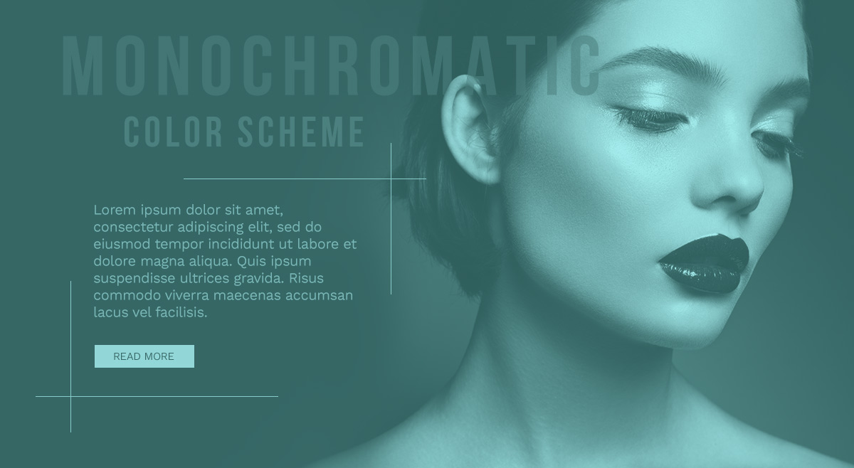
- Monochromatic color schemes focus on one hue only and different shades of it. For example, multiple shades of blue such as a dark blue, bright blue, and pale blue.
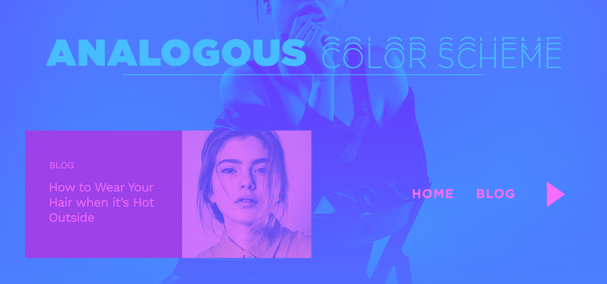
- Analogous refers to the neighbors of a single shade on the color wheel. If we stick to the previous example of blue, the analogous scheme for blue would be turquoise and purple.
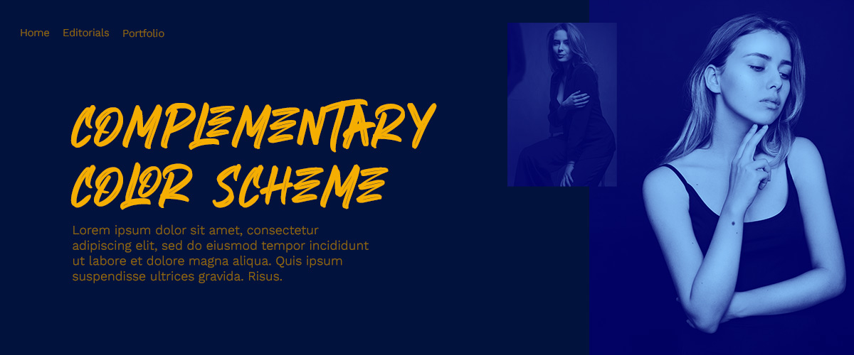
- Complementary are the colors that appear on opposite sides of the spectrum. Blue’s complementary hue is yellow-orange.
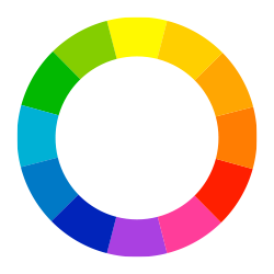
- Split Complementary is adding an adjacent color to the complementary color. If blue is your primary, the split complementary to it are yellow and yellow-orange.
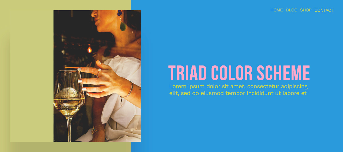
- Triadic uses a triangle scheme to choose the colors. Draw a triangle on your color wheel where one of the points touches the primary, and the other ends are your accent colors. For blue, the triadic scheme would be green and orange.
Color Theory with Newspaper Theme
With the best possible color scheme in mind, it’s time to start building your website. Whether you import one of Newspaper Theme’s demos straight to the site or create the entire website from the ground up from zero, you should always start with the logo.
Within the Header Builder, click or add the “Header Logo” element. From the Style tab, choose the primary hue for the text & tagline. Now, switch to your accent color for the hover. Read more about Newspaper Theme’s Header Logo.
Now you’re ready to move to the rest of the Header. Click on the Menu and Live Search elements and change the colors according to your color scheme. Don’t forget about the Sticky Menu and the Mobile Menu. When you’re ready to move on, begin with the Homepage.
If you’ve already imported a demo, then all you have to do is change the fonts, colors, modify links, and you’re done. Are you building it from scratch? Then head over to the Homepage tutorial to start. Keep in mind to stick with the same color scheme you’ve chosen.
Conclusions
Whether your website is funky and fun, or businesslike and professional, you can engage the audience with the colors chosen. Each hue inspires a different emotion or meaning. Keep the number of shades used to a minimum and stick to ones that work well together. Repeat the primary and accent on each page, each template with Newspaper Theme, and you get a beautiful structure and layout that attracts the type of visitors you want.
Have you chosen a color scheme for your website, yet? Share it with us in the comment box below!








Hai how can I add a beautyful email form like in this page, what i should do in standar post page setting???
Hi,
Thank you for your interest in our theme! If you like that section, please note that you can use it on your website if you will install the Newsletter plugin and set up it according to our documentation from here -> https://forum.tagdiv.com/the-newsletter-plugin/ Also, if you need more technical assistance, please open a new topic at our support forum from here -> https://forum.tagdiv.com/forum/newspaper/ and our team is ready to assist you.
Thank you!
Hi Alex
I read the full article abouut color theory & meanings for newspaper theme its very helpful info. But i have a question for you i want to change my anchor text colur in newpaper theme let me know how we can do this easiest way? because i’m unable to find the option at theme panel.
Thank You
Shrayan
Hi,
If you need more assistance in this case, please open a new topic at our support forum from here -> https://forum.tagdiv.com/forum/newspaper/ where you need to provide more details about where you want to make these changes so we can provide a more accurate response. As a hint, if you want to change this color you can try using such a bit of custom CSS code for that and place it in the Theme panel.
Hope this helps!
Thank you!
Alexandra, thanks for sharing the theory. In addition to geographical the geographical shape theory you shared on the previous post, color theory is another basic thing every designer should understand.