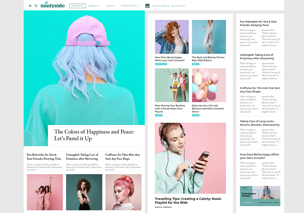
Are you looking to start a blog to share with your friends, family, and build a supportive online community? The new Mintyside PRO demo is the perfect blend of simplicity and minimalism that is not only user-friendly but also allows you to focus on creating content. Write about interesting topics, create eye-catching titles, and let Newspaper Theme handle the full website’s design & its functionality.
Mintyside PRO: intro
A blog can be anything from reporting on the latest trending topics (celebrities, politics, entertainment, finance, news coverage), delivering trusted information to technological and scientific developments. Even more, you can keep a daily blog as a recollection of memories, experiences, and tutorials for readers to enjoy. The Newspaper Mintyside PRO demo allows you to turn your website into the blog of your dreams.
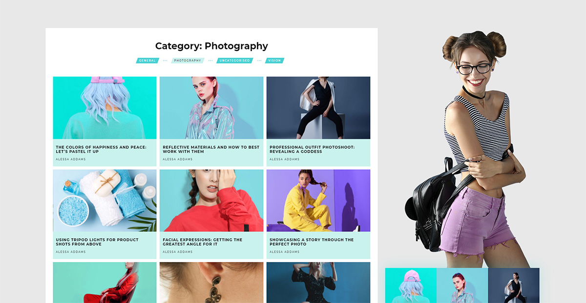
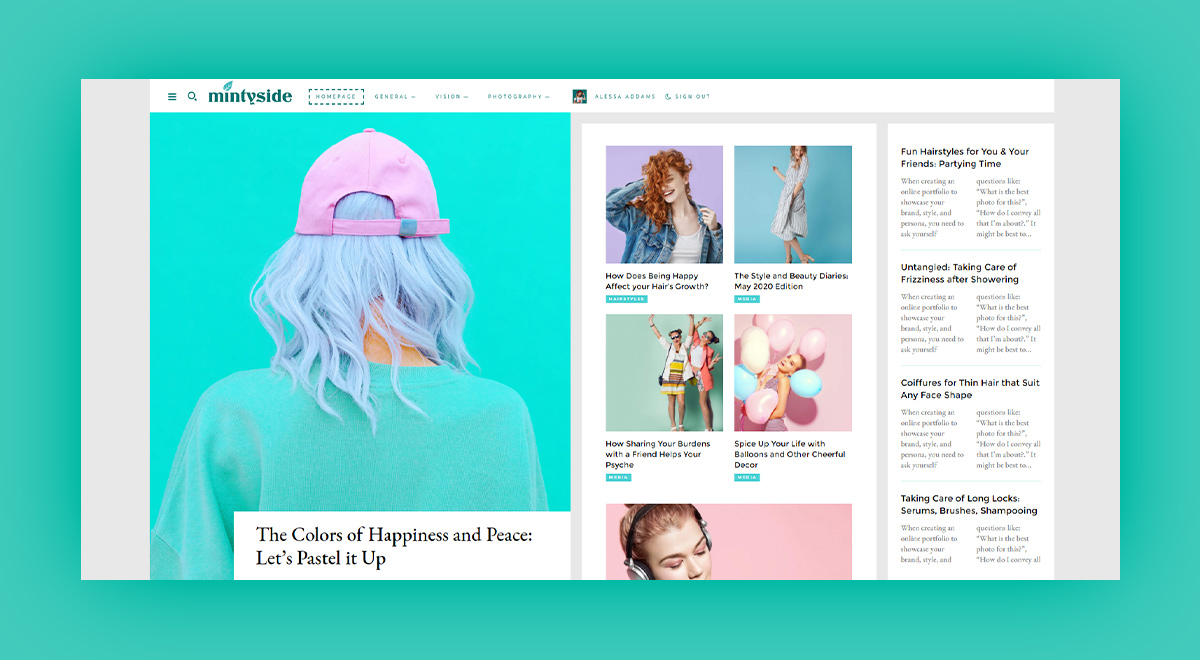
With a wide-set layout, a grey background that goes perfectly with the turquoise accent colors, it embodies a feeling of freshness and energy. Combining a sans-serif font with a serif one and dividing the page into three columns, it leaves the viewers feeling like they’re reading an actual physical newspaper.
By importing your featured images and content, your articles will be the center of the homepage. Monetizing your blog should also be a breeze with the Newspaper Theme’s ad box and Newsletter subscription block. Award your long-time readers and entice the new ones to subscribe and send them weekly notifications about your most important blog posts.
Breeze along
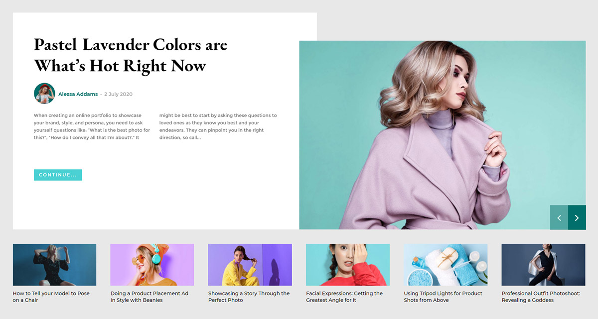
Mintyside PRO demo gives you options to show off your content in different manners, the header main menu is set perfectly for not only mega menu with subcategories, simple mega menu, and even submenus. With dashed borders on hover and shadows for blocks, the demo highlights both the menu and the search bar.
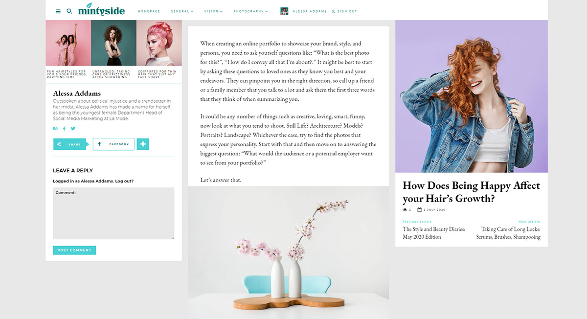
With white rows upon a grey background, headings, excerpts, and categories, the Mintyside PRO demo makes it easier for you to build a brand and share amazing stories with the world. Each featured image can become part of a segment you want to push forward: color schemes, color theory, illustrations, photography, and more.
Installing Mintyside PRO demo
Version 10.3.6 of Newspaper Theme came bundled up with various new demos: Magazine PRO, Lifestyle PRO, Scuba PRO, Retro Blog PRO, and Mintyside PRO. Owning a copy of Newspaper Theme gives you access to all these new demos by simply updating it. If you need more information about that, there’s an in-depth tutorial on how to update your Newspaper Theme.
To install the Mintyside PRO demo, you need to access your WordPress Admin Dashboard. From there, navigate to Newspaper Theme > Install Demos. Scroll down the page to find the one you’re looking for and hover over it to choose between:
- Design Only lets you import only the templates, colors, fonts, homepage.
- With content comes with all the sample content: the categories and posts are included in the import.
The main difference between the two of them is the fact that once you uninstall the demo and install another one, the sample content (categories & posts) are also removed from the website. If you already have content of your own, it’s best to go with “Design Only.”
Header Adjustments
One of the first things you should do after installing the demo is to make changes that showcase your brand and what the blog’s all about. Go to the homepage and open it through the tagDiv Composer. In the header section, click on the Logo element and upload your pre-designed logo as an image, copy and paste it as a SVG code or even create a new one with text and fonts.
The next item on the agenda is the main menu. Click on it, and from the General Settings tab, choose a menu you’ve created using the WordPress widget. You can always create a new one from the Admin Dashboard > Appearance > Menus.
Scroll down the page to change the logo and menu for the sticky header, too. And last but not least, using the device bar of the tagDiv Composer, click on the mobile view and change the logo and menu for the mobile device and mobile sticky.
Let’s tackle the Homepage
When you open the page with the tagDiv Composer you need to filter or offset Flex Blocks. To do this, click on one of them and travel to the Filter tabs. Now, sort the articles by author, categories, tags, or even by ID. From the General Tab, you can add an offset by inputting a number in the box.
On the right column, you have an ad box that can show your affiliates’ ad image. Upload the photo you want to use in the Image ad tab and write the URL. Scrolling down, you have more Flex Blocks elements and a Subscription box, and to the left side of it, a Background Image set on column. The background image can be replaced by navigating to the Column > CSS tab and then choosing a different image.
The subscription box also needs your Mailchimp / Feedburner / MailerLite code. From the General tab, choose your provider and copy-paste the embedded code in the box. Right below this, you have another ad box that you can replace with a different image and URL. The rest of the page only contains one more flex block and a Posts Loop. The Flex block can be filtered or offsetted according to what you wish to show. Save your settings!
Templates
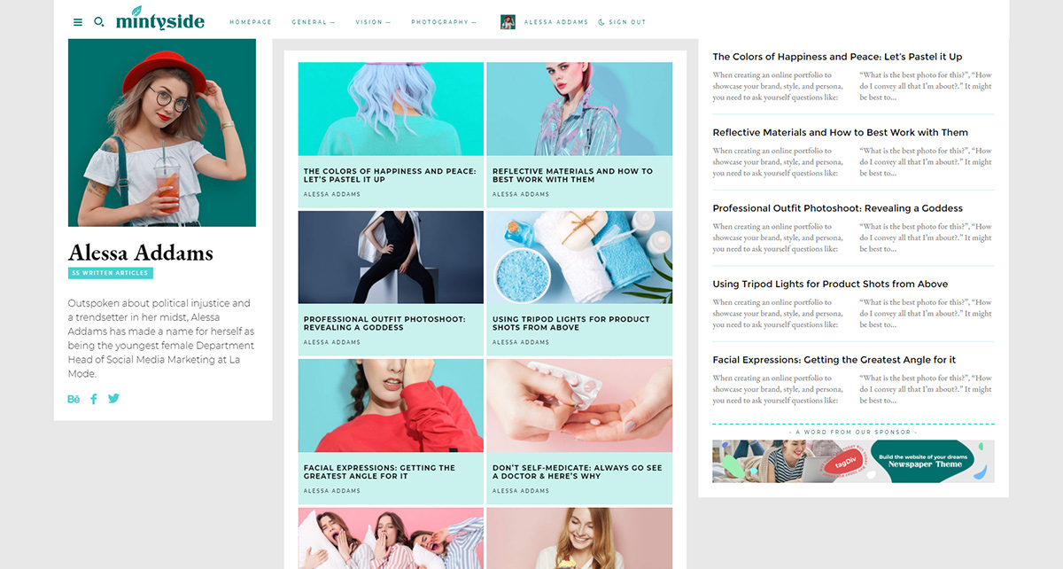
The most important part of adjusting your Cloud Library Templates is to showcase different articles through the flex blocks used on them. And just like above, you can filter or offset them. This applies to all the templates, so just hit the “Edit Template” button and make your adjustments.
Moreover, on the 404 Template, you need to add a URL that leads back to your homepage. So just copy and paste the website’s link to the button. The Author and Single Post Template have an ad box that needs to be replaced, too. Once you’re done, save your settings!
Market your site’s originality
If you want to change the demo’s layout, colors, fonts, you need a plan in mind. Take a look at our typography guide to understand the basics of contrast, tracking, and font-weight. Then choose fonts that are web-safe from the online gallery of Google Fonts. Now when you open a page or template through the tagDiv Composer, you can easily alter the fonts by going into the “Style” tab.
For colors, you need a primary and an accent color to create contrast and highlight important items. To better understand color complementaries, monochromatic and analogous schemes, you should learn the basics of Color Theory. With a color palette in mind, replace the colors on your templates and pages using the Style tab of the elements.
And last but not least, the magical tagDiv Composer allows you to make any layout alterations you need. They all can be done on the front-end by dragging and dropping items in the desired order. Create new rows, columns, adjust paddings, margins, and even borders. Once you have everything perfectly aligned, save your settings!
Conclusions
Whether you want to modify the demo to fit your vision or not, Mintyside PRO is capable of adapting to any type of blog. Everything can be adjusted right on the frontend, without any HTML or CSS skills/knowledge, so building your site is a breeze. Newspaper Theme’s PRO demos are entirely customizable from top to bottom. Once you hit that install demo button, the layout is perfect from the get-go! And remember, content is king.
Let us know how you’ve adapted the Mintyside PRO demo to fit your blog in the comment box below.


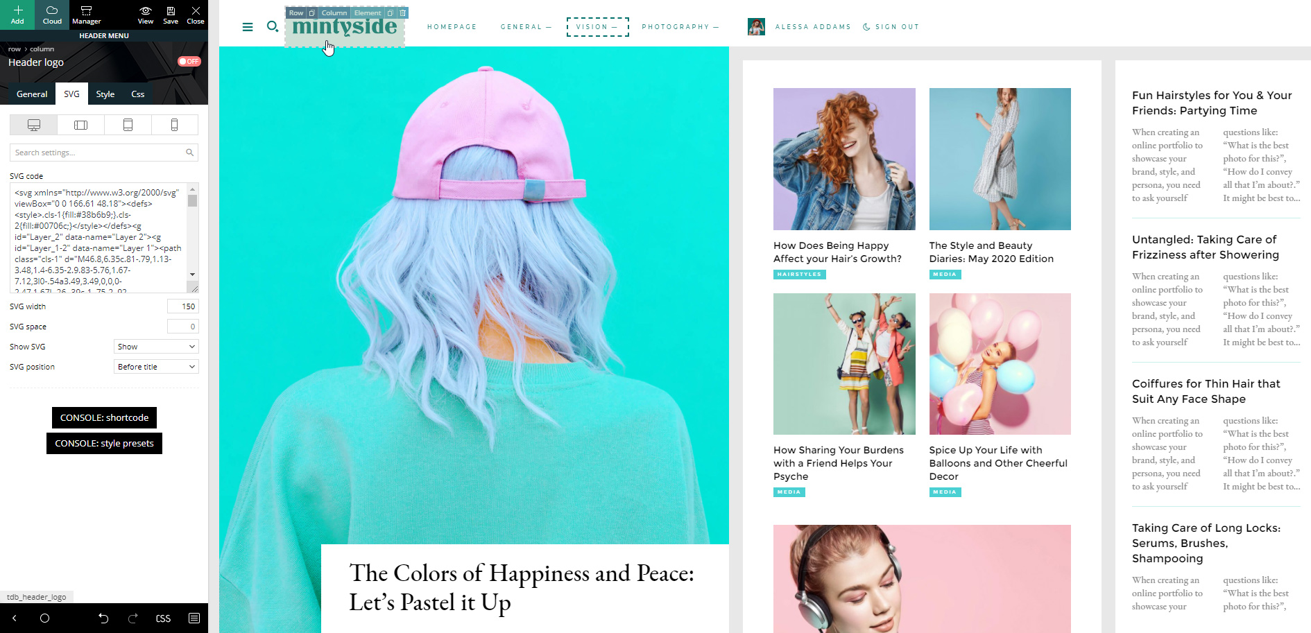
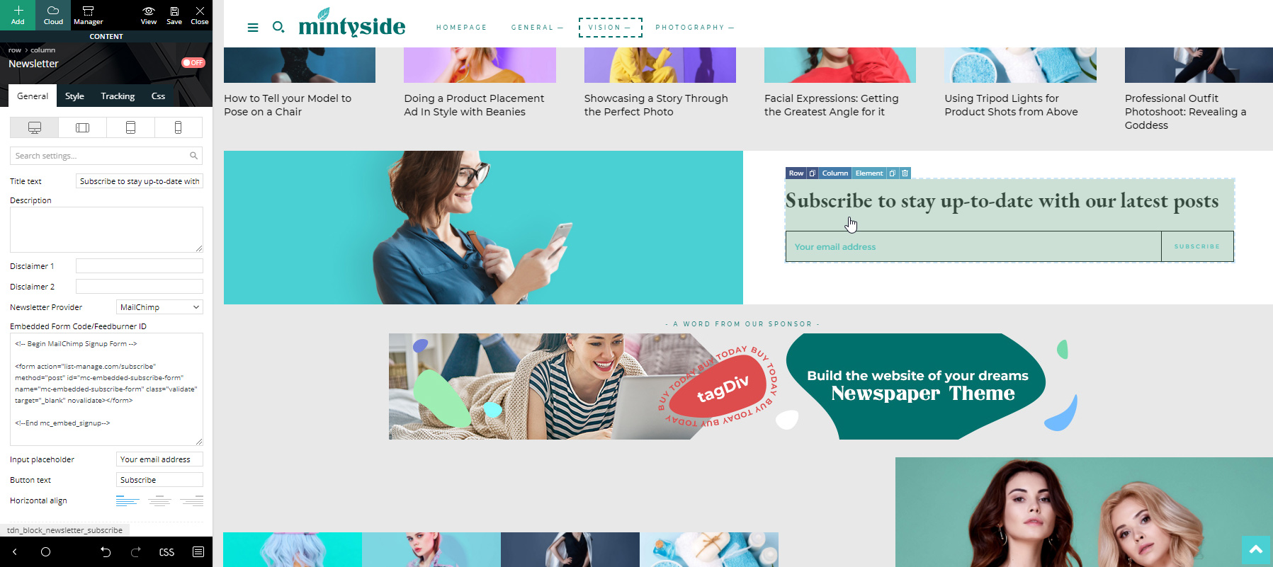







You can accomplish everything on the front end by rearranging elements with a simple drag and drop.