This period of the year is for best deals! With this in mind, we prepared for you an offer you don’t want to miss. Newsmag is a modern, premium WordPress theme that’s best suited for blog and magazine websites. What are you waiting for? Push the button and get the Cyber Monday Newsmag Theme Offer with 30% off and create your new website now!
Cyber Monday Newsmag Theme Offer is Here!
You can buy the Newsmag Theme at a special price, only between the 20th and 27th November. Take your passion to another level and combine visual effects with performance and functionality to build a successful news or magazine blog.
Discover Newsmag strongest features:
Loved by over 13,000 happy customers, these are just a few of the reasons to choose Newsmag for your website:
Version 4.6.
Great for blog, news and magazine websites
Responsive and retina ready
A bold design and easy to use interface
14 Editable Demos
Powered by tagDiv Composer
Front-end customization
Drag and drop functionality
Adaptive and flexible blocks
Optimized for performance
AdSense Ready
Six Premium Plugins
25 custom widgets
WPML compatible
Free lifetime updates
The Newsmag Theme is a powerful and flexible theme for passionate bloggers like you, making it easy to build amazing experiences for your readers, while not using coding knowledge. Haven’t tried Newsmag yet? It’s time to take advantage and get your Newsmag copy with 30% Discount, Now!
Make your website the striking point for any user by creating a dedicated About Page. With the Newspaper Theme, anyone can design a page’s layout easily. Shape the About Page to include the website’s goal, yet keep the message clear and approachable. After all, this is your introduction to the audience!
Use the About Page to Connect with your audience
Dedicate the opening lines to your readers’ objectives throughout the website. Keep their needs in mind, so why not start with the reason they are on the site in the first place? Answer the “What’s in it for me?” question to communicate the benefit your website provides to them.
Include a means of conversion for them such as a Subscription box. With the tagDiv Newsletter plugin installed, open the About Page through the tagDiv Composer and drag and drop the Newsletter element into the desired position. You can use it to link to an existing mailing service provider account such as MailChimp and customize it to perfection.
Be unique with your About Page
One way of staying original is to use your voice in writing. Create the About Page message with that in mind. The second way to be unique is to make your visitors part of the story, give them insight information and tell your story. Why does your website exist? Be personal and relatable. An easy way to do that is by adding or linking to a video that shows what life is like behind the scenes.
Open up the tagDiv Composer on the About Page and add an image to the background of a column as the video thumbnail. Now drag and drop an icon, link to the film in the Video Popup section. Try experimenting with different settings to obtain the perfect look.
When someone links to your website, you can be mentioned through the name put up on the About Page. Whether you choose a pseudonym or keep your real name, people need to know how to refer to you as. A real-life picture of yourself also goes a long way. Include your team members through the Team Member element in tagDiv Composer and write a short description of each.
If you’ve followed these pointers so-far, then the About Page should look impeccable in both its unique presentation and its message to the audience.
Watch the video for a perfect About Page
A beautiful About Page can improve the viewer count while also attracting more people to your website. With Newspaper Theme, transform the page into a stunning sight. Consider using Photos, Timelines, videos or infographics as they all capture the attention of each viewer. Use the Newspaper Theme and front-end page-builder to create and design a fantastic layout.
Each element can be set to look differently on each device which, in turn, delivers an appealing and diversified look. Input different margins, adjust the text format and keep it mobile-friendly! Just a bit of creativity can turn the page’s design into your pride and joy.
Eye-catching About Page designs
Need inspiration to get started? Take a look through the tagDiv Cloud Library, the Newspaper Theme’s new plugin. Import templates that alter a section or a page’s design within a few seconds. Open the plugin and type the word “about” in the search box. The results can be brought to your website to create a fantastic About Page. Edit and customize each layout. The Cloud Library is an effortless way to get started!
Have you obtained the perfect layout and design for your About Page? Show it off in the comment box below! ?
In WordPress’ early years, there were no Tag Templates, and only category templates were provided. The ever-growing need for a complex structure of posts made it hard to only use categories. More and more categories and sub-categories were required for complex article taxonomy structures. This led to very long category lists that were very hard to manage and thus the tag taxonomy started. Tags are similar to categories but with a more in-depth description of particular posts. The tags are smaller in scope and focused on specific topics.
In WordPress, if you do not select any category for a post, then your post takes the default “Uncategorized” category. Tags, however, are not automatically added unless a user adds them specifically.
Just as the categories, the tags require their own template as when a user clicks on a tag of your post, he is lead to the specific tag page. That’s why we’ve created the tagDiv Cloud Library Tag Templates, to help you gather specific posts with the same tag into a single page.
How to apply tag templates?
The Newspaper Theme comes with 3 predefined Tag Templates for you to try out. With the tagDiv Cloud Library plugin open, navigate to the Tag tab. Look through each design offered. Click on the one you like and import it. Once imported, go to the Newspaper Theme Panel and open the Template Settings tab. Navigate to the Tags Template to apply your newly created Tag Template. With tagDiv Cloud Library Tag Templates, you can now design a new universe for your tags!
The Cloud Library plugin provides stunning templates you can apply to your website. Moreover, it serves as a database for predefined elements you can use directly into your pages. You can create new content blocks from scratch easily like that. Select custom made tagDiv Cloud Library Blocks from our ever-growing database of currently over 170, predefined block elements you can use right now to present your content creatively.
So how does this work?
If you try to import a block directly from the Cloud Library plugin by pressing the Add Template button, then navigating to blocks and importing a design, it creates a new page where the block should be added. You can find this page in the pages section of WordPress. This applies to the block, footer, homepage, pages and sections tabs of the Cloud Library plugin. When importing these templates, you cannot find them in the Cloud Templates area but rather in the pages section.
For importing a block on an already-built page, you do not have to access the Cloud Library plugin from the WordPress dashboard. The tagDiv Composer features a Load Template button where are available all the templates that can be applied directly to the page. Choose the Blocks tab and select the block that speaks to you and is perfect for your design. You can preview a block before adding it to your page by pressing the live preview button.
The Cloud Library makes it simple to create stunning pages by not touching a single line of code. You can build the perfect page design with just a few clicks by using the predefined block elements.
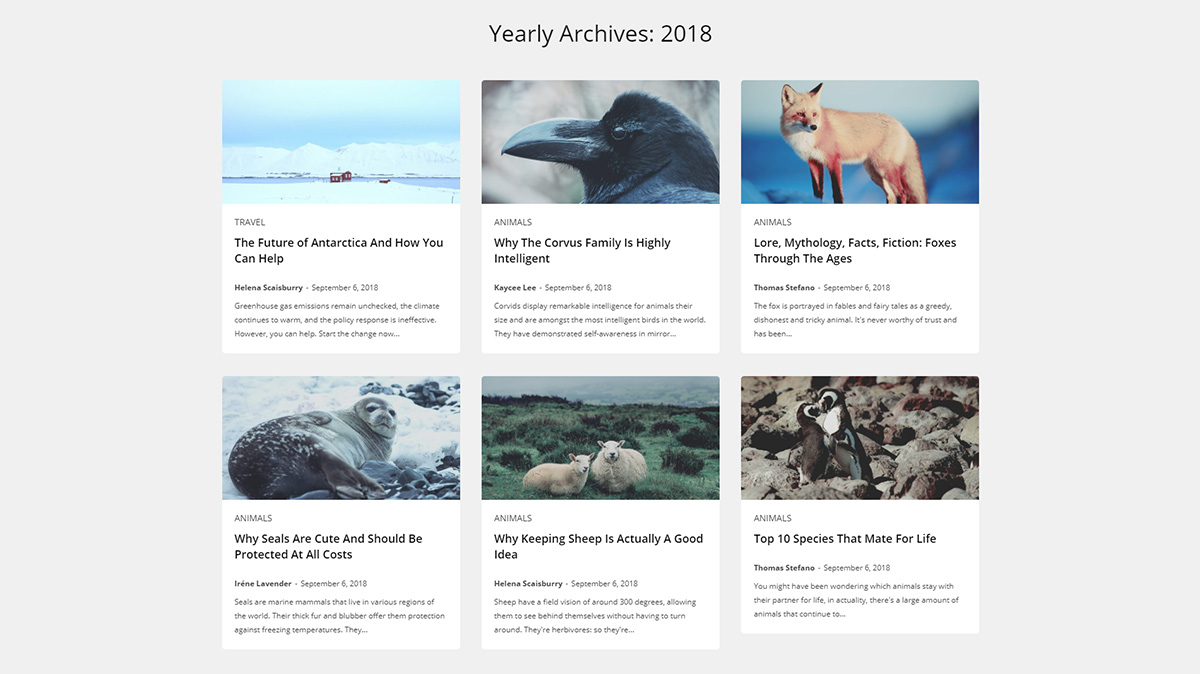
These templates are less known among the WordPress community as people tend to overlook this functionality. An archives page is a great way to structure all of your content in an archive such as monthly, yearly or even a particular date range.
WordPress supports automatic creation of archive pages, so you do not have to create them manually. Sadly, these pages tend to only consist of a simple list of posts, but now you can get creative and use the Cloud Library Archive Templates to import or edit stunning archive designs.
How does it work?
You can customize the appearance of your archive page with pre-made templates. In the tagDiv Cloud Library, navigate to the “Date” tab. Choose the template you like and import it.
For further adjustments, alter them now and then hit the “Save” button. To assign the template to the archive, click the Newspaper Theme Panel. In Template Settings, open the Archive Template section and choose the one you have just imported into the Date Templates drop-down menu. Save your settings and the new Archive Page is available for visitors.
But how do I access archive pages?
Since these pages are already created by WordPress, you only have to add the proper date/year after your site URL. The most obvious example would be to show all the posts from the current year. In this case, you would only add the year after the URL like in this case: https://tagdiv.com/2018/ Selecting a specific date would require you to add the year, month or day after the URL: https://tagdiv.com/2018/11/.
When you upload a file or image using the “Add Media” button, that file automatically becomes an attachment of the particular post you added the element to. Files from the “Media Library” are not particularly attached to a post or page. An attachment can be any file that you can upload using the “Add Media” button when creating content.
Images are the best example of attachment for a WordPress post, and they are the most common one.
An attachment page is a single post page with the post type of “attachment.” Just like a single post page, which is created for your article, the attachment page provides a page for the attachments of the post.
So why use an attachment template?
Attachment pages exist on your site whether you use them or not. Search Engines can easily discover them so choose proper images for your content. Write captions and image descriptions so you can add deeper and more meaningful content to your site. This, in turn, increase your SEO ranking and provides for your users more to do on your site.
How to use the attachment templates
To import an attachment template navigate to the Cloud Library option and then select the Attachment Tab. You can preview each template and select the one that best fits your style and import it. And if, you have the same Template imported more than once, you can now rest assured that you won’t confuse them. With the added functionalities to Newspaper Theme, each time you import the same template, it gets numbered. Find out more about this new feature over here.
The template’s front-end editing section automatically opens where you can modify it using the tagDiv Composer functionality or Save settings and apply the template to your attachment files.
You can globally apply this template from the Theme panel, under Template Settings – Attachment template.
Want more customization options for your Big Grids? If so, then look no further than the 9.1 update to the Newspaper Theme. Our team has carefully created a new and improved list of Flexible Big Grids that brings you countless possibilities in designing your website.
Flexible Big Grids for an endless variety of styles
Open the theme’s frontend page builder tagDiv Composer on a page or template. Now click on the Add Element button and find the 10 new items added to the list: the Flexible Big Grids. Each one has its own layout and comes with a default style, yet can be customized as your heart desires. Drag and drop one to see all the new settings you can use to feature the most important content of your website.
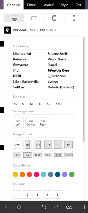
The General tab has a Pre-made Style Presets option ready to help you experiment with different looks for any Grid. Each choice is based on trends throughout popular websites, so mix and match to see which ones you enjoy the most:
Image Height and Width percentage based
Meta info padding, width, and margins
Options to show and hide parts of the Meta Info
Article padding and spacing
And so on.
Each setting can be adjusted easily and if you liked how something looked before, just hit the Undo and Redo button to go back. Experiment and have fun while doing it!
Why you should switch to the Flexible Big Grids
Sprinkle a dash of adaptability and a cup of customization on your favorite web design elements, and you get the Flexible Big Grids. However, let’s be more concrete about them. In the Newspaper Theme:
There are 10 available layouts for the new Flexible Big Grids which means endless possibilities in design.
If you modify the row’s padding and width, the element adjusts itself according to the row that nests it.
Access the Pre-Made Style Presets button to test various looks for any page with just a few clicks.
Each tab contains settings that alter the form of the modules which gives you unlimited options for the overall appearance of the page.
How about a test drive?
Drag and drop Big Grid Flex 8 onto a page. Now, click on the block and hit the Pre-made Style Presets button. With the new section opened up, go ahead and experiment with different looks for your new element.
For Font Family, let’s choose Quicksand. Looks great! Now, pick the font size, align it on the center, and the best part: select the design of the Flexible Big Grid. The style settings give your block an overlay: gradients or colors for a more vibrant and colorful look!
Let’s dive into more details. Go to the Filter section. By default, the Grid is filtered to the Latest posts, but you can choose to display content from only a selected category. Navigate to the Layout section and alter all the settings to get a perfect layout.
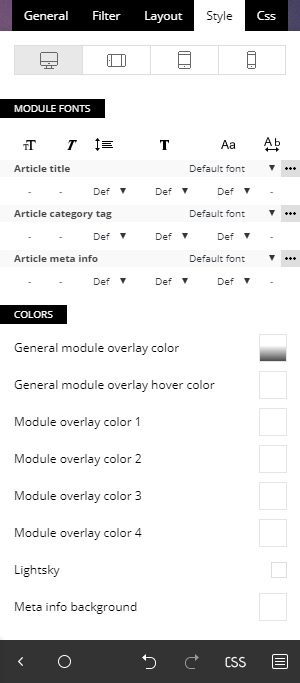
Now, the cherry on top! In the Style tab, under the Colors section, mark the Lightsky checkbox and your block should have a small animation when anyone hovers over your Flexible Big Grid. That’s awesome!
Design and Build new Flexible Big Grids
From concept to creation, designing is smooth sailing with the Newspaper Theme. The new Flexible Big Grids give you more control over the layout and a lot more design options! Find the perfect form for each block in just a few clicks with the Pre-made Preset Styles button and get detailed adjustments with the new settings in the Layout and Style tabs.
Experiment and have fun! Show us your favorite Flexible Big Grid designs in the comment box below and keep on creating the content your heart and audience’s desire! ?
Our themes are primarily news based themes providing elements destined for creating an online newspaper and news magazine. However, what if you need to show your content creatively beyond the standard news magazine based website? What if you need elements to help you present your business or your team members? What if you need a fancy homepage with creative elements beyond the actual articles of your website? We included a range of multipurpose elements to help you create the ultimate design for your website.
Multipurpose elements
Column content – This element has all the functionality of the call-to-action element but adds an image to the content providing extra image controls.
Fancy text with image – As fancy as the name suggests, this element adds a stylish approach to an image and text while providing a unique design perfect for presenting your content.
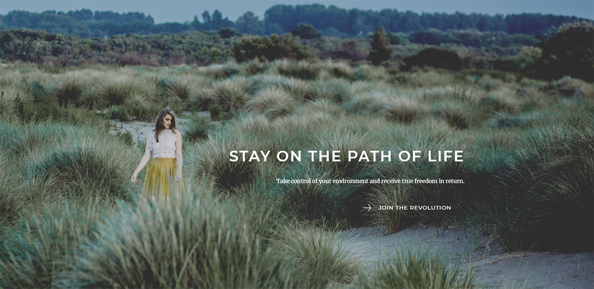
Hero – No, not the Marvel/DC kind, but rather a hero scene with an image and overlay. A description as well as buttons for a call to action functionality. An eye-catching section to draw your reader’s attention.
Image infobox – Similar to the hero element, but with a narrower content area showing the text and buttons upon mouse hover.
Text with image – A variation of the fancy text with an image but without the fancy look. It’s a more traditional way of presenting your content with a title, description, button and image on the side.
Title over image – Allows you to use an image with an overlay title and subtitle providing positioning controls for both the image and titles, with the possibility to show the title only on image hover.
Inline single image – Perfect for when you need to place an image on the page with proper control over the size and position. The element also provides styling options for the image itself like brightness, contrast, hue, saturation and much more. You don’t need a photo editor to provide an ‘edge’ for your image.
Call-to-actions and more
Call to action – This is a text and button based element. Place a title text description and a button. Style them with size, heading tags, fonts, colors, button URL, button text, button shape or size, and much more.
Column title – This title tag allows you to place a title and subtitle inside the page content for defining separate sections of the page.
Inline text – A simple text element which allows a quick text to be added to the page with alignment, font controls, link colors, and link hover colors.
List – A creative way to style a simple HTML list element by adding an icon implementation instead of the standard bullet. You can select different icons in different colors so you can create stylish lists for your content.
Menu product – destined for a product presentation featuring a product image, title, and description as well as price.
Icons, buttons, counters for multipurpose use
Button – The base button element helps you lead your viewers to the desired section of the site or external URL’s.
Icon – A quick and easy way to add an icon to your content. Choose from a wide range of icons included in the theme (over 1500 icons to chose from).
Icon box – Lead your readers to the desired section presented with an icon, description, and call-to-action button.
Social icons – Choose to show social icon links for the following networks: Behance, Blogger, Dribbble, Facebook, Flickr, Google+, Instagram, Lastfm, LinkedIn, Pinterest, RSS, Soundcloud, Tumblr, Twitter, Vimeo, YouTube or VKontakte.
Progress bar – Insert the element, choose the name, style, color, and set the percentage to show off your stats.
Numbered counter – Once in a while you may need to show off your number of sales, customers or products provided. So, no matter the number, this element has you covered.
Involve your clients
Client – an element that lets you creatively present your most valued clients with a text and image possibility.
Pricing table – play an important role for every company that offers products or services. Efficient and straightforward in differentiating between features and prices of different products or services.
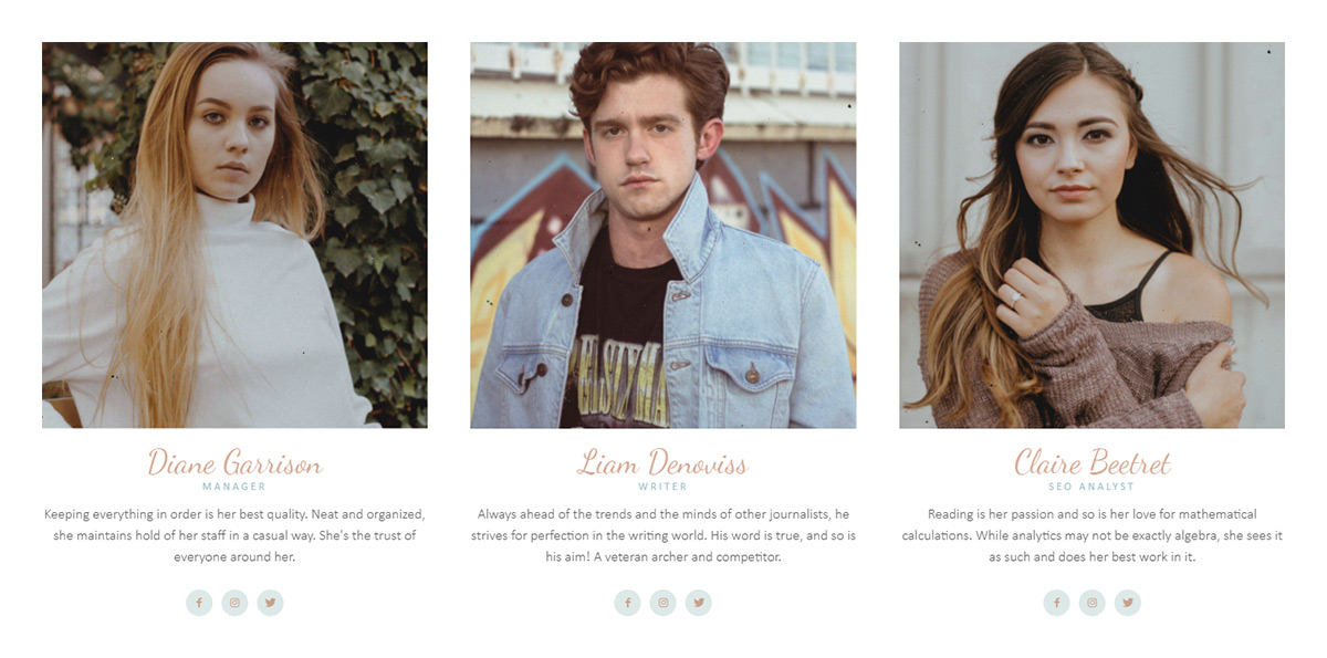
Team member – style your team members with this element providing an image, name, job title, description as well as the team member social networks.
Testimonial – highlight your favorite customer testimonials in style.
For each domain, there are certain best practices generally accepted by developers. One such rule for news, magazine, and other related sites is to display featured posts at the top of the page using large images and big, bold titles. This is where the Big Grids come in and provide the needed options in multiple formats and color styles.
There are a total number of 10 Big Grid Flex elements you can choose from to create unique layouts and show off your highlighted posts. You can also choose the exact size for your thumbnails, the column layout, the number of posts shown and many more.
All the available Big Grid Flex elements have 5 Settings Tabs (General, Filter, Layout, Style, and CSS) so that you can highly customize them as you want.
1. General
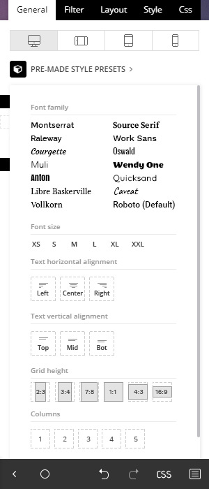
Before diving into the actual settings, the Big Grid Flex elements have a set of pre-made styles you can choose under the General tab for a quick setup of your chosen Big Grid Flex, without going in too deep into the settings.
This is the perfect tool for a quick and easy setup of your grid element if you do not have the skills or the time to dig deeper into grid customization. It provides a panel to set the overall fonts, text alignment, and grid style.
For example, in this section, Big Grid Flex 1 also provides options for grid height and column count for you to choose the preferred number of posts to show in a row.
However, for a more in-depth look at the settings available, each section appears below.
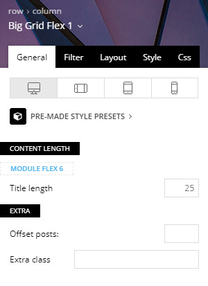
Content-Length – You can select the title length for each of the modules used on the Big Grid.
Offset posts – Start the count with an offset for the posts that display on the grid. If you have a block that shows five posts before this one, you can make this one start from the 6th post (by using offset 5). This means you can make the Big Grid jump over a set number of posts to avoid duplication.
Extra class – Add a particular or unique class for your grid in the input field. This, in turn, allows you to add additional customizations to the grid.
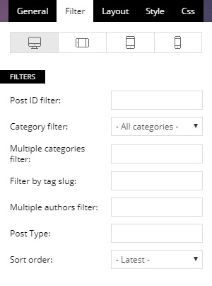
2. Filter Tab
Use this tab to order your posts. You can filter posts in-depth using individual Posts IDs, Categories, Tags, Authors, Post Types, and a variety of custom sort order options.
Post ID filter – Specific posts can be filtered to your block by using the post ID. You can get the post ID by accessing Wp Admin > Posts section, hover the post title and check the link displayed on the browser left-bottom area. Use the URL to extract the IDs. To exclude posts from a Big Grid add a ‘-’ symbol in front of each ID.
Category filter – Choose a category for the block from a drop-down menu containing all the existing categories.
Multiple categories filter – This option allows you to filter the posts by multiple categories. The procedure is similar to the one used on Post ID filter. Add the category IDs separated by commas (ex: 13,23,18). If you want to exclude categories, just a ‘-’ symbol in front of each ID. If you want to display posts from a category and remove the posts included in one of its sub-categories, first add the parent category ID (ex. Fashion category: 341) and after it places the sub-category ID (ex. Daily subcategory id: 342) with a ‘-’ symbol in front, like it’s shown in the image. If you decide to use the ‘multiple categories filter,’ the standard Category Filter is ignored.
Filter by tag slug – Filter the grid posts by their labels and enter the tag slugs separated by commas (ex: tag1, tag2, tag3).
Multiple authors filter – This allows you to filter the posts by author(s). Enter the author IDs separated by commas (ex: 13, 23, 18).
Post type – Use this filter if you want to display custom post types. Add the name of the post type provided by the plugin used to create the CPT, or by the user, if it’s custom-made. Usage: post, page, event – write 1 or more post types delimited by commas.
Sort order
This option lets you order the posts inside the grid. Most of these options are self-explanatory, but there are a few options that have requirements:
Standard sorting options:
Latest posts – Shows posts from newest to oldest.
Oldest posts – Reverses of the previous sorting option.
Alphabetical A > Z – Your posts are sorted in alphabetical order by their name.
Random posts – This sorting option brings up posts randomly on each loading of the page. Every time you refresh the page, the posts are different. As a note: do not use the random posts sorting options together with pagination as it could result in duplicate articles.
Random posts from the last 7 days – This field brings up random posts based on the articles published in the last 7 days.
Sorting options that feature extra requirements:
Popular (all time) – This sorting option requires the post views to be active. If views are disabled, this option does not work.
Popular (last 7 days) – You have to enable the 7 days post sorting from Theme Panel > Block Settings > 7 Days Post Sorting.
Popular (jetpack + stats module required) – Does not work with other settings/pagination and it requires Jetpack – Stats Module to be installed.
Featured – It displays posts included in the Featured category which is available through the theme. If you delete this category and you want to restore it, create a new category with the name of ‘Featured,’ and a slug ‘featured.’
Random posts today – Requires the post views to be active.
Highest rated – It requires review posts, to see how you can set a review please check the following guide.
Most commented – You need comments to be active on posts. Enable/disable the comments from Theme Panel > Post Settings > Post and Custom Post Types.
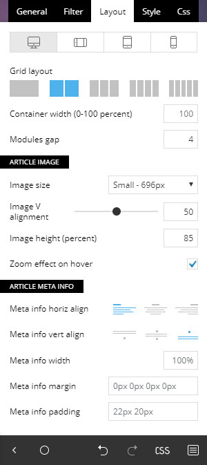
3. Layout
The layout tab is the section where you create the layout for your content. A Big Grid Flex layout can be made out of 1 or more modules. You can find the settings in this section not only for the Big Grid Flex element in particular but for every module used on the particular Big Grid Flex as well.
Individual Big Grid Flex elements have the following options more or less, depending on the selected block type. For the sake of keeping this guide as short as possible, we only mention the most important ones as there are lots of customization options to choose from.
Overall layout
Big Grid Flex 1 is the exception as it offers 2 extra controls in this section regarding the grid layout where you can choose between 1 and 5 posts per row and the container width section in percentage.
The overall layout lets you choose the gap between modules, the alignment of the meta information, the category tag position as well as the option to turn on or off the zoom effect.
Per module settings
Set different options for each module in particular for your grid. The image size lets you control the thumbnails shown for your content. There are 4 thumbnail sizes that Big Grid Flex element uses, namely: small, default, large or full.
After you choose the image size, you can also play around with its vertical alignment, image width, and height (in percentage). Among the controls in this section, we can mention the meta information width, margin and padding, article title space, and padding, category tag spacing and padding, the option to show or hide the category tags, the post author, and publishing date.
There are separate sections for each module allowing you better control over each element of the grid.
4. Style
The style tab is all about design. Change fonts and colors for your newly created grid element.
Module fonts
The top section allows you to change the font size, font family, line height, font weight, letter spacing, and text transform. Alter the module title, category tag, meta information as well as the mobile versions of the fonts in particular.
Colors
The color settings allow you to change individual colors for each of the layout sections. You can change the general or individual overlay color, meta info colors, review stats color, as well as add the “lightsky” hover effect.
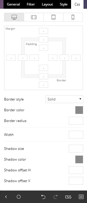
5. CSS
This section allows you to change the CSS for the overall grid element. It includes a box model where you can control the margins, padding, and border for the grid.
Extra settings include border settings (color, style, radius, and width), shadows (shadow size, color, offset), the block overall background color or image (as well as their position and opacity).
The color overlay feature adds a gradient on top of your block. Choose multiple colors to add all new creative gradients to take your grid style to the next level.
The display option allows you to show or hide a particular block. This is useful if you want to hide a particular block for a specific device using the top device tabs.
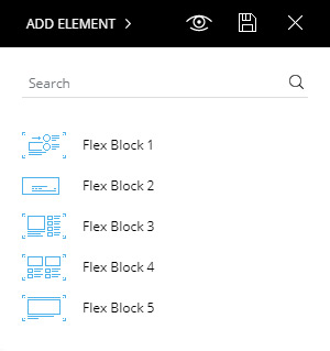
When you start building a website it’s important to use a structure that is suited for your content with the optimal impact on your visitors. Through this guide, you can learn how to use the theme’s tagDiv Composer Flex Block elements. With the tagDiv Composer plugin open, add a Flex Block on a page.
There’s a total of 5 Flex Block elements you can choose from to create your very own customized blocks. You can alter the size of your thumbnails, the column layout, the number of posts shown and much more. The tagDiv Composer Flex Block elements are versatile and will help you make your site to stand out from the crowd. Why don’t we get into more details?
Add a Flex Block to the page just by dragging it onto the row into the preview area. Choose the type of Flex Block you want to use, based on the General style shown by the small thumbnail. Each of the small thumbs offers a general quick look at the style of the block you can create.
The block settings are divided into 5 tabs: General, Filter, Layout, Style, and CSS. However, don’t confuse the Flex Blocks with the Flexible Big Grids as they have a different layout.
1. Pre-Made Style Presets
Before diving into the actual settings, the Flex Blocks have a set of premade styles you can choose under the General tab. Use this option for a quick setup of your Flex block without going in too deep into the block settings.
If you do not have the skills or the time to dig deeper into the block customization, this is the perfect tool for a quick and easy setup of your Flex Block element
This section provides a quick panel to set the overall fonts, text alignment, image format, a quick global color accent, the number of columns for your block. You can also choose the actual layout style and select to show or hide individual meta information. The panel shows different options based on the chosen Flex Block.
For a more in-depth look at the settings, there’s a presentation for each section below.
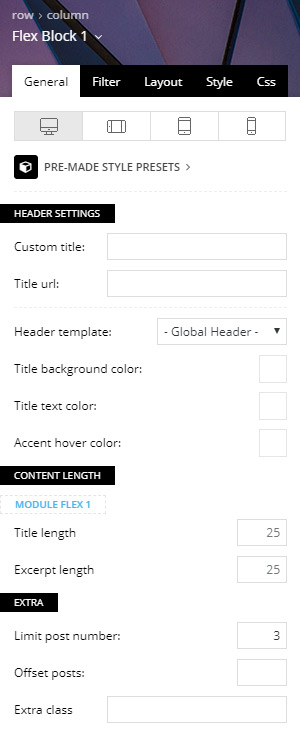
General Settings
The General tab offers broad settings and it’s the same across all of the Flex Blocks. It includes the following:
Custom title (optional) – Set a title for this block, if you leave it blank the block does not display any title.
Title URL (optional) – Set a custom URL for the block title.
Header template – You can choose from one of the 17 available header styles. If you’ve set a title for the block, this changes the style of that section.
Title background color (optional) – Choose a custom title background color for this block. The title background color also affects the hover color of the posts displayed as well as the Ajax filter hover color.
Title text color (optional) – Choose a custom title text color.
Content-Length – Select the title and excerpt length for each of the modules used on the block.
Limit post number – If the field is empty, the limit post number is the number from WordPress Settings > Reading
Offset posts – Start the count with an offset. If you have a block that shows five posts before this one, you can make this one start from the 6’th post (by using offset 5)
Extra class – This input field can be used to add a specific or unique class for your block which can be used to add additional customizations to the block.
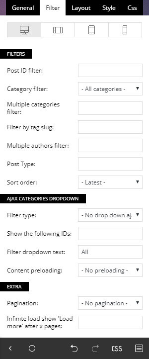
2. Filter
The Filter tab is the section where you can choose which content to show for your block.
Post ID filter – Use the posts’ ID to filter your block by specific posts. You can get the post ID by accessing WP Admin > Posts section, hover the post title and check the link displayed on the browser left-bottom area. Use the URL to extract the IDs. To exclude posts from a block add a ‘-’ symbol in front of each ID.
Category Filter – Choose a specific category for the block from a drop-down menu containing all the existing categories.
Multiple categories filter – This option allows you to filter the posts by multiple categories. The procedure is similar to the one used on Post ID filter. Add the category IDs separated by commas (ex: 13,23,18). If you want to exclude categories, add a ‘-’ symbol in front of each ID. If you want to display posts from a category and remove the posts included in one of its sub-categories, first add the parent category ID (ex. Fashion category – 341) and after it places the sub-category ID (ex. Daily subcategory id: 342) with a ‘-’ symbol in front. If you decide to use the ‘multiple categories filter,’ the standard Category Filter is ignored.
Filter by tag slug – Filter the posts by their tags and enter the tag slugs separated by commas (ex: tag1, tag2, tag3).
Multiple authors filter – This allows you to filter the posts by author(s). Enter the author IDs separated by commas (ex: 13,23,18).
Post type – Use this filter if you want to display custom post types. Add the name of the post type. This is provided by the plugin used to create the CPT, or by the user if it’s custom-made. Usage: post, page, event – write 1 or more post types delimited by commas.
Sort order
– This option lets you order the posts. Most of these options are self-explanatory, but there are a few options that have requirements:
Standard sorting options:
Latest posts – It shows articles from newest to oldest.
Oldest posts – It is the reverse of the previous sorting option.
Alphabetical A > Z – Your articles are sorted by their name in alphabetical order.
Random posts – This sorting option brings up posts randomly on each loading of the page. Every time you refresh the page, there are different articles on it. As a note. Do not use this sorting option together with pagination as it could result in duplicate posts.
Random posts from the last 7 days – This field brings up random posts based on the ones published in the last 7 days.
Sorting options that feature extra requirements:
Popular (all time) – this sorting option requires the post views to be active. If views are disabled, this option does not work.
Popular (last 7 days) – you have to enable the 7 days post sorting from Theme Panel > Block Settings > 7 Days Post Sorting.
Popular (jetpack + stats module required) – does not work with other settings/pagination and it requires Jetpack – Stats Module to be installed.
Featured – it displays posts included in the Featured category which is automatically created by the theme. If you delete this category and you want to restore it, create a new category with the name of ‘Featured’ and a slug ‘featured’.
Random posts today – this field requires the post views to be active.
Highest rated – requires review posts, to see how you can set a review please check the following guide.
Most commented – requires comments to be active on posts. You can enable/disable the comments from Theme Panel > Post Settings > Post and Custom Post Types.
Ajax Categories Dropdown:
Filter type – Display a list of Categories, Authors or Tags next to the title. The user is able to see posts filtered on this block, that are dynamically loaded with Ajax without leaving the page. The Ajax filters (except by popularity) require an additional parameter.
Show the following IDs – the Ajax drop down shows only the (author ids, categories IDs or tag IDs) that you enter here separated by commas. If no IDs are provided in the input below, the filter shows all the available items (ex: all authors, all categories etc..)
Filter drop-down text – lets you choose the name for the first item from the drop-down Ajax list. By default, this is named ‘All.’
Content preloading – When the preloading section is active, the theme loads the first page content for each of the Ajax filters at the initial page load.
Extra:
Pagination – You can choose to add pagination to your block.
Next Prev ajax – adds two navigation arrows to navigate through posts.
Load More button – the “Load more” button appears at the bottom of the Flex Block allowing users to see more posts
Infinite Load – automatically loads more posts when the user gets to the end of the Flex Block.
Infinite loadshow ‘Load more’ after x pages – if you select infinite load you can use this option to make it stop after some pages, the “Load more” button appears at the page bottom allowing users to load more posts. Notice: For the Infinite Load you may need to specify after how many pages a button shows up, otherwise it loads posts until they are finished.
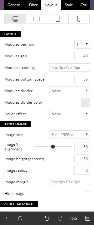
3. Layout
The layout tab is the section allows you to customize your Flex Block’s form. A Flex Block layout can be made out of 1 or 2 modules. You can find settings in this section not only for each Flex Block in particular but for every module used on the particular Flex Block as well.
Individual Flex Blocks have more or less the following options depending on the Flex Block type selected. For the sake of keeping this guide as short as possible, we only mention the most important ones as there are lots of customization options to choose from.
Overall layout
This section allows you to choose the number of columns or modules per column your block displays, the spacing (in pixels) between each module, setting margins and padding around your columns and adding a divider between elements.
If the Flex Block you’ve chosen is made out of 2 modules, there is a second layout section for the second module for more in-depth customization of the block.
Article image
This section lets you control the thumbnails shown for your content. There are 4 thumbnail sizes for the Flex Block element you can choose in this section appropriately named small, default, large or full.
After you choose the image size, you can also play around with its vertical alignment, image width, and height (in percentage), image position, image radius, or select to hide the image altogether if you choose to.
Article meta information
The meta information refers to the post titles, author, date, excerpt and other information about the post shown in a particular block.
You can choose the meta info positioning, alignment, as well as set margins and padding for each of the individual elements such as article title, category tag, author, date, and excerpt. If you want to hide certain elements, you can do it, too.
The author section allows you to use the author image as well as adjust its size.
Flex blocks 1 and 5 can also have a read more button added in this section.
4. Style
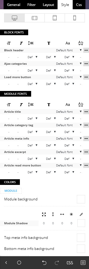
The style tab is all about styling the layout allowing you to change fonts and colors for your newly created block element.
Block fonts
The top section allows you to change the font size, font family, line height, font weight, letter spacing, and text transform. This section covers the fonts for the Block header, Ajax categories and the load more button.
Module fonts
The module fonts section controls the font settings for each module in particular for the article title, the category tags, the meta information, excerpts as well as the read more button if present.
Colors
The color settings allow you to change individual colors for each of the layout sections. You can change the text color, background colors, hover colors, as well as adding a shadow effect and shadow offset.
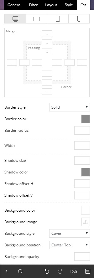
5. CSS
The CSS tab refers to the block CSS as a whole and allows you to change it accordingly. This section includes the CSS box model where you can control the margins, padding, and border for the block.
Extra settings include border settings (color, style, radius, and width), shadows (shadow size, color, offset), the block overall background color or image (as well as their position and opacity).
The color overlay feature adds a gradient on top of your block where you can choose multiple colors to add all new creative gradients to take your block style to the next level.
The display option allows you to show or hide a particular block. This is useful if you want to hide a particular block for a specific device using the top device tabs.
This website uses cookies to improve your experience while you navigate through the website. Out of these, the cookies that are categorized as necessary are stored on your browser as they are essential for the working of basic functionalities of the website. We also use third-party cookies that help us analyze and understand how you use this website. These cookies will be stored in your browser only with your consent. You also have the option to opt-out of these cookies. But opting out of some of these cookies may affect your browsing experience.
Necessary cookies are absolutely essential for the website to function properly. These cookies ensure basic functionalities and security features of the website, anonymously.
Functional cookies help to perform certain functionalities like sharing the content of the website on social media platforms, collect feedbacks, and other third-party features.
Performance cookies are used to understand and analyze the key performance indexes of the website which helps in delivering a better user experience for the visitors.
Cookie
Duration
Description
AMP_TOKEN
This cookie is set by Google Analytics - This cookie contains a token that can be used to retrieve a Client ID from AMP Client ID service. Other possible values indicate opt-out, inflight request or an error retrieving a Client ID from AMP Client ID service.
Analytical cookies are used to understand how visitors interact with the website. These cookies help provide information on metrics the number of visitors, bounce rate, traffic source, etc.
Cookie
Duration
Description
_ga
2 years
This cookie is installed by Google Analytics. The cookie is used to calculate visitor, session, campaign data and keep track of site usage for the site's analytics report. The cookies store information anonymously and assign a randomly generated number to identify unique visitors.
_gat_gtag_UA_43963494_1
1 minute
This cookie is set by Google and is used to distinguish users.
_gid
1 day
This cookie is installed by Google Analytics. The cookie is used to store information of how visitors use a website and helps in creating an analytics report of how the website is doing. The data collected including the number visitors, the source where they have come from, and the pages visted in an anonymous form.
_hjAbsoluteSessionInProgress
30 minutes
This cookie is used to detect the first pageview session of a user. This is a True/False flag set by the cookie.
_hjFirstSeen
30 minutes
This is set by Hotjar to identify a new user’s first session. It stores a true/false value, indicating whether this was the first time Hotjar saw this user. It is used by Recording filters to identify new user sessions.
_hjid
1 year
This cookie is set by Hotjar. This cookie is set when the customer first lands on a page with the Hotjar script. It is used to persist the random user ID, unique to that site on the browser. This ensures that behavior in subsequent visits to the same site will be attributed to the same user ID.
_hjIncludedInPageviewSample
2 minutes
This cookie is set to let Hotjar know whether that user is included in the data sampling defined by your site's pageview limit.
_hjIncludedInSessionSample
2 minutes
This cookie is set to let Hotjar know whether that user is included in the data sampling defined by your site's daily session limit.
Advertisement cookies are used to provide visitors with relevant ads and marketing campaigns. These cookies track visitors across websites and collect information to provide customized ads.
Cookie
Duration
Description
_fbp
3 months
This cookie is set by Facebook to deliver advertisement when they are on Facebook or a digital platform powered by Facebook advertising after visiting this website.
fr
3 months
The cookie is set by Facebook to show relevant advertisments to the users and measure and improve the advertisements. The cookie also tracks the behavior of the user across the web on sites that have Facebook pixel or Facebook social plugin.
IDE
1 year 24 days
Used by Google DoubleClick and stores information about how the user uses the website and any other advertisement before visiting the website. This is used to present users with ads that are relevant to them according to the user profile.
test_cookie
15 minutes
This cookie is set by doubleclick.net. The purpose of the cookie is to determine if the user's browser supports cookies.
VISITOR_INFO1_LIVE
5 months 27 days
This cookie is set by Youtube. Used to track the information of the embedded YouTube videos on a website.
YSC
session
This cookies is set by Youtube and is used to track the views of embedded videos.


