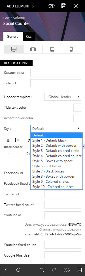
The tagDiv Social Counter plugin brings you support for Facebook fans, Twitter followers, YouTube subscribers, Vimeo, Instagram, Google Plus, Soundcloud and Feed subscribers. This plugin makes it easy to display your social accounts stats.
Watch a step-by-step video guide
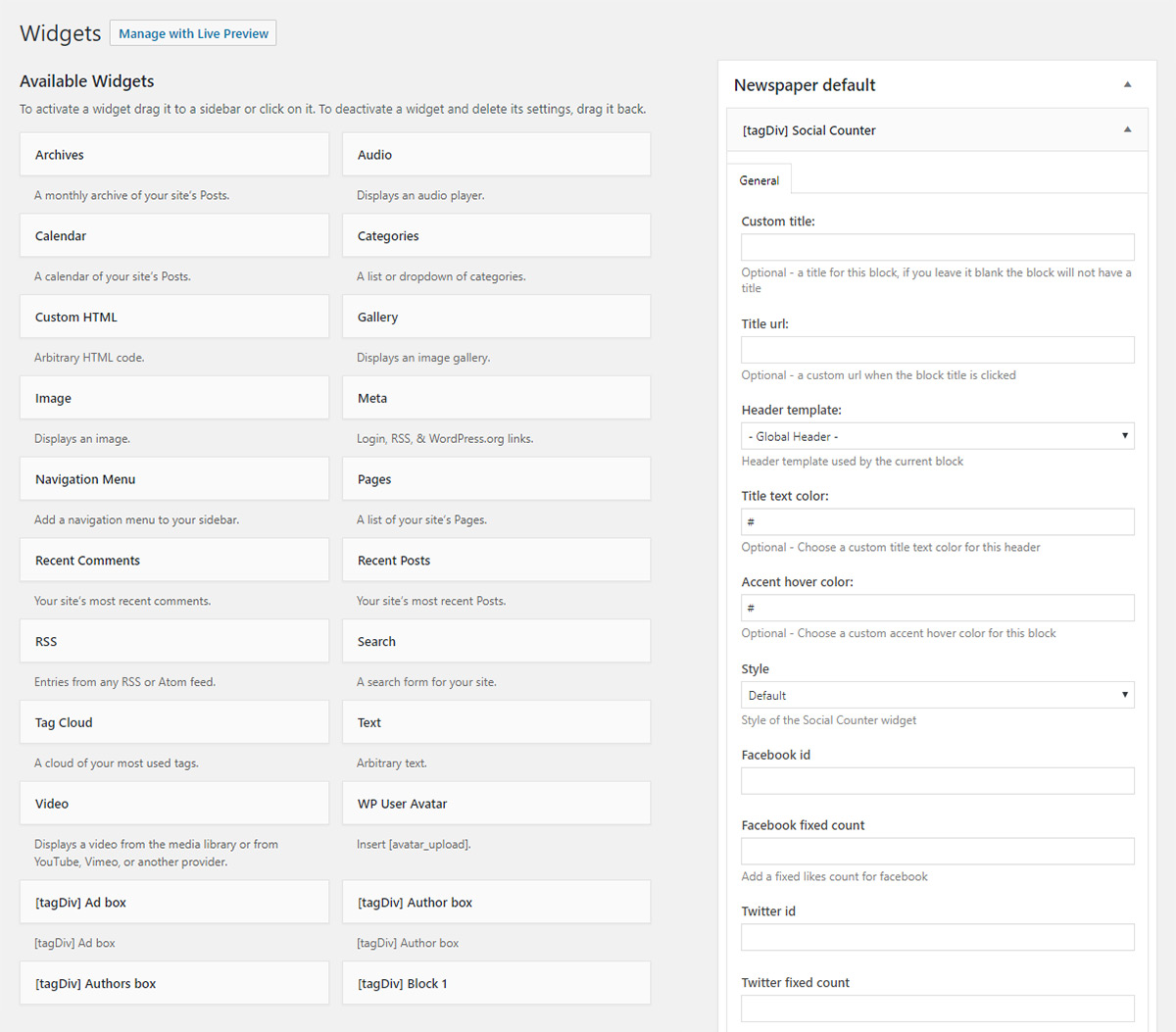
Use the tagDiv Social Counter plugin as a widget in the sidebar
Go to Appearance > Widgets, find [tagDiv] Social Counter and drag it in the sidebar.
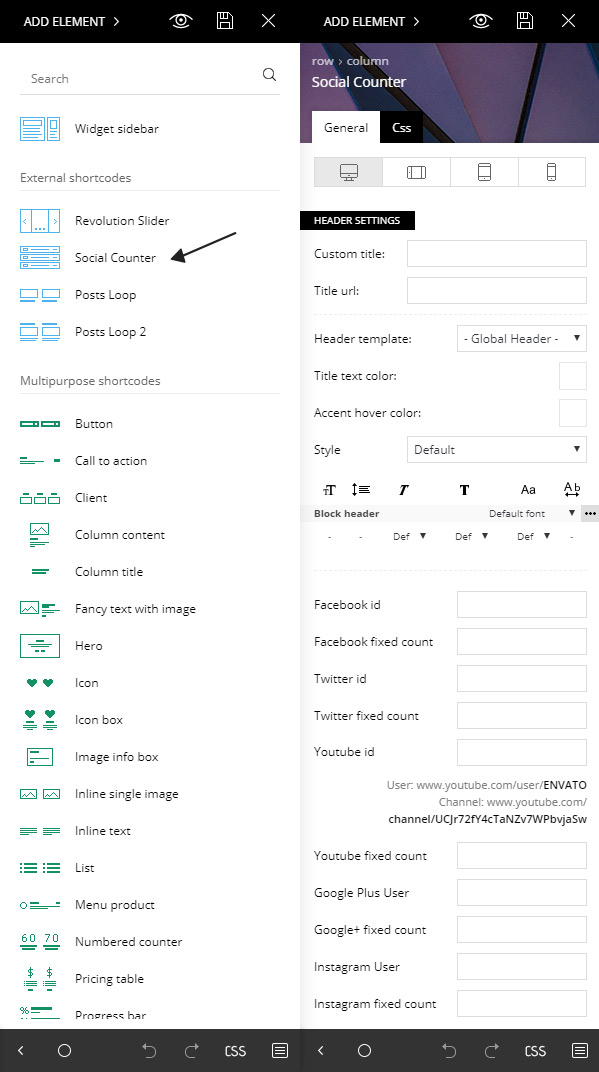
Using the tagDiv Composer add the Social Counter
From the tagDiv Composer page builder, click the Add Element button and select the Social Counter from the list. Drag and drop it into the page.
How to set up the tagDiv Social Counter plugin
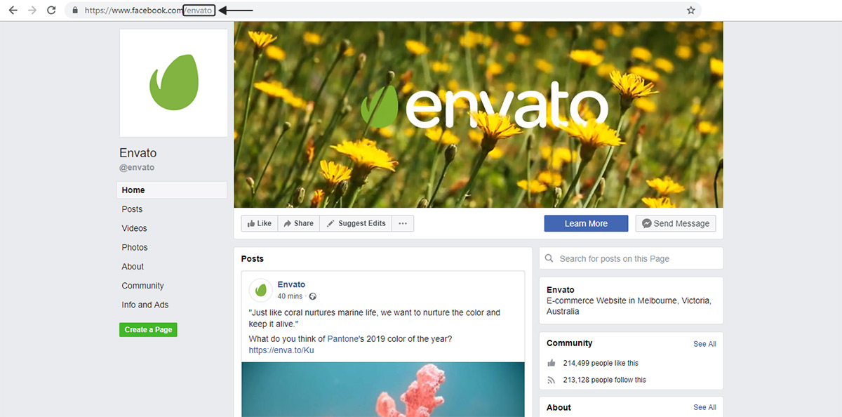
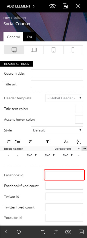
1. Facebook ID
Copy the name from the URL and use it in the required field from the Social Counter
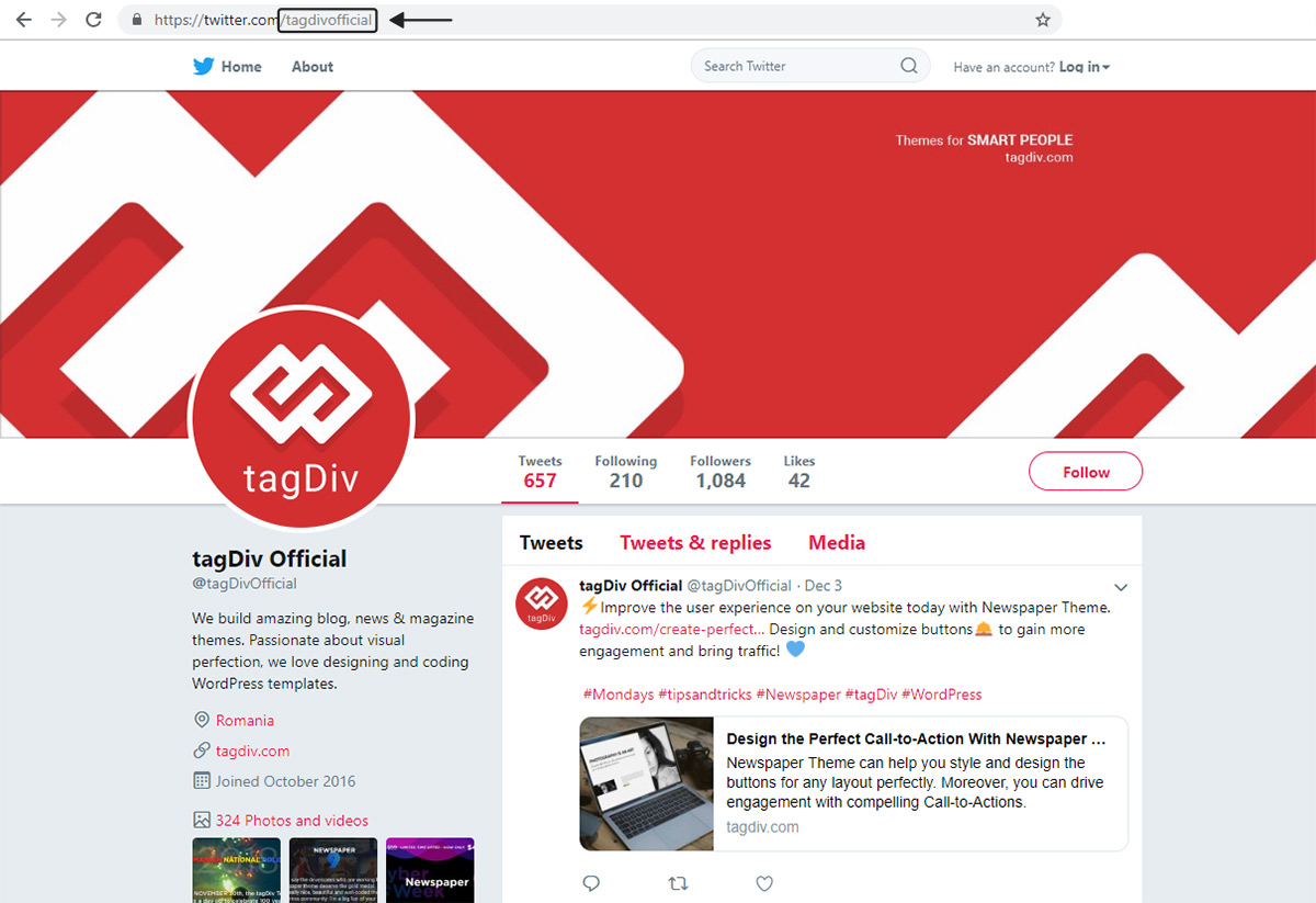
2. Twitter ID
From the URL copy the name and use it in the required field from the Social Counter
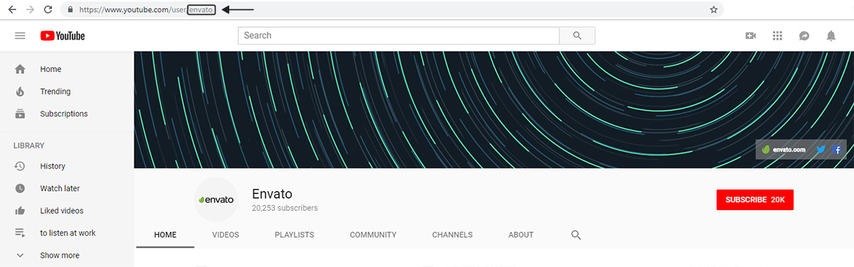
3. YouTube ID
From the URL copy the name and use it in the required field from the Social Counter
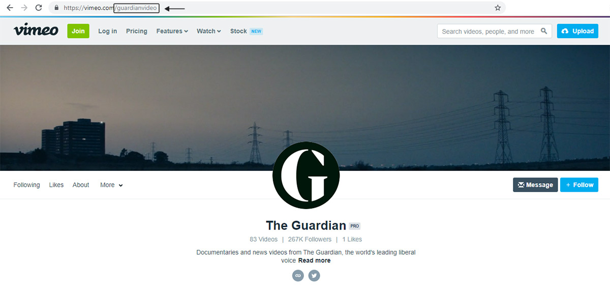
4. Vimeo ID
From the URL copy the name and use it in the required field from the Social Counter
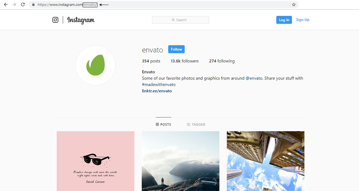
5. Instagram ID
From the URL copy the name and use it in the required field from the Social Counter
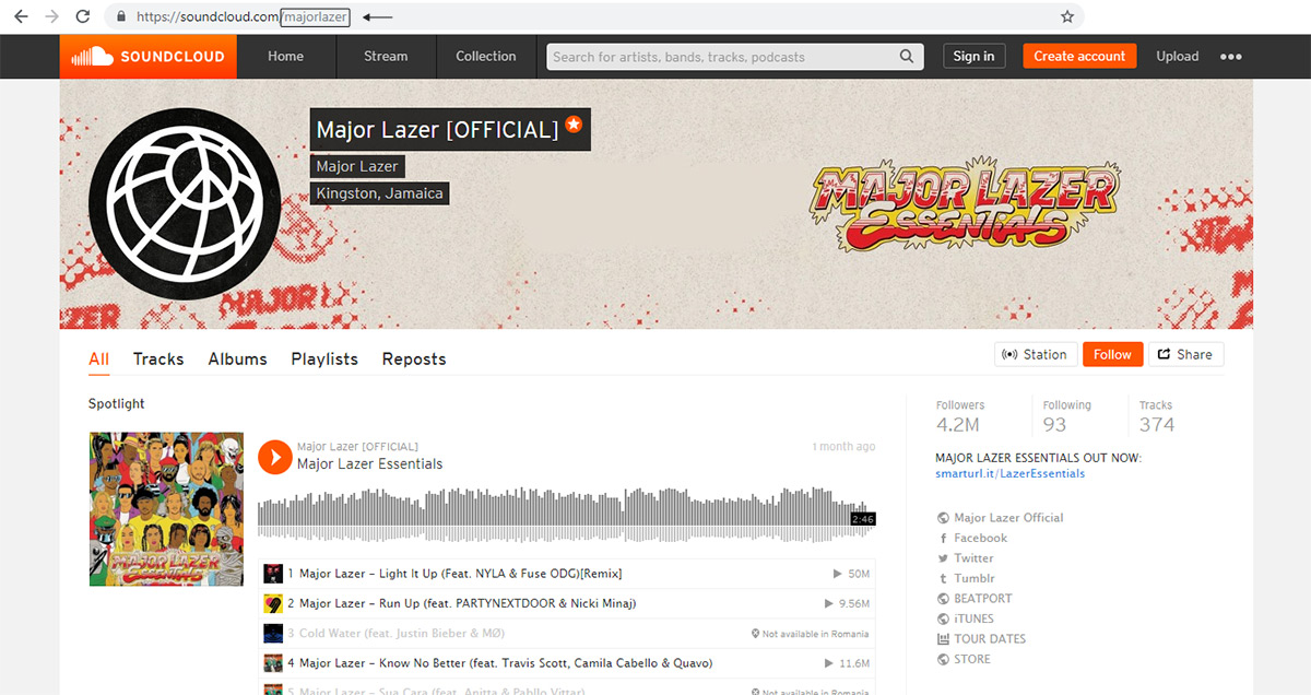
6. SoundCloud ID
From the URL copy the name and use it in the required field from the Social Counter
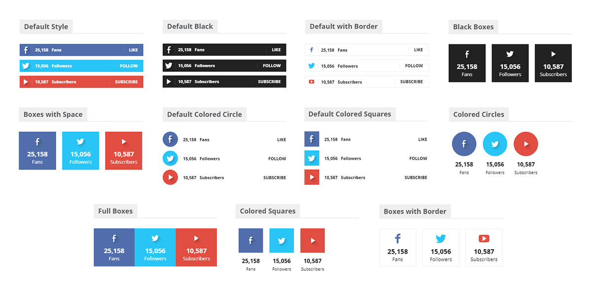
To increase the theme design flexibility, even more, we decided to add ten new Social Counter styles. Try them all and pick the one which works best for your project. You can choose a different design for the tagDiv Social Counter from the plugin settings panel:
Practical example for translating Cloud templates.
The Newspaper theme demos provide beautiful cloud templates for the website header, footer, post, category and so on. These templates can be translated and used for the other languages of the website.
Here is an example for translating a post template, in order to modify it and use it for translated posts, in the French language (used in the example).
Note: First the cloud templates must be set to “Translatable” in the WPML->Settings
In the example we start by having a cloud template set for the posts of the website, that is used for the posts in the original language (which is English in this example):
The cloud post template can be translated for each language created on the website. The steps are the following:
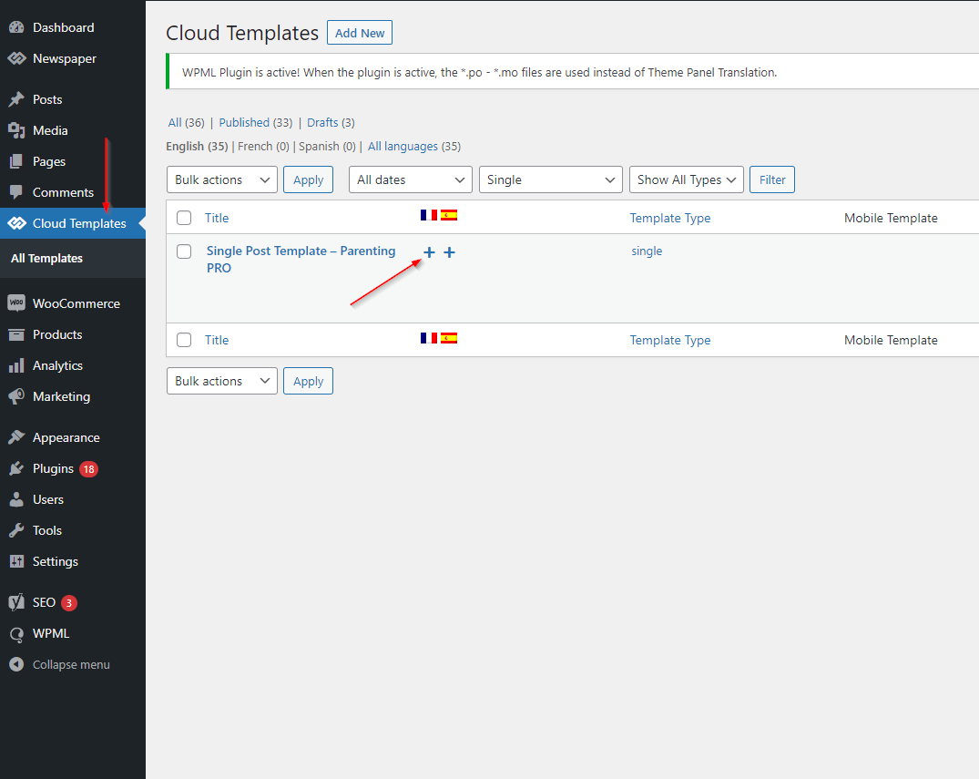
1. In the cloud library section in the WordPress dashboard, click on the translate icon for the language you want to use the template on:
2. In the following screen, select the Copy all fields from original option and mark both of the fields as complete:
Optionally you can set a different name for the translated template. Then save and close the translation screen.
3. The translated template can be edited with the composer:
There you can customize the template and adjust it for the language where needed.
4. Once the template is ready, it can be set to be used for posts in the language the template was translated:
The process is the same basically for any cloud template. They can all be translated and set for their respective languages.
Useful notes.
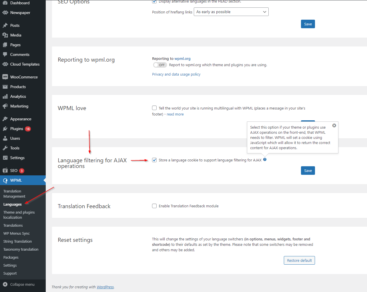
The theme uses ajax for various elements, like block pagination. In order for them to function correctly, please activate this option in the WPML->Languages screen:
Setting a language switcher in menus can be done in the WPML->Languages screen:
Translating the theme default strings using the po mo files.
The theme will only translate the theme elements to the new language. The content itself must be created separately for each language in particular.
How Does this Work?
Let’s add the Danish language to the website:
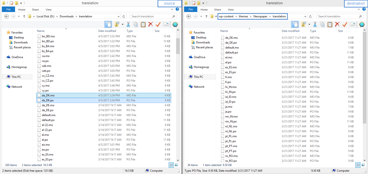
Download the translation .po and .mo files and extract the translation.zip on your device
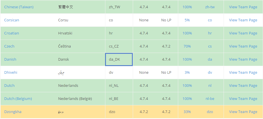
Check the WordPress Translation Teams section to identify the corresponding language file:
Copy the da_Dk.po and da_Dk.mo from the translation folder downloaded earlier and paste it into your theme files on the server:
As an alternative, you can copy all of the .po and .mo files on your server without sorting them out as all of them have less than 2MB.
Additional information.
A brief translation tutorial is available in this WPML guide. We highly recommend you follow the official WPML documentation for the configuration setup.
The configuration xml file used for the WPML Advanced translation editor can be downloaded from here. Please unzip the file! The file must be placed in the root theme folder on the server (/wp-content/themes/Newspaper). A link to the official documentation for the xml file here.
Moreover, if you need someone to customize the WPML plugin along with the Newspaper theme for you, take a look at the list made by the WPML team and decide who’s going to help you make your website multilingual.
Please let us know if you have questions and we will provide assistance.
In this section, you will learn how to compare files or folders to check the structure/code differences. This operation may be useful in many cases. One would be when you want to check the code modifications between different versions of the theme. To compare theme files, we will use Winmerge, a free tool. You can check its documentation here.
Installation:
We won’t cover this area here; it is explained in detail in the software documentation – here.
Configuration:
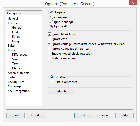
You can access the settings area from the menu Edit -> Options. The most important settings are located in the Compare tab, from here you can specify how the compare process works. Depending on what you want to compare, you can set it to ignore certain aspects (ex. white space, blank lines or carriage return differences) if you don’t consider them essential and you want to return only the result on which you’re interested. The settings used by us are presented below, but you should play with the settings until you obtain the results you’re looking for. The Compare -> Folder settings were not modified.
Compare:
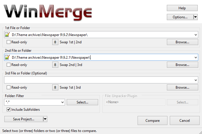
In the following example, I will compare the Newspaper theme folders for version 9.2 and 9.2.1. To do this, open Winmerge, and click on the File -> Open… menu. You can also use the shortcut CTRL+O. This will open a new window, and you have to choose the directories or files that you want to compare. In my case, I’ve selected the folders for Newspaper version 6.5 and 6.5.1. The other filters were set to compare all files and include subfolders.
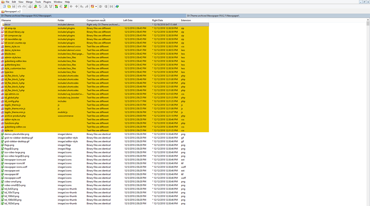
Once you’re done, click the Compare button and wait for the compare process to be complete.
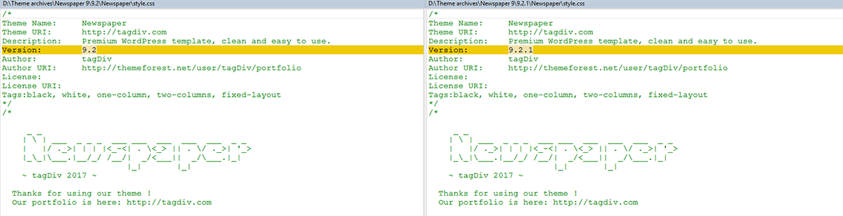
If you double click on a file, you can see the differences between them as highlighted. In the following image you can see the style.css file on which only the version was changed from 9.2 to 9.2.1, and on the left, you can find the Location panel where you can see the position of the lines which are changed from one version to the other.
Merge:
As the title says, this software comes with options to merge the compared files, you can find them in the Merge menu. We will not discuss them in this tutorial, but you can read about them in the official documentation – here.
Newspaper Theme 9.5 comes with a brand new feature designed to increase the time spent by visitors on your website. The “Infinite Loading for Single Posts” makes users smoothly scrolling through your interesting articles and post, without clicking away. Why is this important for you as a website owner and how to set it up? Keep reading below as we take a look inside to see what make this feature an excellent improvement for every website.
Why Infinite Loading?
Infinite Loading lets the audience move from one blog post to the other in a very fluent and intuitive way. Once they reach the end of an article, the loading icon appears, and the next post is brought up. The user can keep reading without having to click away through the breadcrumbs and find your next awesome piece of content through the Category Page.
The feature proves useful as it keeps the visitors on your website for extended periods, thereby increasing the time on page. As a bonus, you get to choose the number of posts a user can read through.
Infinite Loading for Single Posts? Yes!
The ever-popular websites like Pinterest, Tumblr, Facebook, and Instagram are the masters of using this feature to show off related content. This also pans out greatly for mobile device users as they can keep moving through the posts efficiently. However, be responsible with the use of the Infinite Loading as it increases the memory used by the browser. Prevent this from happening by setting up a limit for the number of posts your website pulls up with the new feature.
Get the Infinite Loading for Single Posts
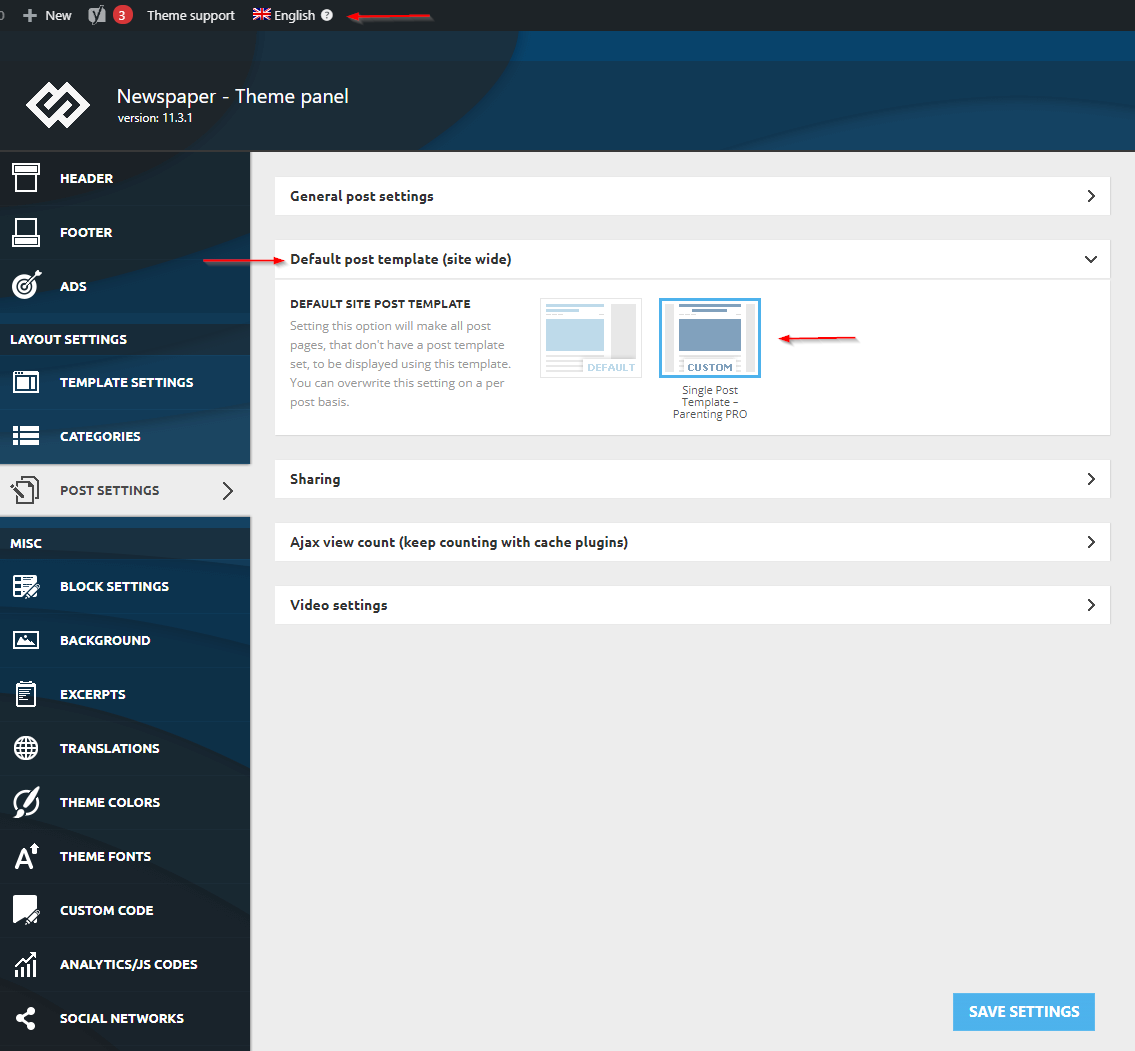
Firstly, let’s start by taking a look through the Cloud Library. Browse through the online gallery and choose the Single Post Template that fits your website the best. Through the Newspaper Theme Panel, assign the Single Post Template as your global template for your articles. Under Post Settings > Default Post Template, choose the imported layout and save your settings.
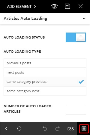
Now, open the tagDiv Composer on your Single Post Template. From the bottom of front end page builder, click the rectangular icon.This brings you to a new window that controls the Infinite Loading for Single Posts. If you click the Enable button, the feature instantly activates globally on your website.
From here, you can choose to display previous posts, recent articles, or ones from the same Category. The decision is up to you. When you open a Single Post Template, click on the Articles Auto Loading icon.
In the “Number of Auto Loaded Articles” section, type a number. Left empty, the Newspaper Theme will load posts until it reaches the end of your content. If you have a few dozens of articles, without setting up a limit, you’ll end up displaying old content. Or worse, you’ll create a frustrating user experience to the engaged visitors, and nobody wants that. Before you close the tagDiv Composer, save your settings. You’re done!
Have you found the perfect number of articles to display for your website? Test and experiment with the “Infinite Loading for Single Posts” to find out what works best for your content. Do you use it to display recent articles or choose to keep the visitors scrolling through posts of the same category? Tell us about it in the comment box below!
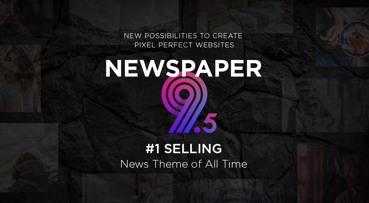
Last year was an exciting one. Over 76,000 dedicated journalists, entrepreneurs, bloggers, and developers have inspired us every day to be more creative. Together, we’ve made the Newspaper Theme the #1 Selling News Theme of all times and we thank you for this!
Are you planning for an outstanding 2019? We hope you are because we’re starting this year with an incredible update. The Newspaper 9.5 introduces the magic Header Builder, giving you new superpowers to design and create amazing experiences for your visitors. Beautiful Demos, stunning elements, intuitive options and innovative functionality that helps you build everything easier and faster on the front end. Newspaper 9.5 is a free update for all our customers. If you own a theme License, or you’re about to acquire one, all the features below and more are waiting for you.
So, what’s new?
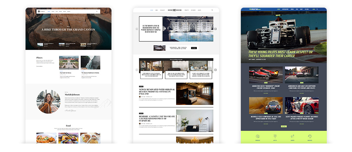
3 New Professionally Designed Demos
Fast start your website with unique Demos! Explore the new Nomad, Racing and Home Decor Demos. Crafted with love by our designers, both are ready to help you create an engaging website in no time. Each demo is built with tagDiv Composer page builder using templates from the tagDiv Cloud Library. You can import the demo you love and easily customize everything: from colors, elements, layouts to page structures and everything in between.
Introducing the Header Builder
The header has always been one of the most important parts of your website for obvious reasons. From here you start to create your brand, and this is also the first thing that should make a strong impression on your visitors. Newspaper Theme 9.5 is an essential update because it brings you a new functionality that helps you create amazing websites for your audience without touching a single line of code.
For the first time, it’s surprisingly easy to create awesome logos, add elements, and customize everything on your header, right on the frontend. With Newspaper Theme, you can now design unique experiences for your visitors on every page.
Ten beautiful elements like logo, menu, login, live search, categories list, date, and weather are ready for you to use. Combine them precisely the way you like into your perfect header. Take the tour of the powerful Header Manager and explore this feature.
30+ New Designs you’ll fall in love with
You can stop thinking of logos, identifiers, and ads. Start quickly with a header layout designed for your needs. Enjoy the pleasure of using beautiful headers specially built for branding.
To make everything even more accessible, our team of designers created dozens of predefined header templates you can import with a single click and each one is automatically assigned on the page you’re editing. Over 30+ handcrafted header templates are waiting for you in the tagDiv Cloud Library. Whatever you plan for your header, with Newspaper everything is perfectly balanced!
Customize, customize, customize
Design a minimalistic header to impress the audience, all without any coding skills. Yes! This is the power of Newspaper Theme. Each element of your header is now fully customizable, and you choose what items you want on your header. Even more, for each component of the header, you can alter its appearance with ease, right on the front end with tagDiv Composer page builder. It’s Magic!
Integrated Logo Design
How should your website’s logo look like? Is it an image or text? Centered, oversized, or it might be aligned to the right? Great! Newspaper Theme gives you all the tools to design and seamlessly integrate your logo into the header.
All the power of the tagDiv Composer front end page builder is now working for your headers, too, and helps you design logos like a professional designer. From pixel perfect alignment and taglines, endless colors and gradients, to custom typography, you have infinite possibilities to create a logo that fits your website like a glove. Read more about this feature in a dedicated article on our blog.
New Header Main Menu
With unique headers for your every page, you can redesign the main menu from the ground up. The Newspaper Theme brings you the power of the tagDiv Composer through an intuitive interface to enhance the navigation on your website.
For the first time, you can create different menus to serve various pages. Choose which items you want for your main menu and add them. Now, Newspaper Theme helps you create navigation with categories, pages, links, posts, and subcategories. You have all the tools you need to guide your visitors smoothly through your website’s architecture.
Also, we’ve added options to customize the style of your navigation bar without hassle. The versatility you love in the Flex Block is available for your menus, too. Explore this feature here.
Slick Designs for mobiles
Stop cramming the header’s desktop version into mobile screens! The Newspaper Theme brings you options to create different versions of each header for specific devices. Drag and drop the desired elements right on the frontend and test your header in real conditions with a few clicks.
The new header builder comes with two sections dedicated for mobiles. Choose or create the layout you want for desktop, then try it on mobile with a single click. Customize the main menu for small screen devices by adding or removing elements from your navigation bar. You can also style all the components, and choose smooth transitions on the scroll.
Build complete experiences without any web design skills! The Newspaper Theme comes with a Live Search function that will make your visitors thank you. It helps your visitors quickly access the desired content by giving results based on the input keyword and each letter typed into the form.
Drag and drop it to your header and customize it. You’ve got virtually unlimited options available to you. Test out the Live Search designs to find the one that works best with the rest of your website’s style.
Infinite Autoloading
In Newspaper theme 9.5 we’re introducing a long-expected feature. The Infinite Loading function on posts is finally here. This is great news for all the publishers out there because now you can give your visitors an excellent reason to stay longer on your website.
Ready to be used globally on the site, you can choose which content to be loaded next. Use older or newer posts, or even posts from the same category and provide great user experiences on your site.
WordPress 5.0+ and Gutenberg Compatibility
Another fantastic news about the functionalities of Newspaper Theme 9.5 is related to the Gutenberg compatibility. As you all know, it was compatible with WordPress 5.0 right from the start. In this update, we’ve improved the integration between our template and WordPress 5.0.3 to give you a delightful journey.
In Newspaper Theme, the Gutenberg editor is now matching the frontend output, indeed becoming ‘what you see is what you get.’ This also includes the used fonts and dynamic styles coming from theme settings. Moreover, it brings you support for the .alignwide and .alignfull classes for wide-images to help you create your beautiful content easier.
Update your theme to get access to the new features and options. You’ll find all the instructions on how to update here. We hope you’ll enjoy using the Newspaper Theme on your website!
With the increase in mobile browsing and shopping, optimization for portable devices is essential for a successful website. Therefore, having a slick and elegant design for your mobile header is the first step toward impressing your audience. Take the plunge and find out how to make a fantastic Mobile Header with Newspaper Theme below.
The Introduction of Mobile Header Elements
Open a page or post through the tagDiv Composer, Newspaper Theme’s front-end page builder. Have you imported a Header template from the Cloud Library, yet? If you haven’t, then do so by clicking on the Website Manager and then on the Import Template button under the “Header” section. Scroll through the various designs and choose the one that fits your website best.
Now, click on any element of your Header or content and then click on the Mobile Device Viewport icon. The entire page now gets displayed as it would look like on the phone. Did you notice how the Header shrank in size alongside the content? That’s the power of the new Mobile Header elements.
Before we move on how to get the same result for your website from scratch, make sure to check out the other related articles for the Header Manager: the Header Logo, Main Menu, Live Search and last but not least the Header Manager. Do this to get a good grasp on how to use the new features!
Build your Mobile Header Easily
When looking at your page across various devices, the design automatically gets adjusted to fit on various screens and sizes. However, you can always adjust the text size and spacing of each element precisely as you wish by clicking on the desired screen viewport and consequently, beginning the alterations.
On the Mobile, however, your job gets easier. With the Newspaper Theme 9.5, alongside the various elements of the Header, new mobile-centered items are available to you:
The Mobile Menu will display a small icon. When clicked on, it opens a list of the menu items so that you can have an elegant layout for the header.
Just like the desktop version, there is a Mobile Live Search element that you can add to your Header. It is specifically modified to bring the same performance on smaller screens as its desktop version.
Do you want to keep the same look across each device through the menu? With the Mobile Horizontal Menu, you can now do so. Each item is shrunk to appear better on the phone screen and lets you display all of the essential navigational links at once.
So, start by dragging and dropping the Header Logo and then adding the Mobile Menu and Mobile Live Search. With the three items added, you can now begin going through the settings for each.
Slick Designs for Better Functionality
By default, the Mobile Menu and Mobile Live Search open with the theme’s default fonts and colors. However, you can easily modify this in the Newspaper Theme Panel. In the Admin Dashboard, navigate to the Newspaper Theme Panel. From there, go to Theme Colors > Mobile Menu/Live Search for colors.
If you need to modify the fonts, go to Theme Fonts > Mobile Menu. Also, if you wish to display a specific image as background, open the Background section, then select Mobile Menu/ Search Background tab. Simply upload a photo in the box and save your settings. These will be instantly applied to the new mobile elements.
Now, back to the tagDiv Composer, don’t forget to select a Menu to be displayed for your Mobile Menu from the General Settings of the element. For a sticky mobile Header, drag the items into the row once more, or through the right-click menu, right-click on the Header row and choose Copy. In the empty Header row for your Sticky Menu, right-click and select Paste Before or Paste After, then delete the remaining empty row.
Your design has now been transferred to the sticky mobile variant. Adjust the spacing and sizes of the icons and logo to get a beautiful thin header. Add a transition to the Mobile Menu Sticky zone and a background to the row to be able to see it displayed over your content. Save, and you’re done!
Wrapping Up
Get in touch with your creative side and design a minimalistic mobile header to impress the audience. Adjusting the logo’s size and choosing between two different ways to display your menu it’s easy. You should create a beautiful user experience for the visitors that are scrolling through your website by making the header smooth to navigate. With the Newspaper Theme, all of these are possible without effort or coding skills.
Post and share with us your beautiful Mobile Header designs in the comment box below!
Create the perfect navigation bar for your website. Want to keep it simple, create lists of items or bedazzle the audience with a Mega Menu to die for? Newspaper Theme is here to help you out and make everything easier.
Header Main Menu ‘How to’ & ‘What ifs’
Open the tagDiv Composer on any page of your website. It can be blank or already constructed and designed. Click the new Website Manager button. If you’ve already created a Header Logo & Live Search, then the functions of the Website Manager should be nothing new to you. However, to find out more about the big new feature head.
Are you ready to meet the new Newspaper Theme 9.5 header builder? Import an already crafted Header Template from the Cloud Library. Now, take a look at the beautiful Menu widget. Click it, and inspect its settings further to get accustomed to it.
In the General Settings tab, right at the top, select your Menu. However, first, make sure you already have a Menu created precisely for the page you’re editing. Let’s get started!
Header Main Menu Widget
In the WordPress Admin Dashboard, hover over Appearance and click the Menus page. Now, on the left, you have all of your Pages, Categories, and Posts, while on the right, you can see your current Menu Structure.
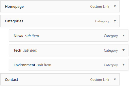
Click on Create a new Menu at the top. Give it a name and then press the Create Menu button. Now, choose which item you want for your menu. Keep in mind the Header Menu should contain only the essential navigational elements. So, don’t clutter it. You can start by adding the Homepage link, then Categories, important Pages and finish with the Contact page.
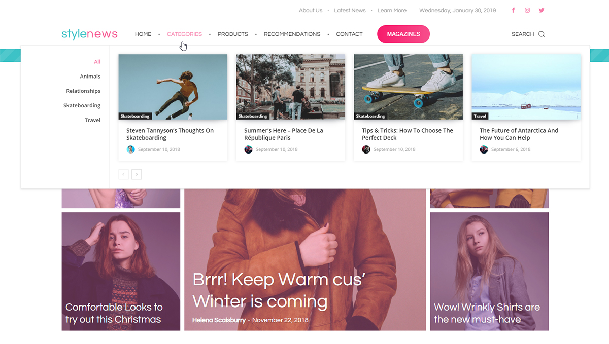
List Menu, Mega Menu, Mega Menu with Sub-Categories
If you need to display more items in the navigation bar, you can easily create a Sub-Menu. Let me show you how to do that! Add a general item, such as Categories. Now, drag and drop the other elements underneath it to create submenu items. This way they become linked to the general item (in our case Categories).
For Mega Menu with subcategories, you need to have a parent Category with multiple other child categories. You can do this easily by going to Posts, then Categories. Hover over any Category then click Edit. From the Parent Category drop-down menu, choose its parent. Now, save your changes.
Go back to Appearance > Menus. Add the parent category to your new menu and then click the small arrow to the right to open its tab. Under the ‘Make this a Category Mega Menu,’ choose the Parent Category again.
To create a Mega Menu element without subcategories list, you can follow the same steps. Add the Category to the menu, then open its tab using the small arrow and choose the same item in the ‘Make this a Category Mega Menu.’ Great! Save your menu.
Customize & Design the Header Main Menu
Why don’t we build a menu from scratch? Open the tagDiv Composer on your page, import a Blank Header Template from the Cloud Library. Then drag the Header Main Menu element to your Header section.
In the General Settings, select the Menu you’ve just created. The next 3 options are referring to MegaMenu with SubCategories item, Mega Menu item or SubMenu. They can be enabled one by one to see how each one looks. However, do not enable all 3 options together, because they stack on top of each other. Enable them one by one as you design and edit them.
Scroll down to access the Main Menu and Sub-Menu sections. Each one brings you options that allow you to customize the Links from the Menu.
Mega Menu Customization Details
Open the Mega Menu tab and look through its settings. The ‘Container Width’ affects the size of your Mega Menu. To get the desired layout, you can also modify the next few options.
The Subcategories section refers to Items in your menu that are Parent Categories and have been enabled as Mega Menu elements. Change the padding of the list, the width, the elements’ space, and many more to get the best results. You should do this with the ‘Show mm. with subcats’ in the tagDiv Composer enabled, so that you can see the adjustments happening live.
In the ‘Mega Menu Module’, you can change how Posts and Articles appear within the box. There are options for Article Featured Images and the Meta Info, too.
From Article Title, Excerpt, Category tag, Author name and Photo, choose what looks best with the rest of your Header and website. Hide or Show different elements and modify their size and alignment.
Styling your Header Main Menu
Click on the Style tab to choose colors and fonts for each part of your navigation bar. Start with the Main Menu section, select the text color and hover animation for it. Decide what fonts work best with the rest of your website and website’s core intention. Check out more about picking the best fonts.
Up next is the Sub-Menu. You can style the menu elements by deciding on a hover animation, colors, and fonts for them. All of these changes affect the List menu items you’ve added in the WordPress ‘Menus Page’.
The following two sections refer to the Mega Menu and its elements. Add shadows to the meta info or the subcategories to make them stand out from the rest of the box. Also, just like before you can select colors and fonts for each option to go with your style. If you want your Menu to appear on top of your content, you can turn the Header into an Overlay Header by going into the Zone Settings and choosing from the “Display” drop-down menu the “Overlay” option. Read more about the Overlay Header.
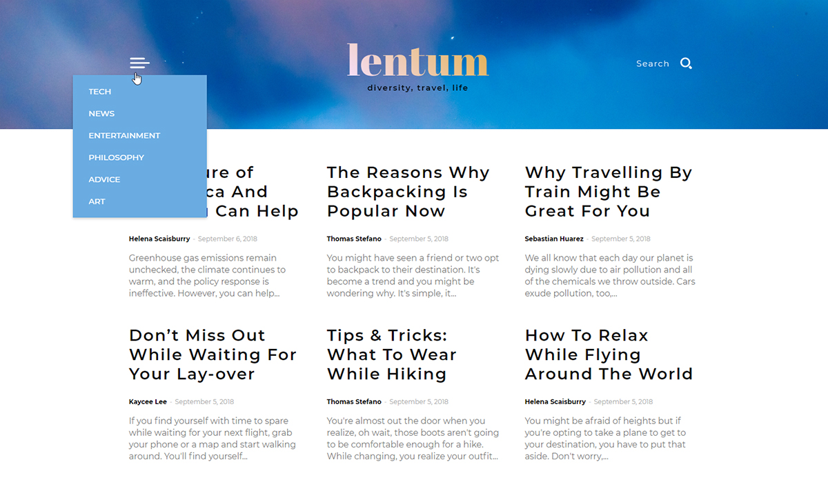
Bonus: the Header Categories List
For a more minimalistic design, you can create a Header Categories List. It’s an icon and, on hover, it displays a list of your site’s Categories. Drag and drop the Header Categories List onto the Header to see precisely what this means.
You can customize it easily. Click it and go to the General Settings. Each of your Categories has a unique ID. With this shortcode, you can exclude or include different ones. You can find out the ID either from:
Posts > Categories page – hover over the Category and look at the bottom of the screen where the word ID appears;
Appearance > Menus – Click on the arrow and look through the Mega Menu dropdown list, and you can see the ID for each of your Categories.
Now, back to the tagDiv Composer. After picking out the IDs for the items, you wish to display, add them in the ‘Include’ box of the General Settings. Each one has to be separated by a comma.
To increase the size of your list, type a higher number in the ‘Limit’ box. Now, you can continue editing and designing the element to your heart’s desire. Add padding, margins, choose fonts, and colors! Don’t forget to save your progress.
Conclusions
With Newspaper Theme, you can easily create the perfect navigational Menu for your audience. Add separators, contrasting colors, paddings, and margins without effort. Arrange the perfect menu straight from your WordPress Admin Dashboard and select it from the front-end editor, the tagDiv Composer. For best results, keep the style of your Header in tone with the rest of your content so that it creates a perfect transition from the top of the page to the bottom.
And, as always, show off your brilliant Menus in the comment box below!
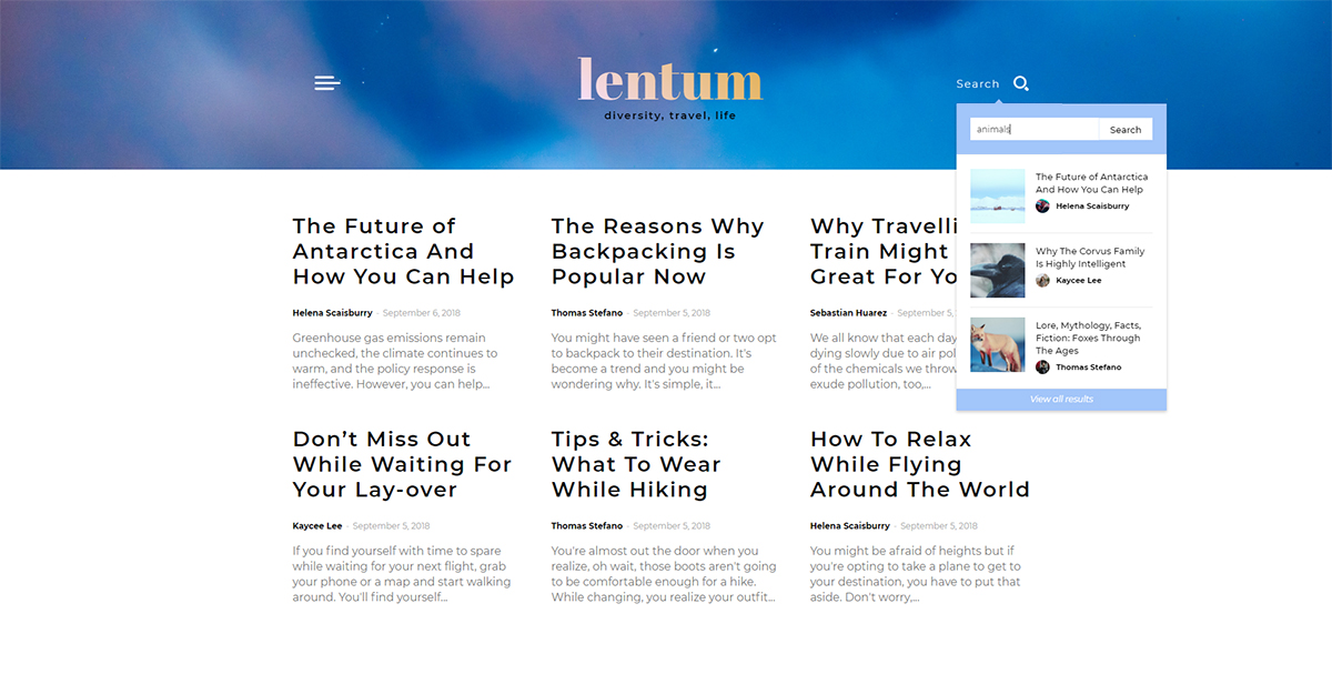
Live Search on your website is an underappreciated usability function. It helps your visitors quickly access the desired content by giving results based on the input keyword and each letter typed into the form. With Newspaper Theme 9.5, you get access to a brand new shortcode: the Header Live Search. Add it straight into your header and give the audience a way to access different pages of your site.
What do you do with the Header Live Search feature?
The Website Manager is one of the core features of the 9.5 update of Newspaper Theme. With it, you can build and customize a website’s header from the ground up. Our team has created a series of shortcodes to accompany it. They give you the elements necessary for a fantastic layout.
Once you add the Header Live Search into the header, you give the audience the content they are searching for instantly. It pulls up articles, posts, pages relevant to the keyword helping them access it faster than ever before.
There’s a lot more to do with the Live Search:
Each result displayed to your readers can be customized from adding padding to the meta info to resizing the featured image for the page.
Create a search form that fits in with your site’s appearance (give it a background color, add a placeholder text, and many more.)
Add a hover animation over the results such as a shadow display or even a movement one.
Let’s dive right in and explore each possibility in detail!
Create the Header Live Search
Import a Header Template straight from the tagDiv Cloud Library. Now, whether you’ve chosen to import a Template or create one from the ground up, don’t forget to customize them to fit in with the rest of your website. Keep the look uniform throughout the design process.
To start customizing the Header Live Search shortcode, find it in the tagDiv Composer and drag it into your Header if you haven’t done so already. Now click on it to open the settings tab. In the General Settings section, you can choose the icon that appears for the button. We advise using a magnifying glass as it is easily identifiable by the audience.
Click on the Show Search Form option to see how your Search Form looks. Adjust the Search Form width, the padding, border and its alignment for starters. You can also choose a text placeholder which appears in the form and then disappear as the user starts typing. Add margins, padding and type the text that appears on the button.
Customize the Header Live Search
In the Results Module settings, you can find options for how the results are displayed within the search form Box. The Modules per row lets you show multiple posts on a single row. This works well in case you want the Posts Limit to be a higher number. Add a hover animation for your modules in the Hover Effect drop-down menu.
The Meta info has many customization options: choose the padding, margins, hide or show different parts of it such as the Category, Author, Button, Date, Comment, and many more. Mix and match to see which works best for the vision you have in mind.
The Style settings are divided into different zones:
The first section is the Search Icon. Choose the color of the icon, and if there’s text that accompanies it, you can choose the font and color of it, too.
Search Form is next, pick the background color, the arrow color, the border’s color if you have a border. There are also input and button options.
‘The View All Results’ is at the bottom of your form. This section can also be customized in the Style settings of the Search Results Box.
The Search Results Module deals with all the fonts, shadows, colors of the Meta info and everything contained within the displayed results box.
With Newspaper Theme, you’ve got virtually unlimited options available to you. Test out designs to find the one that works best with the rest of your website.
Conclusions
Use the Header Live Search to display search results in real time to the audience. This helps them find what they are looking for faster and thereby creating a good user experience. Design and customize the element to fit in perfectly with the rest of your content and website. Display as many search results as you want and adjust their size accordingly. Get creative with Newspaper Theme!
Use the comment box below to share your fabulous designs with us!
How to create a logo with Newspaper Theme? The template comes packed with a brand new update to enjoy and explore. One of the core features of the Newspaper Theme 9.5 update is the Header Manager which is the perfect tool to design your website in a fantastic way. Market products further by taking your layout in a new direction! From Logo Design to Live Search Function integrated right into your Header, the Header Manager is the first step towards obtaining an eye-catching form to each website.
Start from the ground up
To create a logo with Newspaper Theme 9.5, choose an image for it, as you’ve done before, or craft a beautiful design right from the tagDiv Composer. This can be done within just a few steps using the drag and drop function.
Let’s get started! From the WordPress Admin Dashboard, go to the Pages section. Click on any of your pages and open the tagDiv Composer on it. You could also create a brand new page and press the blue tagDiv Composer button.
In the front-end page builder, press the Header Manager button. A new section opens up. Now press the Import Template button. Within the tagDiv Cloud Library, click on the Blank Template and import it. This will add the template to your page. In the Header Manager section, select the Main Menu for the Zone display, and then we can begin editing and adding our new Logo design.
How to create a logo with Newspaper Theme
You’ve taken the first steps towards the foundation of your Header. Let’s craft the Logo now as the first element! From the tagDiv Composer, click on the Add Element button. In the Header shortcodes section, drag and drop the Header Logo onto the page. The Header elements are displayed in the top section of the page, in the grayed out area, so you can easily tell apart this section from the rest of the page’s content.
Here are some ways to create your Logo from the General Settings tab of the element:
Upload an Image with your already designed Logo. Write down an Alt attribute for it, which will be shown in cases where the image does not load. Pick a Logo retina image as well. From the Image Width box, choose the size of it by writing down a pixel amount (such as 200px, 50px) or a percentage (40%, 100%).
Instead of an Image, why not display the name of your website? In the Logo Text box, write the name of it. Choose a tagline alongside the Title. The tagline could be your company’s slogan, the website’s purpose or even a message describing the intent of your content. Alter the alignment of the tagline and modify the spacing between the title and tagline, too.
A title can be accompanied not only by a tagline but also by an icon. Pick the best icon to represent your site’s purpose from our online library. Change the size, the space between it and the title, and the alignment.
With all of these options at your fingertips, you can easily obtain a stylish Logo!
Customize, customize, customize
With a Title as your site’s Logo, go into the Style tab and choose the font of it. Do you have a website that mostly focuses on reporting local news? Then, pick a sans serif font like Helvetica or a blackletter font such as Astloch, Germania One or even New Rocker. Most News websites such as The Guardian, Fox News, Mail Online, and many more use a Logo look like that.
If you have a beauty or even fashion blog, try a display or script font such as Dancing Script, Great Vibes, Tangerine or Sacramento. There are countless choices to explore and try out to best portray your site’s core and purpose, just through the title’s font choice. For more information on font picking, check out our blog post about typography.
You can now focus on picking the color appropriate for the font. Minimalistic designs are best with one color for both the text and the icon. Use gradients for vibrant, bold or even quirky looks. Pick between two or three colors to obtain the perfect blend. Save the gradient and then apply it to your icon, as well, through the gradient presets.
The best way to proceed with your logo customization is to keep it simple, versatile, and appropriate to your content. A simple design is most often more effective than anything else.
As a last tip: the Header can change from page to page, but the logo should be maintained through the entire site to be recognizable for your readers. The more memorable a Logo is, the more memorable the brand and vice versa.
Create the Logo according to your content, and the site’s purpose. Keep it simple, use an Image or go with the site’s name as the Title. Add a tagline or an icon to make it original — limitless options with Newspaper Theme right in the palm of your hand.
As always, share your designs in the comment box below and tell us how you’ve designed the new Logo Element!
Headers are the first part of your website seen by a visitor. It’s vital because a header is where you add brand identity, good navigation and messages about a site’s core intent. Newspaper Theme 9.5 update comes with a new way to customize your header right on the front-end with the Header Manager. Design, customize and explore amazing new options to stand out from the crowd.
Meet the new Header Builder
With this new feature, you can now have different Headers for every page of your website. Each of them customizable right through our front-end page builder. Let’s take a look! Open the tagDiv Composer on any page of your website, or even an empty page, then click the new Website Manager button.
A dialogue window should pop up that lets you choose the Header Template for the page. If you’ve already imported header templates from the Cloud Library, you can choose them from the drop-down menu. Otherwise, press the Import Template button to explore our selection of already designed Headers.
Browse through the gallery and choose the one you like, then import it. The Website Manager window contains 4 customization zones: the main menu, sticky main menu, mobile menu, and sticky mobile menu. Clicking on each section lets you see how they look on your website.
The ins and outs of the Header Builder
The On and Off button for the sticky desktop and mobile menu, in the Website Manager, helps you see how the sticky menu behaves while scrolling down the page. You can turn it off and on again so that you can keep customizing the page or header. However, just by deactivating the stickiness, does not mean that the menu stops being sticky. This UX option lets you keep editing the header, and test the sticky behavior only when you decide you are ready.
If you don’t want the menu, either on desktop or mobile, to become sticky while the visitor is scrolling, you need to clear the row in the Header, so it does not contain any elements. You can do this easily by hovering over it and then right-clicking and choosing the command Clear. For more information on how the right-click menu works visit our blog post.
How to customize the Header Builder
Do you want to create a brand new Header? Then, with the Website Manager open on a page, click the Import Template button. From the tagDiv Cloud Library, choose the blank Template. Close the Website Manager window and go to the Add Element section. Scroll to Header Shortcodes, drag and drop any of the following elements: Header Main Menu, Header Logo, Header Live Search, Header Login, Header Weather, Header Date.
Arrange the elements in whichever order you so desire. For starters, add the Logo, live search and main menu to the row. Write your website’s name in the Logo Text section, pick an appropriate icon, and write a tagline. For more information on how to create your Logo, check out this blog post.
The Main Menu item can display any WordPress menu, so go to your admin Dashboard and create the perfect menu to go well with your Logo. However, keep the essential and important links there.
Live Search is an item that displays your users’ results in real time. Any search word, query, question, tags that they might be looking up, will be shown in that box. Customize it to display however many results you want.
Mobile Menu through the Website Manager
With a blank template already imported, open the Website Manager again and select Mobile Menu to start the design process. Drag and drop elements that fit with your vision. Do you want to have a button that opens the navigational menu or still have the links available just like the desktop version? The Mobile Horizontal Menu lets you display all the links whereas the Mobile Menu gives you the button version.
Whichever option you choose, add the Logo to the header and don’t forget the Mobile Live Search item. Arrange them exactly as you want them to: display them inline by checking the box in General Settings for each or even have multiple rows for each element.
Don’t forget to save the settings and you’re done. You’ve got a Mobile Header now!
To Sticky or not to Sticky?
For the desktop and mobile version of your Header, you can choose to make a sticky variant of it. This appears when the reader scrolls through the page, this way they can still access important navigational items. As such, the sticky Header should be slim and give the visitor enough space to read through the page’s content.
As a plus, you can also decide how the sticky menu appears for the visitors. How do you do this? To customize the Header, click on either the Sticky Mobile Menu or Sticky Menu, the tagDiv Composer then opens the zone for it. In the Zone Specific Parameters at the bottom, you can choose the transition effect, the opacity for the sticky header, and also how fast or slow the transition can be.
To continue editing the content or the Header, you can disable the Sticky Menu from the Website Manager by clicking the On/ Off switch. Don’t worry it won’t delete your Sticky Menu. It’ll just hide it for you to be able to focus on the rest of your page while editing!
With a beautiful new Header, you should have a beautiful new Footer, too. Learn how to create a Footer from scratch with the Newspaper Theme by visiting this link.
Conclusions
Having seen the 4 zones of the Website Header Manager, you’re now ready to tackle making the Header for each by yourself! For more information, however, check out the other blog posts related to the Header: Logo, Mobile Elements, Live Search, Navigation Menu. Start small, with simple elements and ideas then think bold and grow your design through it.
Show us what you made with the new Website Header Manager and Newspaper Theme in the comment box below. We’d love to hear from you!
This website uses cookies to improve your experience while you navigate through the website. Out of these, the cookies that are categorized as necessary are stored on your browser as they are essential for the working of basic functionalities of the website. We also use third-party cookies that help us analyze and understand how you use this website. These cookies will be stored in your browser only with your consent. You also have the option to opt-out of these cookies. But opting out of some of these cookies may affect your browsing experience.
Necessary cookies are absolutely essential for the website to function properly. These cookies ensure basic functionalities and security features of the website, anonymously.
Functional cookies help to perform certain functionalities like sharing the content of the website on social media platforms, collect feedbacks, and other third-party features.
Performance cookies are used to understand and analyze the key performance indexes of the website which helps in delivering a better user experience for the visitors.
Cookie
Duration
Description
AMP_TOKEN
This cookie is set by Google Analytics - This cookie contains a token that can be used to retrieve a Client ID from AMP Client ID service. Other possible values indicate opt-out, inflight request or an error retrieving a Client ID from AMP Client ID service.
Analytical cookies are used to understand how visitors interact with the website. These cookies help provide information on metrics the number of visitors, bounce rate, traffic source, etc.
Cookie
Duration
Description
_ga
2 years
This cookie is installed by Google Analytics. The cookie is used to calculate visitor, session, campaign data and keep track of site usage for the site's analytics report. The cookies store information anonymously and assign a randomly generated number to identify unique visitors.
_gat_gtag_UA_43963494_1
1 minute
This cookie is set by Google and is used to distinguish users.
_gid
1 day
This cookie is installed by Google Analytics. The cookie is used to store information of how visitors use a website and helps in creating an analytics report of how the website is doing. The data collected including the number visitors, the source where they have come from, and the pages visted in an anonymous form.
_hjAbsoluteSessionInProgress
30 minutes
This cookie is used to detect the first pageview session of a user. This is a True/False flag set by the cookie.
_hjFirstSeen
30 minutes
This is set by Hotjar to identify a new user’s first session. It stores a true/false value, indicating whether this was the first time Hotjar saw this user. It is used by Recording filters to identify new user sessions.
_hjid
1 year
This cookie is set by Hotjar. This cookie is set when the customer first lands on a page with the Hotjar script. It is used to persist the random user ID, unique to that site on the browser. This ensures that behavior in subsequent visits to the same site will be attributed to the same user ID.
_hjIncludedInPageviewSample
2 minutes
This cookie is set to let Hotjar know whether that user is included in the data sampling defined by your site's pageview limit.
_hjIncludedInSessionSample
2 minutes
This cookie is set to let Hotjar know whether that user is included in the data sampling defined by your site's daily session limit.
Advertisement cookies are used to provide visitors with relevant ads and marketing campaigns. These cookies track visitors across websites and collect information to provide customized ads.
Cookie
Duration
Description
_fbp
3 months
This cookie is set by Facebook to deliver advertisement when they are on Facebook or a digital platform powered by Facebook advertising after visiting this website.
fr
3 months
The cookie is set by Facebook to show relevant advertisments to the users and measure and improve the advertisements. The cookie also tracks the behavior of the user across the web on sites that have Facebook pixel or Facebook social plugin.
IDE
1 year 24 days
Used by Google DoubleClick and stores information about how the user uses the website and any other advertisement before visiting the website. This is used to present users with ads that are relevant to them according to the user profile.
test_cookie
15 minutes
This cookie is set by doubleclick.net. The purpose of the cookie is to determine if the user's browser supports cookies.
VISITOR_INFO1_LIVE
5 months 27 days
This cookie is set by Youtube. Used to track the information of the embedded YouTube videos on a website.
YSC
session
This cookies is set by Youtube and is used to track the views of embedded videos.


 Firstly, let’s start by taking a look through the


 If you need to display more items in the navigation bar, you can easily create a Sub-Menu. Let me show you how to do that! Add a general item, such as Categories. Now, drag and drop the other elements underneath it to create submenu items. This way they become linked to the general item (in our case Categories).
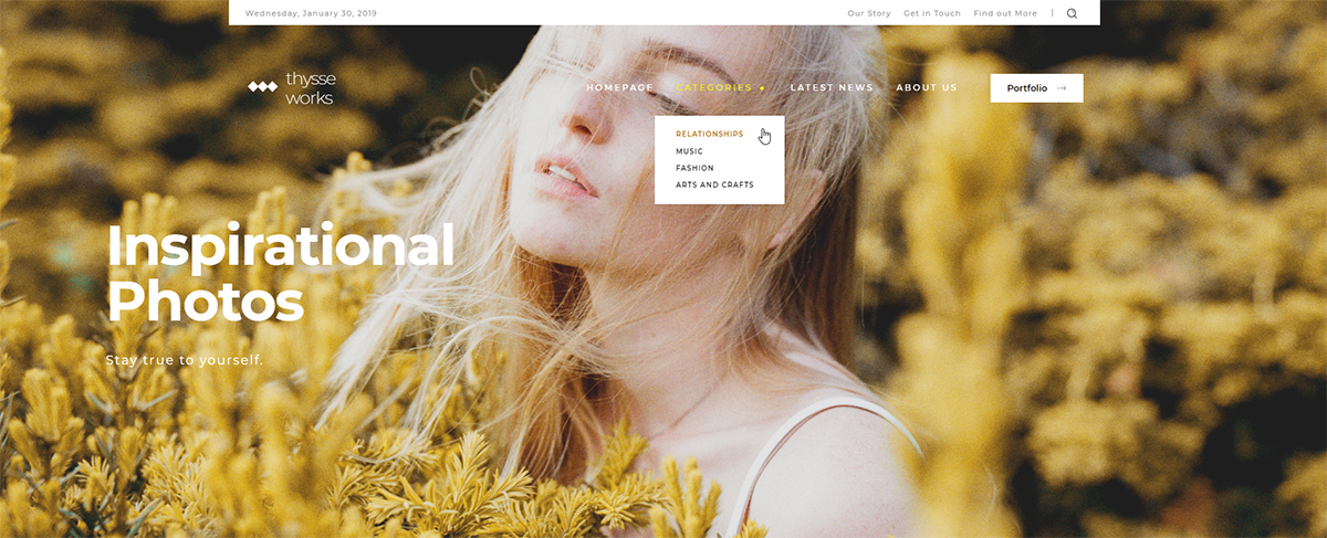


