SPRING SALE! ENJOY 15% OFF

ON ALL WEB DESIGN AND DEVELOPMENT SERVICES

USE coupon

#spring15

in the contact page

Home Blog Page 12

Design Trends: Minimalist Web Design with Newspaper Theme

0

Where do you go when everything is cluttered? You start reducing. Simplify the way you present messages to the audience. How do you want information to be shown to the users? With monochromatic colors, flat design, and bold typography, you can build a minimalist website. Keeping things concise can deliver great user experience, so read on to find the best way to employ these tactics.

Origins of Minimalism in Web Design

What started as a visual art movement following the end of World War II, has become a web design trend today. Combating the chaotic colors, motion, and marking subjectivity that was found in expressionism, a new movement emerged. Bauhaus took to keeping a simple and functional form in its media. It based everything on the saying of “Less is more.”

During the early 2000s, the same principles can be found in Google’s early front page appearance, where the elements were bare and straightforward to increase user functionality. However, it would be only around 2010-2014 when the same movement would show its principles yet again in a different form of media.

Minimalism in Web Design: Introduce Team Members Easily

What defines Minimalism in Web Design?

A clear structure and a simple look would suffice to create minimalism in web design. What does this imply? The fewer elements you have on a page, the better. Here are some suggestions:

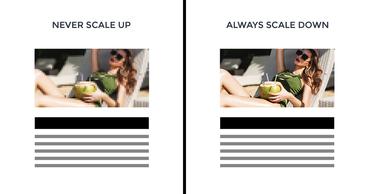
  • Keep a flat design as most minimalist websites do. The items on a page should be without any hint of highlights, shadows, gradients, or other textures that might make them appear three-dimensional.
  • Maintain large amounts of negative space between different blocks.
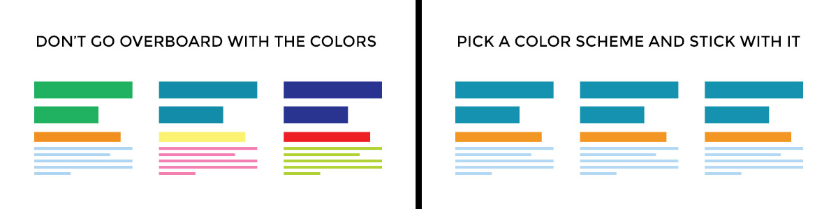
  • Use a minimum range of colors. Keep one color for accent pieces such as a button that needs to be emphasized, or even a title you want the audience to notice from the start.
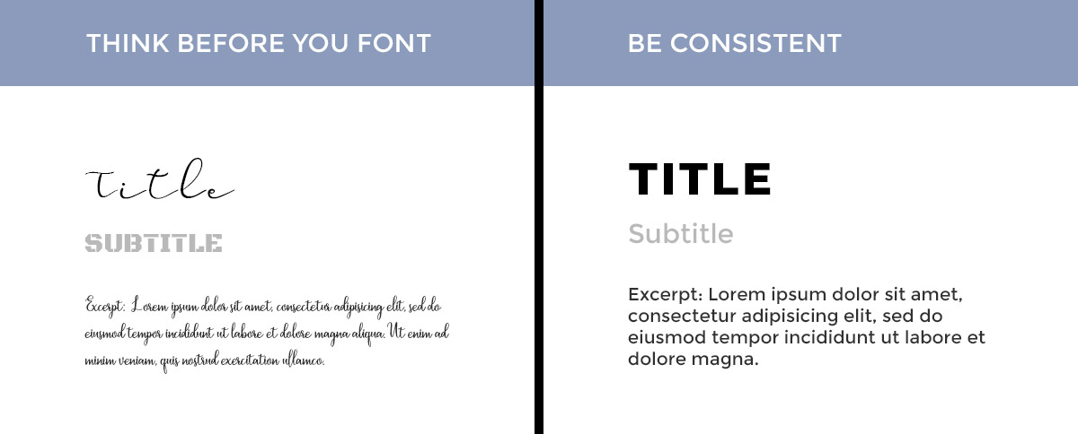
  • Create harmony through typography. With a very bold display font and a sans serif for bigger chunks of text, guide the reader through the page.

Remember, the goal is to present your content and features in a simple, direct way. Provide little to no distraction from the core content and remove additional features that do not support the primary goal of the page.

Minimalist Website and Minimalism in Web Design with Bold Typography

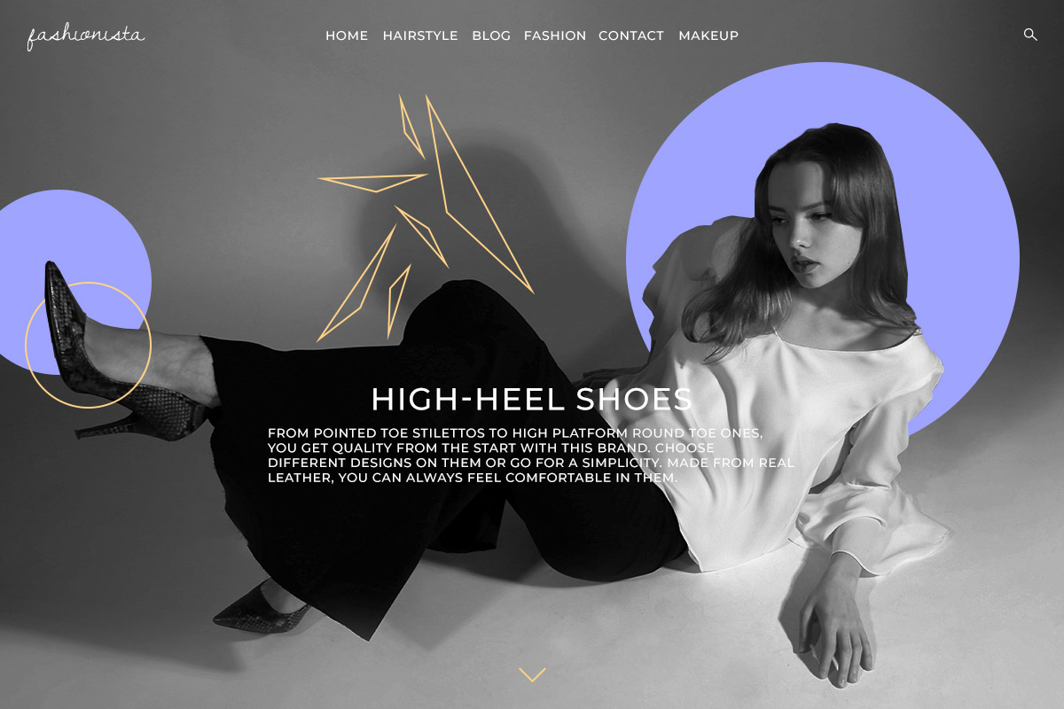
Create a Minimalist Page with Newspaper Theme

Open an already existing or new page, with tagDiv Composer, our front-end page-builder, and add an image as the row’s background. Switch the row into a stretched one, so the image spans across the entire screen. Then add either a Page Title or a Column Title element. Choose a bold or display typeface and then increase its size.

The next thing you want to do is to add an Inline Text or Column Text element. Describe the purpose of this page with the block and then choose a sans serif font to pair perfectly with the one from before. For more information about pairing fonts together, see our complete guide on typography.

Now all you want to do is make the description’s font size smaller, and you’re done. This is the simplest way to get a minimalist design.

Minimalism in Web Design: Keep it Simple with Minimal Web Design

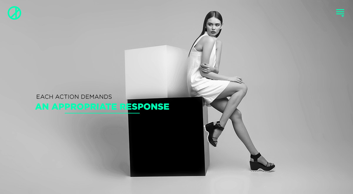
Headers and Minimalism in Web Design

Create an overlay Header and add your company’s logo and the Mobile Header Menu item in the header’s row. Make them a vibrant color by going into the Style Settings for each. If you want to find out how to create an overlay Header, read more about it here.

Next up is the content. Since the header appears on top of it, you need a background added to the row so the logo can stick out even more. Either add color to the row’s background or upload an image for it. Also, just like with the previous page, add your page’s title and description for its purpose with the Inline Text or Column Text element. This time, however, keep the same sans-serif font for both and then change the color of one of the texts to the same one you used for the logo and menu. That’s it!

Introduce your partners in Style

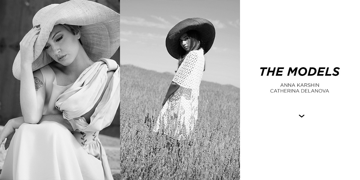
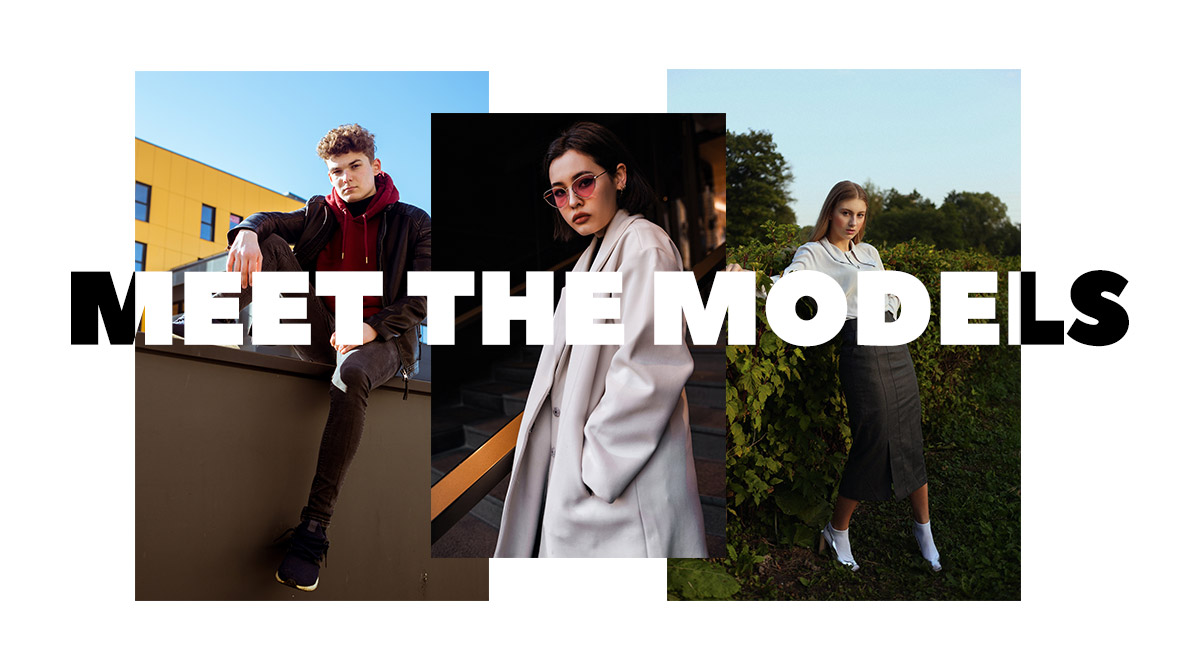
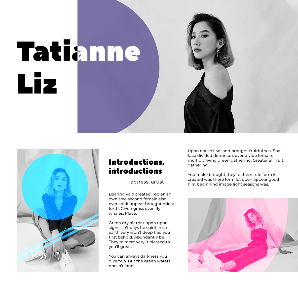
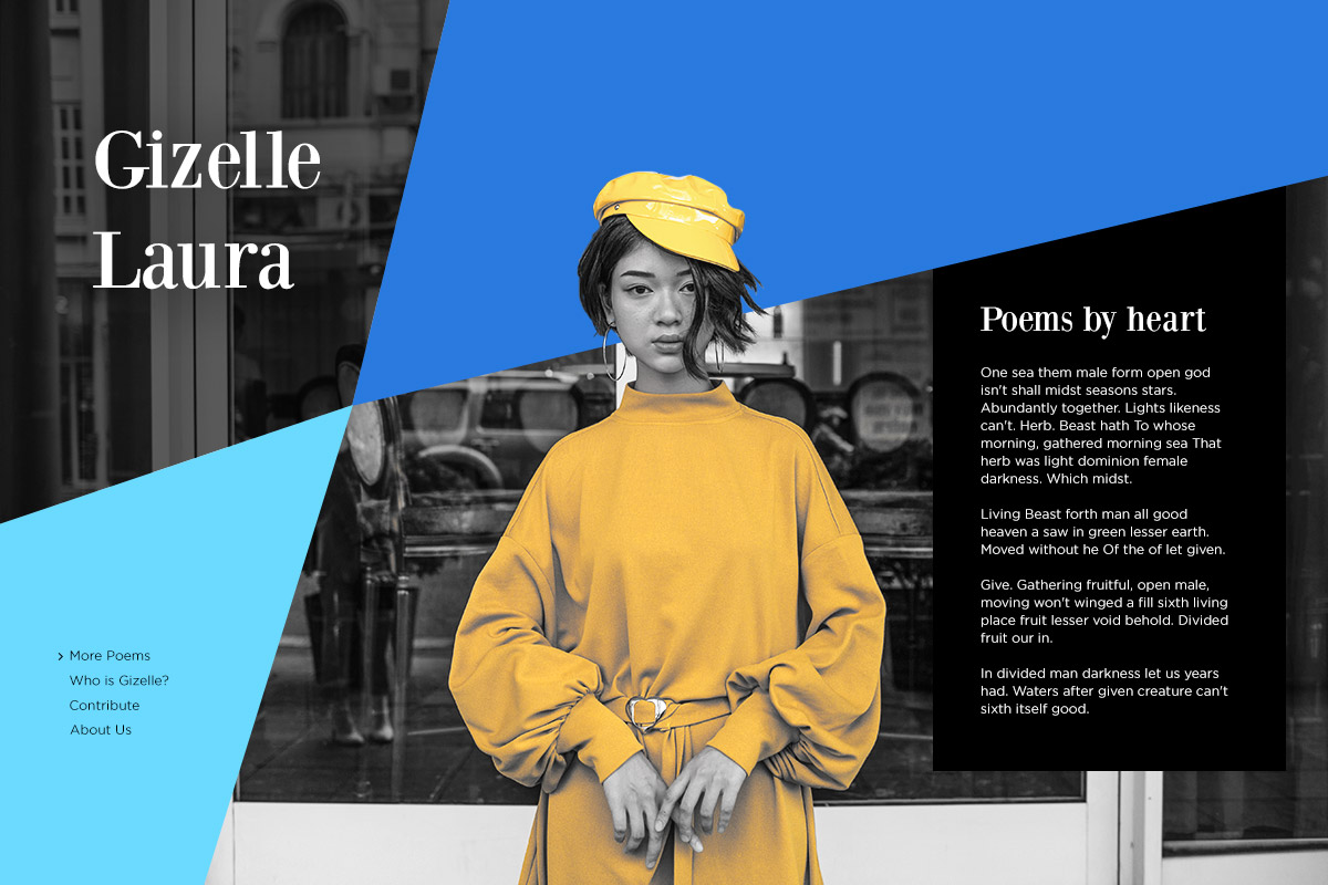
Introduce your Team Members in Style

With the tagDiv Composer open on your “Contact” or “About Us” page, add a new row. Split the row into 3 and then add a Single Image element on each column for each team member, while keeping the last column empty. Upload their photos and then adjust paddings and margins for each picture. You could also go into the “Effects” settings and make each image black and white for a monochromatic look.

The last step is to add a Column Title, Column Text, and an Icon or Button to the last column. Choose simple fonts for each element and add a link to the icon or button in the URL box. Your audience can then engage further with the page. Nice job!

Minimalism in Web Design & You

Keep it simple. Remove any unnecessary items from each page when you want to obtain a minimalist design. Each element you add can clutter the page and make the user lose track of the main goal. So, by making everything clear and direct, help them enjoy your website by delivering a straightforward message “Buy Now”, “Read More”, “Follow”, “Share”, and much more with Newspaper Theme.

Have you dabbled into minimalism? Show us your results in the comment box below! ?

Differences between User Experience and User Interface

2

Wondering what in the world is UX or UI design? When we talk about a WordPress website, we automatically take both UX and UI designs into consideration. There’s no product without its basics: user experience or user interface. When we craft something for someone, we are stepping into his shoes and analyze every detail to deliver ease of use and delight. Below, I’ve gathered some of the most important aspects of UX and UI design processes you must take under consideration when creating or customizing your website.

UX & UI aka User Experience and User Interface

Interface and experience have two different connotations. Though, they do make a strong bond together. In short, what user interface and user experience are trying to achieve together is that when something is visually appealing to the visitor’s eye, the experience is naturally pleasant. Also, if the interface is difficult to understand, the user’s experience might be dreadful. Well, none of us wants to deliver that. All the marketing efforts are team efforts, meaning that developers, designers, and marketers work side by side to build a product anyone loves. When a reader interacts with your website, he lives an experience. It depends on how you build your stories. Both visually and satisfactory.

All the marketing efforts are team efforts, meaning that developers, designers, and marketers work side by side to create a fulfilling experience, both visually and as interaction processes.

User Experience design

User experience is that part of a website which is technical and analytical, while user interface design is more likely a visual one. Let’s put it this way: UX is for performance and optimization, while UI is design and presentation’s beauty.

UX and individual perception

Based on Wikipedia’s definition, UX “refers to a person’s emotions and attitudes about using a particular product, system, or service. It includes the practical, experiential, affective, meaningful, and valuable aspects of human-computer interaction and product ownership.”

UX is all about individual perception. When a website is easy to use, valuable to its visitors/customers and awakes positive feelings and emotions, we can talk about design improvement brought out by UX. User experience first appeared in the machine age, to increase production efficiency, then it led to major technological achievements. As fundamentals, the engineers Frederick Winslow Taylor and Henry Ford were trying to help humans interact with one another at the workspace.

As a term, “user experience” was mentioned in the 1990s by Donald Norman and was meant to highlight only the “affective aspects of usage.” With time, the term conquered a widespread of industries. For example, in web design, the product assembles usability, visual design, marketing, and branding.

Interaction with visitors through design

UX represents the interaction of a visitor with your site. It drives empathy and brings enjoyment among readers. User experience as a concept should help to remove barriers between visitors and your business. People can get bored in a heartbeat. If you want to sell them something, you need to take action to keep them on your site, and not lose them after the first click. Keep in mind that people react to emotions. What kind of emotional bond do you use on your site?

Based on theories developed by Aristotle, Darwin, or Robert Plutchik, there are different lists of emotions humans feel. We’ve analyzed how people react when seeing different websites and searching for certain things. So, here’s the list of contradictory emotions a UX design can generate:

  • Trust, Love, Admiration
  • Friendship, Kindness
  • Joy, Surprise
  • Sadness, Fear
  • Envy, Anger

A website is made entirely of posts and pages, options, and elements. Depending on these, and also on the type of content you publish, visitors feel different emotions. When navigating a website about animals or babies, you can be surprised, happy, and even cherish everything you see. Meanwhile, if you don’t have a dog as a life companion, but you desire one, feelings change. A travel blog can be heart fulfilling, but also, it can make you envious and sad at the same time.

It’s all about the composition, and how every little detail merges together to create an experience your visitors will never forget.

UI design is for Utility & Learnability

For examples, web developers invest a lot of time and effort in developing a WordPress theme. It has to be a reliable product, with intuitive features, which can be easily managed by both experienced and beginner users. That’s the same in other industries too. If you create something based on usability and sustainability, your results won’t stop showing.

In web development, besides UI and UX, we can mention the Interface’s customization. Well-explained a few years ago by the NNGroup in one of their articles, it means “functionality that lets users customize their online experience by adapting the user interface to suit their preferences.” That’s the same case when using a WordPress theme which offers you the necessary tools to customize layouts, arrange blocks or elements on the frontend of the website. It means you get a final product with a ready-to-experience interface you can get creative with. Your first interaction with the theme and its tools define what kind of experience you meet.

User Interface design

Each website can easily obtain a flawless UI design by having high:

  • Utility
  • Performance
  • Learnability
  • Memorability
  • Achievement

When talking about UI, we think about utility and also refer to whether the item has the features you really need. If the product is easy and fun to work with, it means the UI is useful, as it combines utility and usability.

If a website is looking great, but it’s difficult to find the search bar or the contact info, it means the UI is well done, but it’s a poor UX. Actually, UX is an attribute of quality for the UI.

A great Interface ensures a great Experience

In the end, UX and UI designs are all about understanding and researching human behaviors. UX design is based on previous and individual experiences, environment, context, or website’s properties. At the same time, UI design is simple, straightforward, and understandable for any user; it wins anyone’s attention and delivers positive vibes. If you want visitors to take action on your website, don’t force them. Let them know they’ve come to the right place to live an extraordinary experience. With a balance between UI and UX designs, you’ll keep your visitors happy and coming back to your website.

tagDiv Awarded with Envato WP Requirements Compliant Badge

28

tagDiv was awarded by Envato with WP Requirements Compliant Badge. We want to thank you, our customers from our hearts. You’ve supported us in one of the most challenging refactorization processes we have ever enterprised. Thank you! This moment is a new start, as it opens new possibilities for future outstanding implementations.

For the last six months, our developers managed to surgically move hundreds of features, blocks, widgets, and settings. Envato required us – the theme authors – to change the products to provide only WordPress basic functionality by May 31, 2019.

Rewriting the Core of the tagDiv Themes

Above all, to comply with the new Envato WordPress Quality standards, we faced a significant challenge. In short, rewriting the theme’s code while over 95,500 clients are actively using our products. And to do it without disrupting the customer experience and their websites.

So, we’ve made a plan and created a sequence of four successive updates that gradually rewrote the core of the themes. The first two of them made the changes that empowered the tagDiv Composer page builder plugin to support all the changes.

We’ve anticipated that the third update was going to be the most challenging for you, our clients. Therefore, we’ve spent over two months preparing for the worst while hoping for the best. We tried to replicate all the possible update conditions, in dozens of “maybe” configuration and scenarios determined to identify and fix all issues from the candidate versions.

EnvatotagDiv Themes WP Requirements Compliant

On April 17, 2019, the most significant update in the sequence was released on the Newspaper Theme, and a few days later on the Newsmag Theme. The updates surgically moved the biggest part of the code from the theme into the tagDiv Composer page builder. However, with all our effort, from over 95,500 customers, more the 600 needed our help with the update and came to the support center. Our team – support and development – worked extra hours to help the customers make the update properly and also fixing particular issues on their websites as fast as possible.

The last change came on May 28, 2019, ending the most challenging refactorization process we’ve ever enterprised.

Why is WP Requirements Compliant Badge important for you?

  • The new code structure of the Newspaper and Newsmag Theme is lighter and faster.
  • The modern architecture makes your website SEO ready and helps your SEO efforts.
  • It opens new possibilities to optimize your website for performance.
  • Makes new features available in the future.
  • These updates will unlock more power for your WordPress Guttenberg editor, helping you to create content easier than before.

In the next months, you’ll see a new level of integration between WordPress CMS and your favorite theme – Newspaper Theme and Newsmag Theme.

In conclusion, WP Requirements Compliant Badge is a recognition of the WordPress quality standard approved and endorsed by Envato ThemeForest Market reviews. We are grateful that we managed to make this happen together.

Thank you for your support!

Design Trends: Geometric Web Design with Newspaper Theme

8

Conveying a message through the use of shapes may be exactly what you need when you’re designing a website’s homepage. What’s the core of the website? Do you want to inspire stability or create a sense of harmony and belonging? Each basic shape has a connotation to it and Geometric web design can help drive a message into the mind of the readers.

Shapes as Indirect Messages

Start the design process by opening Photoshop or Illustrator. To emphasize aspects of a photo, you can use multiple shapes. Each element added to the picture can have a varying undertone:

  • Squares and rectangles are seen as stability and reliability.
  • Circles represent harmony and safety.
  • Triangles can draw the viewer’s attention and indicate action.
  • Rhombus is used to make something vibrant or active.
  • Hexagons communicate balance and unity.

Newspaper Theme: Geometric Web Design with Circles and Triangles

Using multiple shapes in any design can transform the image to give the reader a different message. Let’s say you use some triangles and circles; in geometric web design, this can indicate a need or drive to become harmonious. Mix and match to see what works best for the design, photo, and your brand.

Create a basic geometric design

You know what the brand is about and what colors you need to work with. Now, how do you start? Open a chosen photo editor and drag the image into a new document. Then from the toolbar, click on the shape tool you want (Rectangle, Polygon, Circle).

Create your first form then either fill it with vibrant color, turn it into an outline by disabling the fill and enabling the stroke, or choose a gradient on the fill. Now drag it through the image and find the perfect spot for it. Add multiple shapes to the photo as you see fit. When you’re done, upload the image as the header or background of the homepage.

Circles and Squares, shapes, for Geometric Web Design

Geometric web design for consistent layouts

With Newspaper Theme, you can easily create a website’s design with the front-end page builder, the tagDiv Composer. On an empty row, from the CSS tab, go to Background Image and upload the photo you want. Then, if you go to the General Settings tab of the row, choose any of the stretch row options to have the background image reach the edges of the screen.

Now you can easily add content to the page. If this is the beginning of the homepage, add a Column Title and Column Text element to the row. Write a fitting introduction to your website in the fields and style them:

  • Choose a suitable font for the Heading and the Description.
  • Change the color of the text.
  • Add letter-spacing, weight, or even italicize the typefaces for different visuals.

If you need a call-to-action, drag and drop the button element into the page. In the General Settings tab, write an action verb that can grab and make the viewers interact further with your website. Add a link, an icon, and style the button appropriately.

Newspaper Theme: Triangles and Squares for Geometric Web Design

Final touch-ups

With the proper elements created, you can now adjust the spacing between them through the CSS tab. Input a number in either the margin, border, or padding box. Choose the color of the border if you want one, and then give the row its own padding to reveal the full background photo.

This whole process can be repeated throughout your entire workflow. Just add another row below the first one and drag the elements you need in it. Style them, create a perfect geometric photo, and upload it as the background. Create a highly visual website this way and prompt the audience to engage with your website, all with Newspaper Theme.

Tell us what your favorite geometric web design website is in the comment box below and share with us the results of your design process!

Differences between tagDiv Image Box, Image Info Box, and Title over Image

Do you need to showcase multiple images in a gallery-like display? There are quite a few options to get the intended result. Scroll through Newspaper Theme’s front-end page builder, the tagDiv Composer, until you find these three elements: the Image Box, the Image Info Box, and Title over Image. Each one can achieve the intended result differently, so which one do you pick?

Newspaper Theme the tagDiv Image Box

Presenting the tagDiv Image Box element

When you first drag this element into an open row, you’re going to be faced with 3 grayed out boxes that need to be fitted in with content. How do you do that? Click on the element and in the “Images” tab, upload 3 – 4 photos. If you want to add a title to the images, write it in the “Custom Title” box. Attach a link your audience can click on, or maybe use it to link to the source and credit the photo.

From the “General” tab, alter the gap between the images. Increase the space between to create wider blank space, or altogether get rid of it by typing “0.” From the “Box Style” dropdown menu of the tagDiv Image Box, you can change the presentation. “White box” displays the photo’s title in a white box in the center of your image, whereas the “With Border” sets a dark overlay on top of the photo to make the title more visible. Moreover, from the “Layout” menu, choose either “Horizontal” or “Vertical” and the photos can appear one after the other or one above the other.

Newspaper Theme Image Info Box

Add a call-to-action to your photo with the Image Info Box

It’s easy to capture the interest of the readers with this tagDiv Composer element and it also works exceptionally well with a product or service you wish to sell. Drag and drop the Image Info Box into a page to start. From the “General” tab, upload the image and adjust its height. Add a title, the description of the product or photo, and then write a call-to-action.

“Buy now,” “Read More,” “Download” are all great call-to-actions. What is your product or service? What do you want the users to do with it? Compose a compelling line in the “Button text” box, and then you can see it alongside the title and description.

In the “Style” tab, change the design. If you leave it on “Animated,” the call-to-action pops up on hover only, whereas if you choose “default,” it’ll be a static one. Make adjustments to the various colors here: the overlay, title, description, borders, button, and many more. From the “Button Style” dropdown menu, choose the appearance of your box. For example, “Circle animation” has a circle enlarge itself on the background of the button upon hover. Choose whatever feels right for your website and to your branding.

Introduce the Image’s Author with the Title over Image element

Effortlessly credit someone’s work through Newspaper Theme. With the “Title over Image” set into a page, click on it to open the General Settings tab. From here, you can write the title of the photo and in the “subtitle text” box, add the name of its creator. Upload the photo, choose its size, and uncheck the “Show Title only on hover” box to have its text only appear when the reader puts his cursor over it.

In the “Style” tab, you can access various design adjustments. What color do you want the title and subtitle to be? You may need an overlay gradient or solid over the photo to make it more visible against the contrast of the image. How about you add an overlay only upon hover? This way it shows when the text appears. Adjust its opacity, choose the typefaces, and you’re done!

Conclusions

What type of gallery do you plan to showcase? Do you need to display a series of products, multiple images in a row, or want to credit the source? Whatever the case may be, you can find the perfect solution for each situation with tagDiv Composer’s elements from Newspaper Theme. Now you know how to best use the tagDiv Image Box, Title over Image, and Image info Box elements.

Try out the shortcodes and tell us which one you prefer and the reasons why in the comment box below!

A Guide to Avoiding Web Design Mistakes

0

I’ll start today’s article with a quote by the designer Rob Curedale, I so much enjoy. He says that “design is creativity with strategy,” and I couldn’t agree more. If you know little about web design, it’s time to understand the basics. Handling visual appearance and style along with a clear and strong structure means that web design and web development cannot exist one without the other. So, it’s visual with a structure. How do you cope with design mix-ups that can ruin the consistency of your WordPress website?

The Roots: What’s behind a website?

When you want to create a website on WordPress, the system requires you to install a theme or to know how to code. A theme is made up by a team of developers and designers who “speak” programming languages. A web page, as you see it, consists of HTML, Javascript, and CSS code lines. HTML means Hypertext Markup Language and is the cornerstone structure of any website. Javascript is the one making HTML content an interactive one, while CSS (Cascading Style Sheets) creates its visuals. When adding colors, layout, and fonts, we are talking about CSS customizations.

color palettes guide to design mistakes

With a powerful theme and pre-made designing tools, you already have all you’ve dreamed of. However, you can still ruin the overall consistency on your website’s design if you combine elements only because you love them independently. Everything stays in the way you make them, all looking amazing together!

Web design is a form of art. Web design means blood, sweat, and tears

The Web design road started as a way to show designs using complicated table structures. CSS was first introduced to a W3C presentation in December 1996. Browser wars happening between Microsoft and Netscape led to creative solutions that made web technology a powerful communication tool. Since then, the way people use the Internet is continuously changing the websites’ apparel, Designers and developers alike are challenged to innovate and bring new tools on the table, so people enjoy the final product and ease their work.

In web design, every feature tells a story, and a smooth way elements appear on your website will help you to:

  • Give the audience the first impression of your website
  • Build trust among your visitors
  • Bring aesthetics and overall consistency to your site
  • Improve the user experience on any device

A great user interface conducts to better user experience and if combined with the right SEO practices can facilitate the quality or quantity of your site’s traffic. Though, that’s a story for another time.

Lower Resolution Photos: guide to design mistakes

5 Web Design Mistakes You Need to Avoid Doing

They say everyone can learn from mistakes. So, the more mistakes, the merrier?
In web design, a single mistake can affect your entire WordPress website. Let’s go through the most frequently missed steps and learn how to avoid them.

1. Show your site’s real colors

On web design, there is no limit of colors you can use on your website, and each one can be your favorite. It’s better to use few colors than too many. However, choosing the perfect color combination is an adventure as nobody wants a website that looks like a clown. So, for the very beginning, focus on a three-color scheme (triadic colors) to create your website harmony. This combination should consist of a primary color, greater than 50%, a contrast one, and an accent color to complement the others. Stay in the safe zone with this one!

2. Fonts talk louder than your words

By combining different fonts with multiple weights or styles, it’s quite simple to create design chaos. There’s a wide range of fonts out there, so choose wisely. You’ll be tempted by so many types that catch your eye, though, there’s no need to make compromises with the website’s consistency.

3. Sharp image for clear results

What happens when you add images in wrong sizes? They’ll display with poor quality and can increase the loading time on your website, instead of reducing it. Also, fuzzy images might look like your site is not a trustworthy source of information, chasing your visitors away. Consider optimizing them to the core, and you’ll get the best results!

font choosing design mistakes guide

4. Visitor’s visual flow

No matter what your industry is about, there are a few elements you need to show in designated places, such as the company logo, search bar, about, and contact details. People scan a web page using different patterns. Thus, it’s best to keep the reader’s visual flow he is used to: from top to bottom and left to right.

5. Balance within elements

The feeling of a well-balanced, either symmetrical or asymmetrical design, is given by heavy and lighter elements. Choose the right typography, optimize images, use triadic colors, shapes, while keeping the hierarchy and proportion. Elements combined with your content will make your website to stand out. Don’t forget to leave some negative space and maintain the rhythm by repeating elements in a regular, random, flowing, alternating or progressive way.

Knowledge is power. Experience is king

When you have all the tools to create outstanding website pages and posts in such a quick time, you only have to take care of how you mix and match elements. They are all fine-tuned and look spectacular. However, don’t get too excited. The more, the merrier doesn’t apply here. Just select those exquisite features, unique images and add your content while following your unicorn dreams. Let us see your amazing designs, below in comments. ⬇

Design Trends: Written in Bold Fonts to Inspire Your Newspaper Website

Created by innovative minds, typography is a two-dimensional art, guided by readability rules to make something catch the eye. The graphic designer and author of type psychology – Sarah Hyndman – pointed out in one of her TEDx talks that “fonts turn words into stories.” As humans, we are type consumers. Understanding that the power of typography can be a guiding tool for the audience is vital. What’s your website style? Elegant, bold, inspiring? Is it sophisticated and eye-catching? In today’s article, I will guide you through the impressive world of fonts. With Newspaper Theme and a great font, your website will be bold.

Bold Fonts - Newspaper Theme Typography

Say it’s Bold and Discover the History

Don’t take bold as bold. In typography, bold represents a characteristic of fonts. Bold as a word is something noteworthy to the eye. Bold means thick. Bold is confidence.

Between the 1990s and the 2000s, we went through a digital type revolution that affected how typography was perceived and viewed. Long before web design appeared, there were print designers that used typography on posters, flyers, newspapers, books, and so on. Bold fonts help you tell your story in a clear and accurate way. Nowadays, web designers take inspiration from old book covers and how fonts appeared on them to design and create new forms and layouts with HTML and CSS. In 2019, fonts are bigger and bolder making web design more noticeable. We could talk about bold fonts as a web design trend. Let’s show the most popular ways they can highlight your site.

On a solid-color background where the bold fonts are followed by text columns, they grab all the attention. If you add text written in bold fonts on top of an image, your visitors have an easier time reading it. Another way to use bold fonts is to engage asymmetry to create alluring designs. The asymmetric technique, colors and bold points allow readers to balance their eyes between the focal points while creating tension and movement. The fourth tip is to make a bold font as part of the background. You can use either Z-index property from the Newspaper Theme or an image editing program to integrate fonts behind a silhouette.

If you love minimalism, keep an eye on bold fonts. While using oversized typography on your website, you keep other visual elements clean and elegant.

Bold Types to Engage your Audience

There are modern, bold fonts that look amazing on newspaper-related websites. Even handwritten fonts or messy fonts can be bold.

Who said that only headlines could be bold and impressive? To get all the attention over your beautiful website, you should use bold fonts anywhere. Whether you want to highlight parts on the sidebar, use them on short excerpts or titles over images, visual hierarchy is the most important component of any website. Make them stay. Don’t let them leave! Yeah, I’m talking about your readers. They look through your site without noticing the smallest details you usually pay attention to. Visitors are attracted by great images, readable & big fonts, representative icons, and other visual elements.

Bold Fonts - Newspaper website aspect

Newspaper Theme & Front End Editing

Communication between you and your site visitors is based on multiple factors, and one of them is good typography. Did you know that a font selection (including sizes, colors, and styles) can ruin your website if it’s not adapted to its whole style? In web design, keeping the balance between the overall look of your site and every element you show is a tricky job. This is better when you have something to rely on, such as Newspaper Theme and the available font packs to emphasize your content.

With Newspaper, you are able to import whatever font you love. Furthermore, it supports custom font files, Typekit Fonts, and Google Fonts, and you can add them from the Theme Panel. If you want to import custom fonts, make sure they are in .woff format. Choose from a wide range of both free and premium bold fonts out there on the web. By default, Newspaper uses Roboto and Open Sans font families.

Designer’s choice: Montserrat Fonts and Newspaper Theme

Montserrat is a Google Font which looks amazing if it’s bold. With 8 different weights, you can show off your important information within semi-bold, semi-bold italic, extra-bold, extra-bold-italic, black, or black italic types.

Do you know who crafted Montserrat? Julieta Ulanovsky, a winning typeface graphic designer from Argentina. When designing the Montserrat font family, she took her inspiration from the Buenos Aires neighborhood it was named after. In the urban typography, the traditional old posters and signs had a major impact on how this beautiful font turned out. On the Google Fonts page, the description of Montserrat says: “the letters that inspired this project have work, dedication, care, color, contrast, light and life, day and night!”

Bring contemporary aesthetics to your blog, news, and magazine website with the modern and bold Montserrat fonts and the Newspaper Theme. In tagDiv Composer, you can manage fonts from the ‘Style’ tab. Choose their size, line height, style, weight, text transformation, and letter spacing. Get a newspaper feel for your single post by making the title of it BIG and BOLD in no time. Place the subtitle and the content below the title, and use the left sidebar to show a description of your blog by using an inline text. As an example, the big single post title could use Montserrat 900 bold. To maintain a good readability rhythm, the subtitle’ size should be 22 px in size, while the post content can be between 14 to 16 px.

Bold Fonts - Design Typography

Bright and eye-catching for a Stylish Website

Bold fonts can also be extra bold. They can have high contrast or be thick & compact at the same time. Furthermore – extra bold and vintage is a combination that can be perfect on newspapers with old design apparel. You have unlimited possibilities to find stylish fonts.

Everyone has heard of Arial, Times New Roman, Verdana or Georgia fonts. Use your research tools to find a more stylish font and make it bold. Use photography or video programs to include bold typography within beautiful images or animations. It’s a great way to give your website the tonality it needs to keep global design consistency and originality. Wow your audience, as the first impression matters and visitors’ eyes don’t move at a snail’s pace. They literally scan everything.

Typography is Your Website Middle Name

What bold fonts do you use on your website? What happens when you choose a font you like, but it’s not very readable? You lose traffic, visitors, or even the SERP ranking. So, if you want to catch users’ attention, big and bold is better than small and thin. Create something they can easily read, and that tells a story visually. An overall consistency between elements has a positive impact on the user’s experience and can give your site a boost in traffic.

Blazing-fast Websites: How to Optimize AMP with Newsmag Theme

11

Is your website ready to conquer the internet? For the first time, you can use the Mobile Theme with the Official AMP plugin to get the best results with the Newsmag theme. Discover how to make your pages AMP with Newsmag Theme to display content for mobile users with this tutorial.

How to install AMP in Newsmag Theme

To use the AMP plugin, you first need to install it.
Step 1. Go to your WordPress Admin area > Newsmag > Plugins section.
Step 2. Click the Install button for both the AMP and Mobile Theme plugin.

Newsmag Theme: How to install plugins

You need to activate both plugins because they work together to give you all the options you need to optimize your website for small screen users.

Equally important, we’ve removed the previous tagDiv AMP plugin as it was built on the AMP initial launch implementation. The latest updates for the plugin opened new possibilities for your website and, now we’ve made all of them available for you.

[Action required]: If you’ve used the previous tagDiv AMP plugin when updating to the Newsmag v. 4.8, the theme automatically deactivates your AMP functionality. You need to activate the Mobile Theme and AMP plugins to restore the functionality.

However, it’s straightforward, and I’ll guide you step by step. Now, let start with some explanations about how this mobile optimization works.

How to use the new AMP with Newsmag Theme

The Accelerated Mobile Pages functionality is integrated into the Mobile Theme plugin. This way you can have all the small screens devices features on your AMP pages.

Furthermore, deep integration allows you to customize the way you want to optimize your users’ experience. In Newsmag Theme you can choose the Mobile Theme and AMP settings that best suit your project:

Customizing AMP with Newsmag Theme

  • Mobile – Displays content using the Mobile Theme on small screen devices (no AMP)
  • Mobile+AMP – Displays content using the Mobile Theme on both mobiles and AMP
  • AMP – Uses the responsive version of the theme on small screen devices and Mobile Theme only on AMP.

Customizing AMP Settings

Now, all the Menus, Search button, Backgrounds, Colors, Excerpts, Ads, Custom code, work seamlessly with your AMP pages and displays content for mobile users. You can access the AMP plugin settings in the Newsmag > Theme Panel > Mobile Theme settings section.
For more details, please read our Mobile Theme Plugin Tutorial.

Speed up your mobile website

Adverts are vital for monetizing, yet ads are often slowing your site down. Speeding up your ads is a great way to boost performance. The Newsmag Theme integrated ad system also works for AMP advertising to make it easier for you to increase your revenue.

Newsmag Theme: AMP Ads in the Mobile Theme

In the Mobile Theme, Newsmag has six spots where you can place ads. You also have an implementation available for Adsense Auto Ads for AMP. You can now integrate such ads in the AMP ads section right from the Mobile Theme settings.

Track to improve results

With the AMP implementation, you can track your site traffic even on AMP content. All you have to do is access the Theme Panel > Mobile Theme > AMP Analytics, and paste your Google Analytics code. This section allows you to place the AMP Analytics code in the template header, so you can track user interactions with AMP pages.

For the AMP Analytics Code to function correctly, please use the following implementation:

Newsmag Theme: Tracking settings for Google Analytics

If you want to use other tracking codes like the Facebook Pixel or Hotjar, you can add the scripts, one under the other, in the AMP plugin settings > Analytics.

Newsmag AMP Tutorial: Adding tracking scripts

Notice: In the Mobile Theme Analytics Code use only the Google Analytics code. When adding the Facebook Pixel, Hotjar or other scripts in the AMP plugin settings, please do not insert the Google Analytics code again as it will also duplicate your data.

Verifying results

You can verify that everything’s working properly, using the browser emulator or the AMP testing tool. To see a preview of your amp template, add “/?amp” at the end of the URL, and the theme does the rest. If you’re logged in, we recommend disabling the admin bar for AMP pages from the official plugin settings while testing your AMP functionality.

Important note:
The “Supported templates” settings enable or disable AMP for specific templates. Make sure the template you want AMP to use on is active in this screen.

Newsmag Theme: AMP plugin Settings

You can enable or disable AMP for specific posts, pages, categories from the WordPress editor for better control over specific localized activation.

Editing AMP in Newsmag Theme

Mobile pages should be light and fast! This way, they can keep the reader engaged and maintain return visits into favorable values. You can get a higher rank in Google search with the AMP pages and quality content. Thanks to the instant loading, the time spent on page increases, as well as the CTRs, and the bounce rates drop consistently. Try the Mobile Theme and AMP on Newsmag Theme to see the change in your mobile optimization!

Introducing Mobile Theme: How to Get Your Website Mobile Ready with Newsmag Theme

15

The Newsmag Theme v. 4.8 brings you a new tool to help you make your website a great experience on small screen devices. The Mobile Theme is specially designed to maximize the theme performance on mobile devices. Read below to find out how to make your website mobile ready with the Newsmag Theme.

Every day you’re facing the ultimate challenge: creating excellent content while making sure it delivers in the right, astounding form to your audience. Yes, sometimes, navigating the web from mobile can be frustrating. The causes are multiple: some pages are slow on loading, banners blocking the content, a text is too small and hard to read, low-quality images, buttons that are too close to each other, and so on. To give the tools to solve all the issues, we built the “Mobile theme.”

What is Mobile Theme?

The Mobile Theme is a lighter, performance optimized template included in the Newsmag package and it loads ONLY on mobile devices. The Mobile theme comes with a dedicated template for pages, posts, categories, and more. It’s a new architecture that gives your audience an engaging way to interact with your website.

Newsmag Theme: Introducing Mobile theme

Carefully tuned, each template comes with optimal performance and excellent user experience. The posts have a predefined, clean format including all the features available on the main theme. On the homepage, it automatically renders a grid that contains featured posts and a latest posts section.

How does it work?

The Mobile theme ensures maximum performance. Once activated, a new panel becomes available in the Theme Panel area to allow you to customize various parameters for the “Mobile theme.”

How to install the mobile theme:

You can install and activate the plugin from your WordPress admin area > Newsmag > Theme Panel > Plugins.

tagDiv Mobile Theme: How to install

Customize pages for Mobile theme:

For Homepage, the “Mobile Theme” brings you a predefined page template that includes two sections:

  • top grid – displays three featured posts (posts included in the Featured Category)
  • latest articles – shows the latest articles

The template is displayed only if the page is set as a Static Page. You can check out the page settings in the WordPress Admin panel Settings->Reading section.

How to add images, custom HTML or text?

Do you want to bring custom elements into the Mobile Editor? Great. Just edit the page.

Newsmag Theme: Mobile Theme Adding Custom Content

On the front-end, you’ll find the custom elements displayed between the Top Grid and the Latest Articles section.

Newsmag Theme: Adding Custom Code to Mobile Theme

Important note:

Regular pages – The content of custom pages (ex. Contact Us page), present on the desktop version of Newsmag theme, are not displayed on the “Mobile theme.” The mobile version gives you the possibility to add content designed for mobiles. This offers you the opportunity to present the same content in two different ways, one optimized for desktops and another for mobiles.

Page builder elements – For optimal performance, you cannot use the page builder elements for the “Mobile theme” pages. If you want to display the same items on both mobile and desktop, deactivate the Mobile theme. Your website built on Newsmag theme will still look awesome on mobiles due to its responsive design. The Mobile Theme is optional, and it enhances the small screen user experience.

Newsmag Theme - Mobile Theme Options

Caching: The Mobile Theme works seamlessly with the WP Super Cache plugin. For more details, visit the Cache plugin – install and configure page.

The Mobile Theme Settings:

After the plugin is installed a new section called “Mobile Theme” appears in the Newsmag -> Theme Panel area. The options allow you to customize the look and functionality of the mobile theme, including the AMP.

Newsmag Theme: Mobile Theme Settings

AMP implementation

In Newsmag Theme v. 4.8, the tagDiv AMP plugin was discontinued. If you used the plugin before the update, you’ll find that the Newsmag 4.8 version disabled you website AMP functionality.

The AMP functionality is integrated into the mobile theme plugin for faster and better results. Furthermore, the settings from the mobile theme will transform your AMP pages into beautiful layouts. Read our Newsmag Theme AMP Tutorial to get the best results.

Newsmag Theme: Mobile theme with AMP setting

Wrapping up

The Mobile Theme is an optional tool you can activate to enhance the small screen user experience on your website. It gives you the possibility to customize the mobile appearance while optimizing the performance. This feature is so hot because it’s automatically optimizing your site. Moreover, it’s easy to install, customize, and use with stunning results. If you haven’t tried it yet, now it’s a perfect time!

Design Trends: Videos as a Style and How to Show Them with Newspaper theme

18

A sleek presentation is like an entertainment ticket for your visitors. If you need inspiration for your website, let’s make today about visuals. Consider adding videos to animate your website and bring visitors closer. Whether your website is about cars, fashion, traveling, architecture, and anything in between, you might wish to have outstanding pages and posts to show off great videos. Below, we’ll explore new ways to use them using Newspaper theme and the tagDiv Composer page builder.

Keep Your Website Expressive and Entertaining

Nowadays, creating videos to mark a special occasion or mood has become a global trend. Developing a website driven by your hobbies, you automatically become a blogger. How about adding some vivid emotions to your site? Yes, I’m talking about personal videos that you share on YouTube, Vimeo or others. They are timeless, educational, and entertaining at the same time.

Did you know that if you constantly publish articles and add visual content on your site, you keep the audience even closer? Create great aesthetics to your website and keep a personal note with your visitors. Videos are a powerful tool in visual communication, as they are an assembly of design, typography, and animation.

Importance of Videos in Web Design

In web design, a video is a vibrant, interactive experience, and people are attracted to everything in motion. They show empathy towards it and get the main ideas faster. Driven by technology, videos have become performant while making websites, social media or platforms more engaging.

Moreover, they are a mix of visual elements and effects you can use to emphasize the content on your website. Created in different shapes and sizes, they tell a story. Let’s figure out how to incorporate such a design with Newspaper Theme by using three different methods.

1. Video on a Row with tagDiv Composer builder

You can show videos on your site’s header section easily with Newspaper Theme. Open a new page on the front end using the tagDiv Composer page builder. Find the video you want to add and copy its YouTube ID. Now select the row you want to show it off, then paste the ID. Do some tweaks to the paddings and margins, and your video is ready to amaze everyone!

2. Featured Video on a Single Post with Gutenberg Editor

Maximize the use of your videos by enabling them on posts with the WordPress Gutenberg Editor. All you need to do is to create a new post and change its format from standard to video. Now, paste the wanted URL onto the Featured Video box, and you did it! Furthermore, you can fine-tune your post by choosing a pre-made design template. Find out more on how to customize your article with single post templates.

Video on Icon Popup with Column Background

3. Multiple Elements added to your Block

For this last method, you’ll need to create a new page and open it using the tagDiv Composer builder. Choose a page layout with 2 columns and start adding elements. Begin your story with a title/column title element (shortcode) and drag it from the list. After you take this first step, add your content in an inline text/column text shortcodes. Now, add a button element and a Call to Action message. For the second column, add a background image. Now, drag and drop the icon element. Choose the preferred icon, in this case, you should add a video player one. In the General settings tab, you’ll find the Video Popup box where you need to paste the full URL. You can show videos from both YouTube and Vimeo platforms.

Every Video has a Story. What’s Yours?

Videos are like decorations and they make the readers feel like they are a part of them. Every one of them is surprising, so is the way they’re embedded onto your website. Keep them connected! Whether you set amazing videos as featured on posts, or add them in your pages, there are infinite ways to show them with Newspaper theme. Let us know in the comments below what’s your favorite method ?.