SPRING SALE! ENJOY 15% OFF

ON ALL WEB DESIGN AND DEVELOPMENT SERVICES

USE coupon

#spring15

in the contact page

Home Blog Page 11

Digital Brutalism 101: Why You Should Know About It

0

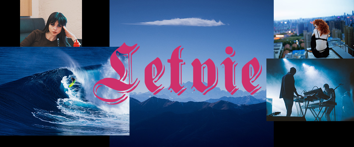
When all rules get broken, you get Digital Brutalism. With an asymmetrical layout, no visual hierarchy, and a fight for attention between the elements on the page, it certainly stands out. As a design trend that has its origins on the architectural movement from the 1950s, the “no holds barred” attitude of Digital Brutalism makes each site unique. In a realm where anarchy reigns, how does User Experience hold up? Before we explore that question, let’s start at the beginning.

pixelated images, clashing colors and asymmetry

What is Digital Brutalism?

Back in the 1950s, right after World War II, a new architectural movement broke out as a counter to the overly ornate style of the previous years. Buildings were crafted out of solid concrete and were left bare, with no drops of color. A stark contrast, they stood out for looking comfortable or relaxed.

How does this come into play nowadays? The lack of structure and rules has always been present in the media and culture. So now we witness it in a new Design trend called Digital Brutalism. A movement which, according to Pascal Deville, “can be seen as a reaction by a younger generation to the lightness, optimism, and frivolity of today’s web design.”

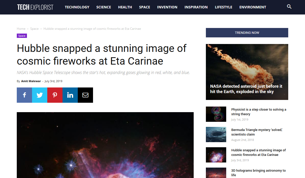
While exploring any brutalist website, you may start to notice patterns. Surely the one distinctive thing about it is the nostalgia. Let’s go back to the early days of the internet when anyone could make a website. Not everyone who had a website back then knew what they wanted to achieve with it or how to get their core message across. You’d come across things such as:

  • Cluttered design, with elements overlapping one another.
  • Items that would appear clickable weren’t.
  • Clashing colors between various blocks or text.
  • No visual hierarchy.
  • Use of pixelated images, multitude of fonts, animated gifs.

These examples may be seen as a faux pas now, but they’ve started popping up again as a throwback to the early days of the internet in this new trend.

Flexible Big Grid and column background image

Why would you build a website like that?

If each website is keeping the same design: a link is a link, buttons are easily distinguishable, there is no clash of colors. Then everything becomes a copy of a copy of a copy. Now how do you break free of that? By abolishing all rules. That’s where Digital Brutalism comes in.

User Experience is important. Anybody wants a site that can be easily navigable. However, when it costs your brand identity to build one, you may need to rethink some design choices. If you search through the vast web, notice that not all sites are user-friendly. This doesn’t have to be the case for you.

Let’s take a look at some popular Brutalist websites:

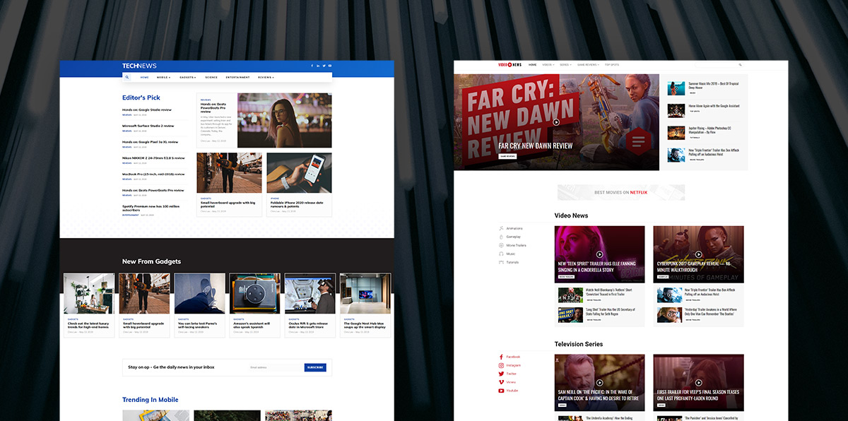
  • Craigslist has kept the same look since it was built. It is still used to this day even with the simple layout and its quirks. Its plain in your face design, however, has probably been the reason why it’s still popular to this day.
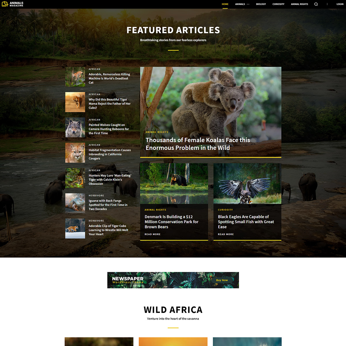
  • Bloomberg has experimented with Digital Brutalism while still retaining its easily navigable features. Take a look at their Yahoo! Article, while it does not align with their other articles, it stands out and grabs your attention.
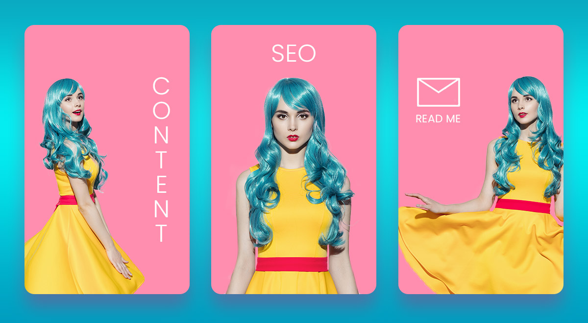
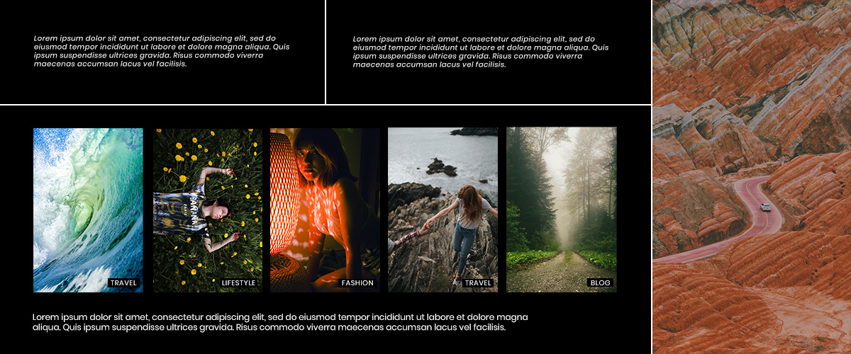
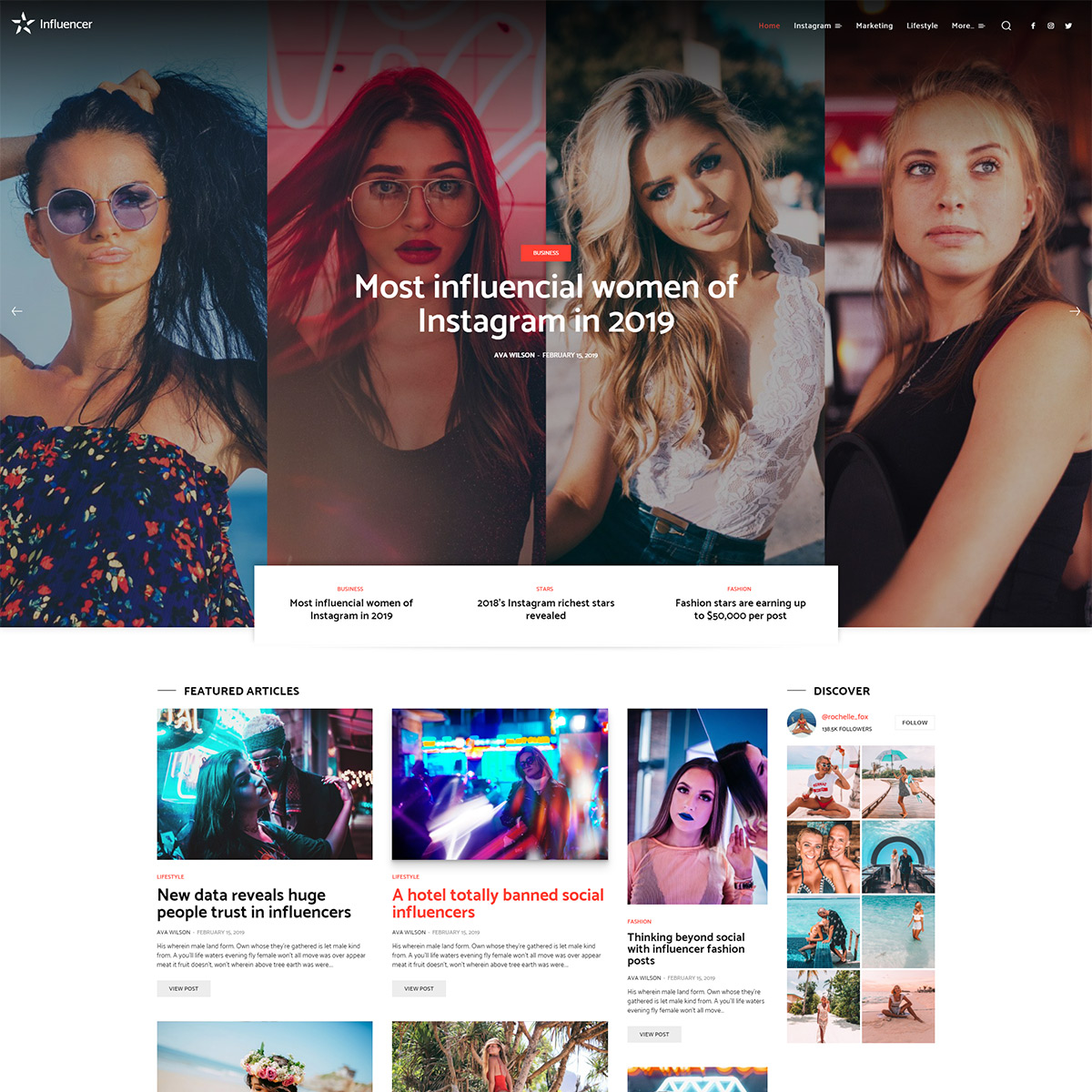
  • The Outline shines through with its appearance. There’s an abundance of color, fonts intermingled together, elements that give the website a unique look.
  • Have you seen Dropbox’s new design? While the elements are still accessible to users, the colors and photos are different and make it novel.
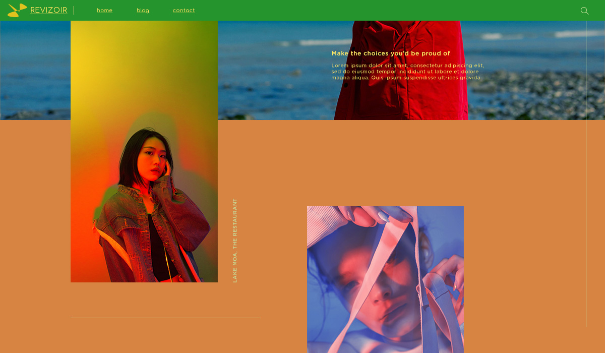
  • Balenciaga has always been a rule breaker. When announcing new products or preparing for an event, their website’s design changes and gets funkier. Even if it may seem overwhelming, it’s been highly successful.

What can you take out of this? There’s no need to sacrifice UX for fantastic design, and if you want to make a striking site: you need to go against the flow.

Complementary colors used in an asymmetrical layout

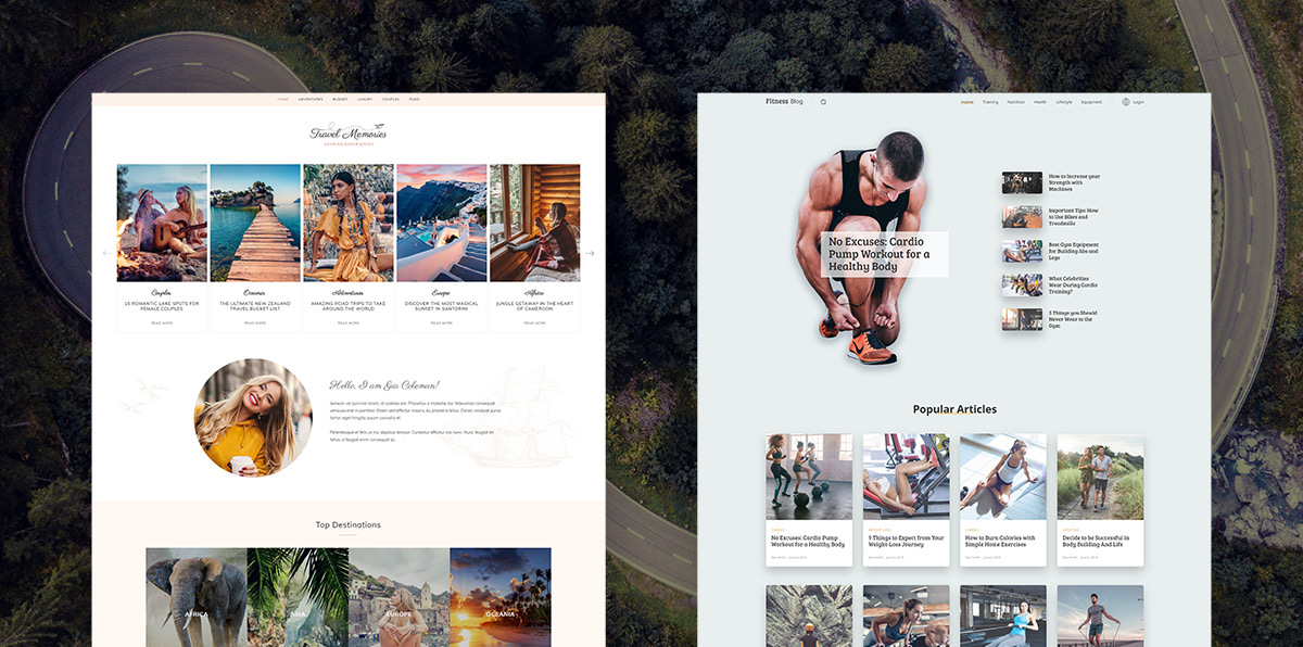
Build a Brutalist website with Newspaper Theme

The first step would be to get inspired. Take a look through any brutalist website that appeals to you. What exactly do you like about it? The color scheme, fonts, layout? Then try to implement it straight on your site with the tagDiv Composer page builder. Whichever answer, keep in mind that you still need to have a user-friendly website. Don’t go overboard with the rule-breaking.

Color me surprised

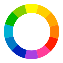
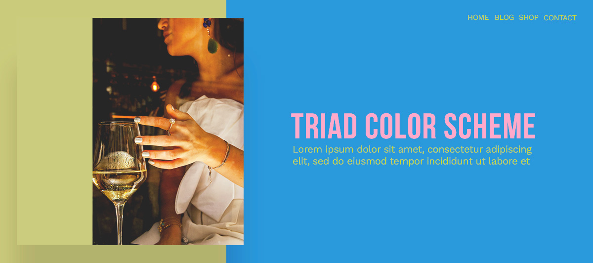
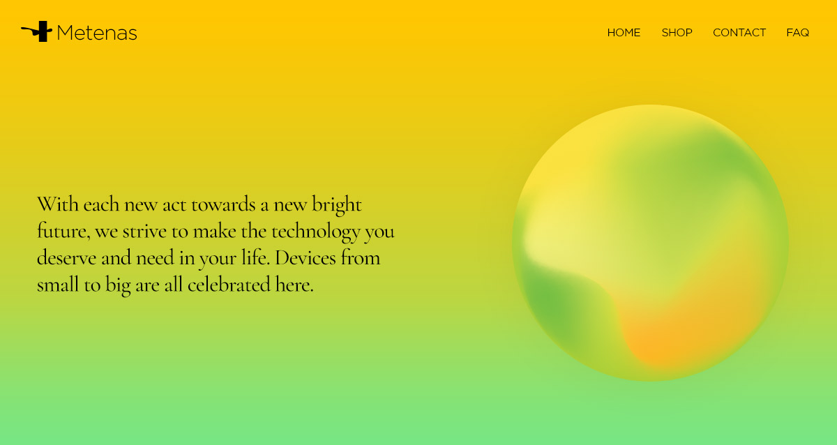
If you want to catch the audience’s eye with the abundance of colors used, then go to the CSS tab on a row and add color to the background. Why don’t you change the color of the Logo and text to a contrasting or complementary one? On the next row, the background color should be different than any of the previously used ones. So, for example, if you used blue and yellow before, use red or green for the background now.

Keep the same scheme up throughout the page while still adhering to the rules of Color Theory. So you can obtain a unique design for your website.

Various fonts on a flex Block

Let’s Open the Type

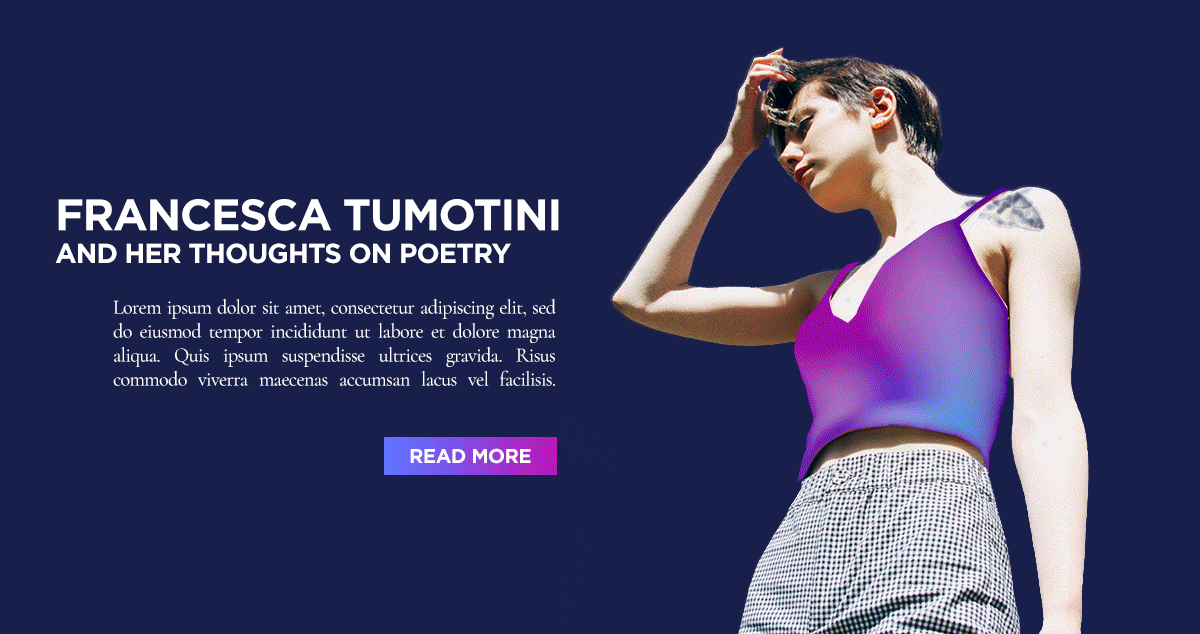
Do you want to be remembered for your choice in fonts? Change the title’s typeface to something bold, big, or even a Display font. Choose a different font for the subtitle and another one for the content. The contrast between each different font is undoubtedly going to make the page distinctive. However, to keep the layout as straightforward and appealing as possible, go for a white or black background and text color so the focus can stay on the content.

No matter what elements you need: Newsletter box, Buttons, Single Images, Flex Blocks, Flexible Big Grids, try to vary the fonts used. So they’re never where anybody expects them. For example, if you used Fugaz One for the title, use it on the subtitle for the next element. You’ll quickly wow your crowd while keeping the users happy by sticking to a visual hierarchy.

May we lay these out?

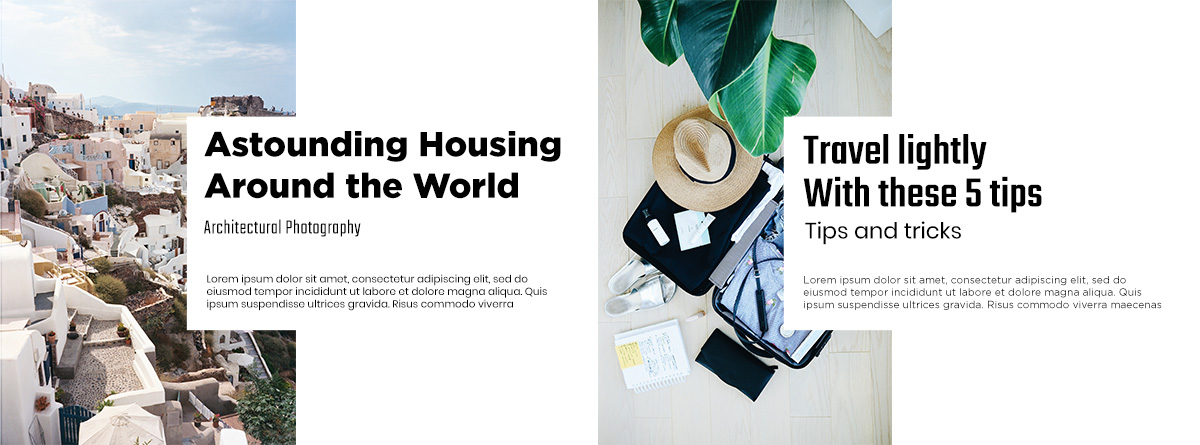
If you want to respect Typography rules and Color Theory, break the boundaries with your design. How do you do that? Go for an asymmetry. Keep each element on the page very far apart from the other by creating white space. Take inspiration from TechStyleFashionGroup. Their grid-breaking layout shines. There’s no abundance of fonts or colors. Everything kept to a minimum to draw attention to the positioning of each element on the page.

Asymmetrical Header Layout with background images

With tagDiv Composer open, add the necessary elements on your page and then create white space between them by increasing the padding or margins between them. You can either do this in the CSS tab or through the General Settings. For example, on the CSS tab of the row, add a lot of space top and bottom. Now add a Flex Block into the row. From the layout tab, modify the Module Padding to create space. Float the featured image to the left, change its width to 50% and then add padding to the Meta Info.

Each time you make changes, look to your favorite website, and get inspired by it. This way, you can achieve something that not only appeals to you but to the audience, too.

Conclusions

While Digital Brutalism may seem flawed from a distance, with all its rule-bending styles, there’s something to take out of it. To stand out in an online environment where design rules are so easily accessible, you need to break loose from some boundaries. Keep your website unique, but also user-friendly with Newspaper Theme.

Show us your favorite brutalist website in the comment box below!

Difference between Left-Brain and Right-Brain Thinking

0

A website is the most visual essence of your business, regardless of the industry. At its roots, a site is a software solution assembled by algorithms and special functions. But still, have you ever wondered why devs don’t visually design and code at the same time? Or why visitors react the way they do while navigating to your website? It’s all in the human personality. Based on neuroscience and psychology theories, our actions can be influenced by one of the two sides of the brain. Depending on the dominant part, the brain handles different types of thinking.

Graphs and numbers

Which side of your brain do you use more?

How does the human brain work? In short, neurons, which are linked together, rapidly conduct information to muscles, nerves, and other cells. This is considered to be brain activity. However, it’s a known fact that the left-brain is not working independently and cannot exist without its right side. The two hemispheres work closely together. There are some theories that sustain that right-left brain sides influence each person’s personality. Even if other theories consider that it’s only a myth, every human is different: from how he looks, to how he behaves, thinks, or makes decisions. Left thinkers are rational, logical, and consistent in solving sensitive, technical issues. Right-brained people are creative, empathic, and are known for acquiring emotional intelligence.

Creative people

Let’s continue this article by focusing on you, the website owner. Building the perfect website requires time and effort. And, your personality totally relates to how things succeed.

If you haven’t yet determined what’s the dominant part of your brain, now is the best time to do it. Then, it’s simpler to acknowledge who your visitors are, and what their dominant part is. If you don’t target the right audience for your website, then, it’s time for major changes. Nowadays, visitors search for interesting stuff that catches their attention in milliseconds.

Creative minds are right-brained

About the right-brain dominance, some say it entertains imagination and creative endeavors. So, if your website is about art…then, your audience is right-brained focused. Also, don’t forget that people will be mesmerized once you show designs and content they really relate to. If your website is all about photography and capturing the most amazing moments, right-brained visitors are the ones you should impress, as they are people that feel and take action based on intuition. Whether you’re creative or not, you can get help from other people or try to optimize your capabilities.

Left Brained people think Logically

Analytical individuals are left-brained

Left-brained people try to explain why something is the way it is. They need explanations based on facts. If you have a business and a website destined to left thinkers, you have to remember that they are driven by clear structures, laws, and rules.

Other highlights you might find interesting:

  • Right-brain shows one’s expressiveness, imagination, and the ability to easily understand music or colors.
  • Right-brained people intuitive and handle issues emotionally instead of rationally deal with them.
  • Left-brain tasks follow numbers, logic, analytical and critical thinking.
  • Left-brained people are more organized and tend to learn foreign languages without effort.
  • Both hemispheres are strongly connected. For example, accordingly to the Cleverism magazine, “the left brain helps us learn our native language, but it is the right brain, which enables us to understand idioms and poetry.”

Right Brained People think Abstractly

Conclusion

The information above is another way to understand your readers, as nowadays it’s hard to capture their attention online. If a user stays 1 minute on your website, you must know it means an eternity! Usually, visitors get bored quickly, and if you don’t grab their attention in less than 2 seconds… well, you need to improve your website. Be creative, analytical, and organized at the same time, and you won’t miss it. So, use all your capabilities and get readers back to your site. Have fun mixing your own abilities for the wanted results!

Introduction into Color Theory with Newspaper Theme

5

How to choose the colors for a website when you start the design process? Take into account their vibrancy, contrast, and the harmony between them. Picking the right colors that complement one another is part of the world of color theory, and through it, you can influence the website visitors’ emotions. So, what sort of impression do you want to create for your audience?

Monochrome Web Design Example in Newspaper WordPress Theme

Color 101: Basics

When we talk about colors, we mostly refer to them based on their contrast, vibrancy, and relationship to each other. How does each one come into play? It’s easy:

  • You create contrast by choosing two different hues for the background and text. It divides elements on a page and focuses the users’ attention naturally. It also makes the text more readable if done right. The best rule of thumb when choosing colors for your text and background is to have one of them be a very light color compared to the other.
  • Vibrancy refers to the level of color saturation. Brighter colors create energy, whereas pale ones help users relax.
  • If two colors clash, they do not complement each other and the results are not harmonious. There are multiple schemes for choosing a pair of colors that works well together from analogous, monochromatic, complementary, split complementary, and triadic.

For a harmonious website, keep control of the contrast, vibrancy, and choose colors that go well together. It’s also essential to minimize the number of hues used, so at most, choose four, at best, choose two: a primary color and an accent one.

How do you choose the perfect primary color?

What do you want the users to feel or think when they first click on your website? Moreover, what is the core message you want to transmit to the visitors? For example, if you to appear professional and businesslike to the audience, you would need to showcase that through the primary color. The same goes for each industry.

Web Design Inspiration: Use Analogous Colors for Contrast

Color Theory and Meanings

  • Blue – represents a soothing, calm color and is often associated with the tech industry. Banks tend to have logos that are blue to represent authority and trustworthiness. It is also a masculine tint.
  • Green – is organic, eco-friendly, and environmentally-aware. If your company has anything to do with the environment, outdoors or nature, green is the best color to use.
  • Yellow – stands for happiness, friendliness, and fun. It is often associated with transportation (buses and taxis are yellow).
  • Orange – stimulates physical activity, competition, and confidence. Loud and warm, it can be the perfect color for a fitness website.
  • Red – is an energizing hue that can easily catch the attention of a viewer. It represents power and passion.
  • Pink – can be the color of femininity, but it is often associated with sweetness. From websites that center around feminine products to candy shops, pink can be perfect.
  • Purple – portrays the tint of royalty and increases creativity. It invokes a feeling of quality and luxury.
  • Brown – is an earthy color that is seen as stable, dependable, and wholesome, often found on agricultural websites.
  • Black – adds a sense of value and luxury. High-end products are usually linked to the color as they can be seen as sophisticated and elegant.
  • White – brings purity and peace to a website or concept. When white space is used on a website, it can give a sense of freedom to the user.

These are only some of the basic interpretations and associations with colors. Depending on the people you’re addressing, the meanings may change. For example, while we often associate green with envy, yellow is the color of envy in Germany.

Complementary Colors in web design

Color Harmony

Have you chosen your website’s primary tint? If you want to know what color to pair it up with, there is a great website that can help with the decision. Head on over to Adobe CC to have your first taste of the numerous color combinations available. However, if the color wheel does not help you decide, here’s an explanation for the color schemes:

  • Monochromatic color schemes focus on one hue only and different shades of it. For example, multiple shades of blue such as a dark blue, bright blue, and pale blue.
  • Analogous refers to the neighbors of a single shade on the color wheel. If we stick to the previous example of blue, the analogous scheme for blue would be turquoise and purple.
  • Complementary are the colors that appear on opposite sides of the spectrum. Blue’s complementary hue is yellow-orange.
  • Split Complementary is adding an adjacent color to the complementary color. If blue is your primary, the split complementary to it are yellow and yellow-orange.
  • Triadic uses a triangle scheme to choose the colors. Draw a triangle on your color wheel where one of the points touches the primary, and the other ends are your accent colors. For blue, the triadic scheme would be green and orange.

Color Theory with Newspaper Theme

With the best possible color scheme in mind, it’s time to start building your website. Whether you import one of Newspaper Theme’s demos straight to the site or create the entire website from the ground up from zero, you should always start with the logo.

Within the Header Builder, click or add the “Header Logo” element. From the Style tab, choose the primary hue for the text & tagline. Now, switch to your accent color for the hover. Read more about Newspaper Theme’s Header Logo.

Newspaper WP Theme Hero Section using Triad Colors

Now you’re ready to move to the rest of the Header. Click on the Menu and Live Search elements and change the colors according to your color scheme. Don’t forget about the Sticky Menu and the Mobile Menu. When you’re ready to move on, begin with the Homepage.

If you’ve already imported a demo, then all you have to do is change the fonts, colors, modify links, and you’re done. Are you building it from scratch? Then head over to the Homepage tutorial to start. Keep in mind to stick with the same color scheme you’ve chosen.

Conclusions

Whether your website is funky and fun, or businesslike and professional, you can engage the audience with the colors chosen. Each hue inspires a different emotion or meaning. Keep the number of shades used to a minimum and stick to ones that work well together. Repeat the primary and accent on each page, each template with Newspaper Theme, and you get a beautiful structure and layout that attracts the type of visitors you want.

Have you chosen a color scheme for your website, yet? Share it with us in the comment box below!

Design Trends: Groovy Gradients with Newspaper Theme

0

Gradients in web design have been around for ages. However, it is only recently that they got popularised again through huge brands such as Instagram and Spotify who have used color combinations on their websites. The trend has come to stay. How do you incorporate this into your website? From buttons to logos, backgrounds, typography, you can easily make gradients part of your style.

Why you should use Gradients in Web Design

It’s a technique that catches the eye of the reader and makes any website more memorable. The stunning color transitions get any gradient to stand out and helps you elevate the layout further. When in nature, colors usually blend very beautifully, in a natural way. Just take a look at the sky at any time during the day. It might change shades of blue and then blend towards an orange, yellow, pink, during sunset or sunrise. Mimicking reality, gradients in web design add depth and dimension to any website, making flat elements appear as though in 3D.

Gradients in web Design Blend of Colors on the Background Newspaper Theme

General Tips to Style your Site with Gradients

When you create any form of gradient on any element on your website, you add two or more hues to obtain a fantastic color combination. However, how exactly do you pick the right colors for it? Which ones work best together, and how do you decide?

  • Take a look into the color wheel. Pick analogous colors, which are close together in their hue so that the gradient becomes a seamless blend between them.
  • If you deviate from analogous and decide for complementary colors, do a 3-part gradient which involves adding a third color in between the first two.
  • The triadic scheme can usually result in dazzling hues.
  • Use nature as inspiration if you’re stuck with picking colors. Take a look around you from the plant that is half in shade and half in sunlight, to the sky that is changing colors between sunrise and sunset.
  • Work with the opacity of any gradient. Is it too bright? Lower the opacity and let it blend into the background.

Gradients in web design: on Background on a website's Header Newspaper Theme

Obtain a fantastic design with Newspaper Theme

While building your website, find elements that allow gradients easily through the tagDiv Composer, our frontend page builder. If you’re stuck, here are a few suggestions:

  • Through the CSS tab of any row, you can choose two colors to create an alluring gradient on the background.
  • All buttons can have a gradient applied to them in the Style tab of their settings. Whether you have a “Read More” button on your Flex Block or need to bold call-to-action, you can make it pop with a stunning color combination.
  • Title elements can be turned into something fun and stylish by adding a gradient to the color of the text.
  • Icons, from logo icons to the ones that are added to your page to highlight any area, can be a seamless transition between two or more colors.

Moving gradient on photo with an Article with button Newspaper Theme

Mix-and-match the different elements to obtain the perfect layout that works well with your brand and intention. Do you have a business website? Aim for colors that emphasize professionalism and trustworthiness such as blue, purple, and green. Each website can break the boundaries of 2D and become more realistic with a cutting-edge gradient. Don’t shy away from finding the one that is a roaring success.

So as a last note…

Have fun. With each new page and template, you create with Newspaper Theme designing becomes a breeze and gradients can be a friend in need. Make a stunning combination of realistic elements and flat design. Obtain a perfect balance, and your website can be the one struck a chord in your visitors’ minds.

Show us how you’ve used gradients in creating your website in the comment box below!

Best Newsletter Practices You Need to Use in 2023

0

Email marketing is perceived as a gold mine of communication in the online world. With such diversity in every area, people rush to do more things in a shorter time. They use all kinds of gadgets, robots, apps, and so on that make everything automated for them. These days, email marketing is becoming stronger and wider, creating a real bond between audiences and service providers. So, if you have a business and you hear a lot about videos, chatbots AI, VR, and don’t know where exactly emailing stands on your list, stay tuned and read on.

Email marketing is not dead. Period

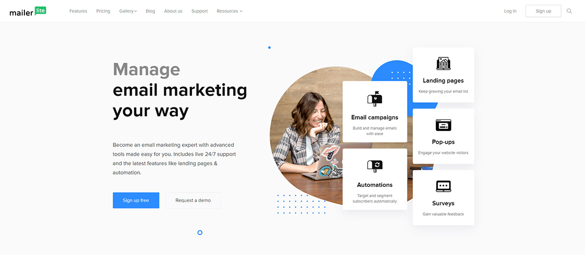
Use a marketing approach to reach your customers directly via electronic post by sending them emails. There are indeed many emails that are annoying, repetitive or lead to phishing websites. When your emails represent a genuine business, it means you’re sending verified information via email, and the spam rate should be at a minimum score. If your emails are interesting and people relate to them, they’ll keep reading them. However, not everything is about the content, as there are other things to consider, too. You’ll have to focus on consistency, originality, relevance, and timing. In short, you need to make a strategy and test different versions.

Why is Newsletter an Important Marketing Tool?

NewsletterYou don’t earn trust. You have to work to build trust. This reflects in every single thing you create in the online environment about your business. Newsletters represent a quick way to send information you believe is essential to your audience. Whether it’s an eBook, a roundup of articles, upcoming events, or a new product update, by choosing a newsletter service, every email you send is nicely wrapped. Email campaign ingredients consist of the design templates, content (title, logo & text), representative colors, and media files. Furthermore, each service lets you customize emails by using pre-made templates, an HTML editor, or a rich text editor.

You’ll find tons of information about the art of sending emails for marketing purposes. I’ve listed here some quick-fire stats on newsletters you might want to try out when starting:

1. Jumpstart with originality. Communicate with your audience and use your brand’s voice.
2. Define your email purpose. What do you want to obtain?Email Marketing
3. Weave diversity into your emails.
4. You can do A/B testing to identify what the best performing variables are from an email.
5. Focus on Open and Click Rates. Numbers tell you the success of your campaign.
6. Optimize each campaign based on its type (welcome, social, standard, seasonal, cart abandonment email, or others).

Email Marketing Software Providers

Email marketing combines intuitive, flexible features with great design. Most of these services allow you to choose from thousands of design themes, upload your own, or create the layout from scratch. Also, you can reuse something you’ve created previously. It saves you so much hassle! GetResponse, MailChimp, or MailerLite are some of the best newsletter companies you can choose from.

GetResponse

GetResponse

If you are looking for a webinar marketing solution besides basic newsletters, perhaps you should be joining the GetResponse platform. This service lets you host and design beautiful webinars to engage more with your audience. You can use GetResponse for free for a period of a 30-day trial, regardless of your list size. This option is available on three pricing plans out of four.

Mailchimp

MailChimp

Based on an “all-in-one marketing suite,” MailChimp provides a single platform which gathers many integration tools that automate all your efforts. Whether we’re referring to newsletter campaigns, social postings, advertisements, landing pages, audience finder or analytics reports, MailChimp has you covered. It’s a free service until you reach 2000 subscribers.

MailerLite

MailerLite

MailerLite is an email marketing software as a service-based app. Integrated with Shopify, WordPress, WooCommerce, CouponCarrier, and many others, you can connect MailerLite with your accounts, for more efficiency. You can add up to 1000 subscribers and send a limited number of 12,000 emails per month. Pricing starts from $15. MailerLite can be a great alternative if you are a beginner and own a small business, as its tools are simple and intuitive.

There are a lot more companies that are trying to make a buzz in this industry or target different ones. These days, it feels like every software wants to give users the freedom to do things faster and easier. From drag-and-drop email builders, personalized signup-forms, API support for developers, and so on, every tool is tailored to boost email marketing strategies.

How can email marketing help your business?

Email Marketing CampaignJust remember how people used to get their mail posts filled with envelopes and newspapers. It’s how information was spread and reached its audience. Newsletters are newspapers alike. People subscribe to be the first to know what’s new. So, by sending newsletters, you create brand awareness, engage readers with quality and varied pieces of content.

Summing-up

Think of newsletters an important asset for you and your site’s visitors or clients. When people sign up to a newsletter, they expect the received information to serve their needs. Effective, personalized content for your lists, tie the knot between you and your audience, and strengthen the visitor-owner relationship. Before jumping into crazy conclusions, check out the stats of your business niche, and discover your competitors’ campaign reports. Divided by industry, some of the most popular email marketing software providers have published quite interesting and in-depth benchmarks on their websites. You can read more about these recent studies on Mailchimp, GetResponse, or CampaignMonitor. Let us know in the comments how you got started with email marketing.

What’s New in Newspaper 9.8 Update: Introducing PRO Demos

Newspaper 9.8 update brings out a new source of design inspiration. We know how much you love working with pre-made full layouts, so we’ve crafted twelve cutting-edge demos that make you design your website like a pro.

Whether your site is content-heavy or minimal-based, the brand new demos such as “Life News,” “Podcast,” “Art Magazine,” “Influencer,” are ready to give your website a fresh and professional look. Unique features like the right-to-left reading, asymmetrical elements, categories with little icons, vibrant overall colors, or calligraphy font combinations are just a few hacks used by our skilled designers. You’ll find all the new demos categorized under the PRO label, in your Newspaper Theme 9.8 dashboard and they are FREE to use for our customers.

newspaper theme 9.8

Influencer

In a world where people share their routine, life, beauty, and travel hacks on social media, the Influencer Demo can be a choice to publish amazing content for your audience. With vibrant colors, split images slide, and strong social network integration, you’re closer to your fans/followers than ever.

newspaper theme 9.8

History

Take your imagination to a different era with this beautiful demo. It uses an overall grayscale palette and sepia-toned photographs of historical events. The History Demo comes with a new magazine cover inspiration and a powerful way of taking offline online. Use the new single post template to highlight your story with a bold title and subtitle.

newspaper theme 9.8

RomaniaNews and LifeNews

Either LifeNews and RomaniaNews Demos have an online newspaper vibe and are an excellent solution for websites with a lot of content. LifeNews gives you a fresh impression, an interesting author page, and underlined titles on hover. Whereas the RomaniaNews Demo takes a traditional approach, with ad placements, content blocks with 78×78 image thumbnail, and embedded video playlist on the homepage.

PodcastPodcast

This demo is an out-of-the-box solution for web owners looking out to easily create an online playlist. It lets you publish a series of audible files by using a shortcode for audio samples. The Podcast Demo has a modern and lightweight footer design, with an impressive subscription box layout, inviting site’s visitors to get your latest episodes via newsletter.

La Mode FashionLa Mode

If fashion is your middle name, this demo made using advanced CSS skills will delight you. The website design uses a stylish, purple, blending mode for the images on hover. Wide elements, minimal menu, all create asymmetry, with a bohemian tone. Now, you can take your fashion and photography skills to a new level, and reveal everything to the world using La Mode Demo.

newspaper theme 9.8

Travel Memories and Fitness Blog

If your hobbies motivate you to build a dedicated website, the new Travel Memories or Fitness Blog Pro Demos can inspire you. In the Travel Memories Demo, you’ll be delighted by the calligraphic display font and sans serif blending, which makes the entire website look outstanding. Meanwhile, the Fitness Blog has an entirely gray background, with floating elements, giving your website a 3D aspect.

Animals MagazineAnimals Magazine

Are you passionate about animals, birds and their life? Walk into the Kingdom Animalia to discover over 7 million species. Kick start your website with the new Animals Magazine Demo design. Inspired by wildlife, this full demo has a fixed background image that moves as you scroll down, and switches between white & black blocks. With big titles and your amazing photographies, the single post is now more attractive, and vivid.

newspaper theme 9.8 - Art MagazineArt Magazine

“Everything you can imagine is real,” said Pablo Picasso. The Art Magazine Demo is a balanced layout that combines vertical with horizontal elements. It also smooths things out by using lots of negative space. On the Exhibitions page, there are sticky blocks with different dimensions, alternating the gothic Oswald font with the Alegreya one. Art Magazine keeps a contemporary, dynamic feeling.

newspaper theme 9.8 - TechNews and VideoNews Demos

TechNews and VideoNews

Having interesting content about technology, breaking news events, make you want to offer top stories in a visually appealing way. With a background texture, outlined boxes for a minimal effect, and full-width elements, TechNews is a pro-choice for bloggers publishing amounts of content. The VideoNews Pro is an innovative demo, as it lets you publish all your posts as videos. Even the single post needs video content embedded and suggests related video posts. Also, it has a beautiful mega menu, social icons, ad spaces, and categories using little symbols.

Make Your Site Powerful, Ravishing, Outstanding

Get all the visitors attention by trying these new demos, and deliver pleasant experiences on your website. Whether you’re a beginner, or an advanced WordPress user, with the Newspaper theme 9.8 demos, your website is in the spotlight. If you’re looking for something different, it’s time to make some website tweaks. In a word, the new PRO demos are a great start! From spectacular layouts, exquisite typography to perfect designed boxes, everything is in foolproof balance. Which one is your favorite PRO demo ❤? With this in mind, let us know below, in your comments.

Newspaper Theme Case Study: 28 amazing websites, a single theme

9

Is Newspaper Theme the right theme for web developers with large clients portfolio? We’ll find the answer by interviewing Amit Malewar, a professional web designer who built hundreds of sites over the last 12 years. He is a WordPress website developer who created over 28 websites using Newspaper theme. We are thrilled to share with you a professional’ thoughts about our product, and how he uses it on various websites, in this comprehensive Newspaper Theme Case Study.

Amit Malewar, Indian Web Developer, owner Tech Explorist & InfophilicAmit Malewar (27) developed, designed, and curated many websites of his hundreds of happy clients using Newspaper Theme. Also, he is the founder of TechExplorist (one of the top 3 science news portals and the only science news site in India), Inceptive Mind, and Infophilic websites.

The challenge

He started in 2010, and by 2015 Amit was already creating websites for his clients. His dream was to be amongst the top developers, to find the best solutions for his customers and to explore new possibilities. So, the idea of the Tech Explorist website started to take shape into a plan. The developer had all the technical skills, but no time to write the code for it. So, he begins to search for “the best” theme for WordPress.

“I’ve found Newspaper Theme in top list on Themeforest. First, I checked the launch date of the theme and the last update date. The premium product I was searching for had to be SEO Friendly, and I was interested in having the lazy load feature. At that time, Newspaper was the only theme with this set of features.

Newspaper Case Study: Article in the Tech Explorist website

The design, flexibility, and general appearance were as important as the Tech Explorist website I was working on are all about technology and innovation news, highlighting the scientific discoveries, inventions, health and groundbreaking researches that shape human living.

I was also searching for a theme that had Custom Ad spaces with easy to customize panel. And of course, fast page load speed. The Newspaper theme undoubtedly met all my expectations, that’s why I am currently using it on all of my websites”, recalls Amit about the first encounter with the tagDiv’ theme.

Getting started

“It took me one or two hours to read the documents and complete the installation process. By the way, you guys got the best documentation. I had posted some questions on the forum when I was playing/trying new things with the theme. The support is awesome, and they quickly helped me understand how some things were working. The best part of the support forum is transparency”, says the developer.

Solution on action

The Indian developer created 28 websites, including three of his own using the Newspaper theme. His is relying on the mobile theme plugin as it “really makes the site faster for mobile users.” When you’re web designing for a living, it’s the little things that make the difference between an enormous project you love to create and some other project. The inbuilt sharing buttons work way better than any other premium plugins available in the market.

This theme has a way to stick into the people’s mind

What I enjoy most about the Newspaper theme is the design, the feeling it gives you. I work it for almost four years, and I still believe Newspaper brings you a more professional design and feel out-of-the-box as compared to many other popular premium themes. Six of my clients contacted me because they just wanted a design similar to techexplorist.com ?. On my websites, people are asking me things related to Newspaper; some want to know what plugins I am using. And so on. This theme has a way to stick into the people’s mind,” says Amit Malewar.

Newspaper Theme Customer Review: Infophilic Simplifying Blogging website

For the Newspaper Theme case study, we asked the web developer to share with us his favorite tools. “tagDiv Composer and the Cloud Library. These plugins make Newspaper Theme more flexible and give me endless design possibilities. The new builder made customization super easy. I can customize any element/module or header in minutes and create a brand new website in a day or two after completing a discussion and planning with the client”, explains Amit.

The results: Significantly increasing in revenue

Speeding up the development time while making the customers delighted by your work is something that many designers dream of achieving. Is it possible with the Newspaper theme? Amit explains it for us “As a developer, undoubtedly it helped me increased revenue. I can finish a project faster and create another website as the cycle of design is much shorter.

This theme is the best in terms of customizability and for SEO. It increases the number of page views and visitors on the site because the mobile version is fast. On my website, before using Newspaper, I had 1 – 2k page views in a day. Now, we have almost 50 – 80k page views/day and some of my clients have 150 – 200K page views per day using Newspaper Theme”.

Newspaper Theme Case Study: Mobile traffic Analytics of the Tech Explorist

Wrapping up

In this Newspaper Theme case study, we’ve brought you the story of the Indian developer Amit Malewar, also Tech Explorist website owner, that registered an incredible traffic growth while using Newspaper on brand new websites. Also, in this customer story, the web designer shared with us how using the Newspaper Theme helped him become a more productive and efficient developer. All these while finding a way to also follow his dream.

What dream do you have? What’s the next step you want to take? Comment below and share it with our community. 

Google Analytics Guide 101: How to Track the Traffic on WordPress Websites

Did you just start your blog with Newspaper Theme? Great! In this article, we explain how to power up your website with valuable insights using Google Analytics. With accurate data about your audience – age, gender, location, traffic source (how they landed on your site), the most popular content on your website and conversions – you can plan effective business strategies and grow your business faster. Are you asking yourself why you should use it?

I’ve made a list of the four main reasons:

  • It tells you which channel drives traffic to your website
  • It shows you which marketing channels are better at converting the visitor to customer
  • It brings you data about the demographic characteristics of your audience helping you to be more effective
  • It enables you to analyze your efforts and pages based on data, not hunches.

The list can go on, but I think we can move on and start with the basics.

Google Analytics Guide 101: Step 1 - Create a new account

Analytics 101: How to set up your Google Analytics

Google Analytics is created by Google to help website owners understand their customers. If you are a publisher and your goal is to bring visitors back to read more of your amazing content or an e-commerce website that aims to get as many conversions, as fast as possible, Google Analytics is the free tool you need to analyze data and grow your business.

Create a Google Analytics account

To set up a Google Analytics account, you need a Google Account. Think of your Google account as the access point for all your Google products and tools. If you don’t have a Google account yet, it takes a few minutes to create a new one.

Google Analytics First step to setup a new account

Once it is done, you can create a new Google Analytics account. Click the button, and you’ll be redirected to the setup page. The Analytics help is quite comprehensive, and you’ll go through the process in no time.

Google Analytics Setup Your Account

You’ll need to give your Analytics an account name, enter your website name, and add your domain name. After you complete these steps, Google will automatically generate your tracking code for the website.

With this, the basic setup is ready. Theoretically, now all you have to do is add the Google Analytics script to the <head> tag and see the data flowing in after 24 hours. But practically, … it’s not! Think about it: how does Analytics suppose to know what actions are essential to you on your website? Are you selling something? Are you aiming for leads? It’s engagement on content vital? If you insert the script in the site now, you’ll be missing out almost all the goodies.

2. Clear objectives = Great, insightful data

Yeah! You must change the Google Analytics script to track actions and metrics that are important on your website. If you have some Java or PHP skills, you can do it by yourself. If not, you can hire a developer to do it for you as this step is a heavy technical one.

But first, you need to get things crystal clear in mind about your website objectives. Make a list:

  • What are the key pages, shopping cart pages?
  • File downloads like .pdfs, apps you want to track inside Google Analytics
  • On-page events like video views, forms, button clicks
  • Does this site need e-commerce tracking?
  • What are the critical conversion points like “thank you” pages, signups, lead capture pages, newsletters?

After generating this list, you should have a clear idea about what do you need to track as actions and conversions on your website. Your Google Analytics should focus on your essential metrics and help you to reach your objectives. Let’s see some example of objectives with potential Key Performance Indicators defined.

According to Klipfolio
A Key Performance Indicator is a measurable value that demonstrates how effectively a company is achieving key business objectives. High-level KPIs may focus on the overall performance of the business, while low-level KPIs may focus on processes in departments such as sales, marketing, HR, support and others

Objectives and KPIs

Objective Pageviews/traffic:
Potential KPIs: Total pageviews, sessions by source/medium, top landing pages, top organic keywords, page value, time on page, goal conversions.

Objective e-commerce/sales:
Potential KPIs: Total revenue, e-commerce conversion rate, page value, conversion rate by source/medium, sales by product category, return on ad spend (ROAS), conversion rate by gender/age and interest category, conversion rate by external campaign name.

Objective lead generation:
Potential KPIs: Goal conversions, conversion rate by landing page, page value, conversion rate by source/medium, conversion rate by gender/age and interest category, contact form submissions by landing page.

Objective affiliate/commission-based programs:
Potential KPIs: Outbound clicks per landing page, content group conversion rates, page value, traffic by source/medium, top landing pages, top external links clicked by page.

Decide what are the most valued KPIs for your website’s objectives and customize the tracking code to make sure this fantastic tool called Google Analytics brings you all the essential metrics in a way you can easily understand and make strategic decisions.

3. How to customize the tracking code to see everything that’s important

If you are selling something on your website, the first thing you’ll want to do is activate the Ecommerce tracking. Navigate to the Admin panel > View level and enable the Ecommerce settings. That’s easy. Now comes the technical part. Head over Google Analytics reference guide and check the instructions for sending data about transactions and/or item metrics to your Google Analytics.

ga('ecommerce:addTransaction', {
'id': '1234',                     // Transaction ID. Required.
'affiliation': 'Acme Clothing',   // Affiliation or store name.
'revenue': '11.99',               // Grand Total.
'shipping': '5',                  // Shipping.
'tax': '1.29'                     // Tax.
});

For content creators and publishers, e-commerce tracking is useless. Adding custom dimensions like Author or seeing engagement on AMP traffic in Google Analytics, it’s another story and could be a gold mine to grow your website.

ga('send', 'pageview', {
'dimension5': '<!--?=$author?'>
});

After you’ve made all these customizations on the code, it should be ready to install on the page.

4. Installing the Google Analytics script in Newspaper Theme

Go to your Google Analytics Account > Admin panel Property, open the Tracking Info section, and click the Tracking Code option. Copy the Global Site Tag and add the sitewide customizations you’ve made in the previous step. Here is an example of customized code.

ga("create", "UA-XXXXXXXX-1", "auto", {
name: "author_analytics",
allowLinker: true,
storage: "none",
clientId: clientId,
alwaysSendReferrer: true
});
} else {
ga("create", "UA-XXXXXXXX-1", "auto", {
name: "author_analytics",
allowLinker: true,
alwaysSendReferrer: true
});
}
ga("author_analytics.send", "pageview");

When you are using the Newspaper Theme or a Newsmag Theme on your website, adding the tracking code is easy. Navigate to your website WordPress Admin area > Newspaper > Theme Panel > Analytics/JS Codes section and paste the code in the “Head Script Code” box. Hit the Save Button.

Newspaper Theme: How to add Google Analytics code to track traffic on WordPress Website

Now, verify if the code is present in the page by opening the page in the browser, in the Incognito mode, and search in the source of the page for “gtag.js.”

Tip: If you are using a caching plugin, consider clearing the cache after adding the Google Analytics tag.

The Newspaper Theme will automatically insert your script on every page, sitewide, and you don’t have to worry about it. Even after updating the theme and/or WordPress, your tracking will still be present on your WordPress.

In Newspaper Theme, you can add all the tracking codes in the Analytics section and forget about them.

5. Using Google Analytics Events

After you’ve added the script, you should see the data about your traffic flowing in the first 24 hours. You can see insightful data about your audience: age, sex, location, where are they coming from, how do they interact with your pages.

But when dive into data, you’ll notice that your tracking is at the page level, and this means that you can’t see any data about how visitors clicked the buttons, links, calls to action or video plays. For this, you still need to take an additional step and create events for Google Analytics.

What is a Google Analytics event?

According to Google, “events are user interactions with content that can be tracked independently from a web page or a screen load (…) Downloads, mobile ad clicks, gadgets, Flash elements, AJAX embedded elements, and video plays are all examples of actions you might want to track as Events.”

You can also use Google Analytics Events to track interactions like:

  • Number of clicks on a button
  • Number of clicks to outbound links
  • How much time the audience watched a video
  • Form abandonment
  • Number of times users downloaded a file
  • Number of times visitors shared a blog post

The event tracking code has four elements: category, action, label, and value. The tracking code snippet example:

onclick=ga(‘send’, ‘event’, [eventCategory], [eventAction], [eventLabel], [eventValue]);

Replace the placeholders with your customized elements based on the events you want to track. Then place the entire code snippet on your page.

Newspaper Theme: Adding Tracking on button for newsletter in tagDiv Composer

After you’ve made the change to the code, you can track the activity on buttons or form submissions. In the Newspaper Theme, you can add events right on the element. Simply add the info into the Tracking section, and the theme implements it for you.

Tip: Don’t forget to generate a list of the events you need to create to reach your website objectives. The purpose is always to have a clear image of your events, as Google Analytics is generating so much information that is easy to lose track of the essential.

6. Tracking traffic with UTM parameters

If you want to track your efforts to drive traffic to your website from your email, PPC, and referral traffic using Google Analytics, you need to use campaign tracking. You can easily create UTM parameters and bring external data to your Google Analytics account.

I’ve shown you how to customize the tracking code to send meaningful data to your Google Analytics account to help you understand who is your audience and how your visitors interact with your website. The Campaign tracking doesn’t require the modification of the tag in the site, as it is used on the link level.

What are the UTM (Urchin Tracking Module) parameters?

“UTM parameters are simply tags that you add to a URL. When someone clicks on a URL with UTM parameters, those tags are sent back to your Google Analytics for tracking.”, according to Kissmetrics.

The structure of a link with UTM parameters for campaign tracking

The UTM parameters and UTM tracking are straightforward to use and highly effective in finding out which links are the most effective in driving traffic to your content.

There are five UTM parameters:
utm_source – Identifies which site sent the traffic like Facebook or your email newsletter, and is a required parameter.
utm_medium – Identifies what type of link was used, such as cost per click or social media, affiliate, and so on.
utm_campaign – Identifies a specific product promotion or strategic campaign.
utm_term – Identifies search terms.
utm_content – Identifies the clicked content that brought the user to the site. It is a good solution for A/B testing and content-targeted ads.

How to create a link with UTM parameters?

Let me introduce you to the Google Analytics Campaign URL Builder. It’s a form inside the Google Analytics help center. You can complete it to add the information to your link automatically. When you are done, copy the link and paste it where you need it. No coding skills are required.

Analytics Campaign URL Builder: How to create a custom UTM Parameters

URL tracking is straightforward to set up and use providing precious insights about your traffic. But, only if you send data into a clear, easy to understand way.

Be consistent with your UTM parameters

Create a convention to help you be consistent in naming your campaigns and avoid a lot of confusion in data analysis. The recommendations are simple:

  • Use dashes
  • Don’t repeat yourself
  • Keep it simple
  • Make your parameters easy to read

Track your UTM parameters in a spreadsheet

Make your life easy and record all the links with parameters in a spreadsheet. Every time you need to create a new one, you’ll know exactly what campaigns and parameters you’ve already used.

Also, it will help your team use the same conventions, ultimately keeping your Analytics data clean and clear. You can use a free spreadsheet template like the one shared by Sam Wiltshire to get started or simply create a new one.

Wrapping up

Now, that you have the tracking setup on your website and you are receiving data from your marketing efforts, take a look at the reports in Google Analytics at least once a week. Tracking the traffic on your website is the first step you make to grow your online business, whether you are a publisher or an e-commerce website.

How to track the traffic on WordPress websites article explains how to get started with Google Analytics and basic campaign tracking. Do you track your traffic on the website? Are you using Google Analytics? Did it lead to surprising discoveries about your visitors? Let us know in the comment section below.

Five Ways to Keep Visitors Engaged with Your Website

6

When creating a website, your job never seems to end as you keep tweaking various aspects of it. If you got yourself a brand new website, and you’re very proud of, it’s time to draw some attention towards it. You’ve implemented everything correctly, added the Google Analytics tracking code, and the Facebook Pixel. You got some traffic, but the bounce rate is high. Which means people come and go, without navigating through your content. How can you make your site more effective to hook readers? In today’s article, I’m going to show the most popular ways to keep your visitors engaged with your website.

Develop a Plan and Set Priorities

Whether this is your first attempt with the online sphere, when you have something to tell people or not, you’re dealing with digital marketing. This involves Content, Search Engine Optimization, Social Media, Advertising, and Email Marketing. These are the five tools you need to use day by day, to make great achievements. I won’t lie. It’s a lot of hard work to build a brand in the online environment and keep your visitors engaged with your website. The amount of effort required depends on your goal: do you want to be in the spotlight and beat the competition, or just to hang in there.

1. Content

The best way to build a relationship with your visitors is to publish stuff they can resonate with. And, when I say content – I’m also referring to media resources such as images, videos, or why not – podcasts. Amazing content makes visitors sensitive, and they respond by returning to your website and staying longer.

Besides publishing great content on your site, you might also write some guest posts on other websites, that will give you more exposure. Be careful, though. If the provided information is not interesting and catchy, people won’t click to see your extraordinary website.

2. SEO

The SEO is an abbreviation which stands for Search Engine Optimization. This means that if you want to make your site more relevant for search engines and help people find it naturally, SEO is the key. As the author and marketer, Lee Odden suggests, “content is the reason search began in the first place.” With this in mind, write and publish quality content, and optimize it for search engines.

By applying good SEO strategies on pages and posts, a search engine recognizes the traffic quality and quantity of a website, ranking it higher. Don’t mislead visitors to your website with unrelated titles, meta descriptions, or keywords. This type of action will only make the search engine think the worst about your site. You can check out this Infographic by Mark Walker-Ford that highlights how SEO looks in 2019.

Keep visitors engaged: Content, SEO, Newsletter

3. Social Media

A great way to make people curious about your website is to be on social media platforms. Greet visitors with your beautiful stories on short, so they want to read more and land on your website. Show them where and how the magic happens.

People are fond of their smart devices and social networks. I’m sure you find yourself browsing or scrolling down on feeds to see what others have to say. Depending on what network you want to create an online presence, such as Twitter, Facebook, YouTube, or Instagram, you have to publish content in different ways. Each platform has its own guidelines regarding image/video sizes, word count, and type of content. Early this year, Social Media Today published a comprehensive article on how social media performs, divided by industries.

4. Advertising

Word-of-mouth advertising will never die. However, to let people know something about your website and business, you’ll also have to use online marketing tools. You can prepare Google Ads campaigns and include brand identity and proper descriptions. Furthermore, you can advertise on social platforms to attract more visitors. Social media networks such as Facebook, Twitter, YouTube, Pinterest, Linkedin or Instagram have their own management dedicated to business. Also, as an advertising alternative, you can promote tweets, boost posts, and target audience according to your preferences. Once you understand how they work, it’s only a matter of time until you get the wanted results.

5. Email Marketing

As a theory, email marketing refers to the act of sending commercial messages via email to a group of people. It is a direct way of communicating with your audience. Invite people to subscribe to your newsletter, and decide what kind of emails you want to send them. Keep your emails interesting, engaging, and useful to your audience so you can prevent spam reports. The easiest way to do email marketing is if you use a dedicated platform, like Mailchimp, GetResponse, MailerLite, or Drip. These companies provide automated email services.

Go Over the Top with the Best Strategy

There are a lot more other factors to consider when you want to grow your online presence. One of the main things to consider is to get a theme that gives you the freedom to customize everything without code knowledge; a theme that’s compatible with popular SEO providers, social network friendly, and ads-ready. Also, if there’s email marketing integration, it’s for the best. Create your strategy, choose your tools and talk with your audience, not to it. As the popular author, Ann Handley says, “you need to create ridiculously good content – content that is useful, enjoyable, and inspired”, you can influence visitors to stay longer on your website, to find more. So, what’s the next step you’ll take to bring your readers closer to you? Comment below and let us know ?

A Guide of the Most Popular UX Design Laws

0

Design is a technological process of creativity. The provenience of the user experience design is still a notorious subject. Psychologists, engineers, professors, philosophes, and others – all are striving to define a blueprint for human behavior. They tried to explain how people interact with things based on individual beliefs. Just imagine how the world was made – it’s the most complex and highly organized system we have ever seen. So, all things are made up by following rules, even if we say we don’t like them too much. In this article, we’ll dig into the most popular UX design principles.

Design Roots are in Human Psychology

They say if you’re an artist, you must have a wild heart and mind. That’s the same in web design. It means you are not afraid to explore new fields, such as designing a brand new user experience. But, to do that, you have to improve your knowledge and take a sip of human psychology and its behavioral paths & patterns. Invest time in research and identify the repetitive trends over the years, because “technology may change rapidly, but people change slowly” advises Don Norman in his book called “The Design of Everyday Things.”

UX Laws with Simple Layout

As a principle, design is based on visual and technological practices and refers to the trademark or copyright protection. In scientific terms, it can be a piece with a 3D appearance, part of an entire item or just a section of it, and may consist of colors, shapes, lines, shadows, backgrounds, and so on. Human-centered design methods can empower the brain and help develop better user research and creative thinking.

Guide of the Most Popular UX Design Laws

User experience design is like a huge collection of “consistent interactions” based on trust. If you want to drive performance and deliver an outstanding item, you should take into consideration the most popular UX design laws.

1. Miller’s Law:

People have short-term memory. The Princeton professor and psychologist, George A. Miller, believes that if you make a user think more than usual, it’s a cognitive overload effort and the experience won’t be a pleasant one. Miller stated in his popular article “The Magical Number Seven, Plus or Minus Two: Some Limits on Our Capacity for Processing Information” that the human’s brain storage capacity is limited.

WordPress Tip: Keep the number of visual elements with the same info on your WordPress website to a limited one.

UX Laws with Call to Action

2. Hick’s Law:

The Hick’s law was crafted by two psychologists, William E. Hick, and Ray Hyman and states that if the UI has a series of choices people need to make, the time to take any action increases. So, when showing a visitor multiple options, he has to think more before initiating the activity, and time flies. If you want to learn more about the differences between User Experience and User Interface, you can take a look at our comprehensive UX and UI guide.

WordPress Tip: For example, you could keep the menu’s design minimal and easy to navigate through.

3. Fitts’ Law:

Paul Morris Fitts has made a study of the human movement based on mathematical models. He says, “the time required to rapidly move to a target area is a function of the ratio between the distance to the target and the width of the target.” In our context, it means that when you need someone to click on a small element on your website, the time of doing so increases. Actually, it’s a calculation between the time to move to the element, the distance to it, and its width.

WordPress Tip: Keep the balance between elements such as buttons, CTA’s, and others, by using proper sizes and positioning. Don’t make the visitor overthink!

Ux Laws with Duotone Practice

4. Jakob’s Law:

Jakob Nielsen is a leading web usability consultant, and notes that “users spend most time on other websites than your website.” When visitors cumulate their experience by navigating on other websites, they are used with some design conventions, and they act instinctively.

WordPress Tip: Analyze competition and make your website the same, yet different. Follow design patterns and get your inspiration from the Newspaper theme or other news themes.

Final Thoughts

There are many more UX design principles you might take a look at such as the five principles of grouping by Gestalt. By following these rules, you get the chance to gather meaningful information, develop and test new ideas, and improve the relationship between you & your consumers. What is the UX design law you use the most? Comment below and show us how you’ve implemented it on your WordPress website.