SPRING SALE! ENJOY 15% OFF

ON ALL WEB DESIGN AND DEVELOPMENT SERVICES

USE coupon

#spring15

in the contact page

Home Blog Page 10

Beginners guide: A word about Responsiveness

7

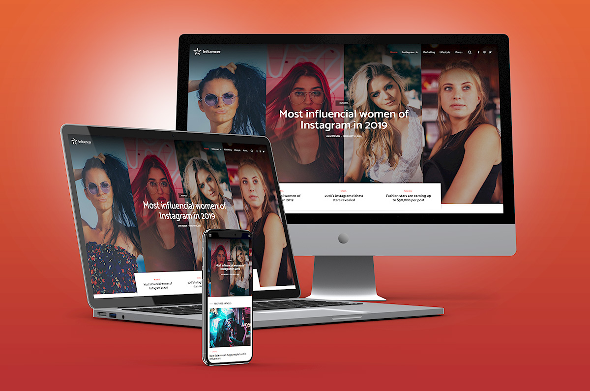
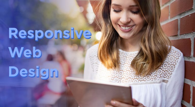
How much do you enjoy your smartphone, and how long are you connected to the Internet? Does a website look the same on every device? Well, in today’s article, we’ll highlight the importance of responsive web design, where this term comes, and what exactly are its characteristics. Sometimes you’ll see it displayed as RWD, which is the acronym for Responsive Web Design.

Evolution of Technology

Everything you like is now online. The clothes, shoes, or bags you used to admire in the shop-windows, even cars, and homes, all of them are now on the world wide web. Companies design mobile apps to facilitate online shopping and improve them continuously. If a few years ago, you had a limited time of Internet per day and a huge desktop, nowadays, you have smartphones, tablets, or laptops with full-day Internet access. The mobile industry is more performant with each day that passes, and all devices become thinner and smarter.

For example, a smartphone is the base accessory that no one wants to lose. You surf the web from school, home, bus station, work using this device. Bank My Cell is a website that published statistics regarding the usage of mobile devices worldwide. According to their article on “How many phones are in the world,” there’s a number of over 5,15 billion people using mobile devices in 2019; it means almost 66% of the world’s population. That’s huge! Also, the 4G speed of the wireless connection is now history. 5G is the hero of the year and will conquer the world in a very short time. With these in mind, IoT (Internet of Things) is more powerful, and websites use faster tools to ensure great optimization. The fact that everyone has access to the latest mobile technologies forces web developers and web designers to align with the trends.
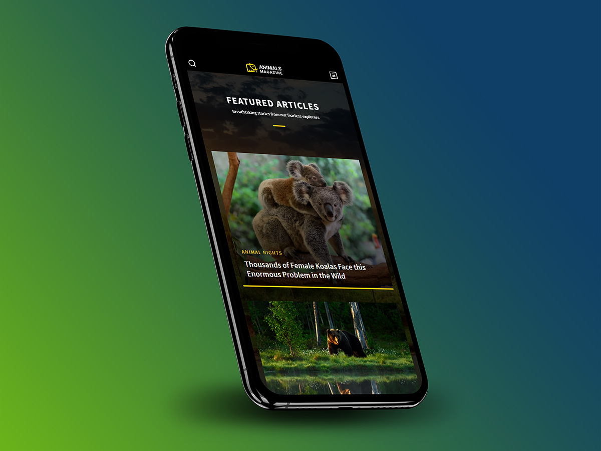
Responsive Mobile Design

Who said RWD for the first time?

Some of you might think that responsive web design is how a website behaves on several mobile devices. Well, that’s right, but not entirely. There’s a story behind each responsive website and a lot of work. Team of web developers and designers create web products (themes or plugins) with features that can easily adapt to serve the user’s needs and improve its experience.

Every device, no matter the screen size, whether it’s a mobile or a desktop one, has to be able to show a website’s pieces of content in a suitable and visually appealing way. A website must be intuitive and flexible for anyone browsing from a desktop as well as from a smartphone device.

The graphic designer Ethan Marcotte first talked about “responsive web design” as an approach to web design. RWD helps web pages to load well on different devices, windows, or screen sizes. Ethan Marcotte is the author of the Responsive Web Design and Responsive Design: Patterns & Principles” books. These show how RWD evolves and changes the web, making it a better and friendly place for every online consumer.

Did you know that the first website that used adaptive layout was Audi.com back in 2001? It was created to “adapt to browser viewport width,” and with time, experts used terms like “flexible,” “liquid,” “fluid,” or even “elastic” to describe responsive web design. However, on A List Apart website, on May 25, 2010, appeared an article, written by Ethan Marcotte where he used for the first time the term “responsive web design.”

So, what’s the RWD?

Wikipedia states that “a site designed with RWD adapts the layout to the viewing environment by using fluid, proportion-based grids, flexible images, and CSS3 media queries.” A flexible design looks amazing on desktops since it was initially designed for such a device. However, it is not optimized to perform beyond that. So, how does it become a responsive design?

“Fluid grids, flexible images, and media queries are the three technical ingredients for responsive web design.”

Ethan Marcotte

The purpose of making the designs more flexible was to make them adapt to the media queries that execute the actions. Media queries are a popular technique for delivering a tailored style sheet to different devices.

You can introduce a media query to alter images’ layouts and recalculate the widths of the fluid grid, making it a two-column one (if it’s a three-column layout). The viewport’s width adapts to show everything nicely on any device resolution. That’s how it all started! From simple CSS media queries to advanced ones, you can reshape every detail of a page to look exactly the same or distinct in various contexts.

Who are mobile device users? It’s incredible, but they represent the same audience as the ones using the desktop version. It’s a known fact that people scan the information they read, and they lose their patience quickly. If a site is responsively created, with UX best practices in mind, a reader is more likely to stay longer, regardless of the size screen device. Furthermore, a responsive website has a single URL and one set of code elements. That way the content is presented the same on tablets, desktops, or smartphones.

What are the advantages of Responsive Web Design?

  • It’s created with HTML elements and CSS properties
  • Fluid Grids, flexible Images, typography and navigation
  • Optimized content delivery on desktop monitors, laptops, tablets or smartphones
  • Cost-effectiveness – a single URL’s usage ensures visibility on all devices without the need for multiple site versions for each screen
  • Improves your SEO efforts, since Google reads your site’s URL & crawls information one time
  • Precise typography on any screen device
  • Readable text size without zooming it
  • Easy tapping on well-spaced CTA buttons
  • Brand consistency and flexibility

Your site should adapt to your visitors, not the other way around

How to differentiate a responsive website from others? If you access a site from a tablet or smartphone and see a set of three lines in the upper corner, you’ve reached the hamburger menu. Let’s be honest: taping an element from a large menu stuffed on a small screen is a horrible experience. Instead, a tiny hamburger icon is elegant and yet minimal. All you have to do is click on it and choose where you want to navigate. This is the best UX practice example! Readers love visuals, icons, and elements that speak to them right away.

A newspaper’s structure is the core of a RWD

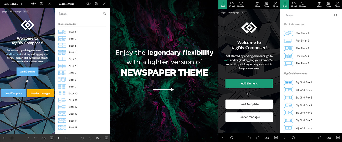
“The idea for responsive content derived from newspapers,” and started from how they were structured, says the Responsive Design website. Elements such as the headline, lead, body, and conclusion can now be organized on a website like header, content, and footer. With tagDiv Composer and Newspaper theme, it’s faster than ever to create and preview your site on any screen device. A responsive WordPress theme and a frontend page builder, you can easily adapt your content, logos, fonts, images. You have to ensure the same UX across all mediums. Remember that the audience loves to receive information automatically, based on their exact needs.

Blending Modes 101: Discover the new feature in Newspaper Theme

2

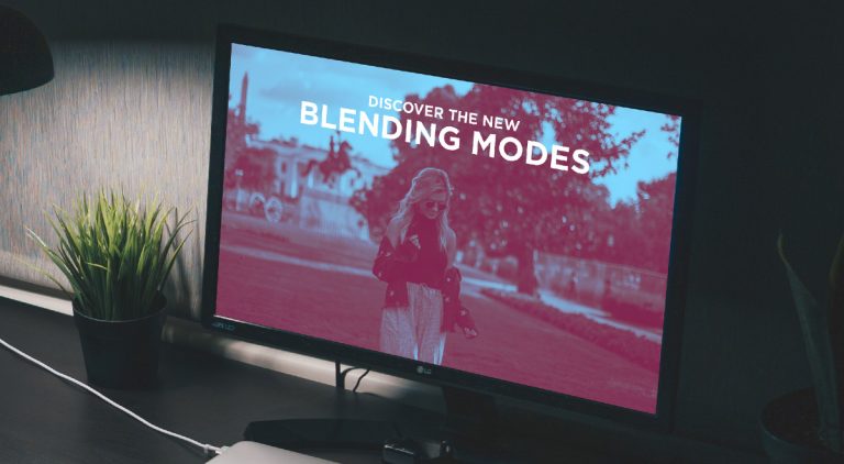
With the arrival of Newspaper 10, so comes the arrival of a new feature straight into the Flex Block’s Settings panel. Get the magic of Photoshop layer blending modes straight into your tagDiv Composer, with no editing skills needed. The new “Blending Modes” uses advanced CSS to give you a spark of magic on every page made. Everything is done on the front-end of your browser! Turn your simple images into a wow-factor for your audience with this new feature.

Develop your own aesthetic with the new Blending Modes

How do the Blending Modes work?

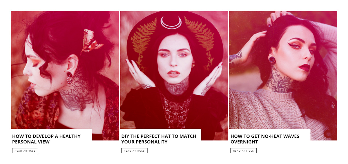
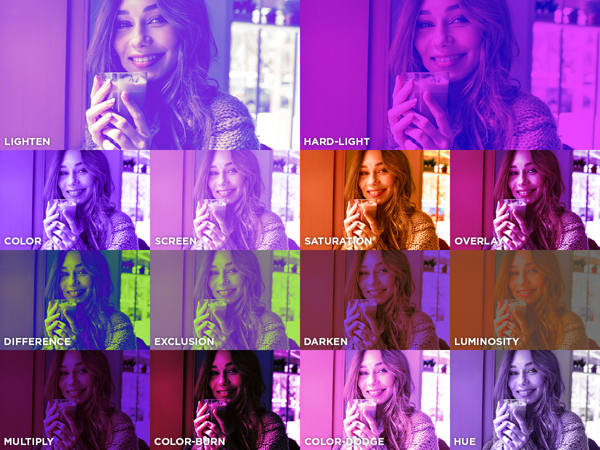
If you add a background color behind an image and then use a new CSS property, you get a mix between the color and the image. Choose the type of effect you need, whether it’s color, screen, multiply, overlay, hue, lighten, darken, hard-light, saturation, color-burn, color-dodge, difference, exclusion, or luminosity.

The result is composed of the value between the foreground and backdrop. It is an overlap between each pixel of the image and the color chosen. The tagDiv team has added this code straight into the backend of your Newspaper Theme, so you don’t have to do it yourself.

How do you use the new Blending Modes?

Open our front-end page builder, the tagDiv Composer, on an existing or new page. Drag and drop “Flex Block 1” and then navigate to the “Style” settings panel. Scroll down to the “Image Effects / Blend Modes” section. This is where the fun begins.

The first line allows you to specify a color or gradient for the backdrop, and then picking one of the blend modes from the dropdown menu gives your block a whole new look! Moreover, you get three new settings that alter the appearance of the photos the brightness, contrast, and saturation sliders. If you drag one of the sliders to the left or right, you can see how they affect the photo. Should you want to go back to normal, all you have to do is drag the slider back to the numerical value of “1”, and choose “Off” from the blend modes dropdown menu.

Discover what each Blending Mode does!

The second part of this section refers to the image effects on hover. However, this is only available for the desktop version of your website. It improves your overall page speed. So go ahead and test it out!

Reasons behind using Blend Modes

How does this all benefit you? Let’s answer that question:

  • If you have multiple images of varying colors and contrasts, you can add a Blend Mode effect to them and match the rest of your website’s hues.
  • With the rise of Gradients as a web design trend, add more color to each image by creating a gradient overlay.
  • If you have text overlapping any images, you can make it easily readable by separating it from its background with the new blend modes.
  • No need to spend hours editing your Featured Images in Photoshop, you can now do it all on the front-end of your website! No Photoshop knowledge required.

Still not convinced? Then take a look at how easy it was to obtain this beautiful result by watching the following video.

Test, experiment, and have fun!

Each blend mode modifies the overall result differently. Test all of them to find the perfect result. Keep in mind that the color or gradient you choose also alters the way a blend mode works. So, modify the colors for each blend mode to discover how it changes the value of every pixel. You can also use the sliders to get the exact photo you want.

Moreover, the new blend mode settings appear not only on Flex Blocks, but also on Flex Grids, Featured Article Images, Category Background Images, Inline Single Image, and Single Images. Create a beautiful page or template with Newspaper Theme within just a few clicks! Become a photo editing Master in no time, all on the front-end of your website.

Have you experimented with the new blend modes? Show us your results in the comment box below!

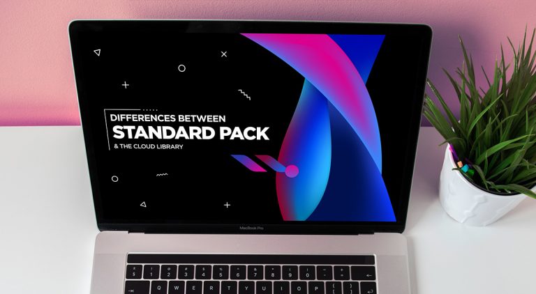
Newspaper Theme 10: Standard Pack or tagDiv Cloud Templates?

312

Newspaper theme 10 brings you two wonderful ways to build your WordPress website. For the first time in WordPress, you have the freedom to choose how much code the theme is loading and optimize your website’s performance straight from the beginning.

Newspaper theme 10 update introduces a major change in how the theme works and allows you to speed up your website. For this, we’ve added a premium legacy plugin called Standard Pack. It brings you all the previous functionality of the Newspaper Theme. When you deactivate it, your website gains page loading speed. Scroll down to learn how to smoothly upgrade from a previous version to Newspaper 10 and build a fast website. Please read this, don’t scan.

Say Hello to Newspaper 10Let’s think of it this way: When you use the Standard Pack, your theme is automatically using the easy-to-use, default settings.
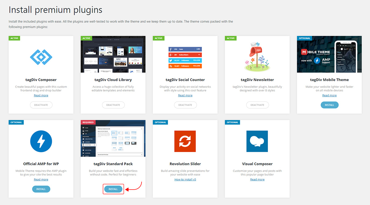

What is the Standard Pack plugin?  

Standard Pack is a premium plugin available to you for free. The new Standard Pack Plugin has two functions: it brings all the functionality you love in the previous versions. It also allows you to separate things when you want to build everything customized and go for website’ performance.

In the previous theme versions, the HTML and CSS code for all these templates were loaded on each page-load of your website, affecting your website’s performance. The headers, shortcodes, blocks, or any other pre-designed elements are all built inside your theme. You just click on the component to select it, made small customizations like choosing colors, and it’s ready to be used. It saves you from diving in CSS and building them yourself. Newspaper Theme with the Standard Pack activated is the theme that you enjoyed before the update.

Anyone can use the new tagDiv Composer page builder

Who should use the Standard Pack?

If you need to create a website and you have no experience with web design, web development, or WordPress themes, then the Standard Pack plugin is definitely the right choice for you. It allows you to use elements created by our designers and build your website in a few hours without any help.

Even if you have experience with WordPress, there may be a moment when you have to create a whole website in the next hour, then using Newspaper Theme with Standard Pack is also the right choice.

If you have experience with WordPress and Newspaper Theme and plan to create a blazing fast website, then the Standard Pack plugin is not the best choice. You’ll achieve your goals easier using the Newspaper Theme with tgaDiv Cloud Library and tagDiv Composer to create a website that loads only the necessary code to make it perfect, just as you design it.

How to use the Standard Pack?

When you are installing the Newspaper Theme 10, you must go to WordPress Admin area > Newspaper Theme > Plugins and enable the Standard Pack plugin.

How to Install Standard Pack

Experienced WordPress user and installing Newspaper Theme for the first time – After you have completed the theme install is to go to the WordPress Admin area > Newspaper Theme > Plugins and deactivate the Standard Pack. Disabling the plugin will help you gain speed for your website. Load a PRO Demo to have a fast start and don’t forget to cut the development and design time by importing elements and sections from the tagDiv Cloud Library. Than customize everything with the tagDiv Composer frontend page builder.

Updating Newspaper Theme and planning have the fastest website – If your website was created with a previous version of Newspaper Theme, you should update the theme according to the theme documentation. Leave the plugin active until all dependencies are removed. What do I mean? For example, your website uses one of the default headers from the theme panel, and you deactivate the Standard Pack, your header will be displayed as a series of text and symbols on the frontend.

Deactivate Standard Pack for blazing fast-websites

To gain page loading speed for your website, you’ll need to deactivate the Standard Pack plugin. This step will separate the templates (pages, singles, headers, footer) you’ve created or imported from the tagDiv Cloud Library from the ones built inside the Newspaper theme panel. All of the default templates from the theme and some of the elements from the tagDiv Composer will be disabled by deactivating the Standard Pack.

Increase your performance with Newspaper WordPress Theme

As a result, your website will start to load only the code necessary for the elements you actually use on the website speeding up your website. This means less HTML and CSS to handle and far more performance. This feature is available for both new and existing websites.

You have all the tools to start a beautiful website and take the page speed optimization to the next level:

  • Import a PRO demo – start designing on a light structure
  • tagDiv Cloud Library – over 800 elements, layouts, templates and sections, created by designers and hosted our servers. Download the templates you need (for single, category, 404, homepage, and so on) for free and enjoy creating your website.
  • With the Header Builder, you can use to create as many headers you need. We’ve also added SVG logos
  • tagDiv Composer frontend page builder – all the power to customize everything on the front end that makes you just as skilled as a professional web designer.

Why using the theme with the Cloud template Library? 

Let me give you only the best-of-the-best list:

  • Don’t build everything from scratch! You have 12 PRO demos to use without the Standard Pack and build fast websites. Extraordinary flexibility to be creative in Newspaper Theme is ready to give you a hand in building legendary websites.
  • Customize everything from the smallest element in the header to the bottom of the page right on the frontend easily with the familiar tagDiv Composer page builder.
  • Gain extraordinary performance – With a lighter theme, your website will be faster. Using the Cloud Templates without the Standard Pack, you can import only what you use on the website. This makes your website load faster on servers and CDN. Import only the necessary code to make your website perfect, without a single line of unused code, making everything work blazing fast.

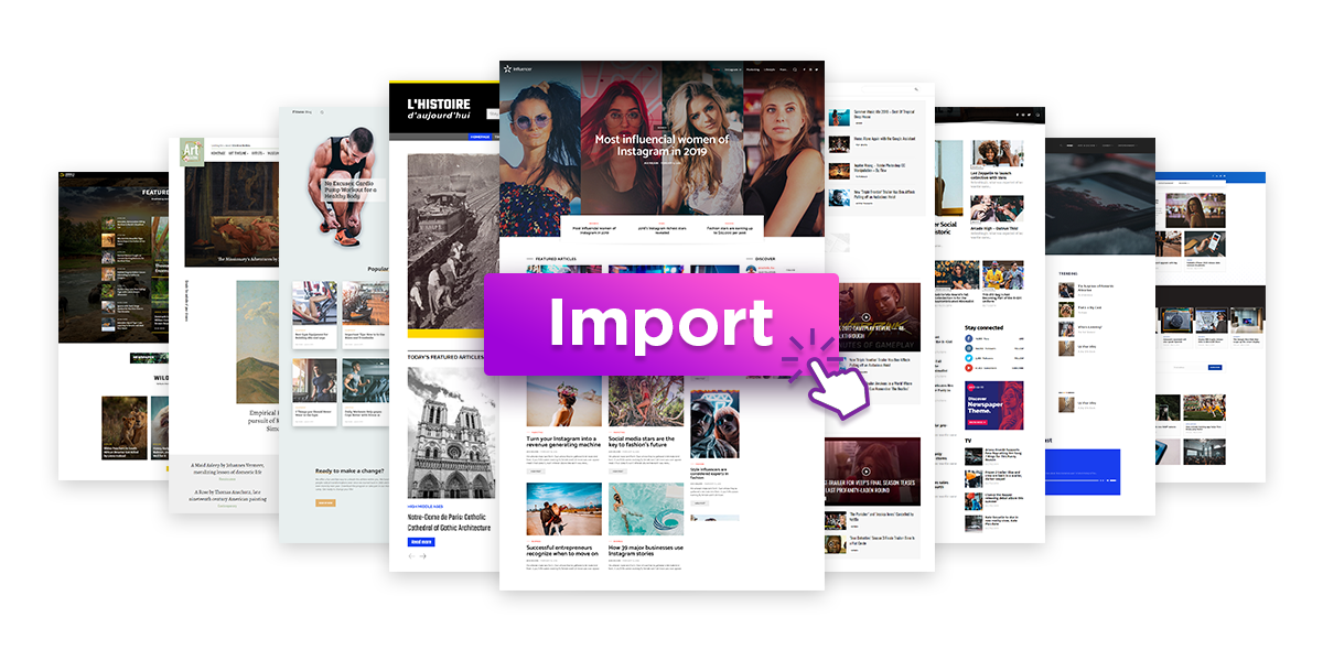
Import the Pro Demos with one click

Easily removing the dependencies

To make the transition from 9.8 to Newspaper 10 with Cloud templates, you need to ensure you gradually and smoothly remove the dependencies. Please read this, don’t scan. Failing in removing dependencies prior to deactivating the Standard Pack will break your website.

How to remove dependencies

Removing dependencies means converting all the default theme panel templates to cloud library template which are fully editable using the tagDiv Composer. That can include:

  • PRO Demos
  • Single Post template
  • Category Template
  • Homepage Template

As in WordPress Standard functionality, Newspaper Theme alters:

  • single.php (the posts and articles), 
  • home.php (your homepage)
  • Archive pages (the archive pages)
  • author.php and date.php (the author profile pages)
  • category.php, (the categories pages)
  • tag.php, (the tag pages)
  • taxonomy.php (the taxonomy pages)
  • search.php (the search page)
  • header.php
  • footer.php
  • Sidebar.php

The new changes in tagDiv Composer

Here’s the complete list of templates influenced by the Standard Pack plugin:

In the theme panel:

  • 15 Headers
  • 8 Category templates
  • 10 Big Grids
  • 19 Modules for blocks
  • 14 Single post styles
  • 14 Footer templates

In the tagDiv Composer:

  • 25 Blocks
  • 12 Big Grids
  • 10 Big Grid Full
  • 1 Big Grid Slide

Extra

  • All the demos that are not marked as PRO Demos.

If your website uses any of the templates present there, you must replace it with its equivalent from the tagDiv Cloud Library. 

We’ve made it easy for you and recreated them. Almost every template from the theme panel already exists in the tagDiv Cloud Library. It should be easy to find the one that’s closer to your brand and import it on your website. Customize it using tagDiv Composer and assign it to replace the existing one. 

You must find and replace templates until you’ve completed the process. Then simply deactivate the Standard Pack, and you are ready for speed and performance.

If you deactivate the plugin, it’s like you hit a magic button, and you get absolute freedom and performance. Keep on reading as I’ll give you all the information on using Newspaper Theme and Standard Pack you need to make your website blazing-fast.

Take your website to the next level

In conclusion, if using the Newspaper theme with the Standard Pack plugin is like taking a shortcut straight to the treasure room, while with the Cloud Templates is the happy ending you’ve always dreamed of. We are delighted to make these choices available to you. Have you already made the switch? Share your experience with us in the comments below.

6 UX Best Practices for Creative Designers

10

Technology changes the way designers create things. Creativity is something you can shape during the years. However, it’s something you are born with and is interconnected with your brain activity. They say you’re a right-brain person if you are creative and empathic. You are introduced to extra activities related to music, dance, or sports, early on in your childhood. These involve innovation, logic skills or a little bit of both. If you’re kind of stuck with creative ideas for new designs, browse our article.

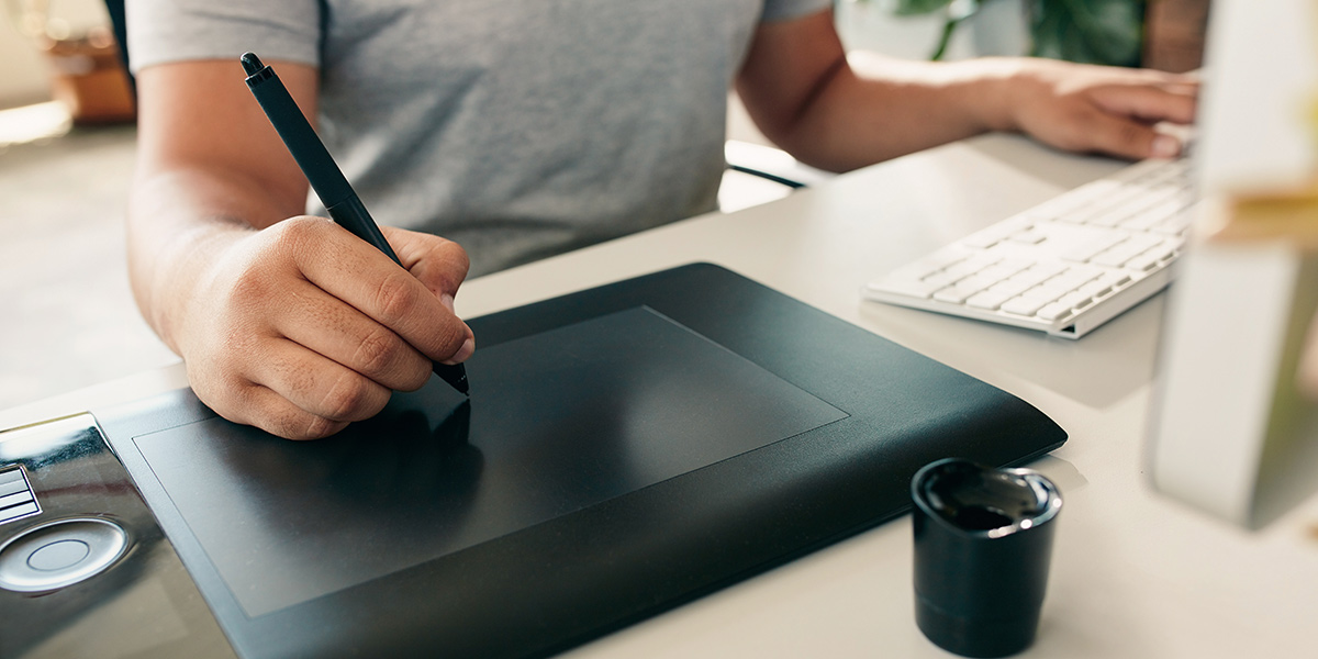
Digital Design using interactive pen displays

Humanity, Efficiency, and Versatility

When you know someone is an artist, you automatically know he’s a talented person, with artistic skills. An artist’s job is to keep improving and come up with unique pieces of art. Whether they use traditional means (canvas, brushes, color oils, and acrylic paint), or modern ones such as interactive pen displays, they use their creativity and passion to craft something everlasting. According to Lexico, you are a creative designer if you are a “person who plans the look or workings of something prior to it being made, by preparing drawings or plans.”

However, a designer can mean a thousand things. Responsible for visual interfaces and experiences, you need constant tips to keep your job at high standards:

1. Seek inspiration

Always seek inspiration. Always be curious and enthusiastic about trying new things.
Technology is constantly evolving, and new editing software or components are encouraging you to test them. Why not ease your work? With the right tools, you’re the hero at the design table. By reading UX books, articles, listen to podcasts, or watching videos you stay informed and up to date with design trends.

Inspiration can come in different forms

2. Designer Pocket Vocabulary

If you call yourself a creative designer, then you must improve your vocabulary. Expressions such as UX, UI, hierarchy, heuristic, composition, balance, contrast, white or negative space, asymmetry, duotone, and so much more. You can check out this article on Medium to discover an A-Z designer’s glossary.

3. Make mistakes

To err is human, says a part of an English proverb. It is part of any creative process. With so many sources of inspiration out there, you also need the freedom to get wild and design something outstanding, even by making mistakes. You should test every idea to get the best results.

4. Reuse old design pieces

Benefits. Recycle finished design pieces because a new idea might arise from them. You don’t have to reinvent the wheel :). Your results will still be awesome and revolutionary, even if you don’t make too many modifications. New designs inspired by old ones are fresh and unique. Also, as a designer, you tend to style things using the same technique. Every designer has their own mark, which differentiates them from others.

Continue to stretch throughout the day

5. Stay healthy

Too much time in front of an electronic device can also damage your health. You need to take care of your eyes, and also your back. Make sure the chair you’re sitting on for 8 hours is comfortable, and that you get up often and do some muscle exercises. This comprehensive article by Inkbot Design shows you the hidden health threats of a web designer.

6. Ask for feedback

Feedback is always welcomed. Ask people what they think about your creations. For example, if you have two solutions for the same design, you can test them with some help from viewers. If you haven’t asked for feedback before, you can follow the steps from the Alejandra Temprana’s post on Medium or How to Create a Survey guide on the JotForm blog to find out how.

Creative Designers are UX-oriented

As a web designer, you work to help visitors understand something on a website. For instance, the logo is representative of a brand so that people can recognize it immediately in other places. This is part of UX. Every creative designer should create something with the user’s experience in mind, and combine innovation, practicability with continuous curiosity for new things.

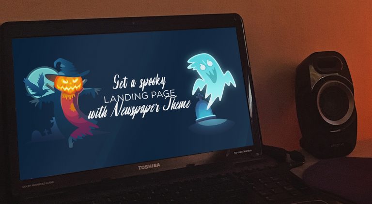
Get a spooky landing page this Halloween with Newspaper Theme

0

With a single focused purpose, a landing page is what your visitors land on when they click an ad, offer, or call to action button. Each season comes with its trends and marketing opportunities. October is the spookiest month of the year. With Halloween coming up, most brands stir from their standard business path and approach the audience differently. Introduce the users to your offers, site, or blog with a Newspaper Theme seasonal landing page that captures their attention and turns them into a client.

Why a landing page?

An ad click is a split-second decision from the audience. Make it personal and relatable enough that from visitors, they become consumers. With a customized landing page, you do just that. No matter the purpose or intention with the landing page, help your readers discover precisely what they need.

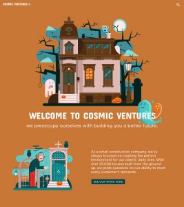
Cosmic Ventures Construction Company Halloween Landing Page
Click to see fullscreen.

The visitor, upon hearing or reading a promotional offer, trusts your website to deliver on the promises it makes. The landing page is where you make a special offer, a trade, deal, or exchange of information in return for their contact details. Done just right, the potential is vast:

  • A boost in traffic for your website
  • Increased sales
  • Growth in conversion

Newspaper Theme makes it easy to create an eye-catching landing page that will hook each user in.

Let the spooks rise!

Halloween’s just around the corner, with its increasing and ever-growing popularity globally, it is just the right time to spruce things up. Popular brands such as Ford, Oreo, LG have released Halloween campaigns that stuck with the audience for years to come. After all, sometimes, the best way to lure new users in is to give them an original seasonal campaign.

Shine above the competition with a spooky or cute Halloween landing page. Easily show visitors that you can adapt to suit their needs. Before you start, however, do your keyword research. What is the topmost searched for words or queries? Use Google Trends as a helpful tool.

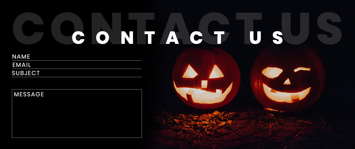
Halloween Contact Form

Be relevant and personal

Whether you choose to be different from your usual website’s style or maintain some form of uniformity with this landing page, know the target audience. After all, people care about getting a solution to their problem, so market it accordingly. If you have a news website, create a Halloween landing page to promote your newsletter and bring more readers in.

The tricky part of designing a seasonal campaign is to create something relevant to your product while keeping the holiday spirit. Take inspiration from popular brands such as:

  • LG chose to show the realistic display of its technology through an elevator prank
  • The Canadian Heart and Stroke Foundation jumped on the seasonal campaign with a scary but informative video regarding first aid in case of stroke
  • M&M’s went viral with an Instagram interactive story that urged their audience to decide the faith of its protagonist
  • The Best Dog Day Ever event chose a cute one-page layout to show their event’s details

Look for something that fits your brand.

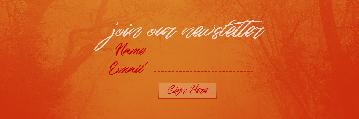
A Halloween Newsletter Form

Halloween landing page with Newspaper Theme

With inspiration in mind and a goal set, you’re ready to create the perfect seasonal campaign! Browse through your favorite stock website and choose images that are going to fit perfectly with your idea. Whether it be jack-o-lanterns, spooky scary skeletons, ghosts, witches, zombies, bats, vampires, choose something that fits with the theme.

The Hunting Trail Event on Halloween
Click to see fullscreen.

Open the tagDiv Composer, our front-end page builder, on a new page. Create a simple Header that allows the user to see the logo and your most essential site links:

  • The Homepage
  • Blog
  • About
  • Social Media

If you’re going for a full-screen background, make an Overlay Header to lay on top of the background image. Make a full-screen background by going into the CSS tab of the row’s settings and uploading your photo. Then choose from the General tab the “Stretch row and content” from the drop-down menu.

Content ghosts

Add a Column Title and an Inline Text element to describe the landing page’s purpose. Invite them to further explore the page by creating a second-row beneath dividing it into two columns. On one of the columns, add an image, and on the other, write a message to convince people why your website is right for them.

For example, if you have a news website, tell them that it always delivers the most accurate reports and it’s always up to date. Convince them through a real and genuine argument. Showcase this through a Flex Block, displaying your latest articles and news posts.

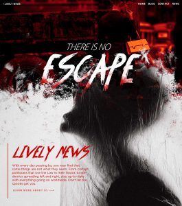
Lively News find out more about this news website
Click to see fullscreen.

Add more spooky elements to the page through the Image element. Adjust the padding and margin to the item so that it appears next to an element as a ghost. Try to include references in your text to the Halloween customs and its associations. However, make it blend in seamlessly with the rest of your message. Drag and drop buttons into the layout to create beautiful call-to-actions and urge the visitors to convert. The last step is to change the fonts and colors of each element to fit in with the theme. Browse through the available fonts from Newspaper Theme, create a beautiful color palette, or get inspired by the Halloween ones offered by Adobe CC. It’s easy! Just type out the term Halloween and browse through user and author made color schemes that have a HEX code you can copy straight onto your website.

Boo your inner critic away

With a great idea in mind, you can achieve anything. Don’t let your inner critic get the better of you. Newspaper Theme’s easy drag-and-drop front-end page builder helps to create any layout desired for any page. Blend everything seamlessly with the Style tab settings. It’s the month where everything ghostly and dreary rises and haunts the earth, so why not celebrate it along with your followers? Remember that a well-made seasonal campaign’s purpose is to convert readers into consumers and also to make your brand appear relatable. So, start editing, start creating, start designing!

Show us the results of your efforts in the comment box below and tell us about your own experiences with Halloween in your country!

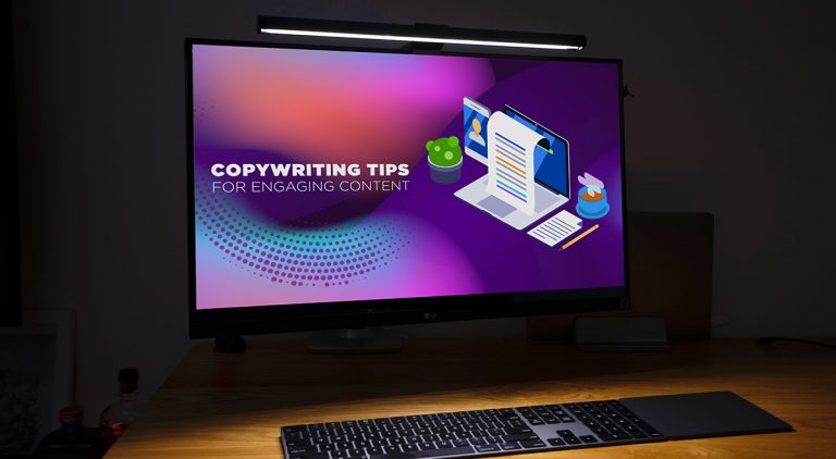
Six Copywriting Tips for Engaging Content

11

Keep your visitors returning to your website by publishing original, engaging, and error-free pieces of content. I said “pieces” as the content is a big puzzle where the text combined with images and videos gives you a full and pleasant experience. The way you interact with the audience through content is influencing your analytics reports, such as the website’s traffic, or social media. Get creative with these 6 copywriting tips and develop your new content strategy to obtain better results with your WordPress website.

Good content gets viral easily. Bad content could also get popular, as well. However, how doCopywriting Tips you want people to remember your website? As a poor-quality or top-quality source where they can come back and look for the right answers? Visitors want to identify with situations they search and find online. If you’re stuck with “I don’t know where to start” or “I want to change the way I create content”, keep on reading.
1. Who’s your audience?

Whether your website is brand new or you’ve had it for a while, it’s imperative to know who your audience is and outline a visitor persona profile. Since it’s best to know users’ interests, A to B split Testing Persona UserGoogle Search Console is a handy tool; it can help you understand what are the queries searched by your audience to reach your content. There are other analyzing software that can provide relevant copywriting information such as Google Analytics, or the Adwords reports for paid advertisements on SERP.

2. Visual Content Matters Too

If you believe that engaging content means you only need to write something down, think again. It’s necessary to show what you’re saying, as sometimes a picture is worth a 1000 words. Along with images, use videos, gifs, and infographics to create visual engagement. For a Branding via Videosmore personal note, you could take images or videos yourself. As for the infographics, there are online templates that can really help you to start off. Also, people will react if your content is “shareable” on social networks. Interactive storytelling is the leading key to keep your visitors stay longer on your website.

3. Diversity: the art of thinking independently together*

An important aspect in copywriting is that you should focus on is the diversity of your subjects. For example, if you have a travel site, you can write about places, food, cultures or people. Even if these are the main subjects, you can diversify them by publishing information divided by experiences; for instance, you could share with visitors: tips to pack your bags, situations Social Media as an Outletyou might encounter while traveling, why it’s essential to know how the weather is before visiting a new place, how to do your research before flying to a foreign country, and more. There are many aspects you share as personal experiences that can help many readers prepare for their next journey.

4. Clean Content Typography

Sometimes, even with excellent writing skills and great pictures, your content is not read, and visitors drop the page immediately. This may happen if you’re using the wrong or hard-to-read fonts, and long paragraphs. Besides, people love being able to scan a text quickly, so you should focus on short paragraphs, add headings & subheadings, bullet lists, and other visual elements. Discover what exactly typography means and how it can help you engage more with your audience from this article.

5. Look-alike Design

A website is usually created by three parts: header, body, and footer. If you want to accessUI / UX tips the “about me” or “contact” page, you automatically go to the bottom of the site, and search for it, while the “Blog” section is found on the main menu. Similarly, since there’s a tendency to publish content based on various subjects, it’s best to organize and show them within a pleasant layout.

6. Feedback

The growth and spike in trafficAnother helpful tip is to ask your readers for their feedback. For instance, you can invite them to comment in the dedicated section or via newsletter. It’s important to know the audience’s opinion on what you publish. Feedback makes you stronger, and you’ll try harder to provide quality content.
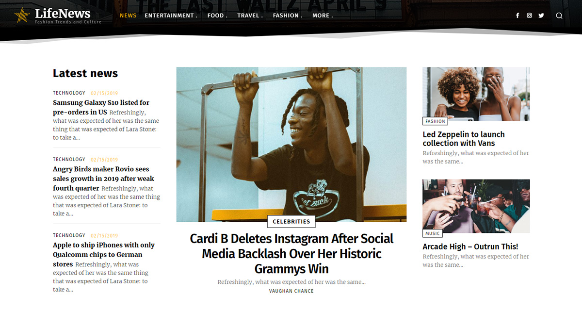
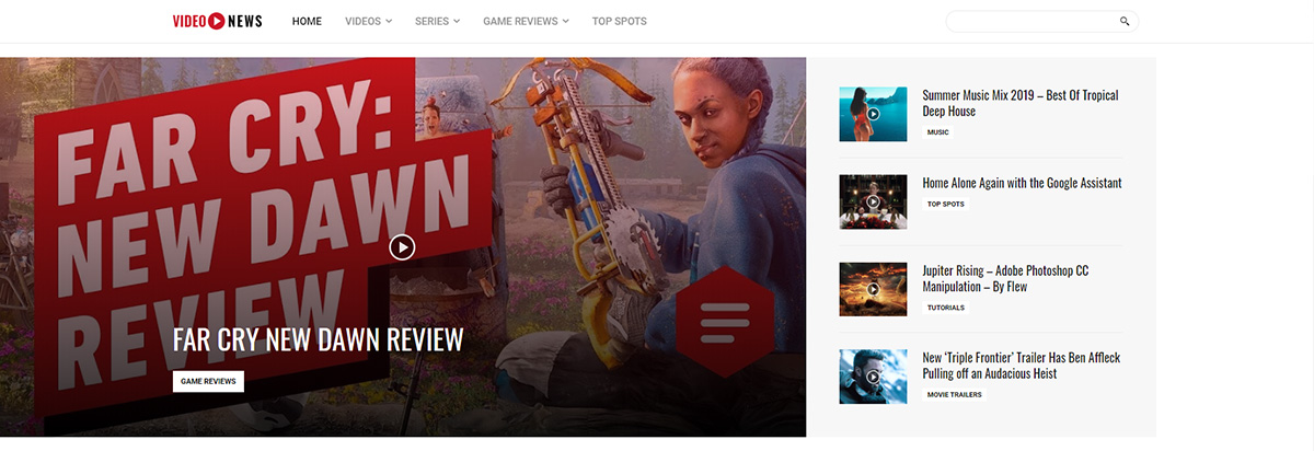
Words with Thoughts

Interesting content is also valuable, and you’ll see results through the spikes of traffic or social media. Don’t forget to establish a strategy, a layout design, and be consistent. With so many content formats, you should publish blog posts, long-form articles, podcasts, case studies, reports, ebooks, presentations, and anything you could think of. If you want to avoid web design mistakes, you could take a look at our comprehensive guide. Share with us in the comments below, what your preferred method of showing content is and what other copywriting tips you have tried.

* A nice quote of the Malcolm Forbes

Five Creative Hacks for News Websites

3

I’m sure you remember the days when you woke up in the morning and drank your coffee while holding a newspaper in your hands. Today, you sip your coffee while browsing news websites and choosing the topics you’re interested in with a single click. But, how about owning a news-related blog and making it wow the world? Nowadays, everyone wants a beautiful site with appealing visuals. It’s all about publishing catchy stories with style. In today’s article, we’ll take a closer look at how to start a news website and how to get creative while you design it.

Creative News Websites

Turn imaginative ideas into real, creative hacks

People who work in the Information Technology business are divided into web developers or web designers. Both have different skills. Web developers are analytical, play with numbers to develop software functionality, while designers bring beauty to the table.

However, where do you get your imagination from? Whether you need a new idea for redecorating your office or rebranding a website, creative thinking is influenced by the two brain hemispheres but also by outside stimuli. Quite often, there are unrelated ideas that blend and deliver original solutions. Furthermore, if you feel like you don’t have any creative skills, they can be learned and maintained. First, go beyond your comfort zone and try new things. Like the American painter, B. Januszkiewicz advises, “creative thinking inspires ideas. Ideas inspire change.”

Getting creative with your news website

The wide web is full of websites with difficulties in browsing through the content. Whether you want to reach the contact details or the search bar, the user interface must be intuitive and friendly. Beware of this when you’re building or rebranding your news website. If you’re starting it, you must find a suitable template, especially if you’re using the WordPress CMS. Look no further than a Newspaper theme that helps you design any news website, regardless of its subject. From sports, health, tech, global, architecture to lifestyle and anything in between, it’s all about the news you spread.

The Overall Color of your Site

There are a few things you don’t have to neglect when building a news-related website:

1. Overall Color

Define your business color. If it’s a website on lifestyle and entertainment news, it would probably be best to use purple hints. On the other hand, supposing it’s a basic news website, you should use an overall black and white, blue or red color.

2. Design Layout

When you’re looking for a WordPress theme, a detail you shouldn’t ignore is the demos or pre-made design templates variation. The more, the merrier. If the web designers already struggled and created tons of alternatives, all you have to do is choose the best suited one for you. No matter if you’ve opted for a minimal style, or classic news with multiple blocks, find your own balance. A tip for you is to find a flexible theme with drag and drop elements where you can easily mix and match.

Something to look at when picking the right design:
– organized mega menu
– sticky sidebar
– infinite scrolling for posts
– social integration
– visible “About Me” page

3. Typography

Another important aspect when designing a news-oriented website is typography. It’s vital that people actually read what you’re writing about. If it’s a stylish, handwritten font but not legible, they’ll leave the page. Usually, classic news sites display the content in Roboto due to the comprehensible and simple lines.

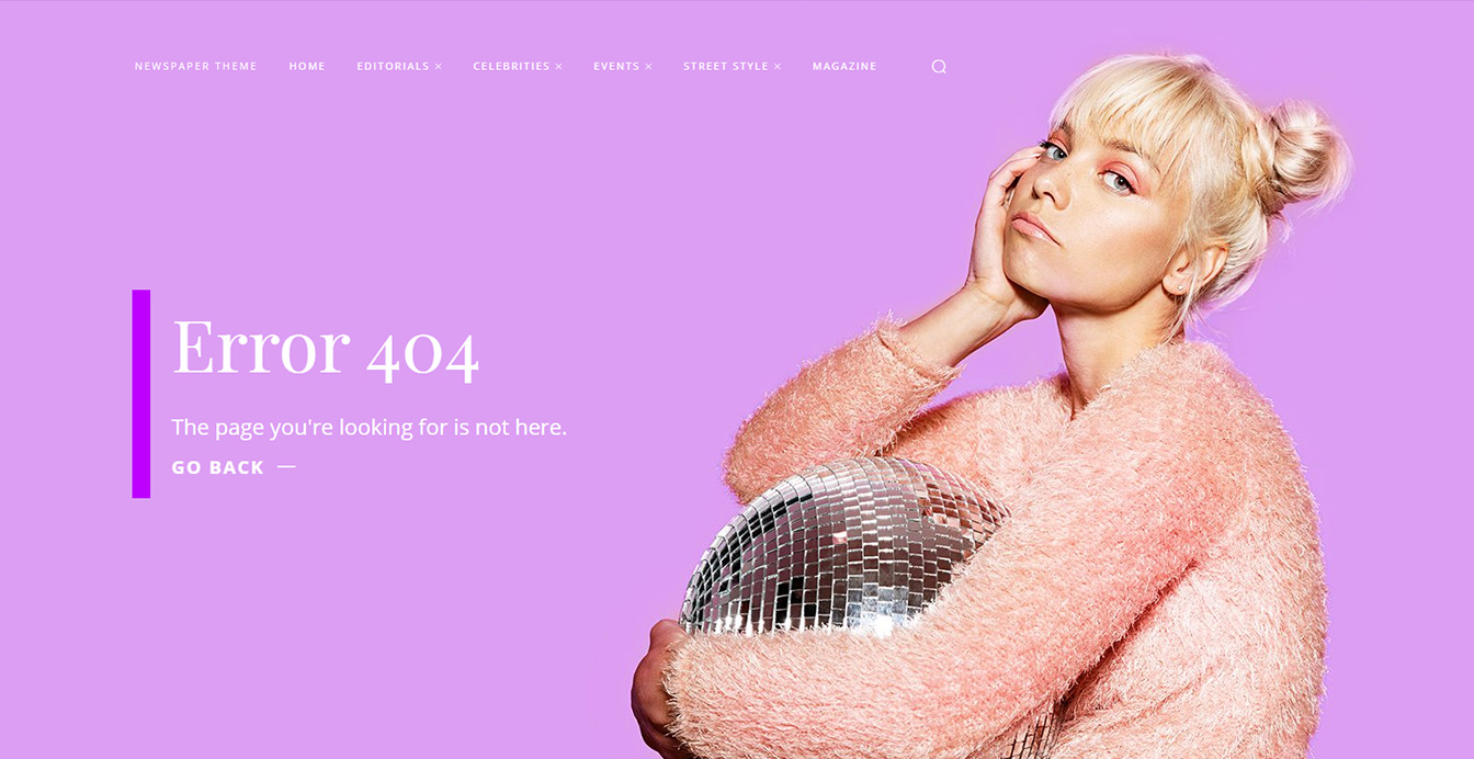
news websites: 404 page template

4. Get creative with your 404 Page

You’ve probably seen 404 Error messages. This happens whenever a page/post is moved, deleted or it’s private. What can you do about this situation on your site? When making some changes on your website and don’t want to show broken pages or posts, the best solution is to publish a beautiful 404 page, that doesn’t look like it’s an error. This way, visitors will return to your site.

5. Original Content

Another element you should pay attention to is the content. Visitors appreciate a site for its unique content. They also love to read the news on a well-made website, that performs at high standards. Optimization is an important key. Minimize your images, videos, or podcasts while keeping their quality, and deliver enjoyment.

Bring utility on your news website

Having an intuitive news WordPress theme really eases your website designing process. With the right tools and the five tips we’ve shared in this article, you’ll get visible. Once you establish what your website is about and how it looks, you can focus on writing quality articles and showing amazing images and videos to highlight them. Pay attention to the smallest details and optimize everything. If you want to check out the world’s most famous news related websites, you can check out this great article on Feedspot.

Logos and Branding Done Right with Newspaper Theme

0

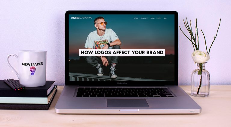
How do you impact the public’s opinion of your brand? With a well-designed logo that can quickly convey the core message of the website. You have three seconds to make a lasting impression, and it all starts with the logo. After all, when entering a new site, you can generally tell what their business is about through this emblem. The same should go for you no matter the company’s type.

Fast News delivered to you

The Effects of a Well-Designed Logo

Imagine you’re out shopping. You notice two products, one of which has a well-known brand’s logo on it. Which one would you pick? Most people would go with the option they know because they instinctively trust it more. This is all because it is more than an image; it is recognition for your clients. Build brand loyalty with good user experience and a fantastic logo.

Your business vision should be the embodiment of the logo. What type of company do you have? What is the core of it? For example, if you’re in the wedding industry, the company may be represented by calligraphic, ornate fonts with an icon that’s delicate and beautiful, such as a butterfly or even a bride’s veil. Moreover, your clients could quickly recognize the logo based on the experience they’ve had with the company.

Remember that any brand identification should be visible in both color and grayscale. Also, if you resize the logo, it has to look fantastic on both a billboard and keychain. Due to being used on various items (printed media or merchandise) and websites, your logo needs to go well with any color background and adapt without losing clarity.

Heavenly Spa awaits you

The Planning

Whether you’re on a tight budget, or can easily spend money on a well-versed designer, you need a plan. The first step to creating a company trademark is to brainstorm the elements required with your team members. Do you want an icon? Should it just be plain text? The second step is to decide on the needed colors. Do your research into the meanings behind each one.

Every color has a connotation. It would do your brand a world of good to know how you want to be portrayed. The third step is to build it.

Creation and process

With Newspaper Theme, you have all the possible elements necessary to create a stunning logo in just a few simple steps. Open the tagDiv Composer on your Homepage and click on the header. Add the Logo element into it and with your plan in mind, begin the design. This is the hands-on approach to the logo-design. There are, of course, others:

  • Hiring a designer can give you a fully-customized Logo ready to impress the viewership. You also get the files in varying sizes which should help when you need it printed or adjusted in different places. To hire somebody that can easily create your perfect Logo, look into the online websites which offer freelancing options. Find someone that can work with your ideas and stay within the budget.
  • Through design services, you fill out a small survey or quiz with your preferences regarding the Logo and within a few days, get it delivered via email. The process isn’t so personal as it would be if you hire a freelancer, with whom you could speak to through the entire creation. However, it is a lot less costly.

Animal Kingdom rules all

  • Use an online logo maker. FreeLogoDesign offers you the possibility of customizing any Logo on the front-end through their interface. Drag and drop text, icons, shapes on a blank canvas. Change their size and color however you want, and when done, click on the Save button. The free plan gives you the logo created in a 200 x 200 pixels .png, whereas their other plans give you more range in sizes and quality.
  • If you have the necessary knowledge in Illustrator / Photoshop, you could easily make the Logo on your own through those programs. When you’re done, save the file in various sizes and file types. This way, it can easily fit onto any media.

Whether you choose to hire a service or freelancer, do it yourself via Newspaper Theme or Illustrator, and stick to the plan. Stay within the chosen color scheme and if you’re ever in doubt, look to websites within your industry for inspiration. How did they create their logo and what colors did they pick? Use those ideas for your logo.

Technology Hub

Newspaper Theme and your Logo

If you’ve already created the Homepage, adjust your Logo to fit into it. If you’re starting a website from scratch, we suggest taking a look at our Documentation for questions. When you first edit the header, choose a background color for the row that should look amazing with the Logo and make it noticeable and legible. Your users need to see the Logo with ease.

With a full-screen background, you may want an Overlay Header so the trademark can lie on top of the content. If you don’t know where to start, look to our other guide for your Logo creation with Newspaper Theme’s Header Builder. When you like how everything looks, adjust the size of the image/ text/ icon for each device through the tagDiv Composer and make sure it looks balanced for each screen.

Hit the “Save” button, and you’re done! The Logo is now online, public, and good to go.

Food Blog Logo

To Sum it Up

When creating a brand identity, you must stay consistent with its design. A logo should not change unless you’re redesigning and changing the core of the website. Otherwise, it might confuse the audience. It’s a point of identification, a recognizable symbol by all the viewers, so use it to communicate your brand’s message through it. Make it with Newspaper Theme, hire a freelancer, service or create it yourself. Separate your brand from the competition and make it memorable. Lastly, create good user experience through the brand, and your Logo should become a symbol of trust.

How did you create your website’s Logo? What does it represent? Tell us about it in the comment section below!

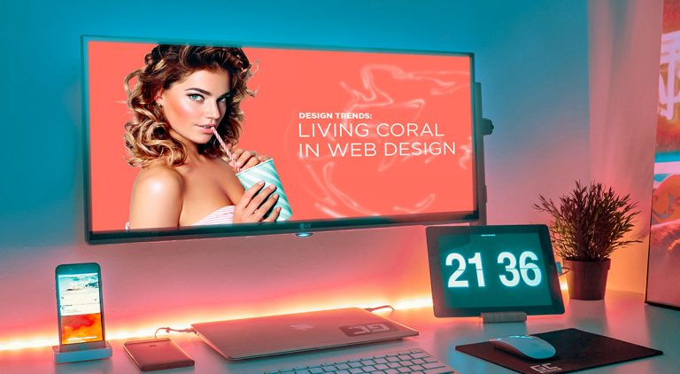
Design Trends: Living Coral in Web Design with Newspaper Theme

0

What makes Living Coral Pantone’s Color of the Year? A vibrant hue situated between orange and pink, the color is now present in both traditional and online design. Ever popular, it grew as a joyful and optimistic color that can easily be present in everyday life. Learn more about its origins and how to integrate it into your website’s design, below.

Duotone design

The Origins of Living Coral

A deep dive into the ocean, you might find coral reefs and therefore the color we’re speaking of in its natural habitat. This would be one of the instances in which you would find Living Coral in the real world, but it’s not the only one. Its presence can be noted in history through its depiction as “warding off evil.” Coral has been fairly often portrayed in Renaissance and Victorian eras through paintings. The color has always been there as a mix of pink and orange, in sunsets and sunrises.

While at first sight, Living Coral may appear as an exotic hue, it can embody friendliness, openness, revitalization. The continued increase in global warming, the ocean’s reefs have been slowly dying. As a call to raise awareness for the dying corals, this is Pantone’s way of emphasizing a growing issue in today’s world.

Why should you include it on your website?

Capture the eyes of all the viewers with this fun and charming color. It includes the happiness of orange and the playfulness of pink. Use it on call-to-actions to attract and invite users to interact further with your website. Are you looking to redesign a website, attract more visitors, or launch a new product? Add a popular color to any design scheme to boost your traffic.

Living Coral could be the statement piece you need to entice users into buying products or becoming a subscriber to an online blog.

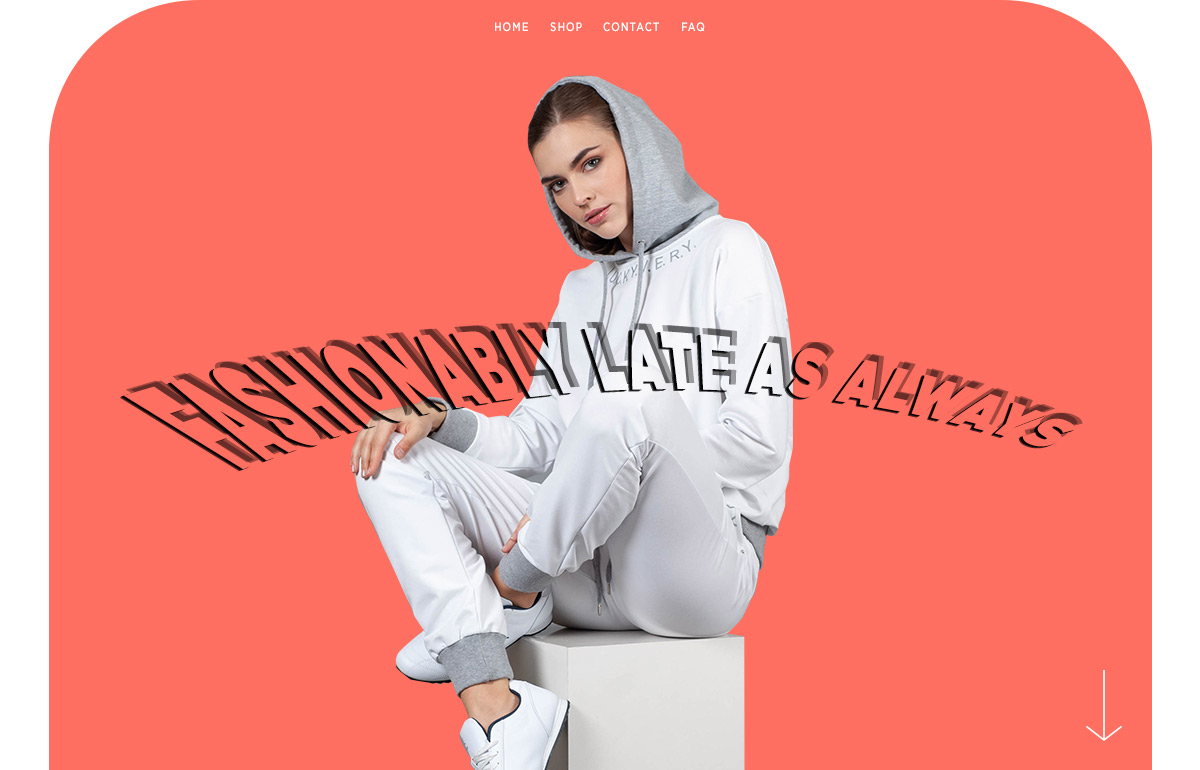
Header with Living Coral

Color Schemes & Plans

If you want this tint on your website, you need a plan, and also a color scheme. The best partner to Living Coral is Teal, a medium bluish-green color. Use them together to complement each other perfectly. A fantastic online tool that can help you find other hues that go well together is Adobe Color.

The hex code for Living Coral is #FF6F61, so copy and paste this into the middle rectangle, and you’re good to go. Explore the color schemes by clicking on the settings on the left. Learn more about how different tints contrast and complement each other by reading into Color Theory. You can also take inspiration by looking into the different color palettes that others have created in the “Trends” tab of Adobe Color. Just type Living Coral into the search bar, and you’ll get dozens of different schemes.

Now, whichever option you use, pick the primary and accent colors of your page or element. With this in mind, we can move on to designing the page.

To Coral or not to Coral?

Open a page you would like to retouch with the tagDiv Composer page builder. With the color scheme chosen in mind, pick the hues for each element accordingly – from buttons to text, icons, and background. Pay attention to the contrast you’re creating so that each element is easily noticeable.

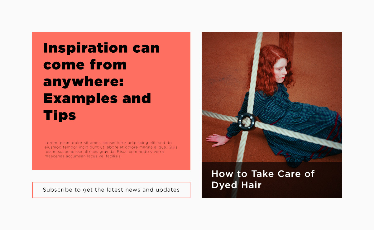
A simple design with two flex blocks and a Living Coral background

If you’re looking to start from scratch, take a look at our guide to creating your Homepage with Newspaper Theme. Populate the page with elements such as a Flex Block, Flex Grid, Hero, Buttons, Inline Text or Column Text, Title. Organize them, pick the typefaces you want, then change the colors. Stick to the palette, don’t stray from it and create harmony between different elements.

Continue doing this with every page you add to the website, and you’re sure to have a beautiful site by the end. For some more inspiration, take a look at one of the design trends of the year: geometric web design.

Conclusions

With every new year, Pantone is the one to look to for new color trends. Their choice tries to reflect the times while also influencing the entire world of design from traditional to online. Keep up to date to get inspired and find new design techniques. Newspaper Theme helps you stay on top of the game with its front-end page builder and its drag-and-drop functionality. So, ease your workflow and incorporate something new!

Tell us how you’ve integrated Living Coral into any website in the comment box below!

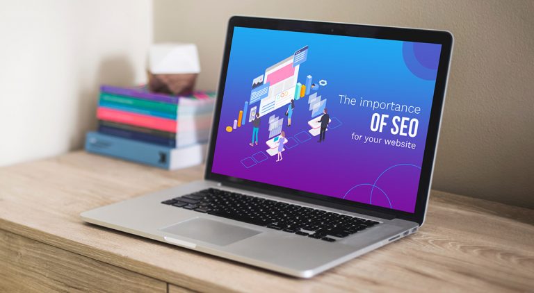
Why is Search Engine Optimization Vital for Your WordPress website

3

If you’re fed up with the old saying “content is king,” I’ve got a new one for you. The content itself is next to nothing if it’s not visible on the Search Engine Results Page (SERP). Do you want the gold medal and always take the first spot with your content? Well, be prepared to do this the hard way. The online environment evolves, Google’s algorithm is constantly changing to crawl & index relevant content. A good Search Engine Optimization strategy helps you stand out with your website in SERP. Consider today’s article as an introduction to the SEO world.

Search engines crawl, index, and understand your site’s content

Search Engine OptimizationAs we all know, search engines are that one friend that knows everything you ask him. When a search query is received, the algorithm deeply analyzes millions of pages in milliseconds to deliver you the most relevant and related pieces of content. In short, Googlebot first crawls the content’s code. Then, if the information is eligible to appear in search, it’s indexed.
If you want to find out more in-depth information about how search really works, you should check out the Google story on organizing data, search algorithms and more.

S comes from “search,” E stands for “engine,” and O is for “optimization.” The SEO acronym means “search engine optimization,” and it’s the non-paid method to make your brand known in the search results, and naturally increase the site’s traffic.

Why you have to make a strategy

Why is Search Engine Optimization Vital for Your WordPress website? A good SEO strategy keeps on telling Google, “hi, this website publishes real and valuable information” until the complicated algorithm agrees & indexes your pages to show them on SERP. So, you have to get Google to trust you (actually, it’s your website, not you as human.)Page Speed Importance

How much do you love data analysis? Even if SEO is very much related to the content, you have to analyze and test every tiny detail. And still, you can’t make it work like magic. Why? Because SEO is evolving every day and so should you. What works today may not apply tomorrow. So, you need an SEO strategy that you can easily adjust.

Google only loves you when everyone else loves you first – Wendy Piersall

Let’s start with the basics. Whether we’re talking about text, images, or any other media files, you need to not only to optimize your website but also to further enhance the content for search engines. So, your work goes on-site (on-page) and off-site (off-page). Bear in your mind that on-site SEO efforts refer to a complete strategy all over your website. This means your titles, tags, post content, pages, categories, internal linking & others Peer Reviews and User Experiencemust be logically organized because nobody wants a negative user’s experience. Also, if a website looks like a jungle with nothing interchangeable, Google will not show it as the top one. External linking from reputable sites is the best off-site SEO method you can use on your site. If you want to understand the Google Algorithm related to search, look no further than what the Search Engine Journal highlighted in their “How SEO Works Exactly” article.

Benefits of well-done SEO

Keyword SearchIn essence, a great strategy means you have to take care of each page or post you publish on the site. On-page SEO efforts are also represented by keywords, meta descriptions, alt text on images, title tags, URLs structure, minimize CSS or Javascript where you can, and enable the SSL (Secure Sockets Layer.) On the other hand, social media posts and domain authority must be part of your off-page SEO plan. With all the search engine optimizations, your website will be visible in search and you’ll get a boost in traffic, as well as a quality audience. Moreover, you can convert traffic into real buyers.


Most popular SEO plugins to use with your WordPress theme

If you’re looking out for a new SEO plugin or you’re just starting, here’s a shortlist of the most appreciated ones:Page quality affects SEO

The Final Note

In this article, we’ve focused mainly on Google. However, there are many other search engines such as Bing, Yandex, Yahoo, AOL, or DuckDuckGo and vocal searches of the Voice Assistants like Amazon’s Alexa, Apple’s Siri, where you can put your SEO efforts to work. On the Reliable Soft website, you can find a great article that gathers info on the best ten search machines. So, you have to organize your website, provide a friendly UI to ensure a great UX. Also, you need to find your business keywords to add them everywhere on the site and improve your pages and posts. SEO achievements are paid in time. Be patient and wait for results! They’ll come if you’re resolute.