
Are you looking for the best web hosting services to buy in 2021? If to start blogging or boosting the speed of your website is a new year resolution, and you took your time to analyze the offer, then this article may help you decide. Three months have already passed, but it’s never too late for a change. What do you want for your website in 2021? For example, if you want to try out another hosting provider or need a better one, keep on reading. This guide has everything you need to know about web hosting services, from pricing, shared hosting, WordPress hosting to VPS, and dedicated servers.
What You Need To Know About Web Hosting
“A web hosting service is a type of Internet hosting service that allows individuals and organizations to make their website accessible via the World Wide Web. Web hosts are companies that provide space on a server owned or leased for use by clients, as well as providing Internet connectivity, typically in a data center.” This is what the virtual Wikipedia encyclopedia has to say about web hosting service. It is a very technical explanation, but how else would it be? There are so many people that own a website but don’t even know what exactly it took to see it up and running. Nothing about domains, WordPress, themes, pages, posts, web hosting services, site optimization, and speed.
Moreover, people normally don’t surf the web thinking about what each website uses, what host, on what domain, why it’s not https or that images take too long to load due to their size. Internet users navigate and return to websites that perform faster and deliver accurate and relevant information for them. If a website takes too long to load, it may be due to having too many JavaScript files, a poorly optimized database, caching issues, huge media files, and others.
So, what exactly does web hosting refer to? WP Beginner published an article last year called “What’s the Difference between domain name and web hosting,” and they made an analogy between domains & hosts and home & physical addresses. This is a great comparison that can be easily understood by anyone.
For years, people used personal computers as servers for their websites, because it was the most reliable and secure thing they could do. However, if there were electricity or Internet issues, then the website was also down, not functioning. With technology evolving, web hosting services have rapidly grown in popularity.
What Web Hosting Providers Store?
Web hosting services store all your website’s files, assets, and databases on their servers. When someone types your domain name into their browsers, the web host responds and delivers the needed data. So, basically, your website and all its content is placed in a rented virtual space. In the background of a website there are programs, plugins, and functionalities that run to support its dynamics and interactivity. All of these files count to the storage quantity that your website will occupy on the servers. This is an essential part when choosing your hosting provider. Depending on the site’s measures, you can choose the perfect pricing plan.
Website Management Services
Web hosting providers also offer website management services, including one-click WordPress, Drupal or other CMS installs, regular & automated site backups, hosted email solutions, intuitive user interface, collaboration tools, secure environments, and more.
What to Look For When Choosing a Web Hosting?
From my point of view, the first and most important reason for choosing a provider is their trustworthiness. Then, you need to find out what type of hosting you are looking for: Shared Hosting, Dedicated Server Hosting, Virtual Private Server (VSP) Hosting, or Cloud hosting. Furthermore, you should also consider these characteristics:
- Uptime and load time
- Bandwidth usage
- SSL and Wildcard SSL (also for subdomains) certificates – only if you haven’t them already
- Cloud, email, WordPress (or other CMS install), VPS, cPanel access, PowerCacher, WildcardSSL
- Unlimited SSD storage
- Unlimited data transfers
- Money-back guarantee
These are the 10 Best Web Hosting Services for 2021
I’ve analyzed the best web hosting services available today, especially to host WordPress websites. Below, I’ve highlighted the best feature of every web hosting provider to make your choice easier:
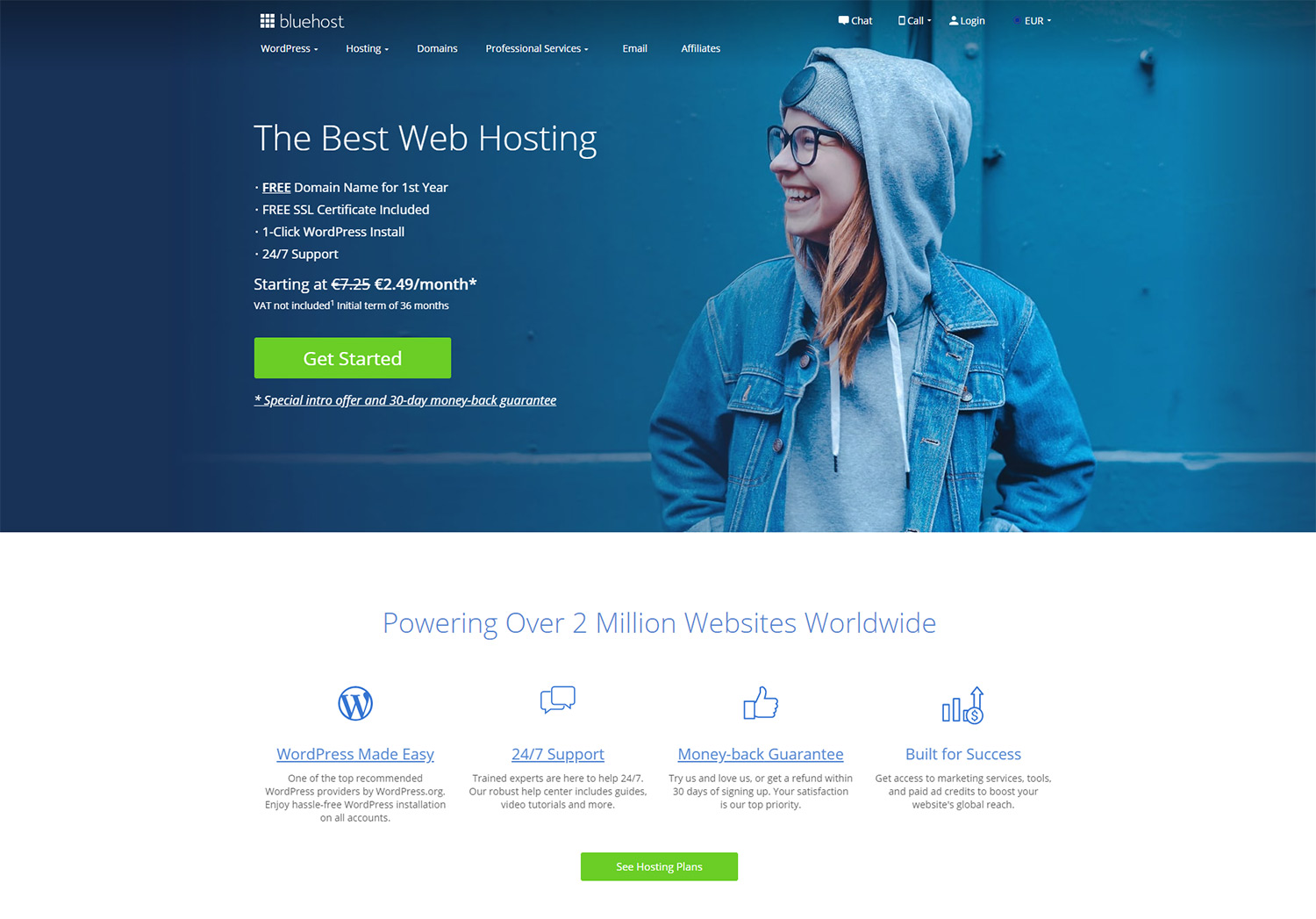
1. Bluehost
One of the most popular web hosting services, Bluehost has been on market since 2003. It’s committed to serving hosting only to WordPress sites. “With a development team experienced in optimizing over 80 open source platforms, Bluehost is the world’s leading solution for open source implementation and development,” it states on the about page. Bluehost offers five types of hosting so that anyone can choose one: shared Hosting, WordPress hosting, VPS hosting, Dedicated Hosting, and Reseller hosting. Every type of hosting has more attractive pricing plans, starting from €2.49/month.
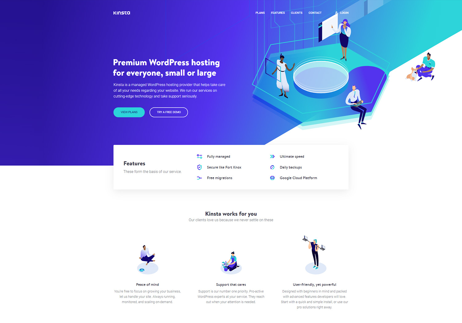
2. Kinsta
The Kinsta company offers managed WordPress hosting, and has an intuitive dashboard control panel where you can manage your websites, migrations, billing, users, and see analytics data, as well as an activity log.
It comes with four pricing plans, starting at $30. To see the full list of features, you can check out the comprehensive Kinsta review we’ve made. Kinsta also has a great pricing offer. If you buy yearly instead of monthly plans, you’ll get two months of free hosting services.
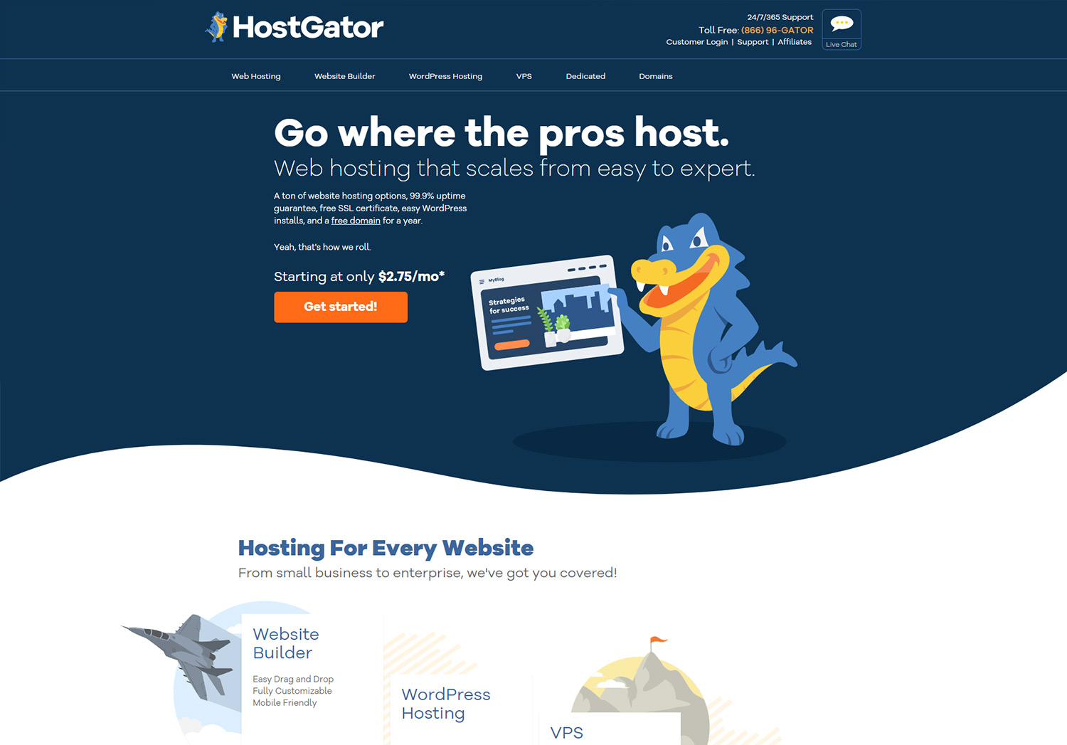
3. Hostgator
Hostgator includes shared Hosting, shared WordPress hosting, Dedicated Hosting, VPS hosting, cloud hosting, reseller hosting, starting from $2.75 per month. Their pricing plans have interesting names, such as Hatchling, Baby, and Business. Based on affordable pricing, great features, high speed, and an experienced support team, Hostgator remains one of the best hosting solutions out there.
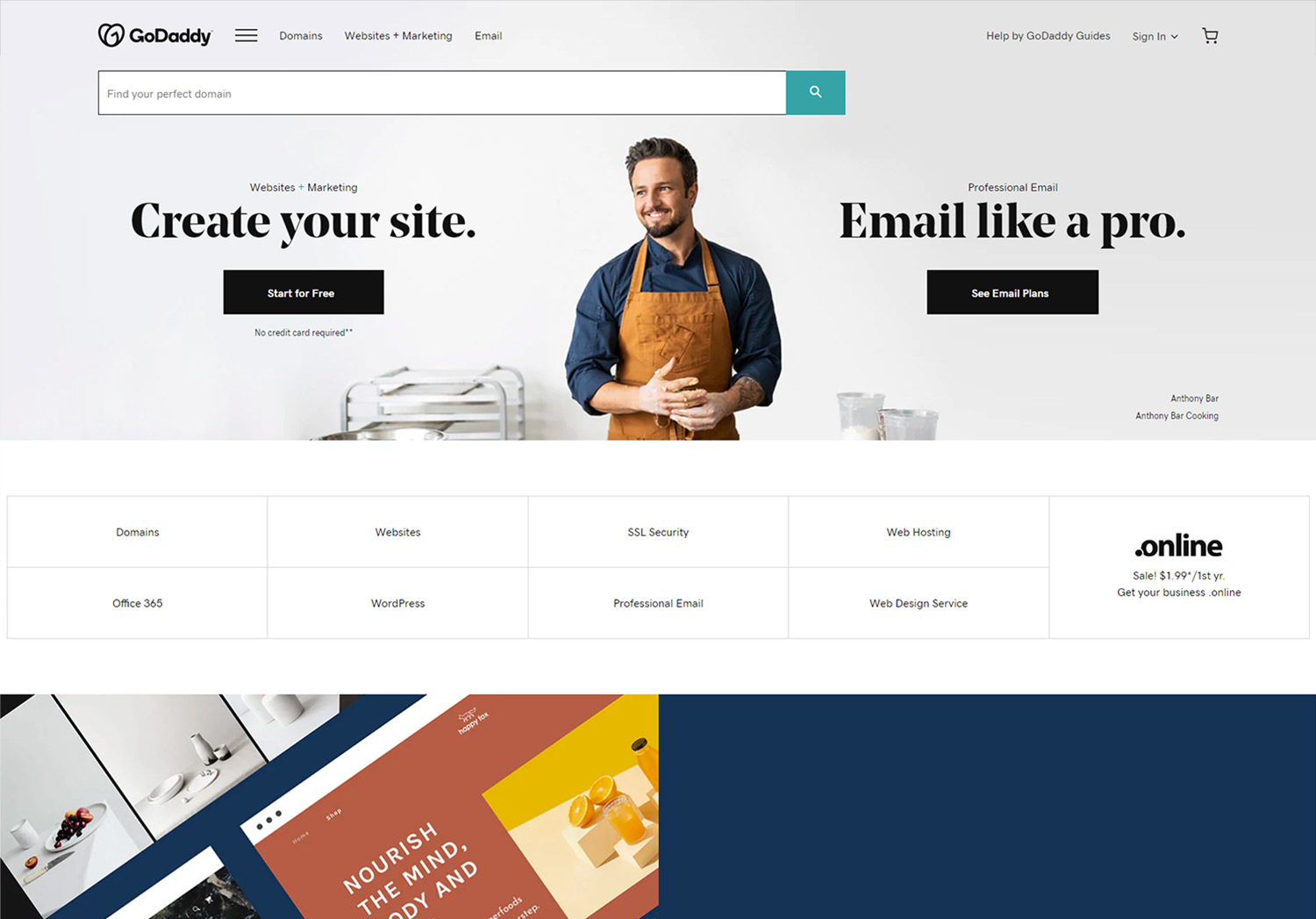
4. GoDaddy
One of the well-known providers in the hosting industry is GoDaddy. Many beginner users choose GoDaddy to host their website because it is fast and stable, and has been reliable since 1999. They include both C-Panel and Plesk dashboards to maintain websites & apps, as well as other settings. GoDaddy offers services that include Web Hosting, Reseller Hosting, WordPress Hosting, Business Hosting, VPS Hosting, and Dedicated Servers. Their pricing starts at $5.99/month.
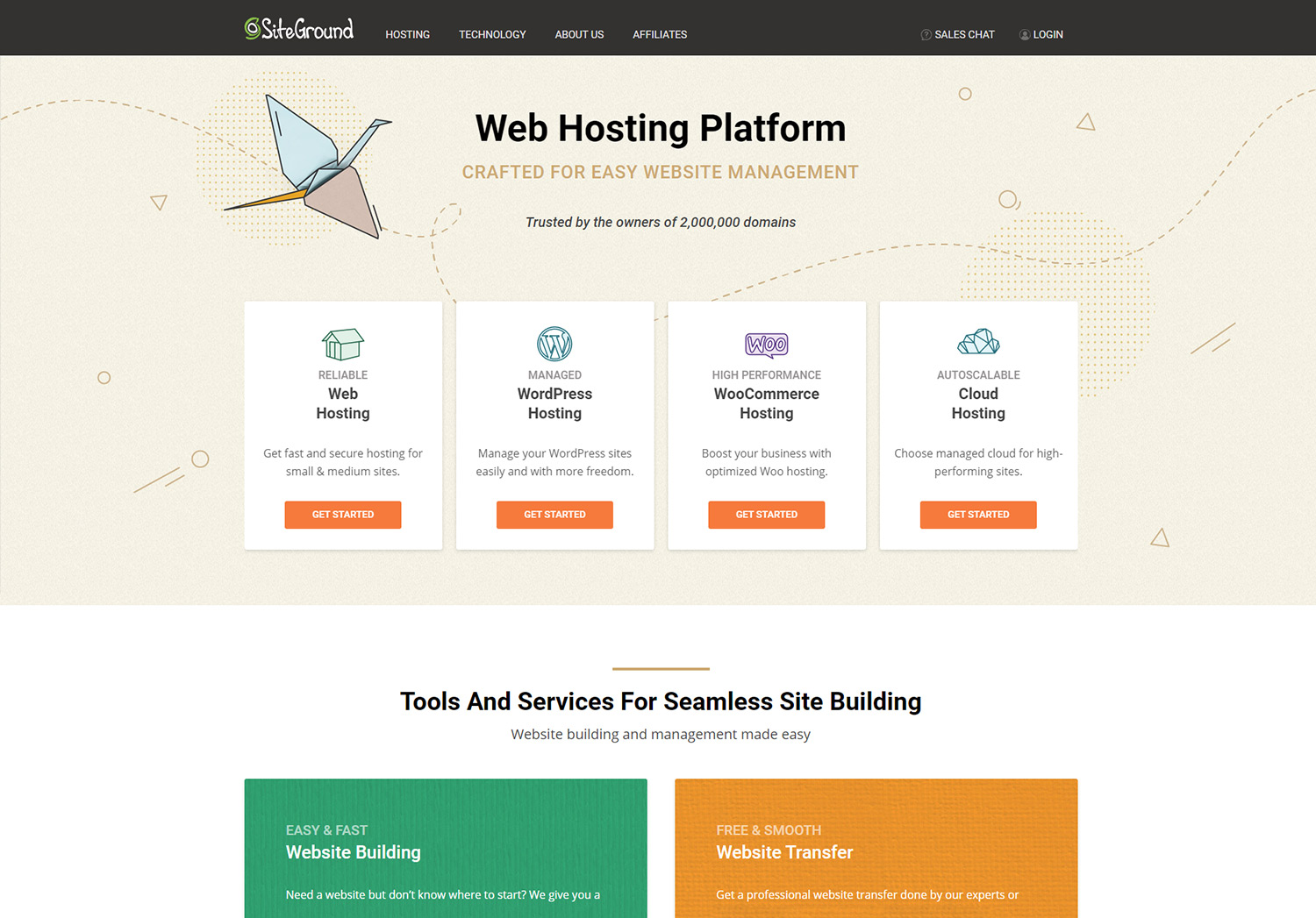
5. SiteGround
Web Hosting, Reseller Hosting, Cloud Hosting, these are some of the services provided by SiteGround. Furthermore, this company comes with hosting applications such as WordPress, WooCommerce, Joomla, Magento, Drupal, and PrestaShop. So, if you want to migrate from one to another, Siteground makes it easy for you. You can choose the right plan for your website by selecting a package of €3.95/month. For example, at this amount of money, you can host one website, a free WordPress install, a free SSL certificate, 10 GB of webspace, and others. It’s a great way to dive into the online environment.
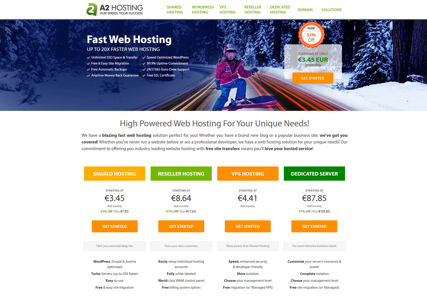
6. A2 Hosting
Whether you’re looking for a Shared, Reseller, WPS, or Dedicated Server Hosting package, the A2 Hosting company has them all. Also, it lets you easily manage the website from a single place. The A2 Hosting has the CPanel available for users who opt for Shared WordPress plans, and the Plesk Control Panel for those who choose the Managed WordPress Hosting, with prices starting from €3.50. For an in-depth analysis of A2 Hosting functionalities, you should read our comprehensive article.
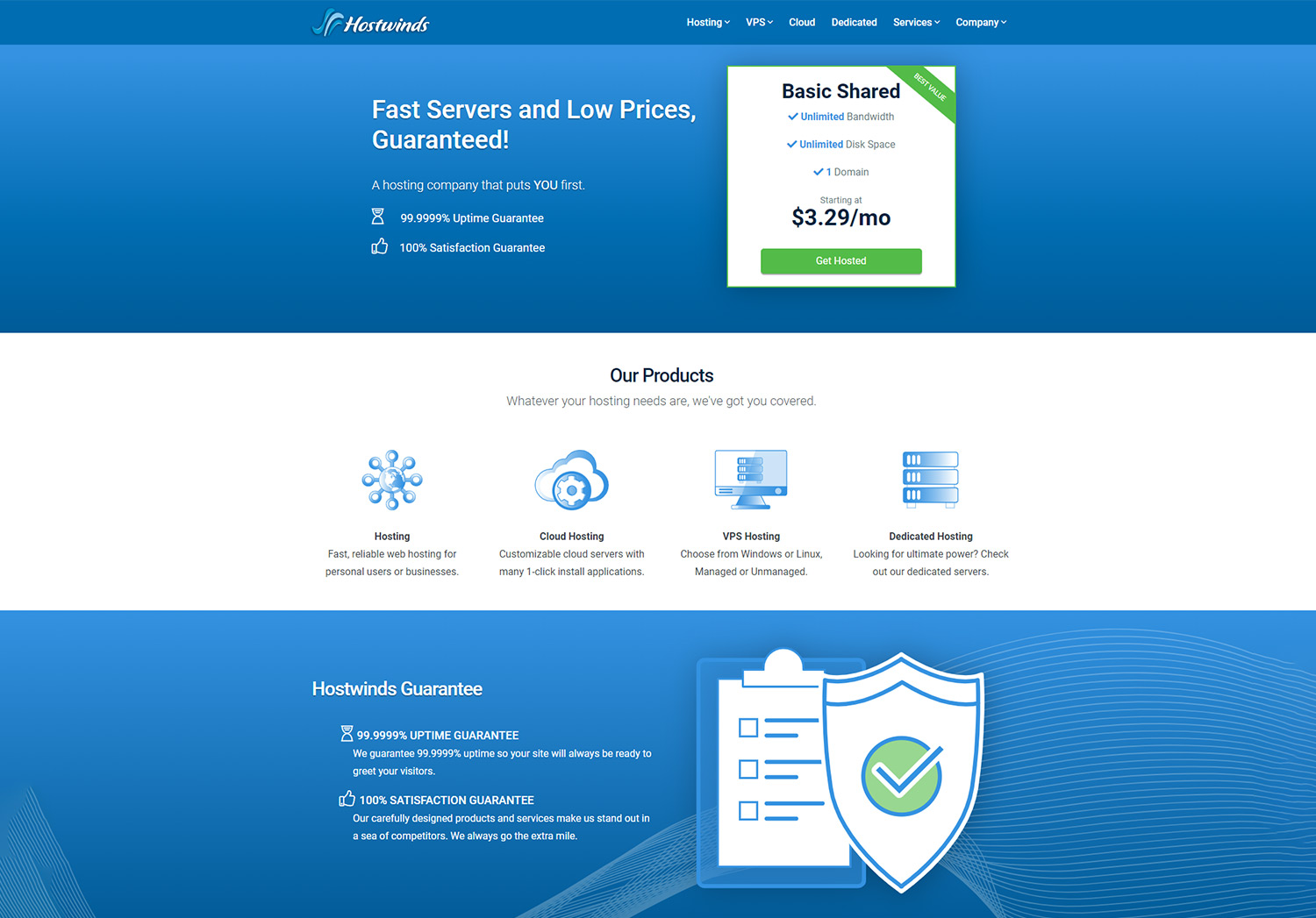
7. Hostwinds
If you want to host services for one domain, Hostwinds comes with unlimited bandwidth and disk space. This provider gives you multiple attractive packages for Shared Hosting, Business Hosting, Reseller Hosting, VPS, Cloud Hosting, and so on.
For people just starting a website and need a web host, probably the best option would be the Shared Web Hosting, which has affordable prices/month: $3.29, $4.23, and $5.17. All the plans come with the Softaculous plugin installed, and the well-known cPanel website control interface, for easy & intuitive access.
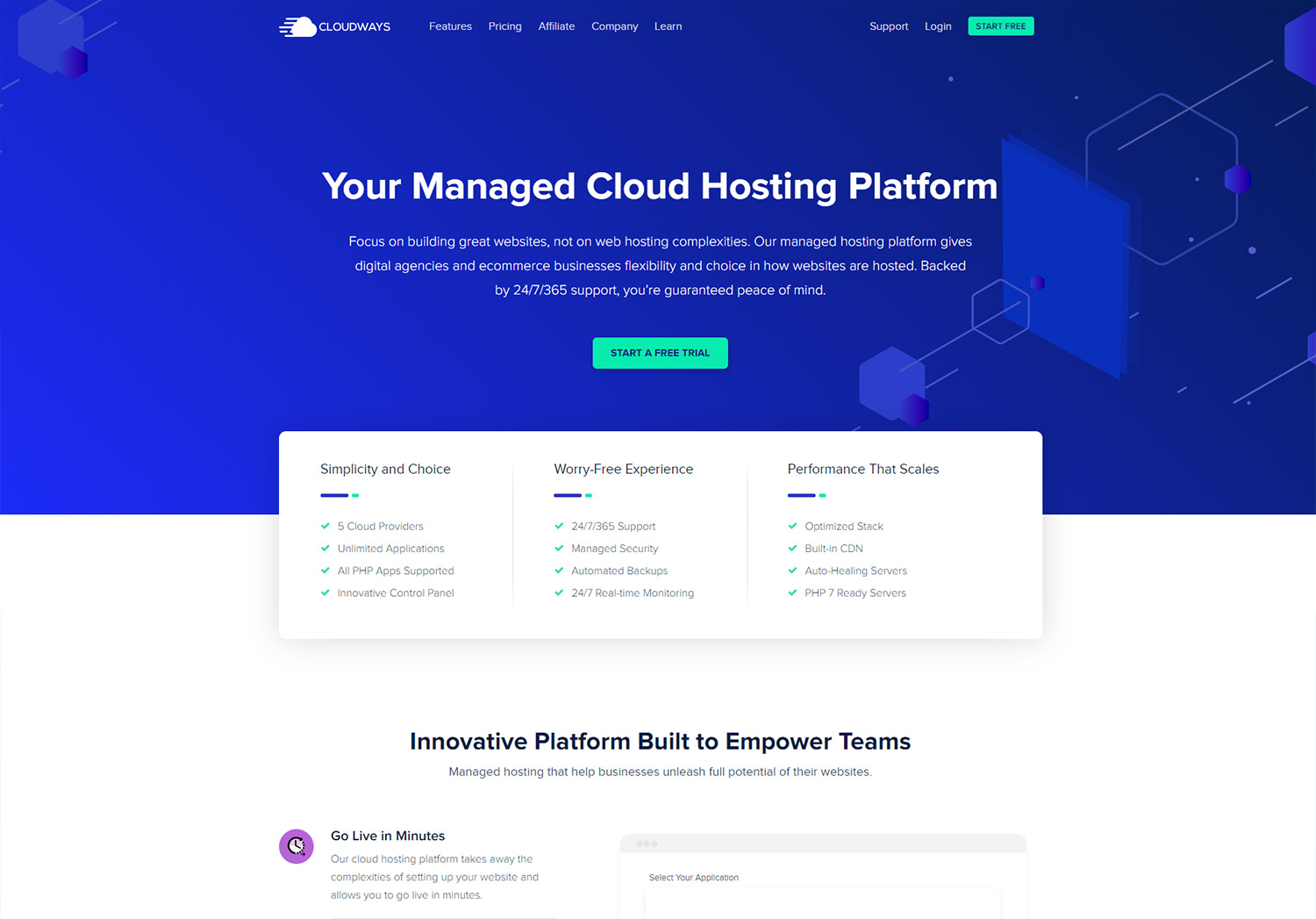
8. Cloudways
The Cloudways is a hosting platform that “gives digital agencies and eCommerce businesses flexibility and choice in how websites are hosted.” It’s a fast performing hosting provider and has a product & solution for any type of hosting. Check out the full article on Cloudways and see what exactly is the company offering.
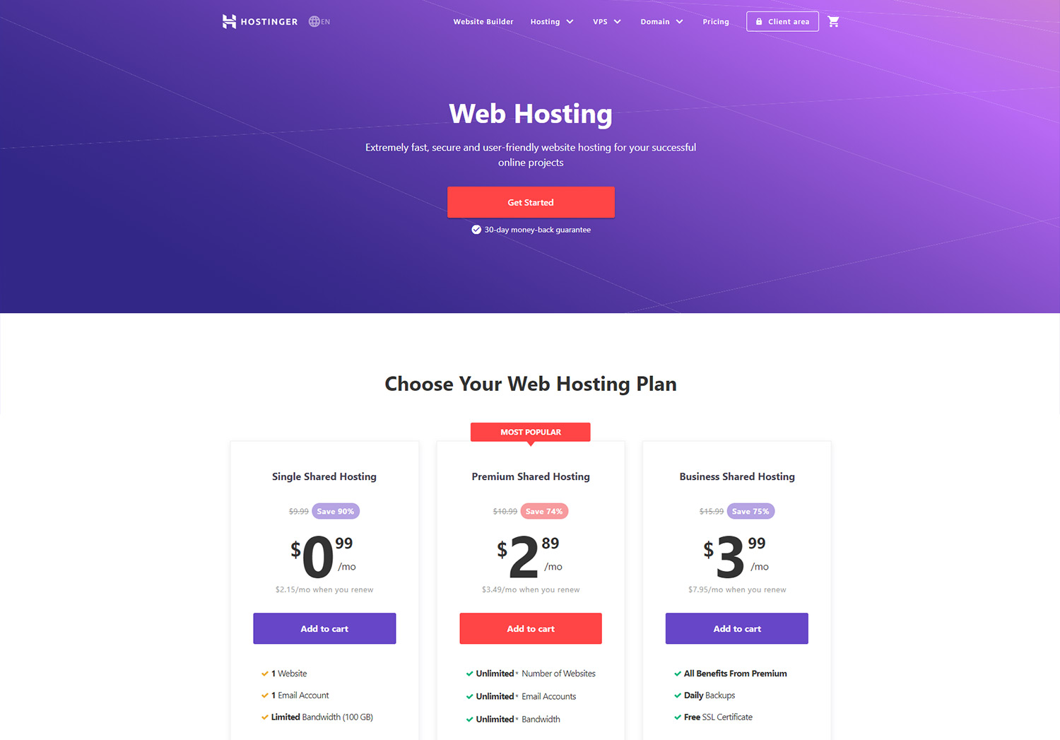
9. Hostinger
Hostinger ensures services of Shared Web Hosting for small and medium websites, Cloud Hosting for big scale projects, WordPress Hosting, as well as email hosting. Starting at $0.99/month (usually it’s $9.99), you can opt for the Single plan and host one website, an email address, bandwidth-limited at 100GB, and 99,9% Uptime Guarantee. The Premium plan has more benefits, but the same as the Single one, you don’t get daily backups, and a free SSL certificate. The most convenient plan of Shared Web or WordPress Hosting is Business, and you have to pay a $3.99 fee per month.
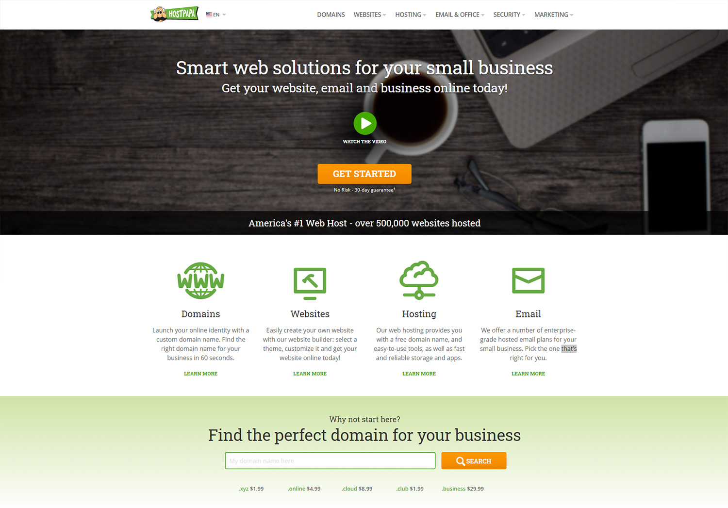
10. HostPapa
Hostpapa not only offers hosting services, but you can also pick a domain name and buy it right away. As for the hosting solution, you can choose the Web, VPS, Reseller, and WordPress services. If you want to find out more information on HostPapa, discover our review.
Is Pricing the Defining Aspect?
In short? Yes. Pricing will always be a defining aspect when buying any service or product. You always get what you pay for. Cheap Hosting means cheap service – that’s why we haven’t talked about tons of hosting services at low costs. There are so many hosting services out there that we haven’t even heard of. Let’s stick to the most popular ones when choosing our web host.
A thing you should be aware of is that hosting companies might use pricing tricks. These are usually pricing packages that are cheap at first, but they get increased after a few months of usage. However, if you want your website to perform at its best, it means that servers, networks, logging response times must be at high standards. And this always comes at a price.
Conclusions
After reading all these insights, I’m sure you know exactly what are the best hosting services you’ll go for in 2021. If you want to read other people’s experiences with the wanted web hosting providers, there are many discussion forums where you can get some great insights. For more in-depth reviews about hosting companies that provide online services, products, and solutions, you could check out the daily articles of the Top10 Website Hosting. If you’re looking for more trustworthy websites, the Hosting Advice, Trust Pilot, and Forum Web.Hosting are just a few of the websites where people share their hosting knowledge and expertise.


