SPRING SALE! ENJOY 15% OFF

ON ALL WEB DESIGN AND DEVELOPMENT SERVICES

USE coupon

#spring15

in the contact page

Home Blog Page 8

Must-Have WordPress Plugins for any Website in 2023

33

Any website owner wants to make a great online impression. In fact, everybody strives to increase their online business and create highly-engaging and successful blogs. Behind any website, there’s a lot of effort in the long-term. Building a website is easy, but the real struggle is to create content that matters for people, which is helpful, and they resonate with. To tweak every piece of content and make it loved by Google, you need to bring on the quality and apply the best search optimization practices. Also, even the fastest WordPress themes out there need some additional powerful WordPress plugins to get the best results for a website. In this article, we’re going to talk about the most popular WordPress plugins that can make the difference for your site. 

SEO Optimization

One key factor of online presence is SEO Optimization. With the right tools, quality content, and extreme care for details, you can boost your pages in front of the audience, searching for you even if they don’t know it yet. There are indeed so many SEO tactics to use, but you should start with the on-page SEO. This means you need to fine-tune the content on your pages, posts, including on media files. 

Yoast SEO

Among other SEO plugins, Yoast SEO is the most popular. This plugin helps you optimize keywords, keyphrases, see your readability score and improve it as well. Yoast SEO comes with both free and premium versions. 

If you’re still wondering why SEO is important for your WordPress website, you need the best Search Engine Optimization strategy to stand out with your website in SERP. You can check out our article for more details on how SEO works and why you need it so badly.

Price: free or premium starting from €89 to €890, depending on how many websites you want to use it. 

Performance

What is the performance of your website referring to? The overall performance refers to the loading speed of web elements on a page and is highly influenced by various factors, such as the server, scripts, media content, plugins, style sheets, bottlenecks between the webpage and the database, and others.    

There are a lot of tools out there so you can test your site’s performance, that also give you hints about what changes you should make on Javascript or CSS files, and how to handle HTTP errors. Look no further than GT Metrix, Google PageSpeed Insights, Pingdom, or Web Page Test. As a takeaway note, just consider to minimize HTTP requests on your websites, optimize your media content, and use proper image or video sizes. It’s important not to clutter the pages with large files. Usually, the performance-optimizing plugins take care of your lazy loading images, CDNs, backups, and so on.  

WP Super Cache plugin

WP Super Cache

The WP Super Cache plugin is created by the Automattic team to generate static HTML files from your dynamic WordPress website. Ranked by speed, this plugin allows you to cache files by using three different methods: expert, which involves web developer skills, simple using the PHP method, and WP-Cache compression. By having a caching plugin like WP Super Cache that doesn’t take too much server resources, you’ll have your site perform at its best. 

Free of charge.

WP Rocket

WP Rocket

The WP Rocket is an intuitive performance plugin, released in 2013 by Jonathan Buttigieg and Jean-Baptiste Marchand-Arvier to help the WordPress newbies optimize their websites quickly. Some of its best features include database optimization, lazyload, defer JavaScript loading, CloudFlare Compatibility, page caching, Gzip compression, Google Fonts optimization, Cache preloading, browser caching, DNS prefetching, and more.

Price: Starts from $49 to $249.

Website Security

What is WordPress? WordPress is an open-source CMS that runs on PHP and a MySQL database. So, it’s important to keep it safe, as well as your website too. With technology within everybody’s grasp, cyberattacks happen daily. The latest statistics on cybersecurity highlight that every 39 seconds, a website is being hacked. They can place malware on your websites, and without having the right tool to block these types of attacks, you’re 100% exposed. 

Sucuri

Sucuri 

Launched in 2008 by Daniel Cid and Tony Perez, the Sucuri Security plugin makes it simple to monitor your website, removes possible malware, sets up a firewall, and helps you backup your site. It is a solution based on cloud technologies for professional website owners in terms of security and performance. 

Price: from basic $199.99 to custom, depending on your requirements.

Wordfence

WordFence

WordFence is a popular security plugin that can help you protect your WordPress website in several ways. This plugin scans all the files that your website contains, for suspicious code lines, phishing URLs, malware, detects unauthorized DNS modifications, and so on.

Price: $99 per license. 

Anti-Spam 

How much tolerance do you have for spam? Not at all, right? Well, if you want to keep the spammy comments, you need to protect your website with a plugin that helps you achieve that without using too many site resources. 
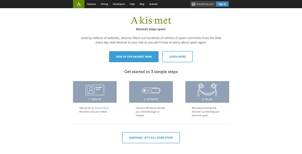
Akismet WordPress plugin

Akismet

Spammy content on your blog can ruin your website’s credibility. With the Akismet WordPress plugin, you can protect your website against spammy comments. It has a personal, plus, or enterprise package for each business domain. Easy to install, get rid of spam!

Price: free or premium, starting at $5 up to $50.

Conclusions

Whether you choose a free or a premium version, select a popular WordPress plugin that is constantly updated and serves your needs. Don’t forget to ensure that your content is the right one for your audience, as well as for the SERP. Guide people to learn more on your website and offer them good reasons to stay longer. You have to keep maintaining these plugins up to date and optimize every inch of your website to get the desired results. For sure, there are a lot more plugins to add a plus of specific functionality on your website. Some plugins are related to Communities and Memberships, Marketing, eShop capabilities, and multi-language ones. Let us know in the comments which category of plugins you are using to extend your website’s needs.

Video Features & Settings with Newspaper Theme: Sticky Video and Pop-up Video

We all know that animation attracts attention; the same goes for videos which have grown in popularity over the years. Most websites nowadays have a presentation video right underneath their header, greeting you. By doing so, they’re showcasing what their company is all about in a very appealing way. But what if your website consists of reporting and delivering the people a reliable source of information? Each article would need to link to news reports, and what better way to do this than to let the audience see the news report themselves? With Newspaper 10.3.2, you get access to a couple of new features that can invigorate your news website.

Featured Video Article

To first understand how these new features work, you would need to have at least one recent article with a featured Video. Open a post through the WordPress Gutenberg editor. In the document settings tab on the right side of the screen, you have multiple sections. Look for the “Featured Video” one below the Discussion tab. Open it up and type in the YouTube URL as your video source. Now hit Update or Publish to save your settings. With a Featured video, the Gutenberg editor will fetch the thumbnail. If you want to replace it, upload your image in the Featured Image section. 

When you’re done, open the article. Having a Featured Video for your post will not only enable you to get access to the Sticky Video feature, but also the Video Pop-up one. 

Sticky Video

Let’s explore how to turn on the Sticky Video feature for your new video post. Go to your Admin Dashboard and then to Newspaper > Theme Panel > Post Settings. With this panel open, click on the “Video Settings” tab and switch on the “Enable Sticky Video at Scroll” button. Save the settings. Great! Now your featured video post can remain sticky for your audience when they play it. How? When a viewer scrolls down the page, after clicking on the Featured Video, it appears on the left or right side of the screen as a smaller version of itself. So, your audience can continue watching the video while reading your article. 

This can be extremely effective in increasing the average time spent on a page or article, which in turn ranks you higher as a more trustworthy website in Google Analytics. Awesome! Now, wait just one second! Before you close this tab, check out the rest of the Sticky Video settings as they can help you decide where exactly the video should remain on the side of the screen while scrolling. 

Video Settings

Let’s start with the width of the sticky video. How big do you want it to show up on people’s screens? The default is set to 450px. However, you can input a different width; just make sure it’s not too small that the viewers can’t tell what’s happening, or too big and it’s taking up too much of the screen.

Vertical Position refers to where the video is displayed, whether it’s at the bottom or top of your screen. Whichever option you choose, the following setting alters the distance between the bottom or top of the screen to display the video. The default for it is 300px so that it can give a bit of space between the header and the footer. 

The Horizontal Position allows you to choose which side of the screen to showcase it. And Horizontal Distance lets you add space between the margins of each side. These settings all refer to the Sticky Video that lets you continue playing the Featured YouTube Video on posts. However, just above these, you get three different new video settings: 

  • Play one Player: if you have multiple videos in the inside of your article, with this option enabled, there will be only one video playing at all times. It’s convenient so that the viewer does not have multiple videos playing at the same time, with audio overlapping one another.
  • Pause Hidden Player: if an audience member clicks on a video(inside your article) then scrolls down to keep reading the rest of the post, this feature pauses the video when it’s not visible anymore. 
  • Lazy Video on Mobile: by enabling this option, when anyone scrolls through your website on mobile, the website does not load each video embedded in the post. Instead, it brings only the thumbnail. Moreover, if the viewer decides to watch any of the videos, the site loads them when they’re clicked on. This helps reduce the data loaded for mobile devices and improves the site’s overall performance. 

Enable any of these options as you want, and then save your settings to see them happening live on your website.

Video Pop-up

Your Homepage is an essential part of the website. When first creating it, you would try to tackle it in a way that makes any member of the audience listen and keep on exploring. If you’re new to creating your Homepage, we have a helpful tutorial about it. However, if you’ve already created and designed your website, then you most likely want to keep the changes you make to a minimum. After spending hours contemplating the layout decisions, you should sit back and hone the aspects of it. 

But as you report consequential items of news, you might need to feature a video to relate your gatherings. With Newspaper Theme’s new Video Pop-up, you can let your viewers click on a video thumbnail and have it play straight from the page they’re already on. This can either be a Contact Page, About Page, or your Homepage. 

Flex Blocks & Ads

Whenever someone clicks on a video thumbnail on a page, the video takes the center of the screen, dimming the rest of the content and starts playing. Most importantly, the place underneath the video is suitable for advertising, which is why you can add ads to display while the user sits back and watches what’s on-screen. This is a great way to reach out and make revenue without crowding the page as it only appears when the video “pops up.” 

Let’s start with the beginning. Open up your Homepage, or any other page for that matter,  with the tagDiv Composer. Now scroll through the page and click on the first Flex Block you find. If you can’t spot one, you can always drag and drop the element from the list. Navigate to the Layout Settings and scroll down until you’re at the Article Video section. Right beneath it, you have your video pop-up settings. First of all, you need to make sure the box that says “Enable Video Pop-up” is checked. This will make it so a reader can click on a video thumbnail and have it play instantly. 

The video icon size refers to the play button and how small or big you want it to show. Video duration settings let you display how long the video is, if you have the option enabled. The big “Video pop-up ad” box is essential for advertising. This is where you write your Google Adsense code or your Affiliates code to display horizontally below the playing video. The images displayed should be broad and narrow in height. When you write your code, you can hit Save and check out your new video settings. Click on any video thumbnail to see how it instantly opens up, dimming the rest of the content, and showcases your written ad code underneath. Pretty neat, right? 

Follow the same steps for any Flex block you have on your pages, and you’re good to go!

Enliven your Website with Video Features

Adopt the new Video Pop-up feature for your Flex Blocks, or enable the Sticky Video for your articles and posts to enrich the viewer’s experience while browsing through your website. Become a valuable news source for your audience with these new features. And, if you’re looking for other ways to embed recorded media, you can check out our helpful tutorial. Deliver a fantastic user experience to all your readers with Newspaper Theme and let your audience check out video material for their research. 

Show us how you’ve embraced these new video features on your website in the comment box below!

Adopt these 7 New Design Trends for your Project in 2020

17

As with the previous years, 2020 comes with a whole new line of thinking for the visual arts. Where are we going now? How do we stand out? By answering these questions, we get to dive into a whole new era of graphic design and its popular tendencies. Find out how to take these design trends to the next level and incorporate them into your website or art. 

Create a product presentation with 3D element

3D Elements & Graphics

Countering the past decade’s minimalist aesthetic, companies have begun using 3D elements and animations to better showcase their brand. Graphic designers, that have knowledge and experience using Maya, Blender, Zbrush, or Cinema 4D, are sought after nowadays. If you need help creating a 3D model, we advise you to either seek out help from a professional or check out these amazing tutorials from GreyScaleGorilla. It’s never too late to learn something new!

Combining a 3D element with a 2-dimensional object or even typography, you get an innovative, fresh look to any design you create. Explore how to use colors to make everything pop by learning about Color Theory.

Entice customers to buy your product using thin line illustrations

Line Art

As a new contender in the design trends industry, line art is about making things simple, direct. With illustrations taking over companies’ branding and media, the desire to make it even clearer is dominating. As such, by removing base colors, you get this new type of illustration – only forms, lines guiding you to read and discover more. 

You can achieve this effect by opening either Photoshop or Illustrator, and taking the pen tool to create a scene with no fill, only strokes. The entire concept behind this new trend is to make everything seamless while keeping it abstract.

Make a poster with cyberpunk colors and shapes

Cyberpunk Color Schemes

Previously, we’ve seen how gradients and bold colors have taken over the design industry so that companies and media stand out. In 2020, we can expect even more vibrancy coming from the visual arts, with bright neon colors mixed to give off a very retro yet futuristic look. 

To achieve this, you would need to create a color palette that involves overly saturated colors while also keeping the contrast between them. This way, any text is visible and legible, ensuring a great reading experience. Mix and match to achieve the desired effect with Adobe Color. When you’ve decided on a scheme, just incorporate it into your website.

Create a stunning impression on clients with quirky fonts

Typography Craze

Experimenting with new fonts, dragging them, distorting them, and creating something brilliant is a graphic designer’s job. This year, we can already see this being taken to the extreme. The quirkier the font, the more use it will get. 

To get started, head on over to your favorite font website. You can take a look at DaFont if you don’t have one yet. Browse through the multiple categories from distorted, eroded, western, calligraphy, handwritten, and so many more. In the search bar, you can select the licensing you want, whether the project you’re working on is for educational purposes or commercial use. When you find the perfect font, read through its licensing agreement and check whether it applies to the type of project you want to use it for. No worries, most artists link to their website from which you can buy the font from if you’re unsure! 

Showcase your company with thin lines geometry

Thin Lines in Geometric Shapes

We’ve seen how geometrical design has taken over the internet in the previous years. It still reigns supreme even now, just in a new form. Taking a grid and overlaying it on top of shapes to sculpt it and mesh it while removing the shape itself, you get a new trend. But how do you make this yourself? Open Illustrator and create the type of grid you want: thin strokes, small spacing in between each line. Now make a shape with the programs’ innate tools. Overlay the lines over the shape and choose merge. 

Now you can add a background to the overall design, or even choose to drag the lines around using the Warp tool option. When it’s done, you can either export it as a .svg or to your library and choose to edit it even further in Photoshop.

Impress your business associates with image masking

Image or Text Masking

Double exposure in photography is the same as this effect. When you overlay one layer across another and link them so that it takes the shape of the one beneath, you get a basic example of masking. This creates a mysterious vibe to the overall image as it leaves much of it unrevealed. 

With your editor of choice opened, you can juxtapose two images on top of each other, an image over a text, or one over a brushstroke. Now, there are multiple ways to get this and the most accessible being to link the two together. However, you can also do this using the multiple blending modes your program offers, such as Lighten, Overlay, Multiply, and others. The last option would be to take the time to mask the image out. You would need to click on the mask option. While having it selected, begin chipping away at its edges using your brush, pencil, or lasso tool with a dark color. 

Appeal to the masses with a vintage look

Retro or Vintage design

You know the saying about how history repeats itself? Well, the ‘50s are back in style in graphic design with artists trying to evoke the earthy colors and the illustration aspects of those years with a modern outlook. Get inspired by taking a look at the warm earthy tones the posters from back then used to look like. 

Create a color scheme that evokes the feeling of these fantastic designs and wow the crowd. If you’re working on an illustration, add a grain texture on top of your finished work to give it a sandy retro feel. 

Conclusions

Whether you choose to adopt any of these new styles into your art, project, or website is up to you. As media is always ever-evolving, trends can come and go, which is why the vintage and retro design is now widespread. To amaze people with a fantastic design takes more than just following the trends: your brand needs to be something your audience can relate to and enjoy. Useful UI is just as impressive as stylish images. If done right, it can be even more impressive. So before you do a complete redesign, try to prioritize your user’s experience. And when you’re up for it, use this list as a source of inspiration. 

Tell us all about your favorite 2020 design trend in the comment box below and show us how you incorporated it into your project! 😀

Introduction to Newspaper Theme Automatic Updates

18

Technology and automated processes are more and more present in our lives. It’s important to keep your website up-to-date, at least for security reasons, and to get access to the newly implemented features. That’s why we have some great news for you! In the Newspaper WordPress theme version 10.3.1, we have introduced the Automatic Theme Update feature. Now, every time a theme update is released, you’re at one click away from the new version. Starting with the Newspaper 10.3.2 version, you can automatically update your theme to the latest version available. 

What Are Automatic Updates?

In general, the automatic updates of any software mean you no longer have to install the new product version manually. When a new update is found, you’ll get notified in the Update Notification System. When a Newspaper Theme update is available, you’ll see a red notification bullet in the Newspaper > Updates.

How to Update the Newspaper Theme Automatically?

All you have to do is click on the Updates tab from the Newspaper Theme Panel and hit the “Install Update” button. The system downloads the latest version from the tagDiv servers and automatically updates the theme’ files and the native plugins.

Note: If you have installed a new PRO demo on version 10.3.1 starting on March 29, 2020, it may not appear in the system that a new update is available for you to install automatically. In this situation, we recommend you to manually update the Newspaper Theme to version 10.3.2. If you need technical assistance to update your theme, please send us an email or open a new topic on the forum, and our support team will help you. 

Upgrade and Downgrade Newspaper Theme Versions

Besides the message that notifies you a new update is available, in Newspaper > Updates tab, you can also check out the theme versions’ availability. For example, if you’ve installed the latest theme version – 10.3.2 and you want to go back to 10.3.1, you can now select the theme version from the list dropdown and hit “Install version” button. 

Newspaper Theme Time Machine

Custom Code and Automated Updates

If you use custom CSS on your website and all the code is added in the dedicated section of the Newspaper Theme Panel, you’re good to update.

If you’ve hardcoded functionality into your Newspaper theme, before updating, you should save the custom code and add it after you install the new theme version. As a best practice, we encourage you to test the new versions of the theme in a staging environment before making any changes to the live site. This way, you can see if any alteration will influence the general design or functionality of your site, and you can fix it before updating the theme on the live website. As a side note, Newspaper Theme also creates a backup for the Theme Panel settings every time you click the Save button so that you can upgrade or downgrade your WordPress Theme. 

Conclusions

Save time by using this secure way to automatically update your Newspaper WordPress theme to the latest version. We know that focusing your attention on your content is the most important thing for you, and we are here to help you achieve precisely that. You know the drill, drop us a line in the comments. We would love to hear what you think about the new features and what you do with the time you’re saving by using the Newspaper Theme.

Be happy creating your website, stay safe, and deliver great content to your audience!

Newspaper New PRO Demo Designs for Your News Website

59

Our web designers are creative everywhere and under any circumstance. Although we’re all going through some unusual times, and we’re still adapting to new lifestyles, our desire to help you achieve your goals is stronger than ever. Even from their home offices, our designers crafted new, unique PRO Demo Designs so you can start your online project right away.

Three of the demo designs have been specifically created for those of you who want to keep people up-to-date about the evolution of the pandemic. With a fresh and minimal touch, these demos have AdSense capabilities. They come with lots of pre-made Banner Areas, Covid-19 Counter Statistics, and Pop-up Video Ads. The customizable elements and live editing make your Newspaper Theme journey a great user experience on an intuitive & flexible platform. Scroll down and discover the new seven awesome PRO demo designs.

Covid-19 Stats Demo PRO

Covid-19 Stats PRO

The Covid-19 Stats PRO demo is designed for news websites oriented to statistics, reports, and other facts regarding the Sars-Cov-2 pandemic. With warm shades, this demo design uses yellow as a primary color to give your audience hope, positivity, and optimism. Especially for this demo, we created two new statistics shortcodes in the tagDiv Composer page builder to help you keep readers informed about the Covid-19 pandemic. The Statistics Table and Statistics Counter shortcodes automatically bring data from Novel COVID API. The shortcodes automatically pull the Coronavirus pandemic official data to populate the fields. Furthermore, the Covid Stats PRO demo comes with a new video modal option. Similar to the lightbox effect, the featured video posts from YouTube, Dailymotion, Vimeo, or Self-Hosted URLs now will open in a modal window. 

Cov-19 Italy Report PRO demo

COV-19 Italy Report

The Cov-19 Italy Report is a PRO demo design, well-suited for authentic news websites. It uses a mix of blue and red colors, with Oxygen fonts, that brings a fresh and up-to-date feeling. The Cov-19 Italy Report demo is based on Flex Blocks and sticky columns. Therefore, with lots of ad spots to easily monetize your website and automatic counters that display the pandemic statistics.  

Pandemic PRO demo

Pandemic PRO 

With a classic newspaper look and medical oriented details, Pandemic Pro Demo design is suitable for any news publishing website. Any visitor that comes across this type of well-balanced design enjoys reading the news. The contemporary fonts, such as the geometric Poppins typefaces and the semi-bold Volkhov ones, provide a motivating reading experience for every user. The Pandemic demo shows a nicely styled live counter that is placed between the logo and the ad box. Also, below on the page, there’s another statistics’ counter that contains more columns and additional data. Pandemic Pro has four pre-designed areas for advertisements on the homepage (and not only). This means once your website is ready, you can easily monetize it.  

Royal Pub PRO demo

Royal Pub PRO

With an overall vintage look, Royal Pub PRO Demo has a lovely design with vibrant hues. It uses hand-drawn graphics, meaning there are sketched images that highlight the subject of this pub & entertainment-oriented website. As a distinct element, the Royal Pub PRO demo shows you a new version of the Video Playlist shortcode. By using the API Key, you can now type the username, an ID playlist that automatically grabs the videos from YouTube. Even more, with a focus on bartending, cocktails, recipes, and consumer goods, the Royal Pub PRO demo design is the best choice for appealing bars, clubs, or pub websites.  

Zodiac PRO demo

Zodiac 

The Zodiac is a minimal yet cozy Pro demo for personal blogs that embrace art. Geometric shapes such as squares, circles, and circles are used to emphasize images, mega menu’s thumbnails, ad boxes, and also the footer area. With warm, pastel colors, fine lines, and a one-of-a-kind About page, the Zodiac Pro demo is an artistic design that can fit any blog.

Baby PRO demo

Baby PRO

The Baby Pro demo has natural colors, and the elements that make its composition are specially assembled to give emotional nurturing. Outlined images, custom ad boxes, an elegant newsletter box, a featured category with images area; they all bring a modern touch. Moreover, with this beautiful demo design to build appealing sites on baby tips, motherhood, and parenting guides.

Estates PRO demo

Estates PRO

The new Estates PRO demo helps you impress your audience with a professional and reliable business site. Flex Blocks, rectangular shapes, bold typography, and plenty of white spaces are just a few of the strong visuals this beautiful demo has. It also includes a styled mega menu, with large image thumbnails, to catch your readers’ eyes with the latest, amazing posts.

AmberLight PRO demo

AmberLight PRO

The AmberLight demo enhances its dark background with neon-colored shadows and yellow tones. With rounded corners on images and blocks, you get a cosy-looking blog that you can import with a single click. Melding together into a nice color palette that impresses any audience member.

London News PRO

London News PRO

Bring your news website up-to-date with the London News demo. Using sans-serif fonts such as Roboto and Open Sans, white background, and elements grouped together systematically, you get a fresh look for your essential articles. Share veritable sources and new points of view in a professional manner with London News demo!

Medicine PRO

Medicine PRO

The Medicine PRO demo helps you build a trustworthy medical blog or news website. Black overlay meta information, green accent colors, Covid-19 statistics blocks, Roboto Slab and Lato fonts are just some of the demo’s primary features. Install it to get an innovative look for your website and spread awareness for this worldwide pandemic.

Covid Dark PRO

CovidDark PRO

CovidDark brings with it large excerpt pieces and a wide layout to encompass its various blocks. Its simple design can also be seen in its mega menu which houses the titles of the articles without the images. Juxtaposing items left and right gives it a much appreciated asymmetrical look. Explore this demo further to see all of its features.

Try New PRO Demos and Deliver Your News within Fresh Designs

Lightweight and fast, the new seven PRO demos are a great way to start or recreate your WordPress website. Modern typography and unmatched flexibility, stunning layouts, all the new designs reflect the news industry. Furthermore, they are a fit for any subject. With an already customized site, you’ll amaze your audience in no time. In other words, every website is a source of inspiration for others. Get all the attention towards your amazing content! Which one is the first new PRO demo from the list that you’ll ❤? Write us your comment below. We’ll love to hear your feedback!

Let’s Revisit the Past Popular Web Design Trends of 2017 to 2019

6

Have you ever wondered what shaped the last 3 years in web design? With the rise and fall of trends, it might be hard to keep track of what exactly grew in popularity. In this article, we take a look back to the top most marketable trends of 2017-2019. Web designers are creative and find their inspiration in simple things. They find and recycle elements, then mix them for stunning style results. Moreover, they want to ensure a great user experience while creating an intuitive interface. In this article, we’ll take a closer look at the web design trends that influenced the online presence between 2017 and 2019. Moreover, we’ll show you some great tips about the site’s consistency. 

Geometric Design in a website

Geometry in Web Design

What’s the basic element in Geometry? Ta-da, it’s the point. Then, you got the line, and the shapes. The readers’ mind has to be trained, and that’s why web designers choose geometry to add a plus of symmetry, balance, repetition, and design consistency. 

Moreover, geometric figures help you build any element on a website. For instance, text boxes, call-to-action buttons, or the underlying structure of the site, they all are designed using rectangular shapes. Furthermore, square & rectangular shapes ensure a sense of stability and are common visual cues. But, why do web designers use circles? Icons or logos represent the main visual elements that are circular. Representing safety and harmony, combined with squares and rectangles, circles give a trustworthy aspect to any website. Each shape has its meaning, discover how to use Geometric Web Design to emphasize your content, by using the Newspaper Theme and tagDiv Composer page builder. If you need inspiration, take a look at the Awwards article on this subject. 

Duotone or Monochrome Colors? 

Some web designers love monochrome colors, while others find the duotone compositions more interesting and appealing. Black and white are not going anywhere. Just like how  some people enjoy dressing in a color or another because it represents their personalities, the overall color of a website must reflect the theme and feel of it. 

Duotone design: take a look at our article about achieving this effect on your own

But, what’s duotone, and how can you achieve it? Duotone is an appealing aspect you can give to the images you show on your website. “Duo” has its etymology in Latin, and means “two”. If you want to bring out the middle and highlight tones of a picture, then, duotone helps you. You can recreate the halftone of the wanted “image using the superimposition of one contrasting color halftone over another color halftone,” as noted in Wikipedia. If you love sepia pictures, you know exactly what I mean, as it’s a duotone effect of mixing brown hues to get a vintage look. 

Oversized Fonts for Daring Titles

Many websites have imposing homepages and oversized fonts. You can notice big fonts on titles, menu items, buttons, and also on footer areas. The gist of capturing someone’s attention is always through big gestures, and what bigger gesture is there besides a giant font trying to make you swoon? Head over to our article about bold fonts and find out how you can mix and match to create the visual appeal you want for your website. 

Big Grids to show off your content

Dominance of Grids to Show Content 

Content means title, excerpt, and media files. Showing off the content in a nicely designed grid is a form to make it memorable in the reader’s mind. The grid is “a two-dimensional structure which serves as a framework in which a designer can put various content and elements,” says the Undsgn team. By showing off your content within beautiful grids, you’re ensuring better readability, which conducts to better user experience on your website. We’ve also crafted some great Flex Big Grids in our themes, to help you to easily structure your content on pages. 

Asymmetry

More and more websites tend to adopt grid layouts. Here comes the asymmetry, for those who don’t want a regular grid-based website. Furthermore, they can use shapes and elements that usually blend together symmetrically, to get astounding asymmetric designs.  

Appealing About Pages

What about the authors? When creativity means the right tools, everything becomes magic. The authors of a website are the ones who do the research, gather relevant information, take amazing images or videos and post them online. So, why not show their work in a stunning, eye-catching Author Page?   

A Custom Newsletter Subscription box

Styled Newsletter Boxes 

Creating content also means to share it with the world-wide. For this, in case you don’t have one, you should consider adding a newsletter box on your WordPress website and make it look engaging. An example is the Newspaper theme, which adopted the tagDiv Newsletter plugin, that is compatible with popular email marketing providers. People still use email as a handy method to communicate with their business partners, to understand their competitors, and to keep up with the latest news in various industries. 

Animations & Illustrations

Enough with the basic animations that were quickly added into websites for impressive visual impacts. They’re old news already. Nowadays, buttons get animated, hover effects, or shadows – they all imply movement. As web design trends, animations and illustrations continue to be suitable for any blog or website.

When Old becomes New in Web Design

Trends come and go, but there are some things, like the layout of a website, that never change. It’s vital to keep the site’s consistency, as it will give a sense of structure and personality to the overall website’s design. So, what’s the recipe for greatness? You need to have responsive websites with plenty of negative spaces, high-quality images, or media content. Navigation, visual appearance, and branding represent the three main aspects you definitely have to enhance. 

Navigation

Who loves easy navigation on a website? Sure: everybody! Keep it simple, and your visitors will stay longer on pages, and return to discover more information. There are three words that characterize the website’s navigation: consistency, simplicity, and also clarity. You can combine them regardless of the navigation style. Furthermore, for the website’s usability, you need accessible navigation, as well as a clearly organized sitemap. 

Site Navigation is essential for great user experience

Sitemap 

Technically, the site map needs to deliver information about a site’s structure for Google to understand the layout and index it. According to Wikipedia, “many sites have user-visible sitemaps which present a systematic view, typically hierarchical, of the site. These are intended to help visitors find specific pages, and can also be used by crawlers.” Below is an example of a basic sitemap:

  1. Home
  2. About page
  3. Categories
    • Tech
    • Lifestyle
    • Medical
  4. Blog
    • Product Listings
    • Product Reviews
  5. FAQ
  6. Contact page

Visual Appearance

When we say visual appearance, we’re also referring to visual hierarchy. The most important elements on your site should be strategically shown, as the readers’ eyes scan the page until they find that piece of information they’re interested in. Based on Miller’s design law, you should keep the number of visual elements with the same info on your WordPress website to a limited one.

Branding

We all know what branding stands for, right? Or, perhaps, most people have some knowledge about it. Is there a secret in maintaining the style for ages? There are various iconic and world-wide brands from all over the industries that become more powerful with every year that passes. Also, they embrace new trends with amazing marketing campaigns. What you need to do when crafting your company’s branding is to pay great attention to the logo, overall colors, tagline, and fonts. 

Conclusions

All these examples are actually a mix of trends that web designers improve every year. There’s no limit in web design, as creativity sparkles from the simplest, ordinary things. Professionals get creative and combine user experience with visual strategies to get better results in the fastest frame of time. What’s the web design trend you liked the most through the years, and what’s the tendency you love in 2020? We’d love to see your thoughts in the comments below.

Fantastic new Cook Blog to Feature your Custom Recipes: Newspaper Theme’s Gourmet PRO Demo

4

What would you say to trying out a new yummy recipe? We’ve got just the perfect demo for you to start sharing your new cuisine ideas and inspirations. With delightfully green accent colors, and soft grey tones mixed in, the demo is both fresh and inviting. Let’s jump right into the story behind it, the matching elements, and how to import it for your website with the Newspaper Theme.

Homepage of Gourmet PRO

Gourmet PRO: the intro

If you’re a foodie and you enjoy cooking, you know that the most crucial aspect to any recipe is the secret flavor added in right at the end. What is the one ingredient that should never be absent from your meal? Love. And as such, while creating Gourmet PRO, Marius, the web designer whose brilliant ideas shaped this stunning demo, used a well-thought-out plan to strike the iron while it was hot.

With lots of care and attention, he molded the demo into everything a cook might need. The fascinatingly entwined combo of serif and sans serif fonts, respectively Crimson Pro and Lato, gives the reader something to latch onto while being guided through the website.

And where else would a food blog be, without a cookbook and a list of recipes? Nestled right into the header, the viewer can hover through the various delicious meals and choose something he is interested in straight away. 

Gourmet PRO's unique Flex blocks

Mmm, yummy!

One of the critical parts in creating a demo is choosing the images to go along with it. For this, Marius chose exceptionally delicious looking images of food. Moreover, when you click on any of the recipes, you get two neat little sidebars that showcase more of the tasty goodness you’re bound to come across.

Each category name is underlined to emphasize them further. With a quirky and comforting style, the layout uses white space to distinguish different elements from each other. And with an eye-catching sticky header that featured the latest posts, you can also make waves.

Installing the Gourmet PRO demo

Newspaper Theme 10.3 comes with ten unique demos for you to try out on your website: Beauty PRO, Black Newspaper, Classic Blog, Gadgets, The Critic, Gossip, Pulses, Sports, Style News, and Gourmet PRO. When updating your theme, you have easy-access to all of these with a single click. If you’re new and need more information on how to update your Newspaper theme, check out our informative article here.

From the Admin Dashboard, go to Newspaper > Install Demos and scroll down to Gourmet PRO. When you hover over the demo’s image, you get to choose between Include Content and Design only. Just hit the switch to make your choice. What do these two options mean? When you import the demo with content, it comes with all of its categories, menus, and even posts. If you ever choose to uninstall this demo, all this content gets removed. Design Only lets you import only the layout, so if your website already contains articles, they get pulled into and will automatically show on the Homepage.

Whichever your choice, hit the “Install” button to import this fantastic demo. 

Sticky Header of Gourmet Pro

Header Logo & Main Menu

Importing a PRO demo comes with a lot of benefits, one of which is that everything is customizable right on the frontend. So, getting your website up and running requires you to take only a few simple steps. Let’s begin!

Open the tagDiv Composer on the Homepage. Click on the “Gourmet PRO” logo and scroll down in the General Settings tab until you get to the Logo Text box. Write down the name of your website. This should now display your website’s title on the front page. Next up is the Header Main menu, click on it, and then under the General Settings tab, select your menu.

If you don’t already have a menu created, save the settings in the tagDiv Composer, and then go to the Admin Dashboard. From there, navigate to Appearance > Menus. Press the “Create a new menu” button after you give it a title. Now drag and drop Categories, Pages, and order them. You can even make some categories mega menu items. When you’re done, save and go back to the frontend of your Homepage.

Choose the menu you’ve just created for the Header Main Menu. Next, click on the Website Manager button that’s on the top of your tagDiv Composer bar. Go through the Mobile menu, Mobile menu Sticky and Main Menu sticky to choose for each of these the menu you’ve created. If you have a parent category that is a mega menu, you may need to create a different menu to display all the nested categories for mobile.

Homepage Elements that can be edited on the frontend

Homepage adjustments

The first section of the page contains 3 different Flex Blocks. If you want to display different posts or articles, you need to either filter them by a tag, post id, author, category, or you need to add an offset to them. To offset the elements, go to the General Settings tab and to filter them go to the Filter tab.

The Sticky Main Menu that you can see once you enable it in the Website Settings window also has a Flex block. You could leave it as it is and have it display your latest posts so that when you write a new article, it immediately shows up for your audience here. Or you can filter it just like you did with the previous ones.

The next section contains an Ad Box, which you can edit to add your affiliates’ ad. Go to the “Image Ad” tab and upload the photo in the “All Devices” box. Now put your affiliates’ URL in the “Ad Url” box. Continue down the page adding offsets and filters to Flex Blocks and changing the titles. When you get to the “Cookbook release” section, click on the inline single Image element to choose a different photo that represents your website.

Write a subheading and a heading for the Inline Text items right next to the image and change the button’s URL by going to the General Settings. Following this section comes a small testimonial that can be replaced with your viewers’ reviews and thoughts about your website. Upload their image, replace the text, and save!

Gourmet PRO footer

Footer

When you get to the bottom of the Homepage, you’re instantly met with a clean and minimalistic segment. At the top, there is a Header Logo, Social Icons, and an Inline Text displaying the contact address. Modify the Logo to display your website’s name, the Social Icons to link to your media, and the text to display your rightful one.

To the left, right below that, you have a subscription box, and to the right, you have an Instagram social network element and a List Menu. Consequently, access your Mailchimp, Mailer Lite, or Feedburner accounts to get the code and copy it. Paste it in the “Embedded Form Code” box.

Now click on the Inline Text item. Write your Instagram name and add a link to it using the <a> tag. For information about adding links to text items such as this, we suggest you take a look at this helpful tutorial. Next, click on the Instagram block and add your social ID in the Instagram Settings tab. This will pull your recent photos and display them on the frontend of your website.

The next element contains a menu. To create a new menu for your footer, refer to our previous instructions above. Change the list to display a different menu by going into the General Settings and choosing it under the “Use Items from” dropdown menu. Save your settings, and you’re done!

Single Posts Template

Templates

With Gourmet PRO, our Infinite Loading for Posts is enabled from the get-go so your visitors can move from article to article seamlessly. To disable it, just open a post through the tagDiv Composer and hit the menu item on the bottom-right of the frontend pagebuilder. Now, switch the button for “Enable Auto Loading” to off and save.

While you’re still on this template, you can offset or filter the displayed flex blocks just as you did on the menu and add affiliate URLs and images in the Ad Boxes. Don’t forget to save when you finish!

The 404, Date, Tag, Author, and Category Templates all contain Ad boxes and Flex Blocks that you can modify according to what you want to display. However, they need not be modified if you want them to display your latest posts. To make any changes, just open the template with the tagDiv Composer and hit Save when you’re done. That’s it! The demo is now fully integrated with your website and can display the information accurately and precisely. 

Gourmet Pro Category Template

Make the Gourmet PRO unique

Let’s say your brand already has a different visual but the layout of this beautiful demo appeals to them. No worries! Any PRO demo can be edited right on the frontend with no coding skills required. Just open the tagDiv Composer on any page or Template and begin editing.

Whether you need elements removed, colors or fonts changed, or even new content added into a page or template, this is all possible with a few clicks. If you need an item gone, just right click it and hit the “Delete” button. To add anything else to a page, find it in the tagDiv Composer. Drag-and-drop it in the desired place.

If you need any adjustments made between the spacing of this element and another, you can go into the CSS tab of its settings and input paddings or margins. To change the fonts, go into the “Style” tab and choose the font size, weight, spacing. For colors, stay on the same tab and modify the colors according to your brand’s visuals. Do this for the rest of the website, keeping everything uniform and clean. 

Let’s recap

Whether you want to keep Gourmet PRO strictly as it is presented or change it according to your style, integrating it with your website can be done with a few easy steps. Make sure to save often and choose fonts and colors that go well together. For any further information regarding this, you can check out our helpful articles on Color Theory or Typography Basics. Get inspired by the best in the domain you work in. Moreover, browse through various other website designs in search of a beautiful color scheme or font pairing that can go well with the core message you want to transmit your viewers.

If you enjoy the Gourmet PRO demo and what it has to offer, tell us why in the comment box below!

Tips to Stay Productive While You Work from Home

4

Staying home means staying safe. It also represents an extreme form of social distancing. On the other hand, it’s social media reconnecting. This is the time to reap technological benefits. Hundreds of years ago, this couldn’t have been possible. But, today, it is. Due to medical pandemics, in most of the US states and European countries, there has been a general state of emergency. This means that “it’s a situation in which a government is empowered to perform actions or impose policies that it would normally not be permitted to undertake,” according to Wikipedia. What exactly does this mean for every one of us, which rights and freedoms get suspended these days? How does it influence the work environments?

In short, we have to listen to the authorities and stay safe. While many of the private and public activities are suspended, we can take shelter inside our homes. If we accept this social distancing, we’ll never get bored. We have the technology, books, movies, and music within our grasp. Isolation doesn’t mean letting go of your hobbies or staying productive. So, I wrote this article to give you more reasons to enjoy this period of time.

People need hard times and oppression to develop psychic muscles.

Emily Dickinson, an American Poet

Extreme phenomenons have always encouraged human bonding. Some are volunteering to get supplies and deliver them to those in need, and others make donations. While others love to research and keep everyone else informed. This is the easiest way to stay productive and maintain your brain active.

If you are one of those people that reads a lot and filters the information based on clear facts, or you’re just someone willing to get the most out of his hobbies, keep on reading.

Explore the Unexplored

Even if you work from home, you still have some quality, free time for you. What do you usually do in your spare time? Maybe there’s a hobby that you’ve put on hold for a while? This could be the perfect time to focus on something you enjoy, be it something crafty or inventive. Maybe you like painting, or perhaps DIY projects such as baked salt dough, show holders for growing plants, pebbles placemats, and so on. For more ideas, browse the Lifehack’s article on awesome DIY projects that you’ve never heard of. 

Let’s move our attention to the most accessible asset these days: the Internet. For example, if you love travelling (but now is not the best time to do it), and have multiple photos & experiences to share, you could create a WordPress website. Find yourself a host, decide on the domain name, and start your online journey. Furthermore, if you’re an avid reader, you could develop a presentation & review website for the books you’ve read. Also, if you love cooking, challenge yourself with new ideas and recipes, while creating an online bonding with your audience. I know you’re probably new at this, so I’ll guide you through the steps.

  1. Decide on the hobby you want to share knowledge about on your website. 
  2. Find your domain name. 
  3. Choose a host and a WordPress package.
  4. Look out for a stunning WordPress Theme to fit your needs.
  5. Include your content and share it with the world.

A WordPress Theme for Any Kind of Website 

I’ve mentioned earlier some hobbies that you could explore more. By searching for new information and details about them, you can really use everything you know to create a unique website. Maybe you don’t know how much time you have at your disposal, but I’ll tell you a secret: an intuitive and flexible theme that comes packed with customizable features is all you need. Let me show you how creating a website is fun if you do it yourself.

To demonstrate this, I’ll exemplify with the Newspaper Theme, which includes a range of over 80 demos you can quickly import on your site, and have a fast start. 

What’s a PRO demo?

Newspaper has been the blog, news, and magazine themes market for more than six years. The web designers have created a demo design for every website topic, including for Travel, Food or Landing Page.

A PRO demo has the capabilities of a demo layout, except that it’s lighter in terms of CSS, and it loads the content faster. You can read more about the PRO demos in our articles: New PRO demo designs for your WordPress website, Welcome to the new Beauty PRO demo into your website,  or Create Enticing Reviews with Newspaper Theme’s The Critic demo

Entirely Designed for the Frontend

With tagDiv Composer page builder, tagDiv Cloud Library for thousands of pre-made templates for pages and articles, Header & Footer manager, the Newspaper WordPress theme is highly customizable from top to bottom, right on the frontend. 

Work from Home Tips to Remain Productive

Intentionally, I kept this part as the last one. I preferred to focus on showing you some tips to get productive with your hobbies, but at the same time, you don’t have to neglect your job. If your employer has given the remote work trust, you have to show him respect and stay in line with your duties. How do you achieve that, from your home comfort? The home office is not that scary, you know? There are a lot of benefits to this and technology comes in handy. It’s a challenge, and we all have to embrace it. Different times, different measures! So, here are the powerful tips to follow:

  1. Define a workspace inside your home. Make it look-alike your office.
  2. Nice, you’re up. Now, Lights On!
  3. Schedule your work from home hours on a daily basis. Make them a routine.
  4. Put your phone on mute. Don’t use it more than you usually do at work.
  5. Don’t get interrupted, no matter what! Focus is the key here.
  6. Communicate with your team via chat and live videos. 
  7. Concentrate with some good music.
  8. Avoid staying in bed or on the couch. Get comfy, but not so comfy, right?
  9. Log Off when your work from home is done for the day.  
  10. Get some fresh air from your balconies, windows, or step into your garden.

I know there are so many temptations in your house: your loved one, kids, pets, and also the obsessive cleaning. Is there a spot??? Well, no, no, and no! While you work, you need no intruders or other things that may distract you. 

Useful Resources

WordPress Theme markets to find your best choice:

Media Websites to find related images and video content to exemplify your stories:

eBooks & AudioBooks:

Listen to good and high-quality music on popular streaming music services: 

  • Spotify
  • Deezer 
  • YouTube Premium
  • Apple Music
  • Pandora
  • Primephonic
  • Tidal 

For movies, just get a Netflix, HBO Go, or Amazon Prime subscription :). 

In The End What Matters…

It is to understand that to work from home is necessary nowadays and it is a temporary measure and that if you don’t want to damage your image as an employee, you have to get the most out of you, right from the comfort of your house. I hope all the above tips will help you settle in your new space, and, besides the work, you’ll explore all the unexplored things you didn’t have time for until now.

Create Enticing Reviews with Newspaper Theme’s The Critic demo

9

One of the demos to come with the 10.3 update of Newspaper Theme is The Critic. A review blog destined for book or movie lovers all over the world. Moreover, it leaves a lasting impression with its portrait-type flex blocks, its wide layout, and the covers and posters for each of the reviews. With a review system implemented in the articles and posts, the demo is ready to be imported on your website with a single click.

The Critic: intro

The idea behind the creation of this demo was a review blog. That was how it started. It first needed some realistic book covers and movie posters. Each one designed in Photoshop with immense scrutiny to make everything blend in with the theme. After the images were crafted, a rough layout plan was sketched out.

Homepage of the Critic Demo

One of the main aspects of the demo had to be the portrait-type elements with plentiful white space between each. Simplicity was the key. All the fonts were chosen with this in mind: a sans-serif and a serif, Josefin Sans, and Cormorant Garamond, respectively. Cormorant Garamond had been the perfect choice to reflect the appearance of printed books, which often have a serif font for their text. Josefin Sans, however, had been picked in part due to its modern character. A blend of old & new. 

Each article was based on its already predestined book cover or movie poster. For Book covers, the genres being Horror, Comedy, and Romance, whereas, for film, it was Action, Drama, Fantasy, and Sci-Fi. To faithfully portray each genre, a number of 5 covers, respectively posters, had been designed.

Simple & Sweet

Between the various grays used on each page and template, the accent color is a peach pink. It is the drop of warmth necessary to brighten and attract the attention of your viewers. Moreover, to guide the audience along the page, 1px borders have been added to columns and rows – divide, guide, and emphasize.

Each template, in turn, receives these characteristics, wide layout, sticky columns, guiding lines, and a pleasant bit of warmth between the shades of gray. In fact, to go along with the theme behind this demo, as a review blog, the book and movie review posts have a rating from 1 – 5 stars. This way, when you import the demo and finish writing a review, you can also display the grade given to it.

A wide row filled with posts

The Critic: installation

To fully enjoy the benefits of this demo, you first need to make sure the Newspaper Theme is up-to-date. This PRO demo comes alongside the 10.3 update to the theme. If you want to learn how to update, look at our helpful guide here. When you’re done, just go to the Admin Dashboard > Newspaper > Install Demos. Scroll down to find The Critic demo in our list, and pick the installation choice:

  • With Content – if you choose this option, you get the entire demo’s design and the photos, covers, posters, that are included. Moreover, all the posts come with it. This option works well if you’re starting a website from scratch and would like to experiment with the design before adding any posts. Remember that the posts and images are removed if you uninstall the demo.
  • Design Only – you get the templates, headers, footers, without the posts and images. In fact, all the flex blocks then display your own crafted posts. This is perfect for someone who has already filled their website with content, and just needs a redesign.

Click on the switch to alter your preferred option and then hit the Install button. That’s it. You’ve imported The Critic demo design!

Categories and Posts

Adjustments & menus

Don’t leave; there are a few more things you need to do. Open the tagDiv Composer on the new Homepage. Now click on the Header zone and the logo. Replace the text with your website’s name and a short tagline. Great! Now click on the small “Manager” icon next to the save Icon of your frontend page builder. Change the logo’s text for each section of the Header. Now hit save!

There’s only one Header Template for The Critic, so once you change it here, it’s applied site-wide. Now click on the menu element. If you have a custom-made menu, you can change it from the dropdown menu of the General Settings. Or, if you want to create a custom menu, then save the settings and go to the Admin Dashboard > Appearance > Menus. Build the new menu by adding page links, categories, and then arranging them in the preferred order. When you’re done, go back to the Homepage. Pick your newly-created menu for the element. Save the settings!

Homepage changes

The first row of the Homepage should have 2 Flex Blocks and a Social Icons element. Click on the Social Icons, and add links to your Facebook, Youtube, Twitter, and anything else you may need. Let’s move onto the Flex Blocks. To have them display different posts each, you need to either filter them by category, tag, author or to add an offset. Open the General Settings of the element, and under the Extra section, add a number in the “Offset posts” box.

The next row contains a text element which can be changed to reflect something else. Add your text to it. Likewise, a wide row follows this with a Flex Block in it. Alter the articles that are being shown by adding a filter or an offset. Next up is an Ad Box element. Write your Google AdSense code in it, or link to your affiliates and upload a dedicated photo.

Apply these steps for the rest of the page. The same goes for the Newsletter box. Add a Mailchimp, Mailer Lite, or Feedburner code. Great! You’ve arrived at the footer zone. You have two footers with your demo import. One that should be for your Author page, however, let’s get to editing. Add social links, Newsletter code, adjust the Copyright code to match your website’s name, and you’re done! Save.

The footer for The Critic

Moreover…

Let’s travel to the Author page. Open the Website Manager window, now under the footer section, choose the alternate The Critic footer. Great, you’ve managed to assign it to this template! Now modify the text, the links, and the subscription code. This is an extra step that adds continuity to your website as the footer changes and shows a different side when you’re on the Author page.

The Category Template has a few text elements that can be changed to display a different message. Travel to one of your Categories, and then open the tagDiv Composer on it. Create a new text to greet the viewers with. Do the same for the Ad Box element. There’s another Ad Box element on your Posts Template. Don’t forget to change that, too!

Save the settings. Let’s travel to the 404 Template now. Some texts can be adjusted here also. The same goes for your tag, date, and search Templates. Just open the tagDiv Composer on each one and alter the text to reflect your website’s core ideas.

Make the Critic demo yours

Just as you’ve edited texts, links, and subscription box codes, you can now fine-tune the demo’s design. Drag-and-drop new items into the page or template with Newspaper Theme’s frontend page builder. Moreover, there’s no limit to how much you can change. From font typefaces to colors displayed, paddings, borders, margins.

The Archive Template of the Critic

If you want any element from any page or template moved, all you have to do is drag it to the position you want. Now scroll to the various devices to see how it looks on different screens. Adjust its padding, margins, size. Create something beautiful that amazes your audience.

Final notes

As with each demo that comes out, every element can be altered to display or show something entirely different. If you’re feeling uninspired, then there’s no need to worry about changing the website’s design as The Critic demo comes entirely responsive from get-go. However, if you’re feeling creative, then drag, drop, modify, and design anything that fits in with your website’s style and vision. Make it useful, easy to navigate, and the audience will enjoy every minute spent reading through your content.

If you’ve imported the new demo, have you taken the extra steps to make it yours? Or have you just adjusted the items and embraced it as it is? Show us your website design in the comment box below.

tagDiv team Embraces Remote Work

0

With everything going on these days worldwide, and Covid-19 declared by the World Health Organization (WHO) a pandemic virus, we’ve decided that the best thing we could do is to prevent. How do we achieve that? Well, by taking the authorized advice and doing remote work. For the first time ever, the tagDiv team will work exclusively from home for the following days. It’s a temporary situation, and we’re taking this approach seriously. 

What Home Office Means to Us

We have decided to continue helping you, our clients, but in a different environment. What does it mean? It means that we’re doing home office, and all the team members are accomplishing their tasks as usual. Web developers will continue to develop and improve our WordPress themes, web designers will continue to craft new appealing demos, layout templates, and ensure that visuals are perfectly functional. Furthermore, our support team is assisting you with technical inquiries on forum.tagdiv.com and via email at contact@tagdiv.com the way you are already used to.

Some refer to this as “the world’s largest work-from-home experiment.” The team is creative and agile, regardless of the location. We’re the lucky ones because our activity is based on having electricity and an Internet connection. With technology within our grasp, we can work from anywhere.

So, here’s a brief list of the services we’re maintaining by working from home: 

tagDiv Remote Work

Why We’ve Decided to Work from Home

The reason is simple. Our CEOs took this decision because they want us to stay safe. This is the difference between a boss and a leader. Usually, a boss doesn’t think of his employees and their personal lives and tries to push them to work until the end. While a leader knows that healthy employees are productive and keep the company up and running. 

An example of such a leader is Tim Cook, Apple’s CEO, who “told employees at several global offices to ‘please feel free to work remotely if your job allows’”. Furthermore, Bloomberg also notes that “Cook said Apple is ‘making a major effort to reduce human density and ensure those teams that are on-site can do their work safely and with peace of mind.’”

And then, the Switch Happened

For the last days, we have been discussing the possibility of taking our computers and work remotely. We made a tons of jokes about it. And a few days later, we made the switch from the open-space office to our individual homes. We made plans on how to communicate effectively and prepare reports regarding our work. This is the technical part. Also, we unplugged and disassembled our desks, then we did some lifting and had a nice car ride. So, dear desktops, here’s your new home, starting now! And that’s it :). Each one of us has created his own little office in the family space. It will be interesting to see how we can manage our time, deal with our kids, and house duties. 

tagDiv Recommends You to Stay Safe

Even if remote working or work from home are some popular workplace trends nowadays, for us, this is a huge challenge. We are a company with 20 employees, and this is the first time we’re experiencing the home office all at the same time. It’s about our team and their families’ safety. 

We’ve tested multiple possible scenarios to get ready for this measure. To keep our projects running smoothly, we use effective tools such as the Asana, Slack, iFlow software, as well as Google Drive files. We have to proactively communicate with each other and stay productive. Of course, we’ll miss the common lunch breaks, but we’ll still make jokes and brainstorm some brilliant ideas.

If you too are working from home and have more time to design amazing websites, look no further than tagDiv themes. We’re here 🙂