We are thrilled to announce that Clutch has designated tagDiv as the top B2B company in Romania and leader for Eastern European countries in web development and web design services for 2020. What does it mean? It means that all the feedback our customers provided on the American review platform consolidates tagDiv Web development as a trustworthy B2B partner for international companies. Furthermore, Clutch has released the Top-Performing B2B Companies in the Web Development Space for 2021 and tagDiv is one of the leading WordPress firms worldwide in early 2021.
At the end of 2019, we’ve decided to expand tagDiv business lines to provide on-demand web development and web design services for website owners around the world. To help us cross the bridge faster, we needed to make sure that companies searching for the services we can provide can find us. Clutch is a partner that supports our efforts.
What is Clutch.co?
You know what the Yellow Pages refer to? If you do not know, then it’s time to acknowledge: it’s the old telephone book people used to have in their houses. Yeah, in that time when mobile phone numbers were not available at a one-tap Google search result. So, just like the old Yellow Pages book, Clutch is a huge directory that contains information about the best business companies around the world, from several industries including advertising, marketing, SEO, mobile app development, web & software development, web design, and IT services & solutions.
Clutch is a verified review platform based in Washington, DC. Their team conducts independent research into the past customers of B2B service providers. This direct feedback ensures that all of their ratings and rankings are fair and transparent. This makes Clutch a reliable source where people post real reviews regarding their collaboration with different agencies.
Their feedback is valuable for both the company and other visitors seeking a software company to start a partnership. People search for testimonials that prove others’ experiences with these companies.
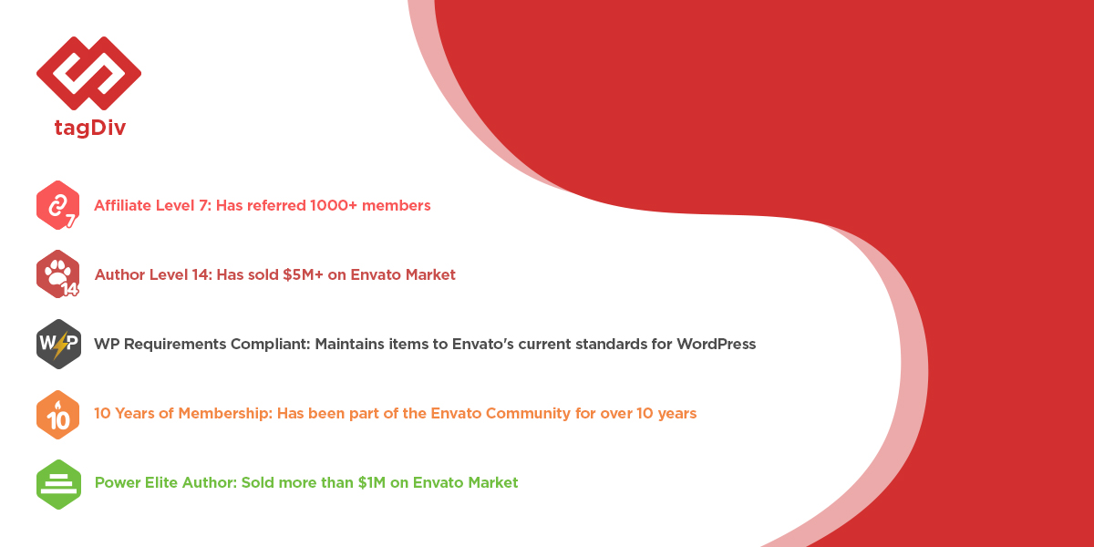
tagDiv is a top B2B company in Romania
Every year, Clutch announces their Leader Awards, the highest-ranking companies, according to geographic location and service line based on customers’ feedback. In August 2020, in less than a year from the moment we’ve created our profile, tagDiv was named a leader on Clutch reports on the top B2B companies in Bulgaria, Romania, and Serbia.
We are delighted to have been chosen as one of the leading web development companies for Eastern Europe by Clutch. It’s nice when Clutch awards our work. Growing from B2C to B2B comes with challenges, and collaborating with Clutch.co is an excellent choice for the tagDiv web development company. It helps us increase our visibility, generating new inquiries, and valuable leads because the prospects find it easy to have the confidence to decide when they see good feedback from other clients.
Radu Oprea, CEO
With over 49,000 companies worldwide featured on the platform, tagDiv is honored to have been selected from such a large pool of firms as a top web development company.
Clutch reviewers have directly contacted many of our clients about the services tagDiv delivered to find out details about the project management style, collaboration outcomes, and other relevant information. These reviews are thorough and offer insights that provide a genuine perspective on how a partnership with our company can lead to transformative results.
We are grateful to our customers, especially those who took the time to leave us a Clutch review! Here’s what they had to say about working with us
The tagDiv team were always respectful and didn’t give up even though I sometimes had a hard time describing what I wanted.
Owner, Web Development Company
The new site is now streamlined and eye-catching, meeting the goals and expectations of the internal team. tagDiv provides quality results through a collaborative and timely manner. The team is hard-working and creative.
Director, Marketing & Advertising Startup Company
The team is skilled and they accomplished all of our needs.
Editor, Online Media Publication
We are impressed with the team’s quick turnaround, professionalism and cost-effectiveness.
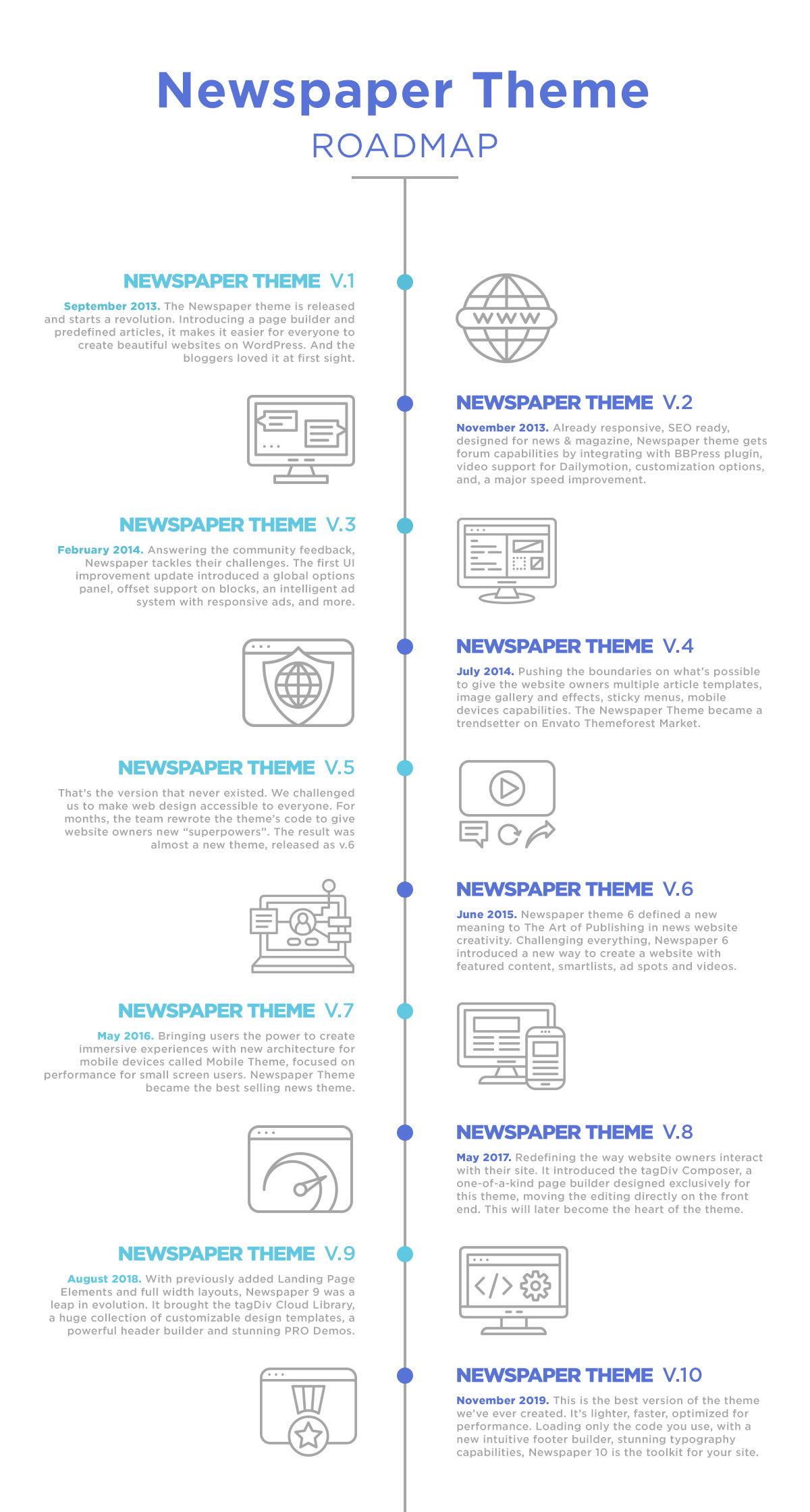
Let’s celebrate the Newpaper Theme 7 Years Anniversary! Today is about great achievements, hard work, challenges, and emotions. The Newspaper WordPress Theme now powers more than 100K customers all over the world. We are proud to show you some of their creations in our Showcase page, portfolio projects, mention them on our site, social media, or ThemeForest Newspaper page.
100K is more than a number!
This is a memorable moment for the tagDiv team, and we want to show you how thankful we are for receiving your support and encouragement during this journey. We couldn’t have achieved this without you! We consider you as part of our team, and your feedback pushed our creative minds to find new functionalities and simplify the way a website is designed.
7 years ago, when the Newspaper theme got released on Themeforest (on September 4th, 2013) there were only two people in our team. With the growing interest for the news WordPress templates, new members joined the our team. Today, we are a team of 21 web developers, web designers, digital marketing strategists, brand, and project experts working closely together to deliver professional solutions.
There are countless stunning WordPress websites designed with the Newspaper WordPress Theme. Different, unique, glamorous, styled, bold, popular, branded. Moreover, behind every website, there’s a team that maintains it technically and visually. Any website has its authenticity, original content, and social communities. So, Newspaper is more than a popular news theme! Newspaper is your site’s home, a comfortable and intuitive place for anyone to discover and enjoy.
Newspaper is the Best Selling News WordPress Theme from All Times
Reaching a theme milestone like this has not been easy. For us, the core motivation is to create a great customer experience and deliver the benefit of having every tool within your grasp. When we craft a new functionality, we always focus on its purpose. ’How would it help customers reach their goals easier and faster’? is the first question we ask.
This Newspaper theme milestone is like achieving your first New Year’s resolution, a celebration for us, and each and every customer that made this journey with us. We all had our part in creating this amazing news theme you love tweaking on your WordPress website.
Now we are celebrating the efforts behind the tens of thousands of hours you invested in countless conversations you had with the tagDiv team sharing your suggestions and struggles with us, asking for solutions to build your website faster, easier, to grow your business. We celebrate the amazing community from tagDiv Forums where users are so dedicated that they provide solutions for other customers, and the devs and designers all over the world. We salute you! Thank you for your contribution to improve the theme. We are greatful!
Development. Perseverance. Evolution.
Founded by two friends, Marius (web designer) and Radu (web developer), the tagDiv team started the WordPress journey in a spare room in the house of Radu’ s parents. Working on the WordPress theme project after their jobs, the most important issue to solve back then was finding a market fit for the product. They took a year of actual testing of different WordPress themes and systems to understand exactly how things work in the marketplace. Once they decided to go for the news industry and provide a theme that solved the issues for the online publishers, Envato Themeforest was the right market. The Newspaper Theme got launched a year later.
Let’s take a trip down to the memory lane, and see how the Newspaper theme changed over time. You can discover all features detailed on the Newspaper theme changelog page.
The Thanks Go To…
As with any celebration, it’s important to thank everyone for their support, implementation, and implication. We haven’t prepared any long speeches, but we believe that a big Thanks! to anyone who helped us make a difference in the WordPress news industry is appropriate.
The tagDiv Team
We’ve faced challenges, had dozens of brainstorming sessions, conferences, and long coffee-driven discussions. We grew together, we met up outside of the office and through the years, we became a family. Together, we have achieved something amazing: we’ve reached this great Newspaper theme milestone! You are truly creative when working as a whole, and you’re enthusiastic while experimenting and finding new solutions. Team rules!
When you’re surrounded by people who believe in you, the workload,and effort seem easier to tackle, says Marius, co-founder tagDiv
Envato Team
We chose Envato ThemeForest market to be the exclusive place to sell the Newspaper WordPress theme. ThemeForest was released by Envato in 2008, and it was on the rise when we were looking for a trustworthy marketplace to launch Newspaper back in 2013.
So, here we are, in 2020, and we are more than happy to continue our collaboration with the Envato team. This partnership is based on trust, respect, and communication. ThemeForest is a reliable source to buy yourself a safe product and give credit to the author’s hard work. Thank you, Envato team for being part of our greatest Newspaper Theme milestone ever!
Social Media Communities
We know that a social media presence is your fast way to talk to us. That’s why you can reach out to us at any time. We mostly answer pre-sale questions on our social media accounts, as for getting theme support you can always drop an email or use the forum.
If you haven’t followed us yet, you can find tagDiv on Facebook, Twitter, YouTube, Instagram, Pinterest, and Linkedin. We’re delighted to keep in touch with you and see how much you support our work.
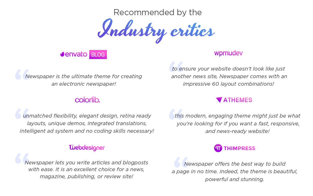
Industry Critics, Online Publications & WordPress Bloggers
There are various publications online, related to WordPress, software, or technology out there. You can check out many business magazines that have published Newspaper theme reviews, tagDiv blog posts, or included our WordPress template into related collections. Moreover, the Newspaper theme is appreciated by popular web design authorities such as Awwwards, CSSDesignAwards, CSS Winner, Shoutmeloud, aThemes, Colorlib, Templatic, and many more. There are so many real stories about Newspaper & tagDiv published on your websites, and they all contributed in our customer’s decision-making process. We would like to thank you for believing in our product and for your honest, expressive thoughts!
Together We Are Changing the World
Paulo Coelho nicely wrote that “everybody has a creative potential and from the moment you can express this creative potential, you can start changing the world.” Our company’s performance is definitely a business milestone we want to share with our amazing customers. Let’s celebrate tagDiv’s achievement together! We’ve prepared a discount for you to use it if you need a custom web development & web design solution. Submit your new request and include the milestone20TD code within the description, and you’ll get 20% off the project! Thank you for taking this amazing journey with us! We’ll keep inspiring you so you can develop and achieve your projects and goals with ease.
Are you taking a step towards a brighter future and a better 2020? So are we! Let’s tackle the rest of the year with a positive design project. A color as enlightening and joyful as yellow is the perfect way to start your journey. Let’s dive right in by exploring some of its meanings and associations.
Yellow’s Color Meanings
One of the first cave drawings used yellow paste. Since then, yellow has been incorporated into art in various ways and to describe multiple things. Paintings from Medieval and Renaissance times used yellow to portray outsiders. However, that’s not the only association it has had. Artists like Vincent Van Gogh used yellow to convey light and vibrancy.
During the Age of Enlightenment, bright yellow was seen as light shining down on the people’s minds and bringing about a new age of prosperity, of science. So what does this color mean exactly? Yellow is often associated with joy, caution, energy, optimism, intellect, and loyalty. But let’s explore this further:
Orange yellows are sophisticate and powerful.
For a somber and traditional look, brown yellows are perfect.
Refresh anything with green yellows bursting with stylishness.
Pale yellows are spring-like and pure.
Color Schemes for Yellow
Knowing the basics of color theory, you might be able to guess some colors that pair well with yellow. According to the Color Wheel, here are some of yellow’s color combinations:
Monochromatic yellow palettes use the different shades of yellow to bring consistency across the entire design. Use dark, bright, and pale hues to create contrast.
Analogous color schemes involving yellow rely on its neighbors: orange and green. It’s a fresh and bold way to make a statement.
Purple is the color complementary to yellow. With this combination, anything can be striking and exceptionally beautiful.
Split complementary relies on a triangle being drawn across the color wheel, its edges indicating this surprising, yet very alluring color combination: yellow, cyan, and red.
Last but not least, a triadic color palette involving yellow should contain blue and pink.
Knowing what colors go well together can be detrimental to any design project, so choose your color palette wisely.
Design with Yellow
Whether you’re working in a vector-program, painting digitally or traditionally, designing a website – integrating a vibrant and energetic color as yellow should be straightforward. Create the perfect color palette that suits any motif or design idea using Adobe CC. It helps you make triadic, complementary, analogous, and even monochromatic schemes. For more inspiration, there’s also a section to explore other schemes.
Yellow can be the accent color of the piece you’re creating or the one which frames your composition and brings it to life, working from behind the scenes to ensure your project shines. How do you do that if you’re designing a website? With a theme that lets you edit everything on the front-end, such as Newspaper Theme, you can easily change colors for columns, backgrounds, buttons, and text.
Just click on any element on the page, go to its Style settings, and choose your preferred hues. Create contrast between the text and its background to make sure it is highly visible and legible for your readers. If you’re stuck in a rut, look to your favorite websites for inspiration: how did they incorporate colors in their design? Where did they use it, and how can you do it yourself? Once you have an idea, get creative, find what works best for your vision.
Conclusions
Adapting is the basis of any creative endeavor. Any project undertaken shall be successful if you allow experimentation. When designing with the color yellow, keep in mind its meanings and how they can affect your general audience. What is the core message of the project, and how to convey it? Moreover, what is the driving force behind it? Use those answers to conclude what type of yellow you want to use and what color combination makes the best decision.
If your website uses yellow throughout its design, show us its design in the comment box below. 😀
In version 10.3.6 of the Newspaper WordPress theme, we’ve added five new PRO demos you can one-click install on your website. This year is challenging for everyone, and the majority of us don’t even have the chance to go for a relaxing get-away in exotic places. But even if most of us won’t get to see the mountains, nor the sea, we can try to make it through together by bringing the beauty and relaxation through these 5 spectacular new PRO demos.
In terms of beauty, functionality, and high loading speed, the Newspaper theme is the best choice. Furthermore, if you need some extra solutions that require professional web development & web design assistance, here at tagDiv, you’re all covered.
We know trends come and go. That’s why we revived some of our old full demo designs, the ones you loved having installed on your website. By recreating old demos as new PRO demos, we made them lightweight and faster, without unnecessary elements. Moreover, they have a cool summer vibe and fresh out-of-the-box elements you can mix & match on the frontend of your site using tagDiv Composer page builder & tagDiv Cloud Library. Let’s see each new PRO demo characteristics so you can easily choose your new favorite design.
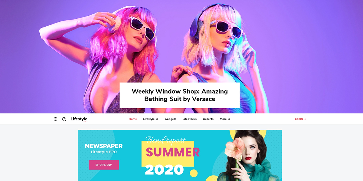
As the name suggests, Lifestyle PRO encompasses interests, behaviors, hobbies, and distinct opinions on health, politics, religion, values, or world view. This demo is built specifically for those who want to share their way of living with others, and also for those who embrace consumption behavior. For example, the majority of us follow celebrities or popular people on social media. They are all influencers that combine personal and psychological factors with social ones, and have a different lifestyle than ordinary people. We follow their activity to learn something new.
So, we’ve designed a new PRO demo, unique, by using bright colors and a lot of white space to give you the best playground for a Lifestyle website. Whether you have a personal blog or a magazine site, this demo has predefined spots for ads, clean photo areas, and is social network friendly. The beautiful chosen post template comes with the infinite scrolling effect enabled, so your readers can stay longer and enjoy the lovely content. Furthermore, to create this unique demo design, our web designers used alternation and asymmetry as the overall key factors.
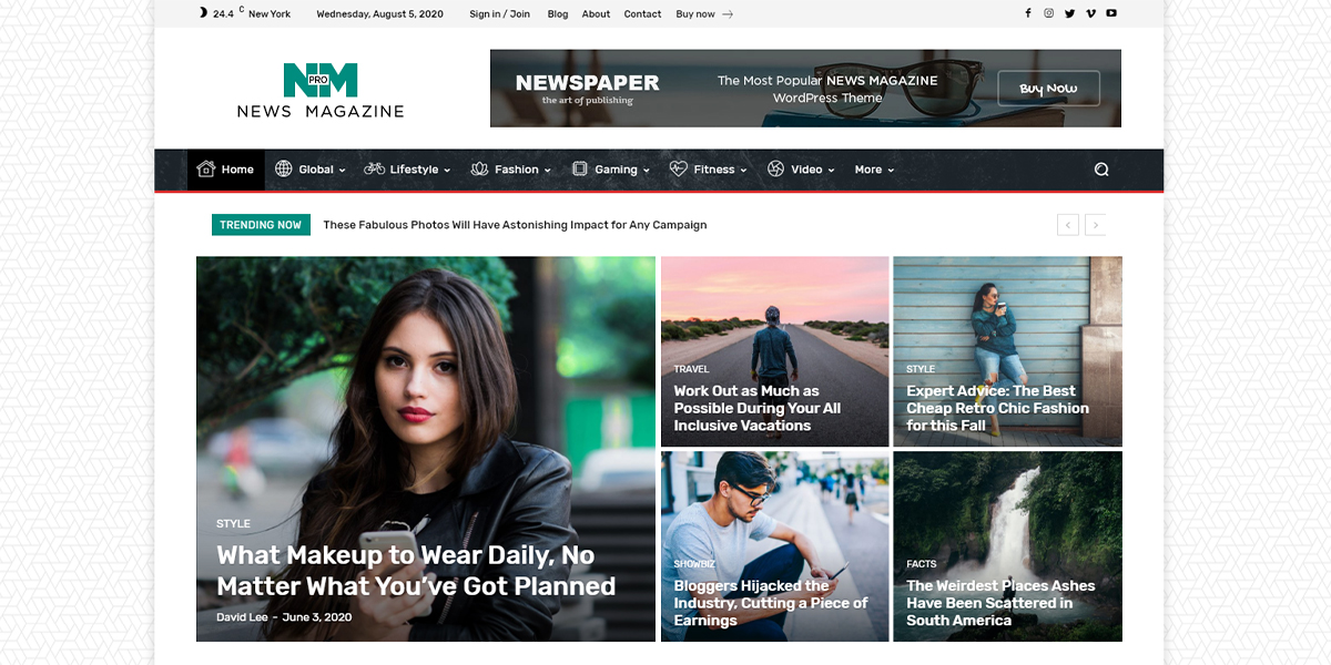
News Magazine PRO demo is an actual remake of the old Magazine demo. You’ll notice the difference! This demo design is easier to edit, which makes designing your new magazine website on the frontend a piece of cake. With round and rectangular shapes, bold and thin typography, the Magazine PRO demo shows you the latest articles, creation date, and author name strategically. The homepage is showcasing distinct information and interesting content by alternating image boxes with text, hover colors, and an overall mysterious vibe.
Structured by a Big Grid Flex with thicker white borders between images, social network area, ad spots, different post categories, big titles, text excerpts, embedded video playlist, the Magazine PRO is every blogger’s dream. It has a compact design, a fine background texture, and essential features like news ticker, weather shortcode, as well as infinite scrolling enabled on articles.
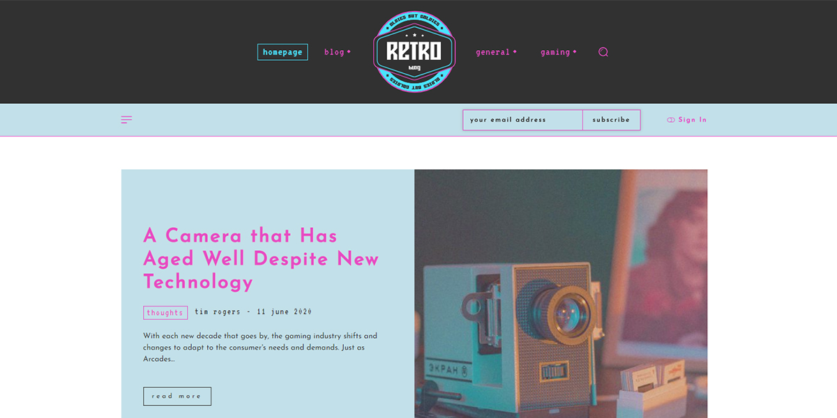
When thinking about vintage culture, we are actually referring to those retro aspects that describe past trends, lifestyles, art forms, old music, attitudes, fashion items. The Retro Blog PRO is a demo inspired by retro gaming that meets arcade colors and lights. There’s a contrast between cyan and pink shades, as well as custom-made shapes and icons to highlight the importance of retro in modern life. For example, the animated hamburger menu that smoothly slides from left side, and the usage of the elegant and geometric Josefin Sans Font family gives you the complete vintage feeling.
When you first see this demo design, you’ll fall in love with the details. You’ll want to go and unpack things from your childhood that used to make you happy and keep you occupied. The Retro Blog PRO demo design makes you want to be a child again and share your best game tips with everyone. With this demo, you can build an amazing tech, video game, game news, or entertainment website.
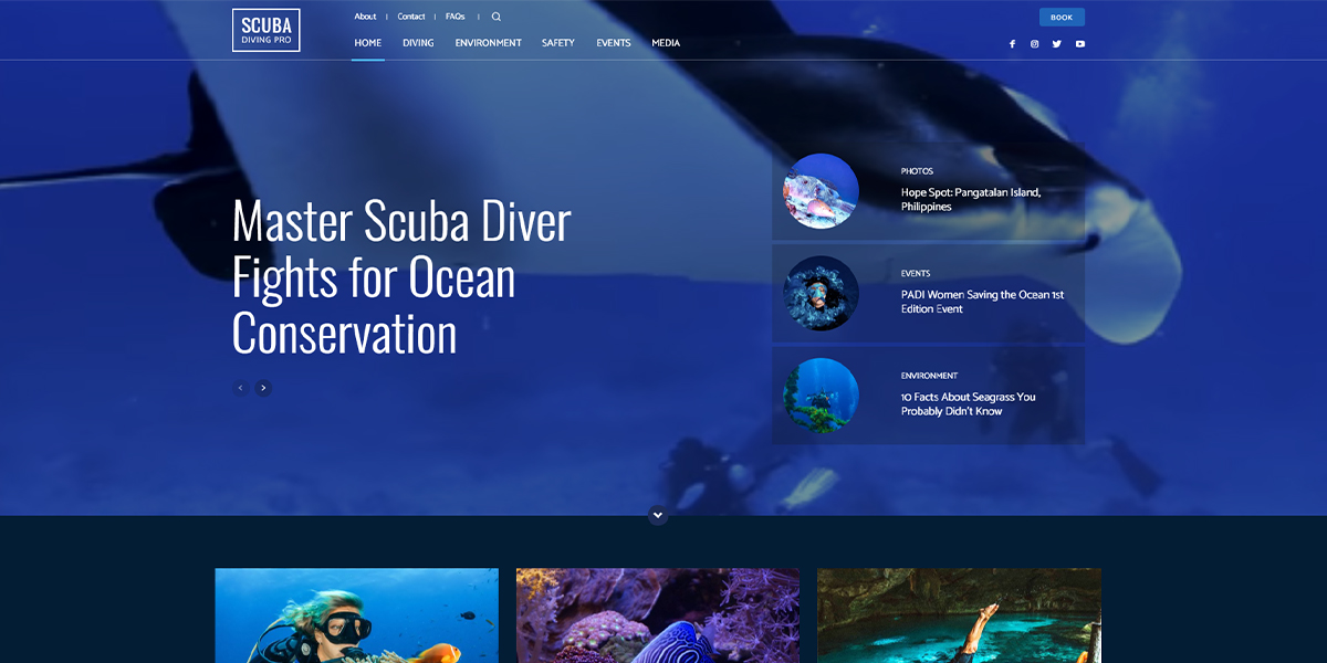
Scuba PRO is just an amazing demo that will immediately take you on a journey under the sea. The high-definition video background for header is a great way to catch your visitor’s eyes right from the start. Navigation buttons on the mega menu are also a neat addition to the functionality of the beautiful Scuba PRO demo.
Designed with a blue monochromatic color scheme, and transparent modules placed on row backgrounds, Scuba PRO is a fresh, calming, and vibrant demo design. With a one-of-a-kind footer, organized in four columns, these are the necessary elements to give your readers everything they’re looking for. There’s a minimal-looking subscription box as well as quick links to the main categories, and social media icons, all shown in the bottom area of the demo design.
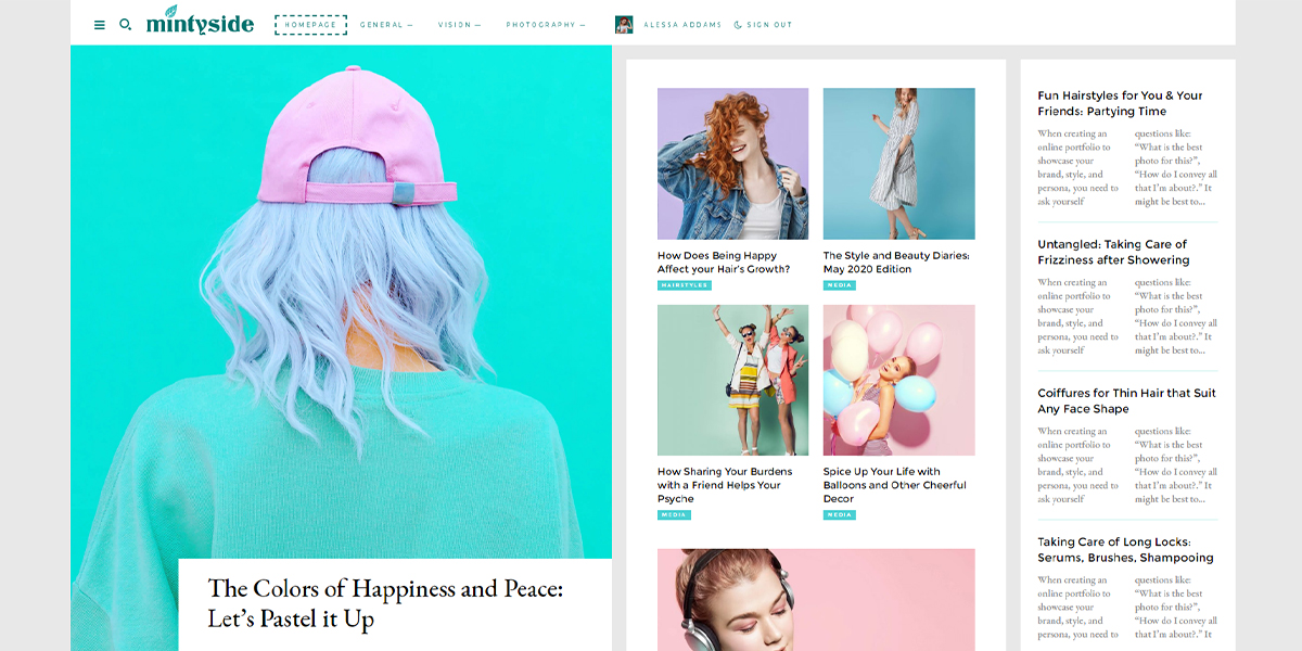
Inspired by the mint symbol of generosity and wisdom, the Mintyside PRO is an explosion of visual elements that serve as the perfect place to show your writing skills. The stylish logo includes a mint leaf, that’s well-balanced with the typography.
Modern fonts, pastel colors, and a grey background throughout the entire website make Mintyside PRO a delight. It is a unique demo design, based on a three-column layout. Moreover, wide elements are organized by combining Flex Blocks with two-column excerpts to give you plenty of space to use your content.
Conclusion
In case you’re wondering how our web designers craft new demos or redesign old ones, you must know the secret: there’s a lot of research done. To keep up the high standards, we use modern typography, popular colors of the year, fresh forms and graphics, as well as the news industry specific: built-in ad spots that are entirely customizable. The new PRO demos of the Newspaper template are, as always, included with the theme’s package, and easy to install. They’re fast, gorgeous, and customizable from top to bottom. What’s your favorite new PRO demo? Let us know below in comments ?
Have you just created an online business from scratch, or you already have one, but results are not coming as expected? Have you created a buyer persona yet? Read the whole article to understand why it’s necessary to have a customer persona profile and learn how you can shape it for your business. Today, we’ll analyze components of inbound marketing so that you can create awareness among your customers through different channels, by using great content. Furthermore, we’ll tell you a word about outbound marketing.
What is an Inbound Marketing Campaign?
An Inbound Marketing Campaign is a set of good content-driven practices with the aim of reaching new and successful business leads. Inbound marketing approaches are not traditional ones. If you’re used to the old, offline marketing methods, it’s time to hear about inbound marketing campaigns. Whether we’re talking about live chat/bots, meeting schedulers, surveys, typeforms, or any other ways of requesting feedback, the potential buyer has the possibility of asking pre-sale product questions. Not all inbound marketing approaches involve AI technologies. People still love to and appreciate talking to a real person. This is an everlasting thing.
What Outbound Marketing refers to?
Outbound Marketing or interruption marketing means to promote an item through continued advertising, publicity, public relations, and sales. Most companies also use outbound marketing campaigns to find possible clients with help from billboards, pop-ups, banner ads, telemarketing, cold calling, TV, radio ads, and so on. By opting for an outbound marketing campaign, the chances to get rejected are high. Furthermore, potential customers get annoyed by spammy content, tons of emails, or phone calls between their working hours. According to Hubspot’s article on inbound vs. outbound marketing, “Your average human today is inundated with over 2000 outbound marketing interruptions per day and is figuring out more and more creative ways to block them out, including caller ID, spam filtering, TiVo, and Sirius satellite radio.”
So, inbound marketing is a new concept that focuses on quality content across different platforms, while outbound marketing refers to paid advertising on various channels. Whatever you prefer inbound marketing or outbound marketing, it’s best to combine both methods to bring new leads and get the most of your marketing efforts.
What are the KPIs?
To know if your marketing effort is successful or not, you have to measure results. Define your KPIs (Key Performance Indicators) for the inbound campaigns. You may be interested in tracking Sales Growth, Leads, Lifetime Value of a Customer, Cost of Customer Acquisition, Website Traffic to Website Lead Ratio or any other KPI that is valuable for your business.
Wondering how to measure them? Google Analytics, Marketo, Hubspot, and more free or premium tools are available today at one click away. If the results are not satisfactory, you’ll have to rethink your inbound strategies.
What’s a Buyer Persona?
It’s a fictive and the main character in your online business story. Is the person who will buy your products. An effective business is based on real facts. We know you’re excited about starting or running a new business, but you have to keep an eye on details, to support all your marketing efforts. Who are you selling to? Where is he or she from? What’s hers or his age? What are they interested in?
The importance of defining a customer persona profile is the core key to your business. Without knowing who you address, you get scrambled results, and you invest money without having benefits. Depending on the industry, you can have one, two, three, or more buyer persona profiles.
How to Build a Customer Persona Profile
It’s time to give a deeper understanding of your customers’ needs. Take a pen. And paper. Or maybe you like to brainstorm and draw on a board? Whichever the way, just roll up your sleeves and answer these questions:
Start with your industry. Is it fashion, make-up, software, food & drinks?
Which are the buyer persona’s demographics, goals/challenges, personal background?
What are your customer’s problems? Why would he need your product?
How can your product respond to the customer’s needs?
Which are your solutions for customer’s needs?
Benefits of your items that can solve their challenges?
If you want to learn more about your prospects, you can use data-driven research, interviews, and surveys. If you want an already-made template, you can subscribe to our newsletter and download the buyer persona template we specially made for you. After you establish who your buyer is, you can focus on the right marketing strategies and messages.
Data analysis based on the most popular online tools
Even if your buyer persona is a fictive character, you can build the Jane Doe with real accumulated data. You have to get the big behavior picture of your customer, and you have to use various channels of data to analyze insights, attitudes, motivations, behavior. You’ll gather and store data about existing customers based on age, location, interest, and time spent on a page, the bounce rate, and other details. Below, there’s a list of the most popular data analysis tools to use in your digital journey:
Data Analysis
1. Google Analytics is a full Google Marketing Platform solution that combines analytics intelligence, detailed acquisition, advertising, behavior, conversion reporting, and helps you understand how visitors use your websites and products. For example, if you want to know more, you can follow our Google Analytics Guide on how to track the traffic on your WordPress website.
2. Google Search Console is the one option to go for when you want to measure your website search’s traffic in terms of performance, fixing issues, or optimize your content with search analytics help.
3. Crazyegg is an online software that allows you to use visual reporting to better figure out where your audience comes from, where they’re navigating through your site. To improve your UX practices, use A/B Testing on your pages.
4. MixPanel is a product analytics platform that can help you analyze how visitors use your site from different devices and how they convert. Moreover, it comes with data science integrations, behavioral analytics, messaging & testing, as well as data governance or user analytics infrastructure.
Content and Behavior
5. BuzzSumo is a content marketing tool that helps you discover high-performing content, research data, identify influencers, and monitor comments.
6. SemRush is an advanced SEO software to track, manage, and monitor your site’s visibility and to get the most out of your content marketing strategies. In addition, it includes options to analyze your site’s content, advertise, backlink, and it integrates with the Google marketing tools.
7. KissMetrics is an advanced behavioral web analytics software for any Saas or eCommerce business.
8. Moz PRO helps you understand visitors based on keyword explorer capabilities, rank tracking, website audit and crawling, page optimization, and backlinking opportunities.
9. Hotjar is a popular visual tool that shows you specific results based on heatmaps, recordings, funnels, surveys, forms, and behavioral polls.
Optimization
10. Optimizely is an optimization software that gives conversion, adoption, engagement & retention solutions for marketing, product, engineering, data, retail, travel, high tech, finance, or media businesses.
11. Cyfe is a real-time data dashboard that monitors your business across various channels and allows you to easily use pre-built widgets and templates to keep track of the wanted KPIs.
12. Hubspot Marketing Hub is described as all-in-one inbound marketing software that keeps your campaigns in a single place and helps you attract, convert, and get a satisfactory ROI.
13. Ahrefs is a powerful content analytics tool that helps you explore keywords, check out relevant backlinks, and new website opportunities to grow.
14. CustomerSure is a helpful customer experience software for measuring NPS, CSAT, and CES. Furthermore, it comes with an intuitive dashboard, you can improve client loyalty, data retention, and develop customer-focused products.
15. Facebook IQ is part of Facebook for Business platform consisting of consumer behaviour and marketing real data series and reports based on real people insights.
16. NGDATA is an AI customer data platform that provides real-time data on every client and captures insights from many channels.
Email Marketing and Social Media
17. Campaign Monitor is an email marketing software, enhanced with drag and drop functionality so you can optimize your campaigns with ease. Includes pre-built signup forms, data analytics panel and is integrated with the most popular apps.
18. Pardot is a data-driven automation tool that provides advanced marketing and sales analytics within customizable dashboards.
19. Buffer is one of the most popular social media analytics tools. You can publish content across various social channels while measuring their performance with reports and insights to grow your business.
20. NinjaCat represents a company that uses automated reports, tracks budgets, and KPIs to easily gain access to valuable data and insights on your marketing campaigns. It also uses many useful integrations for a full data report.
Human behavior is also influenced by several factors while navigating on a website: design, functionality. Best User Experience and User Interface practices must be respected if you want to keep your customers interested. For example, a complicated scheme of navigation on your homepage might result in high bounce rates and low time on page.
Streamline Your Sales Process with the Right Buyer Persona Profile
To summarize, just put yourself into your customer’s shoes. Use data-driven research for real information, and always ask for your customers’ feedback through interviews, surveys, or other ways. It’s important that you build a buyer persona that’s relevant to your brand and business. Furthermore, all your marketing efforts can provide helpful solutions your development team can implement and make your products better. OptinMonster has added some fully-filled-in templates for concrete buyer personas, which you also may find useful.
The tagDiv Cloud Library brings you over 1200+ already-built layouts. We have designed it to simplify the way you create layouts in the Newspaper theme and make your website stand out! The innovative system of tagDiv Cloud Library allows you to import templates and customize them using the drag and drop functionality.
The plugin has three significant purposes:
Helps you create stunning templates and pages quickly, without the hassle of adding CSS code;
Allows you to use of the tagDiv Composer on all WordPress templates;
Provides a growing database of pre-made templates, homepage, sections, blocks and so forth.
With the tagDiv Cloud Library, there’s no need to create your content from scratch. You can easily import the selected element, and use it directly or customize it to your preference and style. You can also import pages easily with one click! Just add your content straight through the tagDiv Composer, and you have a beautiful page from scratch. Find out more about the tagDiv Cloud Library Page Templates here.
Think of it as a template builder that comes with a vast collection of layouts for every section of your site. You can browse the tagDiv Cloud Library collection, preview the unique designs, and import the one(s) you love!
How to use tagDiv Cloud Library
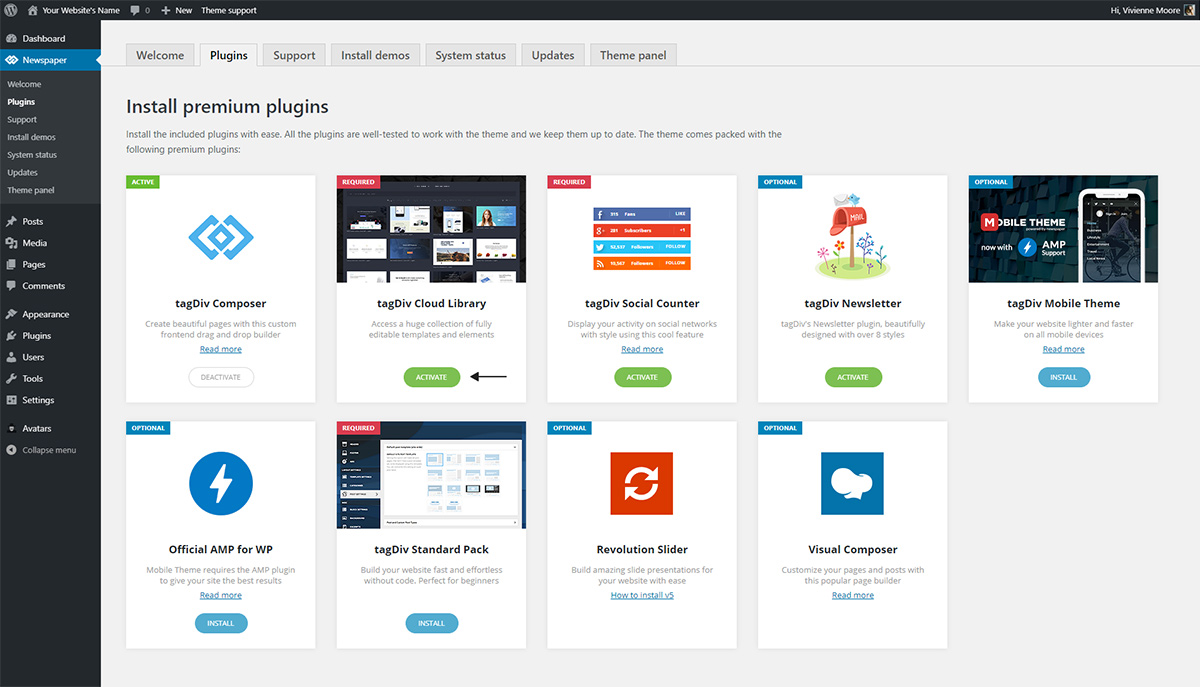
First, make sure to activate the plugin from the theme plugins section:
Then go to either a category, author, tag, date, or post on your website. As long as you’re logged in, the WordPress admin bar contains a green button: Cloud Library. Click it to open the tagDiv Cloud Library and browse through the selection of predesigned templates. If you want to create your own, choose the “Blank Template” one.
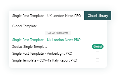
Click on any of them to open their “Create Template” window. Hit the button to have it imported and assigned straight onto the page you’re currently on. Great! But how do you set it globally? What if you want the current template to be on all your categories or posts? To the left of the “Cloud Library” button on your WordPress admin bar, you have your template button.
If you click on this tab, it opens a dropdown window with every template suitable for the page you’re editing. It should look something like this:
Any Template that you click on is applied on the current page. Please note that it does not get set globally. To assign it globally, you need to check the box next to the wanted template. Then, every page of the same type will use the template assigned by you globally.
Duplicate, Rename, Delete Templates
From the same dialogue box previously opened, you can delete, rename, and duplicate templates. When hovering over the title of a template, three dots appear to the right of it. Move your cursor top of the dots to get access to the following icons.
Let’s explore each one starting from the left, moving to the right:
The trash can icon deletes the template hovered upon. Any deleted templates can be found in the trash of your WordPress Admin Dashboard > Cloud Templates > Trash.
To the right of the trash icon, you have the duplicate icon. It makes a copy of the template.
When you click on the pencil icon, you can rename the template. This is perfect for organizing all templates.
Now that the Template button has been fully explored, let’s move on to editing and creating a new template from scratch.
Create Templates from Scratch
Before we jump into the creation process, check out the tagDiv Composer basics tutorial to familiarize yourself with the workflow of dragging-and-dropping items to create your page’s layout. When you travel to a category, post, tag, date, search, or author page, next to the “Cloud Library” button on your WordPress Admin Bar, there is an “Edit Template” button.
This is only available if you have installed a demo, or imported a template already. When you click it, you get to drag and drop elements that are necessary for your audience. Keep in mind the user experience – you want every functionality to be highly visible and easily accessible. Take a look at our guide to avoid design mistakes and learn what the do’s and don’t’s of web design are.
Keep everything cohesive, restrict the number of fonts you use on the template to a maximum of three. If you need inspiration, you can also take a look at our 2020 Design Trends, which encompasses the year’s most popular styles. Once you’re done creating the elements, stylizing them, and choosing colors, save your settings by clicking the save icon on your tagDiv Composer.
Let’s sum it up
By exploring different templates and finding out what works best for your website, you get experience. Newspaper Theme opens up a whole new world of creation and possibilities as each choice can impact your audience. Design something stunning that makes use of excellent user experience to connect better with your viewers.
Let us know how you’ve used the Cloud Library Templates to design your website in the comment box below!
With Newspaper Theme 10.3.5 comes a whole bunch of new features for arranging your page or template’s layout. More mobility, ease of access, and faster options to move, align, and order your elements in your rows or columns. If the old school way to make advanced customizations was via the CSS box, now it’s possible to tweak those aspects by clicking some icons. Let’s learn what the new flexible rows and columns do.
Layout Choices
First of all, make sure you’re up-to-date with the Newspaper Theme version. If you’re new to updating your WordPress Theme, take a look at our tutorial on automatic updates. Now, navigate to a page or template that you want to edit. Open the tagDiv Composer, our front-end pagebuilder. New to using the drag-and-drop editor? Discover how to move and arrange elements withtagDiv Composer first.
Either drag-and-drop a new row into the page or just click on an already-existing one. Split the row into 2-4 different columns. Go to General and choose between the predefined column choices. You might have noticed a new tab called “Layout.” Click it to explore a whole new set of adjustments.
The first row contains three options:
– if you leave it on OFF, you deactivate the feature for the row you’re on.
– keeps the layout of the row arranged in columns vertically.
– each column gets aligned horizontally.
Right below those, you get a checkbox to rearrange the columns in reverse order. The second option lets elements wrap inside the column, just like a text. Once you activate an option, you can see the changes happening live on the page and how your new layout looks.
Horizontal Alignment
The next few settings refer to the placement of the items inside a row or column. So let’s say that you have a column with an item shorter than the total width of the column. How would you move it to the left or right side of it? You might try to add paddings or margins to the CSS settings of it. However, there’s a straightforward solution now.
Click on the column you would like to modify. Now turn on the column settings ( ). Right next to “Horizontal Align” are these available options:
– is turned ON by default and arranges all elements to the left side of the column.
– moves components to the center of the column.
– aligns the item on the right side of the column.
– works only with multiple items that are displayed on the same row and column. It distributes them to the left and right sides of the column.
– just like the previous option, it only works when there are multiple elements on the same row and column. It creates an even distance between the items.
Vertical Alignment
Do you want elements to align in the center of your row without adding unnecessary amounts of CSS? With the Vertical Alignment options, each row or column can be moved to the center, bottom, or even to the top.
Just like with the horizontal alignment icons, there are a few icons for the vertical alignment:
– is turned ON by default and arranges the elements starting from the top.
– aligns the objects to the middle of the row.
– moves the items to the bottom of the row.
– the objects align on a horizontal line so that the text’s baseline sits on top of it.
– this option, when turned ON on the row, makes every column equal in height to the tallest one. This is a great option to vertically align items within their columns and even to create proportionate colored backgrounds within the columns.
More Options, More Accessibility!
The last two features for flexible rows and columns in the Layout tab are the Order and Width boxes. They allow you to control the way your content sits on the page and rearrange items differently on various devices.
Order
By default, it’s set on Auto, which means the columns appear one after the other exactly as you see them on the page. If you have multiple columns, at the very least 2, you can easily switch to a tablet or mobile view through the device bar and have the columns show up in a different order.
How do you do this? Click on the column you want to show up first and input a number. It can be any number, but for simplicity’s sake, write down 1. Now go to the second column and write down a number that’s higher than the first one; in our case, we can go from 2 to ∞. The columns should now show up with the “1” before the “2” column.
This is absolutely fantastic when you move to smaller devices and want your content to be the centerpiece of the website.
Width
This feature works brilliantly on both the flexible rows and columns if you want to increase or decrease the amount of space they take up on the page.
Put in any measurement in the box, and it will increase the content accordingly. You can use pixels, percentages, points or anything as long as it is marked by the correct shortening. View a full list of measurements here. So, if you want that column or row to increase its size, just input it in the box.
Flexibility at Your Fingertips
Let’s say you’ve decreased one column’s width, what happens to the rest of the columns? Most likely, they will stay at their existing width if you haven’t increased it. To make it easier, we’ve created a set of options that automatically calculate the remaining space in the row and adjust the column’s width accordingly. Let’s explore the options next to the “Occupy remaining space in row” option:
– it is turned ON by default. It lets each column remain at the size they were when you first created the row.
– if you turn the option ON, it will adjust the column’s width to fill the rest of the row.
– turns the option OFF.
Remember that this icon needs to be turned ON on the row for this feature to work properly.
Conclusions
As with every new feature, the best part about it is implementing it creatively on your Newspaper website. With so many options and combinations, there’s plenty to explore and discover. Moreover, there’s much to be done with the new flexible rows and columns: widening columns, stretching background colors, arranging items, and organizing your site in a simple manner!
Show us what you’ve created with these brand new features in the comment box below.
A high-energy passionate color, red has had its fair share of symbolism throughout history. From being incorporated as a sign of power to being gifted in flower bouquets, red can include different meanings. But, how do you use it to design a website or product? Let’s explore how to best approach using this bright color in your future endeavors.
The Origin and Meanings of Red
It was first used as a paint dye in caves. Red as a color has always been present in nature. The flames of a fire, the petals of a flower, each are a part of this beautiful hue. However, it was during the Renaissance that red began to grow. With aristocrats dyeing their clothes scarlet, it was seen as a symbol of power.
During the 19th century, it took on a more significant role: a sign of revolution and anarchy. Whereas nowadays, red is seen as a feminine color. In fashion design, it is incorporated to portray sensuality and confidence. Let’s take a closer look at red’s primary meanings:
Most traffic signs which indicate danger make use of red as a color. Whether it is high voltage markers, stop signs, or even traffic lights, the color immediately attracts attention.
The background or logo of an energy drink usually contains red as its primary color. Why is that? It’s because it’s a lively hue that promotes a sense of vitality.
Martyrs are usually portrayed wearing red as a color of their sacrifice and bravery. This can also be noticed on flags during wars as it inspires the troops to march into battle.
As a shade of seduction, women often wore red lipstick throughout the ages to encompass their youth.
Red Color Schemes
There are many variants of red: purple reds, orange-reds, true reds, and dark reds. Each one has its own personality and appeal. With orange-reds, you get a brighter and livelier shade. Purple reds tend to be more feminine, while dark reds embody a rich and luxurious vibe.
When designing a product or a website, there are a few rules you must keep in mind. Color Theoryis essential to know which colors to use together and what they create. So, these are the most popular color combinations for red:
A Monochromatic color scheme means different shades of the same color. When adopting this type of color palette, you make use of contrast between darker and brighter tones of red.
Using an analogous combination of colors means using the neighboring shades of red. Pink and orange are some of the friendly neighbors to our color.
The color complementary to red is green. When paired up, they tend to symbolize Christmas and all its delights.
Triadic uses neighboring colors to the complementary one for red, which are teal and yellow. This color palette has a retro-futuristic vibe.
The split-complementary for red includes a lime-green and a blue shade of green. Combined, they make a refreshing pair.
For more inspiration regarding color palettes for red, check out Adobe CC, which lets you pick out the type of color combination needed.
Designing with Red
When you embark on a new project or website design, you need a plan. What is the primary purpose? This can be any number of things, such as trying to build trustworthiness or even constructing a brand image. The audience needs to receive the intended message upon first sight. Do it using color combinations that place your product’s meaning at the forefront.
While reading about the various color schemes involving red, you might have already chosen something to convey your intent adequately. Now, it’s time to decide whether to make red the primary or accent color in your design. As an accent color, it thrives on highlighting objects, whereas as a primary color, it bathes every object in it.
If you’re designing a website using WordPress, you need a template to build everything on the front-end. With Newspaper Theme, you get access to the tagDiv Composer, the frontend page builder that lets you drag and drop elements while constructing it. Let’s see how to use it to adjust your site’s colors.
Newspaper Theme in Red
Take a look at our basic tutorial for the front-end page builder if you’re new. Then open any page or template using tagDiv Composer. Whether you’ve installed a demo or created the entire website from the ground up, any element can be modified to fit into your chosen color palette.
Click on an object to begin editing. Go to its Style or CSS tab to adjust colors of different headings, titles, descriptions, and even image overlays for posts. As a bonus, you can add a gradient or color blending mode to any article or image. Take a look at our helpful tutorial for more information.
When you’ve finished creating and incorporating a red color scheme, save your settings and continue for the rest of the website to create uniformity.
Conclusions
As a highly-energetic color, red can be seen as both a symbol of power and enticement. Each meaning that is associated with red, can be easily adjusted with a color combination to fit your product. While developing and creating the visual appearance of your website, you need a strong plan in mind. Furthermore, it also has to incorporate the intent behind your project. If you follow your intuition, creativity, and the plan you come up with, you’re bound for success!
Show us your amazing red designs in the comment box below!
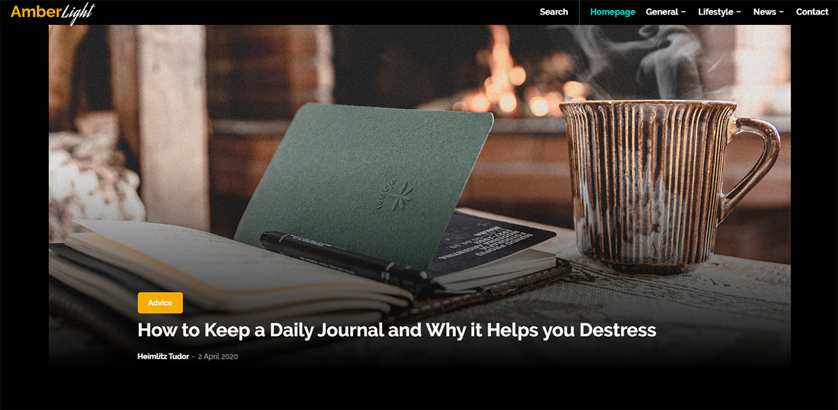
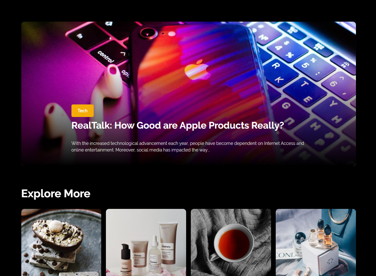
Ready to start a blog? Become the frontrunner of a locally-brought news source or just share your insights on new technology. Show stories from all around the world with a beautiful website design. Newspaper Theme 10.3.3 released 6 new demos that are meant to stun and wow the audience. One of which is the dark yet cozy-looking PRO demo AmberLight. Let’s explore all that it has to offer and why you should consider installing it on your website.
AmberLight: intro
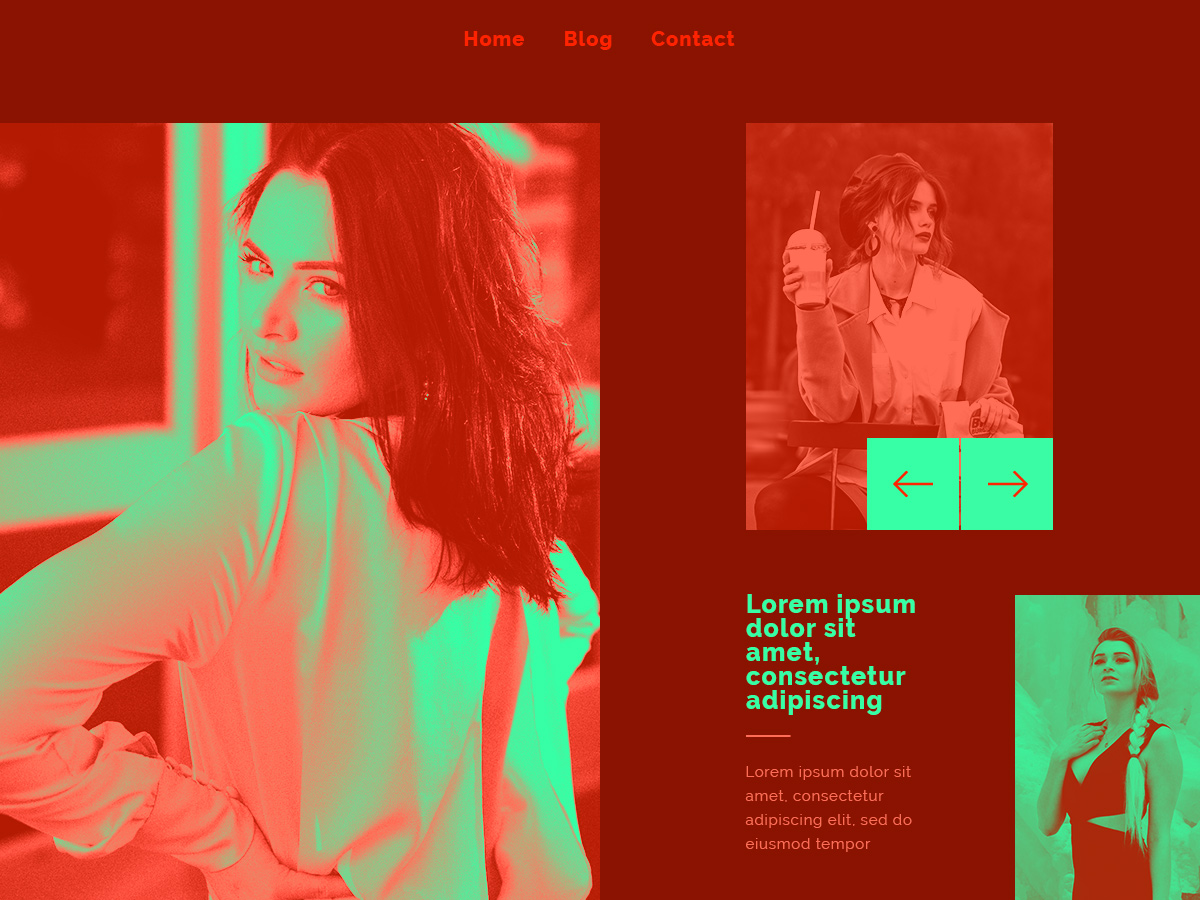
Emboldened by a dark background, the text and images will stand out among each page and template with AmberLight PRO. As such, your blog can deliver the content the viewers want to read in an enjoyable fashion. Combining the warm tones of yellow with turquoise and a dark green-blue, the site gets modernized while maintaining a level of comfort in aspect.
The bright neon turquoise tends to slip on the cyberpunk color scheme and gives the page’s elements a retro-futuristic vibe. Take advantage of this accent color as it seamlessly blends with a website focused on technological advancements. Moreover, the amber hue plays an essential role in warming up the entire layout. Contrasting widely against the cool-shades of turquoise, the golden tones are perfect for any type of blog.
Taking a Dive into the Deep-End
As we’ve previously seen, each geometric shape has its own meaning. Any element that is rounded and has no sharp edges represents harmony and safety. Consequently, AmberLight PRO demo follows that theory as each item has a curved smooth surface. Moreover, according to UX Movement, while sharp corners take away focus from inside a rectangle, rounded corners place the viewer’s attention inside it.
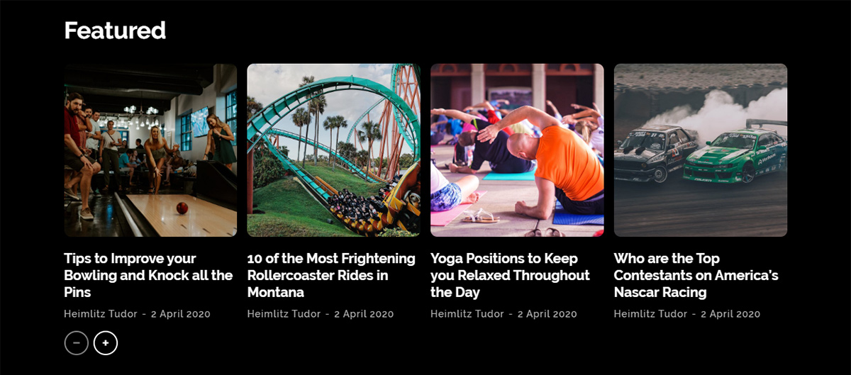
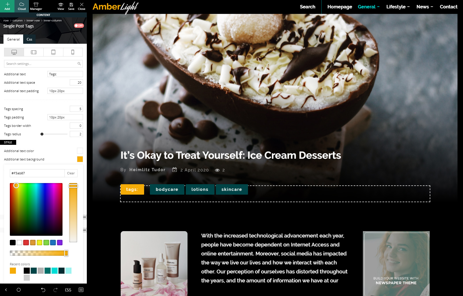
Another different pair, just like the color scheme, are the shapes which appear in the design. Taking away from mathematical equations, we have polar opposites: the plus and minus sign, which are predominant throughout the demo. Of course, the last polarity of the layout is the hover effect of any feature post image, which turns black and white. By taking away the color of the photo, the feature crosses into another contrasting threshold. It marks the dissimilitude between monochromatic and colorful.
Installing AmberLight PRO
When you update the Newspaper Theme to the latest version, you get access to all the recent features and PRO demos. Version 10.3.3 comes packed with 6 new demos, one of which is AmberLight PRO. If you’re new to WordPress, we have a helpful article on how to update Newspaper Theme.
From the Admin Dashboard, go to Newspaper Theme > Install Demos. You can look for AmberLight on the side column, which shows a list of all the possible demos you can install, or scroll down the page to the featured demo image. When hovering over the demo’s photo, the Install button pops up. Moreover, right next to it, there’s a switch that allows you to import the entire demo’s articles, categories, menu items, images, and links.
If your website has no content, and you want to test out how AmberLight would look, install it by letting the demo “Include Content.” However, if you’ve already started publishing articles and posts, flip the switch over to “Design only.” This option installs the demo without actually adding the articles and posts. Because when you uninstall a demo, it will delete all the categories and posts it came with.
Header & Footer
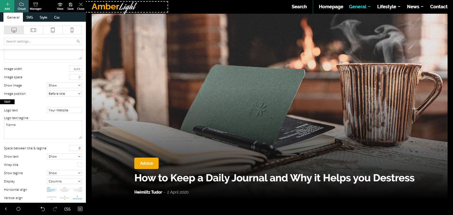
When first installing a demo, you need to make some changes to truly showcase your website. For starters, if you’re new to using the tagDiv Composer we advise you to check out the basic tips and tricks for our frontend page builder. Now open the homepage using the tagDiv Composer and click on the Header Logo. In the General Settings tab, scroll down to the “Text” section and write your website’s name inside the text and tagline boxes. Whichever word you input in the text box will be white, while the tagline will be golden. Upon hover, the colors will switch.
Save the settings. Go to the Admin Dashboard then to > Appearance > Menus. If you have already created a menu with pages, items, categories, and various other links, you can skip this step. If that’s not the case, then start dragging the homepage, and any categories you want to showcase. Make items mega menu elements or even create sub-menus. If you need more information about that, check out our main menu article. Save the created menu, then open the tagDiv Composer on your homepage again. Click on the Main Menu item and choose your predefined menu in the drop-down list.
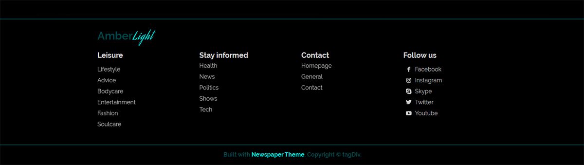
Repeat these steps for the mobile menu by going to the Website Manager button in the top left corner of your tagDiv Composer and clicking on the mobile view. When you finish, scroll down to the bottom of the page and choose 3 different list menus for the footer. Change your Header Logo here, too, and finally: Save!
Homepage Adjustments
If the frontend page builder is still open on the homepage, let’s take this moment to make some further adjustments. Click on the first Flex Block on the page. When importing the demo, it will display your latest posts but you can go to its Filter settings tab and choose to display a preferred category. The next Flex Block on the page can show a different category, or if you want, just add an offset so that it skips over the first few posts. Go to the General tab and add a number in the Offset Posts box. Great! Now continue filtering the rest of the Flex Blocks for the page.
Let’s take a look at the ad that appears on this page. Click on it and go to the Image Ad tab. This is where you upload an affiliate’s photo. Moreover, copy-paste the affiliate’s link in the Ad URL box. If you want to use Google Ads, go to the Custom Ad tab and input the code there. You’re done! Save the settings.
Templates & Contact Page
The steps you’ve taken above can be applied for the rest of the templates of the website, as well. Edit them by going to the Admin Dashboard > Cloud Templates and choosing which one to start > Edit Template. This should open the template with tagDiv Composer using sample content. If you want a live preview of it, however, just navigate to where it’s used. For example, for single Post Templates, open an article and hit the “Edit Template” button on your admin bar.
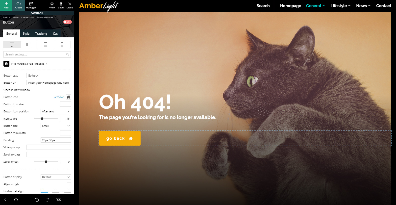
AmberLight PRO has a straightforward and direct layout design. So, all you need to do for most templates is filter Flex Blocks to display different posts and adjust codes for your Ad Boxes. The only template that needs something else done to it is the 404 Template. It contains a button that needs a link back to the homepage. Click on the button through the tagDiv Composer, and go to the General Settings tab. In the “Button URL” box type in your website’s address. Save!
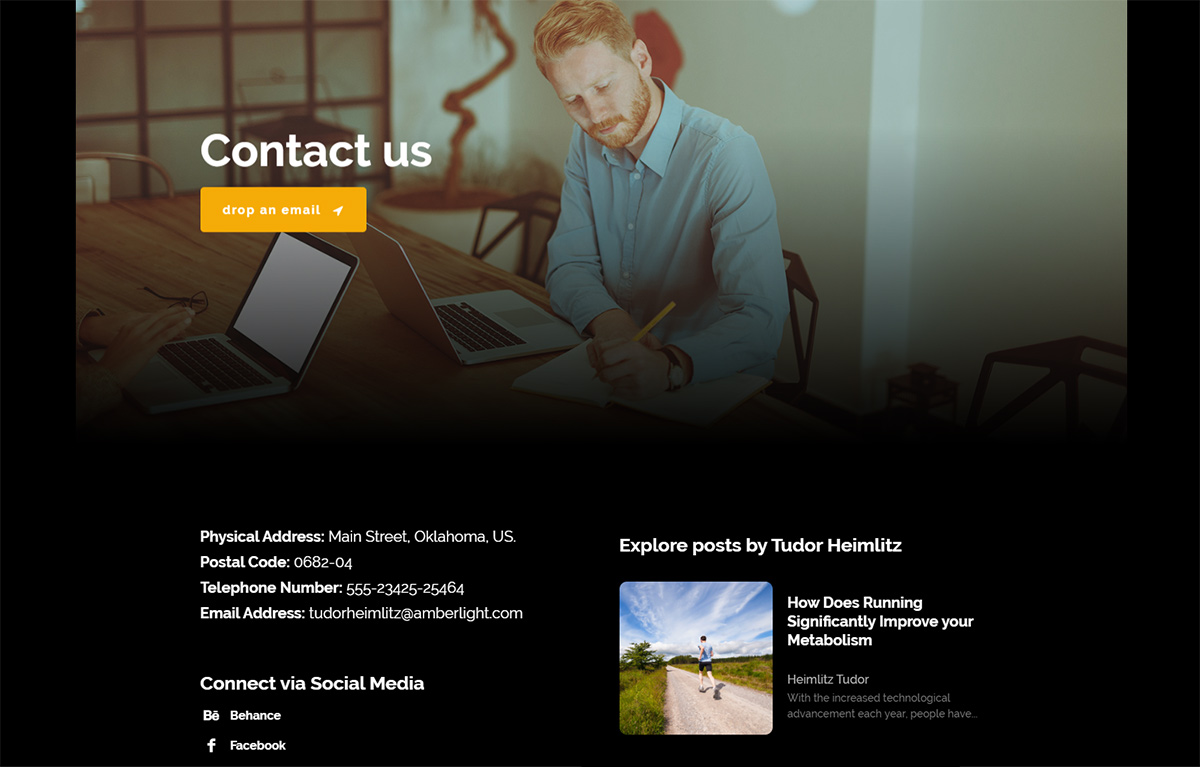
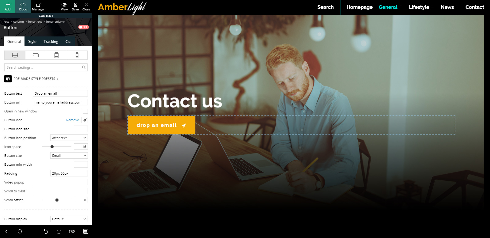
Contact Page
The demo also comes with its very own contact page that you can edit to your liking. Let’s go to the frontend page builder and see what needs to be edited. The first item that needs adjustment is the button: it needs a link just like the 404 Template one. Add a link to your email address using the “mailto:emailaddress” form.
Let’s check out the next element, which is a text element. All you need to do for this one is to insert your personal contact information replacing the sample one. Push the “Edit Content” button from the element’s General Settings tab. Now write your correct addresses and numbers. Great! Right below this item is a social links one. Click on it and add your precise social media usernames.
And last but not least, this element is a Flex Block. Filter it by a favorite category or add an offset to adjust what posts you want to show, and you’re done! Save.
Make AmberLight personal
Just as you’ve made the last few edits to each template and page the demo has, you can make a lot more! Whether you want to adjust fonts or colors to match your website’s core vision or add new images to the contact and 404 pages, the frontend tagDiv Composer builder makes everything effortless and intuitive.
If you already have a color palette you want to stick to, change both the row’s background color and text colors. Links, hovers, buttons, anything can be modified. Just click on any item you want to change and go to its style or CSS tab. In fact, the newest version of the Newspaper Theme has a search bar function. Just type in “color” to see exactly what you need marked by a red dot.
Go through each page and template and gradually turn the demo into something stunning that wows your audience. Don’t forget to save consistently!
Conclusions
Whether you want to create a striking contrast by using AmberLight PRO or just build something new from the ground up, each adjustment made should match your vision. With rounded corners, yellow highlights in opposition to the cooler tones of turquoise, grayscale hover featured images all of these upon a dark background make up precisely what makes AmberLight stand out. Explore each feature, each factor that contributes to it by installing it and showcasing your website down below!
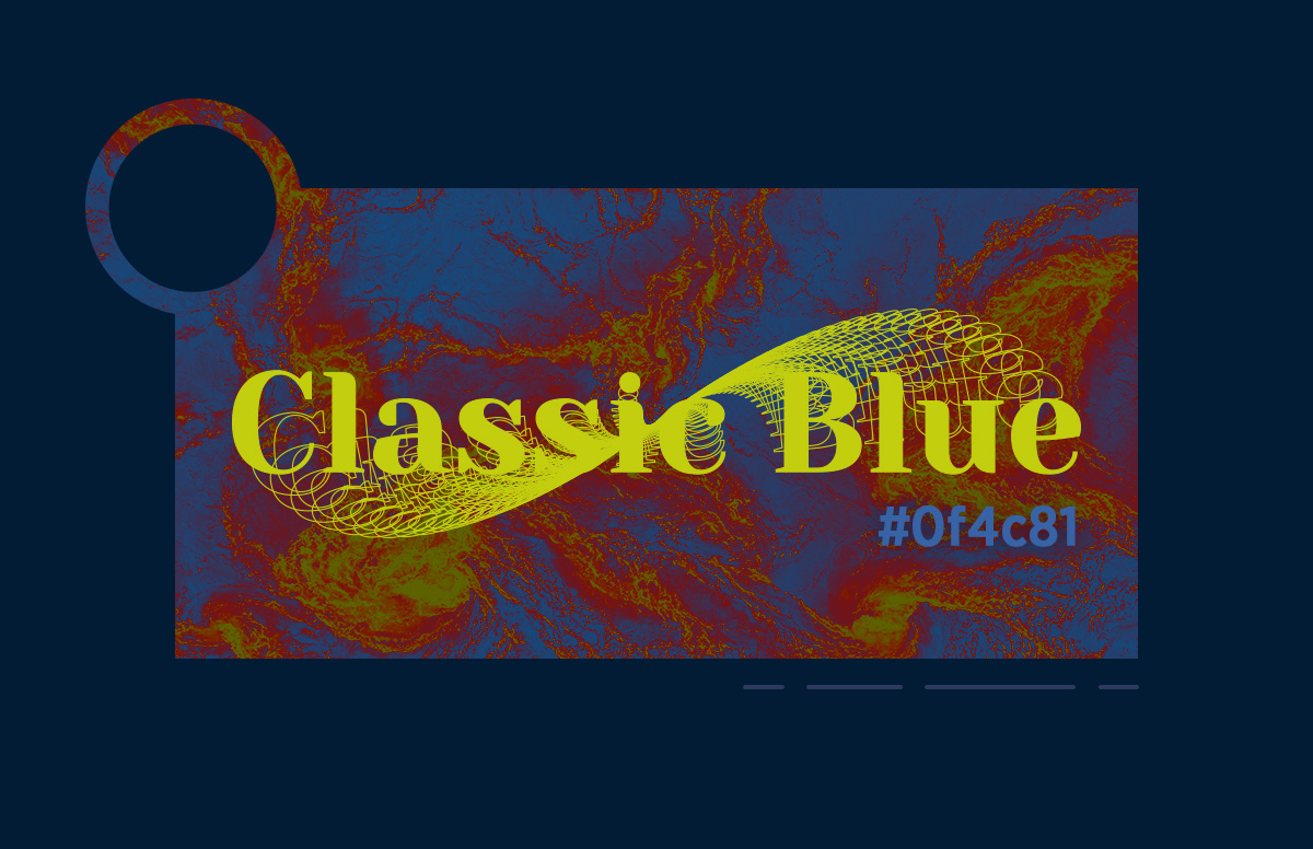
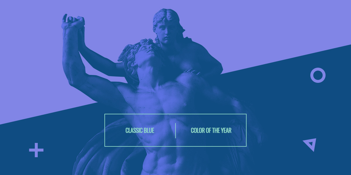
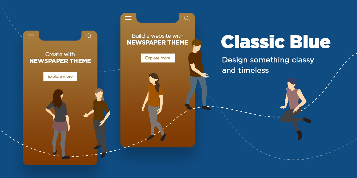
As with every year that comes around, a new attitude begins to bloom. Influenced by a wave of social perspective, marketing, and advertising shifts to complement it. With a turmoil brewing underneath the seams internationally, Pantone chose classic blue as 2020’s color of the year. How does one color make a massive impact on design and media trends? Let’s explore its meanings and the vast possibilities of creation together.
Classic Blue: Meanings
When the social and cultural environment shifts and begins to change, everyone tries to cling to something that has always been constant. Just like a sunset which welcomes the cold of the night, classic blue is present in various aspects of anyone’s daily life. It can appear on the surface of any deep pool of water, the sky at night, and even in design or art.
To have a stable future, you need a solid foundation, and that’s where this color comes into play. With its evocative nature of peace, clarity, and even protection, the color takes precedence over any doubts or qualms anyone might have. This is precisely what is needed in such an unstable environment, such as the year of 2020. It helps with concentration and brings a sense of resilience.
To Blue or not to Blue?
If you’re running a company that needs a boost in its traffic, one of the best ways to achieve that is to redesign one of your projects. Trusting the front-runner of all things color-related, Pantone, is a great choice. Their decision for 2020’s color of the year comes with its own merits. Companies, marketers, and even designers have incorporated classic blue into their art, projects, and social media posts.
Paying close attention to other design trends that are popular right now can also help you create something entirely stunning and different. And when your audience is happy with your product, they can spread the word and boost your sales and traffic.
Color Schemes
Any project or product needs a plan before you start it. One of the main aspects is choosing a color palette that defines it and your own design perspective. To better understand why colors play such an essential role in creation, head on over to our Color Theory tutorial.
One of the first things that needs to be decided is the type of color scheme you need:
A monochromatic scheme would involve different shades of blue being used and weaved in between elements to create contrast and attract the viewer’s eye. It’s simple and direct, effective, and meaningful.
Analogous is both harmonious and eloquent in getting a design started as it involves colors on the right and left side of the color you’ve chosen: purple and green shades. These hues, paired with classic blue, evoke a mysterious aura and feeling.
The color-complementary would be brown or cream. A royal or navy palette presents dark colors which are majestic in nature.
The triadic color scheme requires both lime green and red hues as the counterparts to classic blue. A rather fun color palette that can also be used to evoke a neon, futuristic style, or even a serious, somber outlook.
If you need more inspiration, go to Adobe Color and explore some of the user-made color palettes that involve classic blue.
Designing with Classic Blue
When you’ve chosen a color scheme to go with, you can begin your design process. Go into your preferred software of expertise and implement classic blue as the main color of it, and adding other shades as accent hues. This can be applied to anything you create:
If you want to incorporate these colors in your painting, you can try forming a neon-futuristic landscape inspired by cyberpunk themes. Or even take a standard-setting and switch up colors – the grass isn’t green anymore, it’s blue, and so forth.
As an animator or 3D artist, you may need to plan out the way your project should go before you start work on it. With your plan set and knowing what you want to show, you can implement the color scheme to match it.
Illustrations and posters can be retouched by adding gradients or splashes of color that make it excitingly stunning. If you need inspiration, take a look at Behance’s projects.
When you redesign or create a new website, you have to think of the layout and the user experience before you start. The moment you have all the elements together, you can always change the color scheme to match the one you’ve chosen as your color palette.
Keep in mind that even if you don’t find yourself targeted in this list, you can still create something unique with the chosen color scheme. Experiment, have fun, and don’t let anything constrain your creativity!
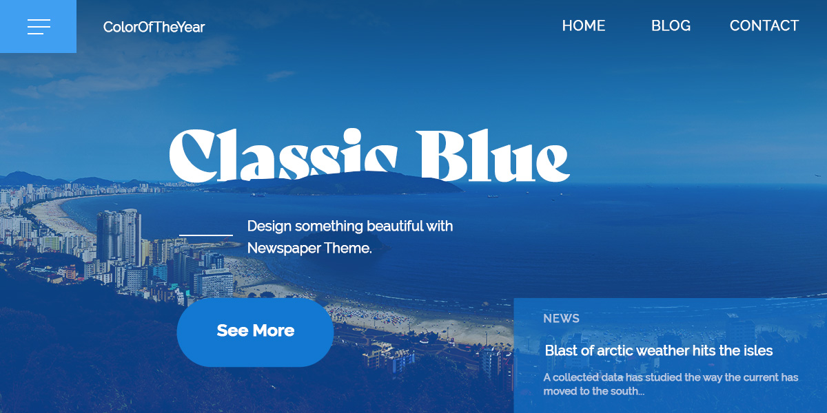
Newspaper Theme & Classic blue
Our front-end page-builder, the tagDiv Composer, makes any design task effortless! With a few simple clicks, you can access the element’s settings and change its appearance. If you’re new to the editor, take a look at our first steps tutorial. Let’s start with the idea behind the project: what is its purpose? Whether you’re designing a Single Post Template or creating a Landing Page, the goal is to engage your audience in a meaningful way. That can be either done by adding a subscription box, disclosing methods of contacting the company, or even by linking social media accounts that boost your follower interaction.
Layout
When you have the idea, and set up a goal and start creating the layout. If you are looking for inspiration, take a look at some of the websites you enjoy browsing through. Where is their search button? How does their header look? Are the posts crowded together or given ample space between? Now that you have your inspiration, drag and drop the necessary elements into the page. Arrange them according to your vision by adding padding, margins, borders. Check out our handy tutorial about creating a homepage if you need further instruction.
Style
The next part is choosing fonts and changing colors. To do this, click on an element to begin with and go to the “Style” tab. All the settings you need are here: text colors, backgrounds, shadows, and different borders. Change each one in a way that creates contrast. For example, if the palette chosen is a monochromatic one, you can have classic blue as the primary color of text and elements. In contrast, their background can be a pale sky blue. This can be switched up if you need for the next row to create balance and sections. The idea is to experiment with what looks good and appeals to you. Don’t forget to ask for feedback from coworkers, clients, or even the audience. A second opinion never hurts!
Wrapping it up
Pantone is a trendsetter in color decisions, and can positively impact your audience if you let it. Try incorporating classic blue while designing to add a touch of stability to an otherwise unstable environment. As a color of clarity and peace, let it inspire you in all of the projects you undertake.
If you experiment classic blue in art, design, or any other form of media, show us your creations down in the comment box below!
This website uses cookies to improve your experience while you navigate through the website. Out of these, the cookies that are categorized as necessary are stored on your browser as they are essential for the working of basic functionalities of the website. We also use third-party cookies that help us analyze and understand how you use this website. These cookies will be stored in your browser only with your consent. You also have the option to opt-out of these cookies. But opting out of some of these cookies may affect your browsing experience.
Necessary cookies are absolutely essential for the website to function properly. These cookies ensure basic functionalities and security features of the website, anonymously.
Functional cookies help to perform certain functionalities like sharing the content of the website on social media platforms, collect feedbacks, and other third-party features.
Performance cookies are used to understand and analyze the key performance indexes of the website which helps in delivering a better user experience for the visitors.
Cookie
Duration
Description
AMP_TOKEN
This cookie is set by Google Analytics - This cookie contains a token that can be used to retrieve a Client ID from AMP Client ID service. Other possible values indicate opt-out, inflight request or an error retrieving a Client ID from AMP Client ID service.
Analytical cookies are used to understand how visitors interact with the website. These cookies help provide information on metrics the number of visitors, bounce rate, traffic source, etc.
Cookie
Duration
Description
_ga
2 years
This cookie is installed by Google Analytics. The cookie is used to calculate visitor, session, campaign data and keep track of site usage for the site's analytics report. The cookies store information anonymously and assign a randomly generated number to identify unique visitors.
_gat_gtag_UA_43963494_1
1 minute
This cookie is set by Google and is used to distinguish users.
_gid
1 day
This cookie is installed by Google Analytics. The cookie is used to store information of how visitors use a website and helps in creating an analytics report of how the website is doing. The data collected including the number visitors, the source where they have come from, and the pages visted in an anonymous form.
_hjAbsoluteSessionInProgress
30 minutes
This cookie is used to detect the first pageview session of a user. This is a True/False flag set by the cookie.
_hjFirstSeen
30 minutes
This is set by Hotjar to identify a new user’s first session. It stores a true/false value, indicating whether this was the first time Hotjar saw this user. It is used by Recording filters to identify new user sessions.
_hjid
1 year
This cookie is set by Hotjar. This cookie is set when the customer first lands on a page with the Hotjar script. It is used to persist the random user ID, unique to that site on the browser. This ensures that behavior in subsequent visits to the same site will be attributed to the same user ID.
_hjIncludedInPageviewSample
2 minutes
This cookie is set to let Hotjar know whether that user is included in the data sampling defined by your site's pageview limit.
_hjIncludedInSessionSample
2 minutes
This cookie is set to let Hotjar know whether that user is included in the data sampling defined by your site's daily session limit.
Advertisement cookies are used to provide visitors with relevant ads and marketing campaigns. These cookies track visitors across websites and collect information to provide customized ads.
Cookie
Duration
Description
_fbp
3 months
This cookie is set by Facebook to deliver advertisement when they are on Facebook or a digital platform powered by Facebook advertising after visiting this website.
fr
3 months
The cookie is set by Facebook to show relevant advertisments to the users and measure and improve the advertisements. The cookie also tracks the behavior of the user across the web on sites that have Facebook pixel or Facebook social plugin.
IDE
1 year 24 days
Used by Google DoubleClick and stores information about how the user uses the website and any other advertisement before visiting the website. This is used to present users with ads that are relevant to them according to the user profile.
test_cookie
15 minutes
This cookie is set by doubleclick.net. The purpose of the cookie is to determine if the user's browser supports cookies.
VISITOR_INFO1_LIVE
5 months 27 days
This cookie is set by Youtube. Used to track the information of the embedded YouTube videos on a website.
YSC
session
This cookies is set by Youtube and is used to track the views of embedded videos.


 .
.

 – if you leave it on OFF, you deactivate the feature for the row you’re on.
 – keeps the layout of the row arranged in columns vertically.
 – each column gets aligned horizontally.
 – is turned ON by default and arranges all elements to the left side of the column.
 – moves components to the center of the column.
 – aligns the item on the right side of the column.
 – works only with multiple items that are displayed on the same row and column. It distributes them to the left and right sides of the column.
 – just like the previous option, it only works when there are multiple elements on the same row and column. It creates an even distance between the items.
 – is turned ON by default and arranges the elements starting from the top.
 – aligns the objects to the middle of the row.
 – moves the items to the bottom of the row.
 – the objects align on a horizontal line so that the text’s baseline sits on top of it.
 – this option, when turned ON on the row, makes every column equal in height to the tallest one. This is a great option to vertically align items within their columns and even to create proportionate colored backgrounds within the columns.
 device bar and have the columns show up in a different order.
  – it is turned ON by default. It lets each column remain at the size they were when you first created the row.
 – if you turn the option ON, it will adjust the column’s width to fill the rest of the row.


